Building a better election map | World news | theguardian.com
▻http://www.theguardian.com/world/datablog/2013/sep/06/better-election-results-map?CMP=twt_fd
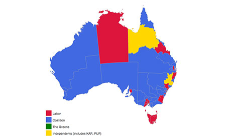
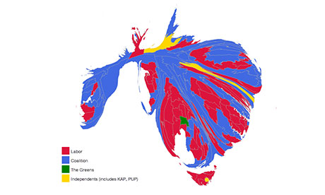
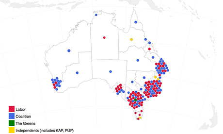
I’ve spent a lot of time thinking about maps this election. Australia has an interesting problem when showing election results on a map – because of our vast landscape, with population centres clustered at the edges, the electorates do not align very well with geography.
Federal seats range from a meagre 30 sq km in the inner city seat of Wentworth to the sprawling 1,587,758 sq km Western Australian electorate of Durack.
Because of this, it’s very hard to present at a glance election results in a geographic form.