Mapping Migration in the United States - NYTimes.com
▻http://www.nytimes.com/2014/08/16/upshot/mapping-migration-in-the-united-states-since-1900.html?_r=1&abt=0002&abg=1
Une représentation visuelle vraiment bizarre du NYT
Mapping Migration in the United States
AUG. 15, 2014
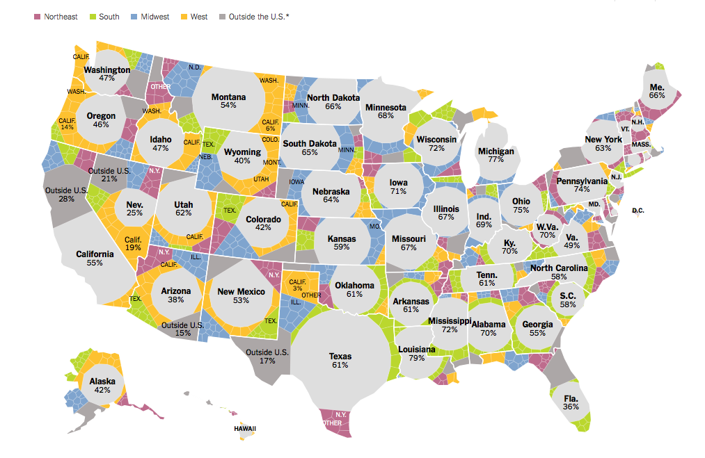
Where people who lived in each state in 2012 were born
Each shape represents where the people living in a state were born. Within a state, larger shapes mean a group makes up a larger share of the population.