Prolonged grief disorder symptoms afflict many who lost loved ones from COVID-19
▻https://www.reuters.com/graphics/HEALTH-CORONAVIRUS/USA-CASUALTIES/lbpggbmrapq
Prolonged grief disorder symptoms afflict many who lost loved ones from COVID-19
▻https://www.reuters.com/graphics/HEALTH-CORONAVIRUS/USA-CASUALTIES/lbpggbmrapq

Je découvre cette collection de « Reuters Graphics », mélange de #longforms et des #data-visualisation :
▻https://www.reuters.com/graphics
When more Covid-19 data doesn’t equal more understanding | MIT News | Massachusetts Institute of Technology
▻https://news.mit.edu/2021/when-more-covid-data-doesnt-equal-more-understanding-0304
“An initial hypothesis was that if we had more data visualizations, from data collected in a systematic way, then people would be better informed,” says Lee. (...) The researchers found that antimask groups were creating and sharing data visualizations as much as, if not more than, other groups.
And those visualizations weren’t sloppy. “They are virtually indistinguishable from those shared by mainstream sources,” says Satyanarayan. “They are often just as polished as graphs you would expect to encounter in data journalism or public health dashboards.”
“It’s a very striking finding,” says Lee. “It shows that characterizing antimask groups as data-illiterate or not engaging with the data, is empirically false.”

Chouette ! L’un des motion designers de l’émission #data-gueule nous présente un making-off de l’émission, avec notamment quelques trucs sur Illustrator et After effect.
ça donne envie de créer tout ça ...
Masterclass avec Kino (Laurent Kinowski) | Animer les données | Adobe France - YouTube
Les #data-visualisations du New York Times et du Financial Times
▻http://digiday.com/publishers/financial-times-guide-data-visualization
▻https://github.com/archietse/malofiej-2016/blob/master/tse-malofiej-2016-slides.pdf
#inspiration #data-visualisation
Nadieh Bremer
▻http://www.visualcinnamon.com/portfolio/heatmaps
▻http://www.visualcinnamon.com/2016/07/brush-bar-chart-d3.html
▻http://blogs.scientificamerican.com/sa-visual/the-boundless-beauty-of-pi
Gradients SVG
►http://www.visualcinnamon.com/2016/04/svg-beyond-mere-shapes.html
Motion blur
▻http://www.visualcinnamon.com/2016/05/real-life-motion-effects-d3-visualization.html
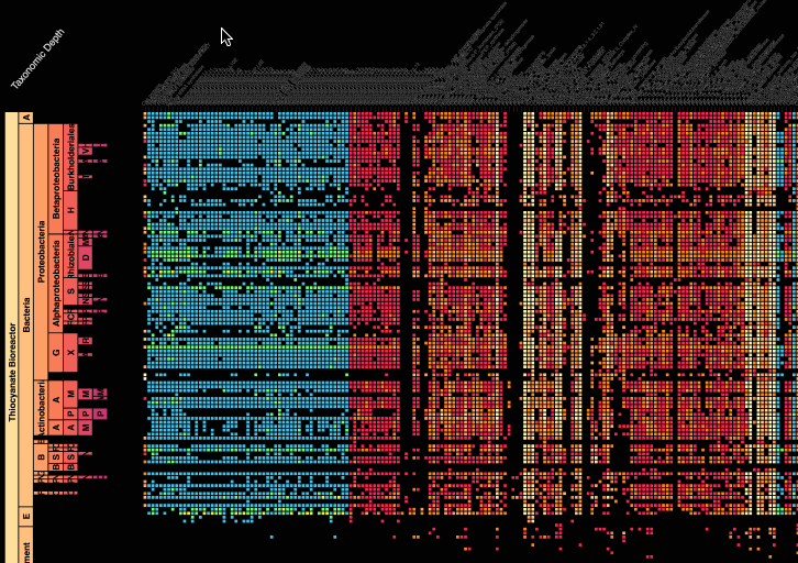
Zan Armstrong
▻http://blog.zanarmstrong.com
▻http://policyviz.com/episode-54-zan-armstrong
▻https://www.youtube.com/watch?v=IiF4-g001EQ
▻https://hi.stamen.com/stamen-exit-interview-zan-armstrong-d44d06e89d6d
▻http://stamen.github.io/metag/taxonomy/treemap-altered.html
The Shapes of Emotions
▻https://hi.stamen.com/the-shapes-of-emotions-72c3851143e2
Rachel Binx

Vingt-quatre heures de trafic aérien au-dessus de l’Europe en deux minutes
▻http://www.lemonde.fr/technologies/video/2014/03/14/vingt-quatre-heures-de-trafic-aerien-au-dessus-de-l-europe-en-deux-minutes_4
▻https://www.youtube.com/watch?feature=player_embedded&v=SrZSelcIxWM

Dessiner des #arbres et des #graphes avec #jQuery
jsPlumb qui lie des trucs avec des ancres et des connecteurs :
►http://jsplumb.org/jquery/demo.html
▻http://jsplumb.org/doc/usage.html
JIT, une super librairie de #data-visualisation (#dataviz ?), qui fait entre autre des arbres :
▻http://thejit.org
et plus particulièrement la démo de l’arbre :
▻http://philogb.github.com/jit/static/v20/Jit/Examples/Spacetree/example1.html
et son code :
▻http://philogb.github.com/jit/static/v20/Jit/Examples/Spacetree/example1.code.html

+1 pour JIT, c’est ce que j’ai utilisé pour l’arbre des #taxinomes ici :
►http://www.lestaxinomes.org/spip.php?page=arbre
J’avais fait une tite collecte de lien à ce sujet sur mon bloc note par là :

Haha @seenthis, encore ce foutu favicon pourrite attribué par erreur à mon bloc note :p

Des infotographies à propos de la nourriture : gras dans le fromage, calories… présentés grâce à des infographies faites avec les aliments puis photographiées.
►http://fatorfiction.info
#data-visualisation

Density Design | Workshop in Beirut | The Guardian Panorama on Lebanon
►http://www.densitydesign.org/2012/07/workshop-in-beirut-the-guardian-panorama-on-lebanon
The aim of the workshop was to learn how to unveil and describe unexpected stories extracting meaning from big digital datasets by creating different visualizations.
During the workshop the 20 participants explored all the articles related to Lebanon published by the Guardian, to understand how Lebanon is perceived abroad: who are the main actors, relations and most relevant topics.
#data-journalisme #data-visualisation #infographie #cartographie #carte&territoire #Liban #Beyrouth #Density_Design

Gephi, graph exploration and manipulation software
►http://gephi.org