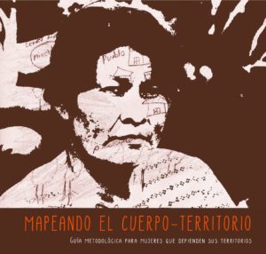
Cartographie sensible ou subjective
Pour Quentin Lefèvre, la cartographie sensible (ou #cartographie_subjective) peut se définir comme un média de restitution de l’#expérience du territoire ou encore comme la "#spatialisation_sensible de données sensibles".
▻http://quentinlefevre.com/cartographie-sensible
Cartographie sensible, émotions et #imaginaire
#Elise_Olmedo cerne les contours théoriques et méthodologiques de la cartographie sensible, en décrit les étapes de création et s’interroge sur ses impacts, son utilité et ses limites, à partir d’une expérimentation faite sur le terrain au Maroc, à Marrakech, au printemps 2010.
►http://visionscarto.net/cartographie-sensible
Cartographier les #interstices de la #ville
En faisant remonter à la surface les éléments du #paysage, l’artiste scénographe #Mathias_Poisson délivre des informations sur l’#ambiance des lieux, qui sensorialisent la carte. Élise Olmedo rend compte de cette #expérience_urbaine subjective dans ce beau billet.
►http://www.strabic.fr/Mathias-Poisson-Cartographier-les-interstices-de-la-ville
Cartes et cartographie des ressentis et représentations d’individus
La cartographie d’objets tels que des #ressentis (une gêne) ou des représentations de l’#espace_vécu (un risque) relatés par des individus mobilise des bagages conceptuels et techniques nombreux, nécessitant une mise au point sémantique et méthodologique. Aurélie Arnaud discute l’état de la recherche dans ce domaine dans la revue M@ppemonde.
▻https://journals-openedition-org/mappemonde/4666
Et si les cartes permettaient aussi d’explorer l’#invisible ?
C’est ce que propose l’atelier pédagogique de la BNF "Les cartes de l’invisible".
▻http://c.bnf.fr/JtG
L’#Otletosphère
Cette cartographie relationnelle des personnalités et institutions liées à #Paul_Otlet cherche à mettre en visibilité la forte implication de l’auteur au sein des organisations pacifistes internationales ainsi qu’au sein des institutions bibliographiques et documentaires.
▻http://hyperotlet.huma-num.fr/otletosphere/117
Pour une pratique féministe de la #visualisation de données
#Donna_Haraway, dans son essai fondateur sur les #savoirs_situés, offre une critique brillante non seulement de la représentation visuelle mais de la préférence extrême et perverse donnée aux yeux sur le corps dans la pensée occidentale.
►http://visionscarto.net/visualisation-donnees-feministe
#feminisme
Nouvelles cartographies – Lettres du #Tout-Monde
Ce projet de création expérimental et ouvert à tou.te.s a été lancé par des artistes et journalistes associés au #Labo_148. Quelle sera la cartographie du monde après la crise sanitaire ? Que redéfinit-elle ? Quelles urgences « à rêver un autre rêve, à inventer d’autres espoirs » s’imposent ? Le “Tout-Monde” selon #Edouard_Glissant, est cette inextricabilité de nos devenirs, et en cela, il invite à une poétique active de la #mondialité, de rencontres des imaginaires. Voir notamment l’expérience de Paul Wamo Taneisi : “Je porterai moi-même ma carte géographique”
▻http://www.labo148.com/category/nouvelles-cartographies
#Cartographies_traverses
« Cartographies traverses » est un dispositif de recherche-création qui regroupe des productions visuelles et sonores traitant des expériences migratoires contemporaines.
►http://visionscarto.net/cartographies-traverses
Re-dessiner l’expérience, art, sciences, conditions migratoires
#Sarah_Mekdjian et #Marie_Moreau utilisent la cartographie avec des migrants "pour un autre partage du sensible". Le projet débouche sur l’élaboration d’une très belle carte sensible (à voir).
▻http://www.antiatlas-journal.net
Cartes de migrants
L’artiste camerounais #Jean_David_Nkot réalise des portraits avec des cartes afin de "représenter les nombreux lieux qui se bousculent dans la tête des migrants" : ►https://wepresent.wetransfer.com/story/jean-david-nkot
Cartes d’ici et d’ailleurs
Favoriser l’inclusion sociale des personnes migrantes en France à travers des ateliers de #cartographie_participative et sensible (CartONG) : tel est l’objectif global du projet “Cartes d’ici et d’ailleurs”, soutenu par la Fondation de France et mis en oeuvre par #CartONG.
▻http://veillecarto2-0.fr/2018/12/21/carte-sensible-un-outil-dinclusion-sociale
#Guerilla_Cartography
L’objectif de Guerrilla Cartography est d’utiliser l’#art pour promouvoir une #cartographie_collaborative et engagée. Le site rassemble plusieurs atlas originaux et artistiques sur l’#eau, la #nourriture, les migrants.
▻http://www.guerrillacartography.org
Plateforme Art & Géo de Cartes Sensibles
Proposé par le polau-pôle des arts urbains et #Crévilles, ce site regroupe des cartes artistiques et géographiques qui rendent compte d’un territoire existant en assumant un regard sensible et/ou subjective. Il est conçu comme un outil de ressource et de partage pour chercheurs, artistes et curieux.
►http://polau.org/pacs
L’art est dans la cARTe
#Ghislaine_Escande est artiste peintre et plasticienne. Avec ses cARTes, elle redessine le Monde et nous fait voyager.
▻http://neocarto.hypotheses.org/10407
Carte sensible du festival de #Glastonbury
Le plan du célèbre festival de musique et d’arts de Glastonbury au Royaume-Uni selon The Word Magazine.
La carte subjective du musicien #Nick_Cave
Il s’agit d’une affiche de 2006 pour le concert de Nick Cave à Manchester en Angleterre. Elle contient plus de 50 énigmes basées sur les paroles de ses chansons. Voir cette vidéo qui revient sur le sens de cette carte subjective.
▻http://www.davidrumsey.com/luna/servlet/s/3ypdis
Médier les récits de vie. Expérimentations de #cartographies_narratives et sensibles
Article de Sarah Mekdjian et Élise Olmedo paru en 2016 sur le site de M@ppemonde.
►http://mappemonde.mgm.fr/118as2
#cartographie_narrative
Cartographier une année de sa vie
#Nicholas_Felton est un artiste designer qui traduit les données de la vie quotidienne en objets et en expériences significatives. Il est l’auteur de plusieurs rapports annuels qui résument les événements de l’année en cartes et graphiques rendant compte de son expérience subjective.
▻http://feltron.com/FAR08.html
Cartographie du #confinement en période d’épidémie
L’artiste britannique #Gareth_Fuller (►https://fullermaps.com/artworks/quarantine-maps) raconte en 14 cartes l’expérience de survie que représente la #quarantaine. Un grand nombre de cartes décrivant différents vécus en mode confiné sur Citylab (www.citylab.com/life/2020/04/neighborhood-maps-coronavirus-lockdown-stay-at-home-art/610018/). Le confinement en croquis, vu de France : géographie politique, sociale et culturelle du monde post-Covid19 par #Jérôme_Monnet (Cybergéo : ▻https://journals.openedition.org/cybergeo/34804). Une manière de décaler le regard sur le monde peut être d’utiliser (et d’admirer au passage) les très belles oeuvres de #street-art (▻https://www.francetvinfo.fr/culture/arts-expos/street-art/coronavirus-tour-du-monde-des-plus-belles-oeuvres-de-street-art-face-a-) produites dans le contexte de la pandémie. #Virginie_Estève a proposé un projet cartographique à ses élèves de 4e : cartographier leur espace vécu de confinement et aborder le paysage sensible depuis leur fenêtre. La preuve que l’on peut continuer à faire de la géographie et travailler à distance, moyennant quelques aménagements ( voir ce Genialy : ▻https://view.genial.ly/5e80c8155ad5150d93dab237/guide-geographie-du-confinement). Julien Dupont (Kobri), professeur d’histoire-géographie en collège à Vaulx-en-Velin et auteur de fictions radiophoniques et cartographiques, a mis en ligne sur son site Kartokobri (►https://kartokobri.wordpress.com) ses cartes quotidiennes du confinement. #SCOPIC (▻http://www.revuesurmesure.fr/issues/battre-aux-rythmes-de-la-ville/explorations-sensibles-de-notre-1km) s’est interrogée sur l’expérience du kilomètre autour de nos habitats. Pour d’autres liens, consulter le billet "Faire de la géographie en période de confinement" (▻https://cartonumerique.blogspot.com/2020/03/geographie-et-confinement.html).
Maps of Home
"Maps of Home" est une vision nostalgique faite des souvenirs de #Janesville dans le #Wisconsin, où l’auteur a grandi et où il a dû revenir à cause de la pandémie.
▻http://moriartynaps.org/maps-of-home
Suivre ses proches en temps de guerre
Carte dessinée à la main par ma grand-mère pour suivre les mouvements de mes grands-pères pendant la Seconde Guerre mondiale (1943-1945).
▻http://www.reddit.com/comments/be814f
#Nomadways
Le groupe Nomadways a invité 24 artistes, éducateurs et travailleurs sociaux à découvrir et explorer l’espace à partir de leurs #émotions et à créer leurs propres cartes subjectives dans un but de construction et d’inclusion communautaires.
▻http://nomadways.eu/subjective-mapping-2017-france
Cartographie autochtone, activités extractives et représentations alternatives
Le réseau #MappingBack a pour objectif de fournir du soutien cartographique aux membres des communautés autochtones luttant contre les industries extractives sur leur territoire. MappingBack cherche à utiliser la cartographie comme un outil de #résistance.
▻http://mappingback.org/home_fr
#peuples_autochtones #extractivisme
#Native_land, cartographier les voix autochtones
Le site Native Land, mis sur pied en 2015 par #Victor_Temprano, propose un outil cartographique participatif permettant une conceptualisation décoloniale des Amériques, du #Groenland, de l’#Australie et de la #Nouvelle-Zélande. Lire la présentation du site.
►http://native-land.ca
#décolonial
Cartographie et #langues_autochtones
#Marlena_Myles utilise son art pour célébrer sa culture et sa langue autochtones ainsi que pour aider le public (notamment les enfants) à comprendre l’importance des traditions et de l’histoire orales autochtones. Ses cartes racontent le passé, le présent et l’avenir du peuple et de la langue du #Dakota.
▻http://marlenamyl.es/project/dakota-land-map
#histoire_orale
Counter Mapping
#Jim_Enote, agriculteur #zuni traditionnel dans le Colorado (Etats-Unis), collabore avec des artistes pour créer des cartes qui ramènent une voix et une perspective autochtones à la terre. Ces cartes zunis s’inspirent profondément d’expériences partagées de lieux dans une volonté de #réappropriation du territoire par les #Amerindiens.
▻http://emergencemagazine.org/story/counter-mapping
Cartographie personnelle et subjective de #Mary_Jones
Au cours de ses dérives dans la ville de #Des_Moines, Mary Jones observe les lieux et les habitant⋅e⋅s, fait des photos, remplit des carnets d’#esquisses, prend des notes, enregistre parfois aussi des sons. Une masse de matériaux bruts qu’elle assemble ensuite en images hybrides (#collages, #superpositions, #sampling_visuels) qui composent une sorte de cartographie personnelle, subjective, voire intime de la cité et de ses marges.
►http://aris.papatheodorou.net/une-flaneuse-a-la-derive
Cartographier les espaces vécus et les émotions (#Drusec)
La ville telles qu’elle est vécue par les usagè.re.s de drogue marginalisés de #Bordeaux.
▻http://drusec.hypotheses.org/1722
#Queering_the_Map
Queering the Map est un projet de cartographie généré par la communauté #queer afin de géolocaliser des moments, des souvenirs et des histoires par rapport à leur espace physique. En cartographiant ces moments éphémères, Queering the Map vise à créer une archive vivante d’expériences queer.
▻http://queeringthemap.com
Cartographie subjective des Etats-Unis par #Paul_Steinberg
Cette série de vues subjectives des Etats-Unis et du monde a été réalisée par Saul Steinberg pour des couvertures anciennes de magazines (The New Yorker ou autres)
▻http://saulsteinbergfoundation.org/essay/view-of-the-world-from-9th-avenue
La cartographie au service des théories platistes
La théorie de la Terre Plate perdure jusqu’à aujourd’hui. La réalisation de cartes à l’image de la #terre_plate devient un objet de promotion de ces théories.
▻http://veillecarto2-0.fr/2020/09/22/la-cartographie-au-service-des-theories-platistes
Le monde vu de...
Une série de vues du monde à partir de #New_York, #San_Francisco et différentes villes des Etats-Unis (lire notre article sur le monde vu de la Silicon Valley).
▻https://imgur.com/a/XTnSn#0
Le monde vu par les Anciens
Cet atlas de #Karl_Müller de 1874 reproduit "les systèmes géographiques des Anciens" et d’une certaine manière la façon dont ces systèmes de représentation de l’#Antiquité étaient eux-mêmes vus au XIXe siècle.
▻http://geodata.mit.edu/catalog/princeton-r207tq824
L’Europe vue de la Russie
L’Europe vue de Moscou et l’Asie vue d’#Irkoutsk pendant la Guerre froide (1952).
▻https://www.reddit.com/r/MapPorn/comments/epdn4c/europe_from_moscowasia_from_irkutsk_time_magazine
Cartographie et subjectivité chez #Alexander_von_Humboldt
En scrutant minutieusement les différentes cartes réalisées par Alexander #von_Humboldt, on remarque certaines particularités, des mentions qui, à priori, n’auraient pas lieu de s’y trouver tant elles témoignent de la subjectivité de l’auteur.
►http://visionscarto.net/Humboldt-carto-subjective
Le monde sens dessus dessous
Un planisphère renversé montrant la Terre vue depuis l’hémisphère sud (à télécharger en haute résolution). Consulter la page des #projections cartographiques (▻http://cartonumerique.blogspot.com/p/projections-cartographiques.html) pour accéder à d’autres vues renversantes de la Terre.
▻https://www.digitalcommonwealth.org/search/commonwealth:9s161j433
Cartographie ultrapériphérique, et si on changeait de point de vue
Une carte des territoires ultramarins vus depuis l’hémisphère sud.
▻http://www.une-saison-en-guyane.com/extras/carte/carto-ultraperipherie-si-on-changeait-de-point-de-vue%e2%80%89
Projections du futur
Les projections du futur seront probablement centrées sur les océans, comme ces deux cartes du monde en projection Mercator oblique qui représentent les continents tout autour d’un océan unique.
►http://rightbasicbuilding.com/2019/09/09/the-world-maps-of-the-future
Carte subjective de #Paris en 2050
Cette carte imagine Paris en 2050, lorsque les effets du #réchauffement_climatique se seront durement faits ressentir... si rien n’est fait. Voir notre article de présentation : ▻https://cartonumerique.blogspot.com/2019/02/carto-subjective-geo-prospective.html
▻http://www.deuxdegres.net/projects/paris-2050
#changement_climatique
Utiliser des #SIG pour cartographier les #pratiques_spatiales
Des recherches récentes montrent l’intérêt d’utiliser les données fournies par les #réseaux_sociaux pour les cartographier et mettre en évidence des comportements des individus dans l’espace.
▻http://www.gislounge.com/using-gis-to-analyze-peoples-attitudes
Cartographie collaborative
L’objectif de ce site est de développer un ensemble d’usages pour aider à la dissémination des pratiques collaboratives en matière de cartographie, que ce soit pour le citoyen ou au sein de structures (associations, collectivités, milieu scolaire).
▻http://cartographie-collaborative.eu
#Mapquote
Le projet collaboratif Mapquote prend la forme d’une #carte_interactive où chaque utilisateur peut déposer une #citation de #romans où il est question de cartes.
▻http://neocarto.hypotheses.org/6502
L’usage de Google Maps dans « #Netherland »
Netherland est une belle réflexion désabusée sur les lieux et le déplacement, l’#espace et la #séparation, le fait de pouvoir être physiquement dans un lieu et mentalement dans un autre. Google Maps n’intervient que dans deux courts passages au début et à la fin du livre (source : Spacefiction)
▻http://spacefiction.fr/2009/11/01/google-maps-enters-litteraturegoogle-maps-entre-dans-la-litterature
#Hoodmaps
Hoodmaps permet de créer des cartes participatives pour éviter les #pièges_à_touristes et fréquenter les quartiers branchés de la ville. La typologie est assez basique, voire un peu réductrice : entre les “hipsters”, les touristes, les étudiants, les “riches”, les “costards” et les “normaux”, mais permet de rapidement identifier les différents quartiers d’une ville.
▻http://hoodmaps.com
Apprendre sur le territoire en représentant son territoire
Carte sensible élaborée par une classe de 1re ES qui montre la vision de leur lycée. A compléter par l’interview de Sophie Gaujal pour le Café pédagogique : L’approche sensible en cours de géographie, un ingrédient du bonheur ?
►http://hal.archives-ouvertes.fr
Cartographie ton quartier
Les cartes postales géocartographiques permettent d’articuler géographie spontanée et géographie raisonnée. Organisé par Sophie Gaujal, en partenariat avec le Café pédagogique, la Cité de l’architecture et l’IGN, le concours Cartographie ton quartier récompense les cartes postales cartographiques réalisées par des classes.
▻http://blog.ac-versailles.fr/geophotographie
Atelier de cartographie sensible (Ehess)
La plateforme SIG de l’Ecole des Hautes Etudes en Sciences Sociales, met à disposition des ressources sur la cartographie sensible dans le cadre des ateliers Géomatique et humanités numériques qu’elle organise, notamment sur Gennevilliers.
▻http://psig.huma-num.fr/cartes-sensibles
#Cartes_mentales dans le nord de #Marseille
Ce billet de #Jérémy_Garniaux relate un atelier « cartes mentales » mené à Marseille, dans les 14, 15 et 16e arrondissements, par une plate-forme culturelle hors-les-murs constituée de cinq structures culturelles du Nord de Marseille.
▻http://www.mapper.fr/cartes-mentales-dans-le-nord-de-marseille
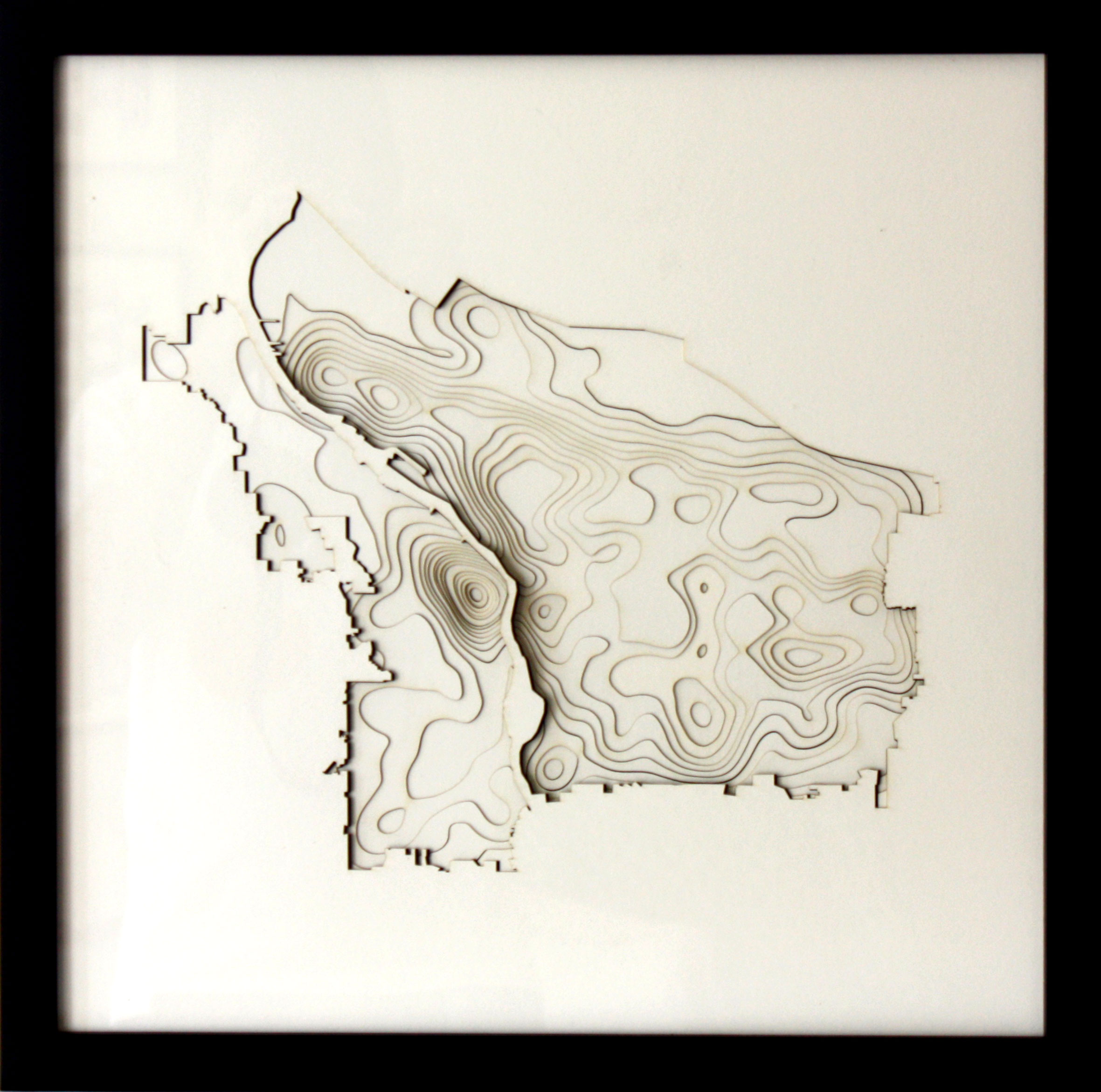
Chicago HomeStories Project
Le projet est né à #Chicago et commence à se diffuser dans le monde. Il s’agit d’encourager les citoyens par des #marches_civiques à en savoir plus sur leur quartier.
▻http://www.nationalgeographic.org/projects/out-of-eden-walk/blogs/lab-talk/2021-04-chicago-homestories-goes-global
Concours #cartographie_imaginaire
Cartographier la ville de demain, son quartier dans le futur, son école ou son collège idéal...
▻http://www.concourscarto.com/accueil-cci
Concours de dessin de cartes du monde pour enfants
Le concours #Barbara_Petchenik est un concours biennal de dessin de carte destiné aux enfants. Il a été créé par l’Association cartographique internationale en 1993 dans le but de promouvoir la représentation créative du monde sous forme graphique par les enfants.
▻http://icaci.org/petchenik
Lignes d’erre - Les cartes de #Fernand_Deligny
Pendant des années, Deligny a dessiné et fait dessiner des cartes de ce qu’il appelle leurs #lignes_d’erre, soit les trajets « libres » des #enfants sur leur aire de séjour. Il a perçu, par l’observation, que les autistes avaient une autre façon d’être au monde, une autre manière d’incarner l’humain.
▻http://culture.univ-lille1.fr/fileadmin/lna/lna60/lna60p34.pdf
La carte sensible de #Boulogne-Billancourt
Un projet pédagogique conduit par une équipe d’enseignants du lycée J. Prévert de Boulogne-Billancourt avec des classes de Seconde.
▻http://www.cafepedagogique.net
La "carte du Tendre" de #Nantes
#Gwenaëlle_Imhoff et #Emilie_Arbey, professeures de français et d’histoire géographie au collège Gutenberg de Saint-Herblain ont amené leurs 4èmes à réaliser de nouvelles « Cartes du Tendre » à la manière de Madame de Scudéry pour inventer « une géographie nantaise de l’Amour ». Enjeu de ce travail créatif et collaboratif, visuel et oral : aider les élèves à s’approprier « l’espace urbain proche et pourtant trop souvent lointain ».
▻http://www.cafepedagogique.net/lexpresso/Pages/2020/08/31082020Article637344555283464848.aspx
▻http://www.pedagogie.ac-nantes.fr/lettres/continuite-pedgogique-et-numerique-en-lettres-carte-du-tendre-pr
Cartographier l’#insécurité au collège
Professeure d’histoire-géographie au collège Molière de Beaufort en Anjou, #Anaïs_Le_Thiec lance sa classe de 5ème dans une cartographie sensible du collège. Elle les invite à libérer leur parole via une #storymap.
▻http://www.cafepedagogique.net/lexpresso/Pages/2019/10/18102019Article637069844590338061.aspx
Dans ma ville on traîne
Visite guidée et habitée par le rappeur #Orelsan, qui propose une description de la ville de #Caen. L’intérêt principal est de rappeler qu’un espace géographique, avant d’être un objet d’étude, reste surtout un lieu de vie que l’on habite. Le rappeur énumère ses souvenirs d’enfant, d’adolescent, d’étudiant. Ce faisant, il raconte SA ville. Il associe chaque action passée au lieu où elle s’est déroulée.
►http://lhistgeobox.blogspot.com/2020/10/dans-ma-ville-on-traine-visite-guidee.html
Des lieux où l’on exprime ses sentiments
Carte interactive des lieux où les étudiants ont déclaré avoir pleuré sur le campus de l’université de Waterloo aux Etats-Unis (avec les commentaires). Cela correspondrait-il aux bâtiments de sciences et de mathématiques ?
▻http://www.reddit.com/r/dataisbeautiful/comments/l3t3xx/oc_an_interactive_map_of_where_students_have
Psycho-géographie de la ville de #Gibellina
Quand les artistes essaient de tromper les algorithmes de télédétection. C’est ce qu’a fait l’artiste #Burri avec une oeuvre d’art gigantesque couvrant les ruines de la vieille ville de Gibellina en Italie (à voir dans Google Maps)
▻http://www.archdaily.com/958178/the-psycho-geography-of-the-cretto-di-burri
Lyon-La Duchère 2030 : imaginer des scénarios prospectifs
Ces #scénarios prospectifs sont proposés par des élèves de 2nde du Lycée La Martinière-Duchère concernant le projet d’aménagement urbain #Lyon-La Duchère 2030.
▻http://canabae.enseigne.ac-lyon.fr/spip/spip.php?article1103
#Cartographie_sonore du quartier de l’Union (#Lille - #Roubaix - #Tourcoing)
Réalisé dans le cadre du projet de recherche Géographie et prospective piloté par l’IFE, cette expérimentation pédagogique a permis de découvrir par l’expérience spatiale un projet d’#aménagement_urbain d’envergure (son évolution, ses acteurs et ses enjeux) dans l’environnement proche des élèves, en privilégiant une géographie fondée sur l’expérience du terrain.
▻http://ife.ens-lyon.fr/geo-et-prospective/projet/cartographie-sonore-du-quartier-de-lunion
#Cartophonies
Comment sonne le monde ? Le site « Cartophonies » a pour objectif d’explorer l’#expérience_sonore contemporaine et d’aider a les prendre en compte dans l’avenir et dans les projets de transformation. Il contribue à construire une connaissance des milieux habités, du vécu des espaces et des ambiances contemporaines, celles du passé proche comme celles du futur.
►http://www.cartophonies.fr
#son
Cartes et mise en récit des mobilités
Dans le cadre d’une recherche doctorale, #Sylvie_Joublot-Ferré étudie les spatialités des adolescents en s’appuyant sur la cartographie de leurs déplacements quotidiens enregistrés sous forme de traces GPS et en analysant ces cartes comme des #récits_de_vie.
▻http://www.researchgate.net
▻http://www.radiobus.fm/episode/interview-de-sylvie-joublot-ferre-hepl
Comment les enfants ont perdu le droit de se déplacer
Carte montrant le territoire pratiqué pendant l’enfance sur quatre générations à #Sheffield.
►http://www.dailymail.co.uk/news/article-462091/How-children-lost-right-roam-generations.html
Comment les jeunes géographes ressentent-ils le monde contemporain ?
Un exercice de cartographie sensible proposé à des étudiants de master destinés à s’orienter vers le monde associatif donne un regard sur leurs représentations du monde. Environnement menacé, mobilités généralisées, et questionnements autour de la mondialisation émergent de ces cartes mentales, témoignant des inquiétudes d’une génération.
▻http://geoconfluences.ens-lyon.fr/informations-scientifiques/a-la-une/carte-a-la-une/cartographie-emotions-monde-contemporain
« Mais madame, je n’y suis jamais allé ! »
Un #voyage_virtuel à #La_Réunion à travers la confection de #cartes_postales sensibles par des élèves de lycée professionnel. La #géographie_expérientielle ce n’est pas seulement du vécu, ce sont aussi (et surtout) des représentations (article extrait des Cahiers pédagogique, n° 559 "L’aventure de la géographie".
▻http://www.cahiers-pedagogiques.com/Mais-madame-je-n-y-suis-jamais-alle
Tour de la France par deux enfants (G. Bruno)
Cet ouvrage constitue l’archétype du roman scolaire géographique. Réédité de nombreuses fois depuis sa sortie en 1877, l’ouvrage a connu un énorme succès (plus de 9 millions d’exemplaires), contribuant à façonner une image du territoire national.
▻http://gallica.bnf.fr/ark:/12148/bpt6k5684551x
Une géographie subjective à travers les romans d’aventure pour la jeunesse
Aurélie Gille Comte-Sponville, Modernité et archaïsme des lieux dans les romans d’enquête et d’aventure pour la jeunesse pendant les Trente Glorieuses en France, thèse soutenue en 2016. L’importance des lieux correspond à la quête d’une #utopie de l’enfance éternelle, qui figerait non seulement les héros dans la perfection de leur âge, mais aussi les lieux, dans une forme d’uchronie idéalisée.
▻http://www.theses.fr/2016ARTO0008
Le #Londres des romans de #John_Le_Carré
#Mike_Hall a été chargé de dessiner pour l’éditeur Penguin Books la carte des personnages, des lieux et des scènes de romans d’espionnage de John Le Carré.
▻http://thisismikehall.com/smileyslondon
La carte de la classe de khâgne
Cartographie subjective de la classe khâgne par Gus (@ecsolius) : quand un khagneux dresse la carte symbolique d’une année en prépa littéraire
▻http://twitter.com/ecsolius/status/1292071140047937536
La carte des mathématiques
La carte du "#Mathematistan" représente les rapports ambigus que l’on peut avoir les #mathématiques. Une région souvent inaccessible ?
▻http://www.reddit.com/r/math/comments/2av79v/map_of_mathematistan_source_in_comments
Cartographie de son appartement
Géographie de mon appartement vu par Thibaut Sardier.
▻http://twitter.com/tsardier/status/1326832393655816192
Cartographie imaginaire du nourrisson
@LittleBigData suit, en infographies et sur les réseaux sociaux, les tourments et les joies de #jeunes_parents (voir cette présentation). Le résultat est un cartographie imaginaire des premiers mois de la vie d’un enfant. Avec une magnifique carte de la première année extraite de l’ouvrage Le Bébégraphe publié par Claire Dealberto et Jules Grandin aux éditions Les Arènes en 2021.
▻http://twitter.com/LittleBigData_/status/1263721598076555265
Carte des #lieux_communs
De "l’usine à gaz" au "terrain d’entente", @LaMineComics passe en revue tous nos lieux communs inspirés de métaphores géographiques.
▻http://twitter.com/LaMineComics/status/1097068721846321152


