Interactive Infographic - 13 Reasons Why Your Brain Craves Infographics
▻http://neomam.com/interactive/13reasons

Why your Brain Craves Infographics

Agent d’ingérence étrangère : Alle die mit uns auf Kaperfahrt fahren, müssen Männer mit Bärten sein. Jan und Hein und Klaas und Pit, die haben Bärte, die haben Bärte. Jan und Hein und Klaas und Pit, die haben Bärte, die fahren mit.
Interactive Infographic - 13 Reasons Why Your Brain Craves Infographics
▻http://neomam.com/interactive/13reasons
Why your Brain Craves Infographics

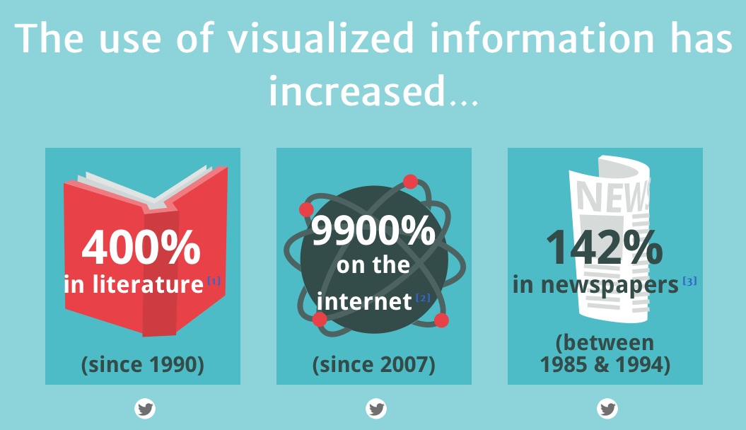
The use of visualized information has increased…
…or rather…
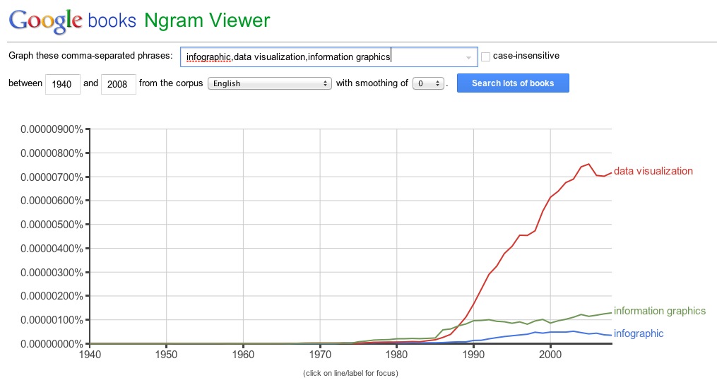
The use of the terms has increased…
Source 1: + 400% in literature
Source 2: + 9900% on the internet
Source 3: an old (but interesting) paper (2002), long before infographics on the internet…
Diagrammatic Representation and Reasoning, pp 187-206, Graphs in Print, Zacks J., Levy E., Tversky B., Schiano D.
Springer, 2002
▻http://link.springer.com/chapter/10.1007%2F978-1-4471-0109-3_11
Abstract
Diagrams for presenting quantitative data are an important component of print communication. Their rate of use is high and rising. This reflects in part the recent development of software tools for generating data graphics. These programs allow a wide range of choices for data visualisation — some of which may be ugly or ineffective. How has graph usage evolved during this period? A survey of graph usage in academic journals, magazines, and newspapers during the years 1985-1994 revealed several dynamic trends in the characteristics of data graphics, as well as robust differences between media. However, graph features that have been singled out by experts as poor choices, such as “3-D” rendering, do not seem to be on the rise.
Mais un GROS bon point : les sources sont citées. Bravo !