

Go with the flow: the hypnotic beauty of public transport – mapped | Cities | The Guardian
►https://www.theguardian.com/cities/2017/oct/04/hypnotic-beauty-public-transport-mapped
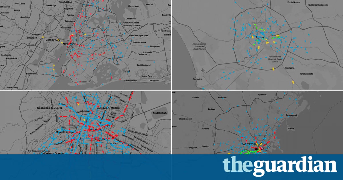
Public transit maps are a testament to the power of visual communication. They reduce the task of navigating hundreds or even thousands of miles of transport routes to simply glancing at an image. However, understanding a city’s transit frequency – how often the trains and buses run along those routes – is not nearly as easy, and typically requires scanning through pages of timetables.
How can cities make their transit frequencies as simple and intuitive to understand as their routes? Columbia University grad student Will Geary offers a solution: TransitFlow, an experimental set of tools for building animated transport frequency maps.