


#Grid for layout, #Flexbox for components
▻http://ishadeed.com/article/grid-layout-flexbox-components
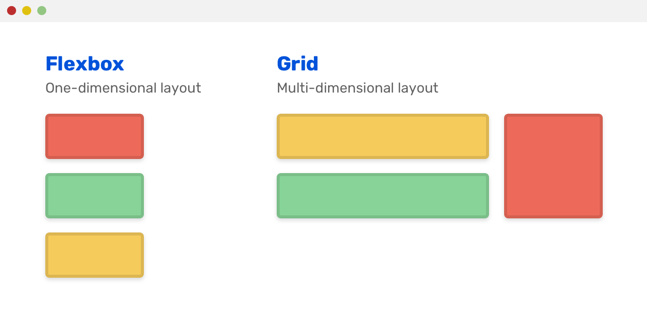
Before diving into concepts and examples, I want to make sure that you understand the main difference between #CSS grid and flexbox. CSS Grid is a multi-dimension layout module, which means that it has columns and rows. Flexbox can lay out its child items either as columns or rows, but not both
Let me be clear about that, there is no direct way to decide between CSS grid and flexbox. Adding on that, there is no correct or incorrect way to use them. This article is a kind of guide that recommends using a technique for a specific use-case. I will explain the general concept, and then go into examples, and the rest is on you to explore and experiment more.
Deciding between CSS grid and flexbox can be a bit hard (sometimes), especially if you are new to CSS. I can hear you! Here are some initial kick-off questions that I ask myself when choosing between them:
– How the component child items are displayed? Inline or as columns and rows?
– How the component is expected to work on various screen sizes?
Article intéressant avec pas mal d’exemples d’usage.
