


The Guide To #Responsive_Design In 2023 and Beyond - Ahmad Shadeed
▻http://ishadeed.com/article/responsive-design
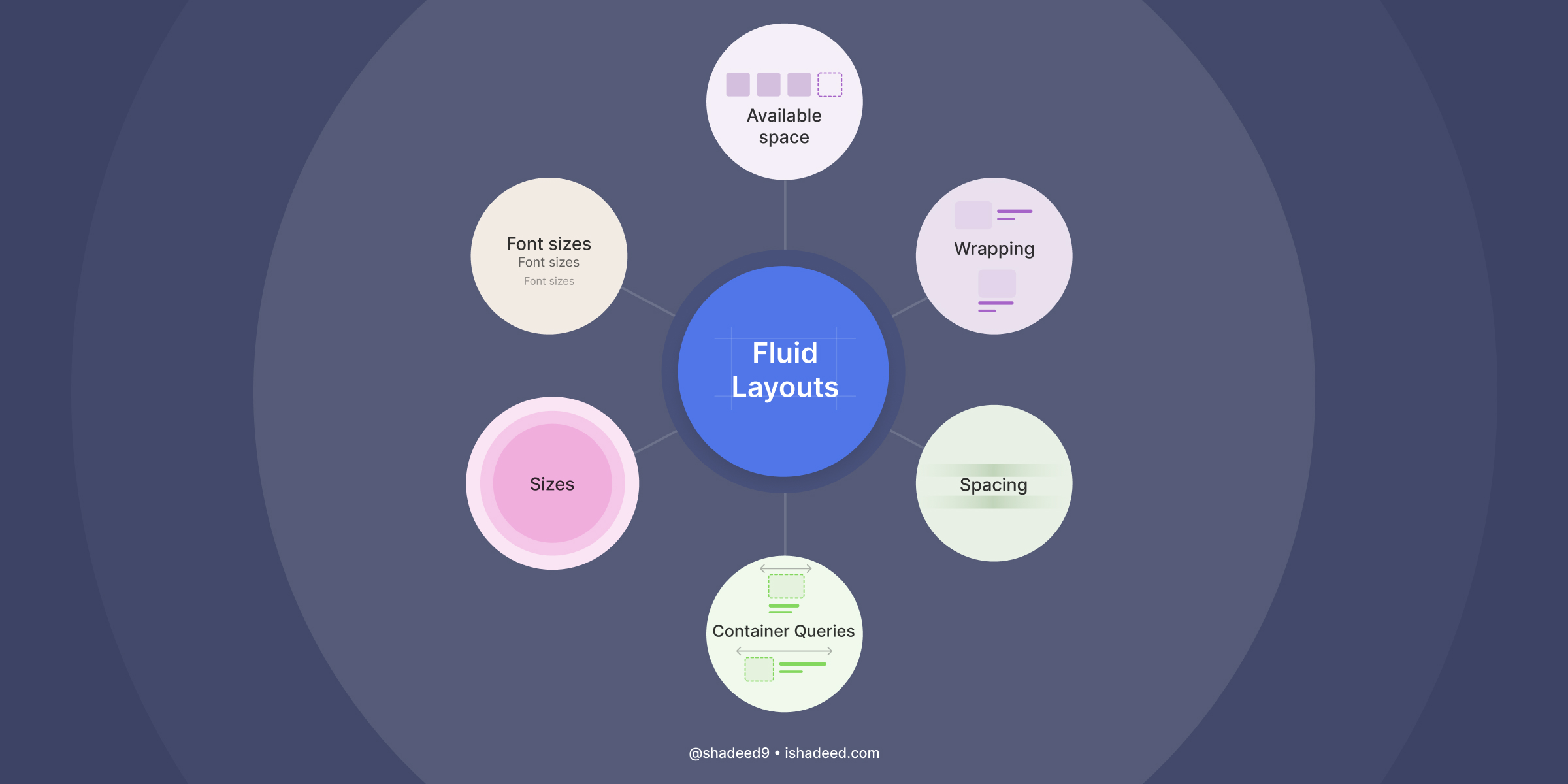
Responsive design isn’t about #media_queries anymore.
So, the web is responsive by default, unless we start getting creative in designing our layouts.
Using modern CSS
– The typography is responsive to the viewport width via clamp() function.
– The spacing is responsive to the viewport width via clamp() function.
– The hero section is responsive to its content via flexbox wrapping.
– The cards grid is responsive to the available space with minmax(), no media queries.
– The card component is responsive to its wrapper via size container queries and style container queries.
– The margins and paddings are responsive to the websites language via logical properties.
Using media queries
– The site navigation is responsive to the viewport width.
– The theming is responsive to the user preferences in their operating system.
– The card hover effect is responsive to what the user is using (touch vs mouse).