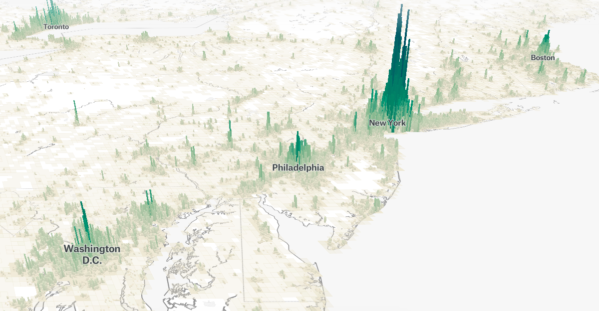
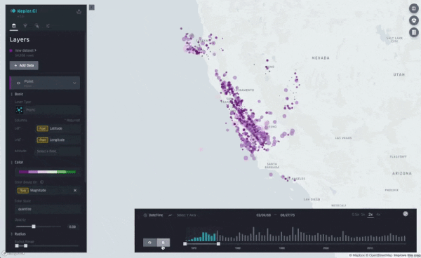
Visualizing the World’s Population, in 3D
This project wields data from the Global Human Settlement Layer, which uses “satellite imagery, census data, and volunteered geographic information” to create population density maps.
Visualizing the World’s Population, in 3D
This project wields data from the Global Human Settlement Layer, which uses “satellite imagery, census data, and volunteered geographic information” to create population density maps.


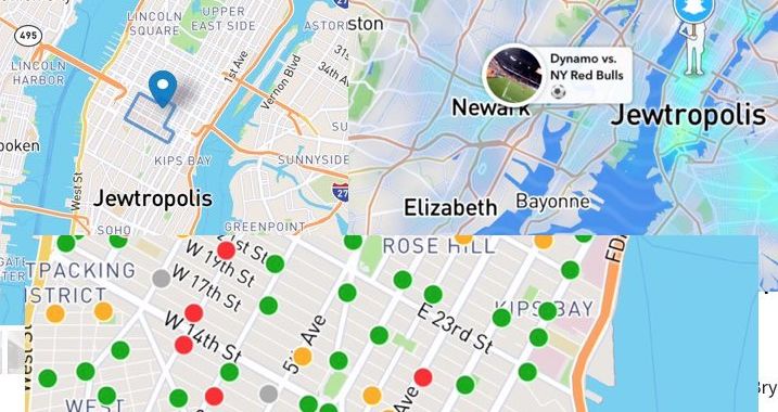
Data vandal changes name of New York City to “Jewtropolis” across multiple apps [Updated] | Ars Technica
▻https://arstechnica.com/information-technology/2018/08/data-vandal-changes-name-of-new-york-city-to-jewtropolis-across-multipl
Update, 12:20 pm: In a prepared statement sent to press, a Mapbox spokesperson said that Mapbox has “a zero tolerance policy against hate speech and any malicious edits to our maps.” The label change was deleted within an hour. "The malicious edit was made by a source that attempted several other hateful edits," the spokesperson said. “Our security team has confirmed no additional attempts were successful.”
Mapbox data comes from more than 130 sources, and the Mapbox spokesperson said that the company has "a strong double validation monitoring system." A machine learning system flagged the change for review; this change was one of more than 70,000 that are flagged on a daily basis, according to the company. “While our AI immediately flagged this,” the spokesperson said, “in the manual part of the review process a human error led to this incident. Security experts are working to determine the exact origin of this malicious hate speech. We apologize to customers and users who were exposed to this disgusting attack.”
#trolls #nazis #cartographie #mapbox via @archiloque

City Street Orientations around the World - Geoff Boeing
►http://geoffboeing.com/2018/07/city-street-orientations-world
By popular request, this is a quick follow-up to this post comparing the orientation of streets in 25 US cities using Python and OSMnx. Here are 25 more cities around the world:
qui fait suite aux villes américaines: Comparing City Street Orientations
▻http://geoffboeing.com/2018/07/comparing-city-street-orientations
Each of the cities above is represented by a polar histogram (aka rose diagram) depicting how its streets orient. Each bar’s direction represents the compass bearings of the streets (in that histogram bin) and its length represents the relative frequency of streets with those bearings.

Une version « interactive » avec #leaflet réalisée par Vlad :
►https://mourner.github.io/road-orientation-map
Et le billet qui explique la recette utilisée :
▻https://blog.mapbox.com/visualizing-street-orientations-on-an-interactive-map-1eefa6002afc
Génial. Du coup, l’Écusson de #Montpellier :
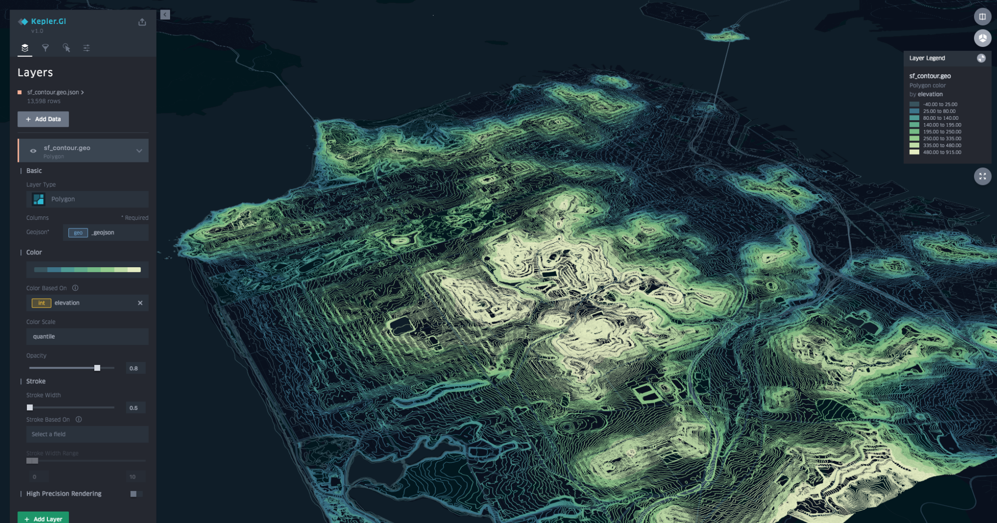
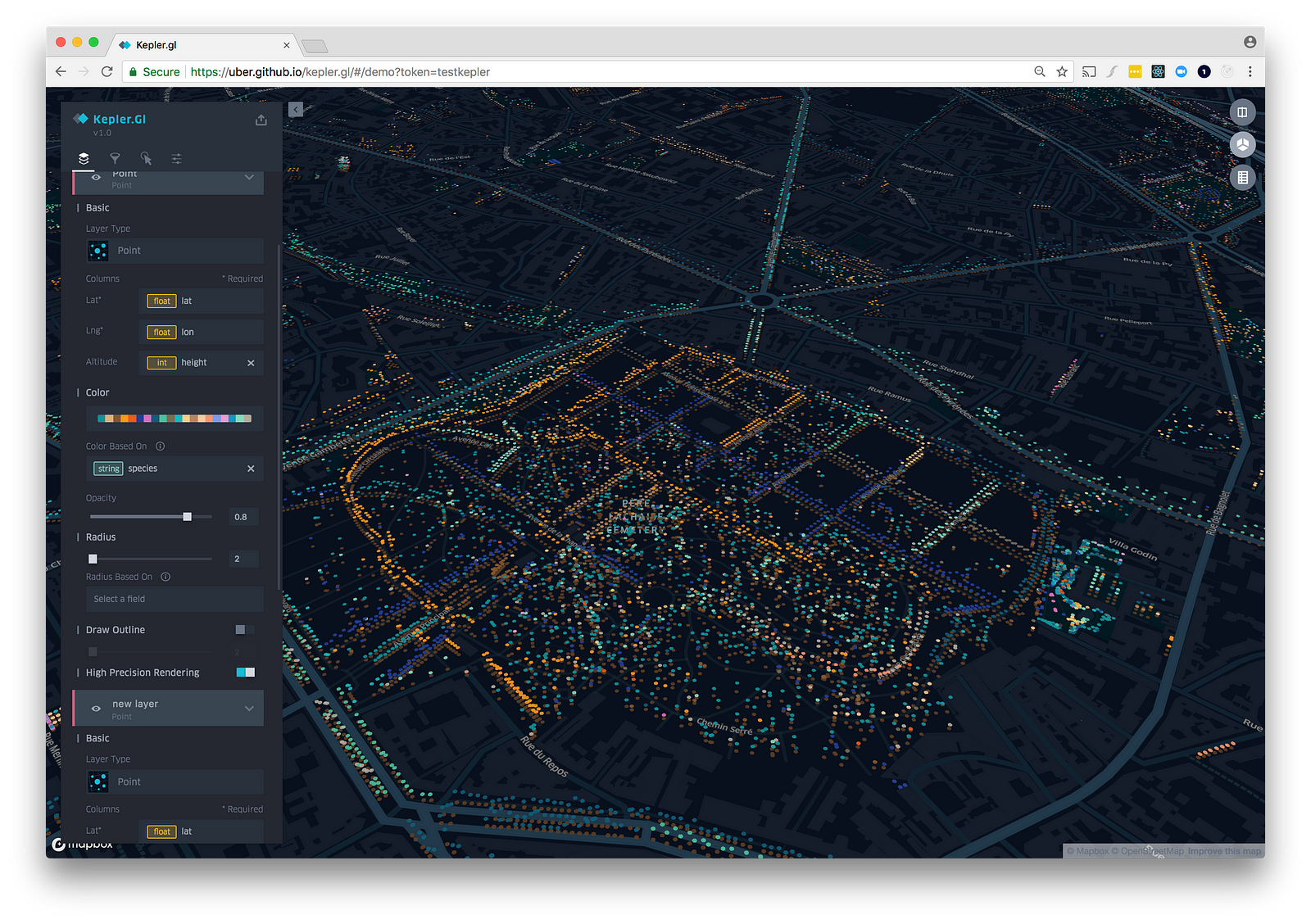
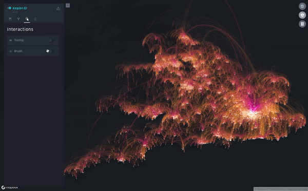
Introducing kepler.gl, Uber’s Open Source Geospatial Toolbox
▻https://eng.uber.com/keplergl


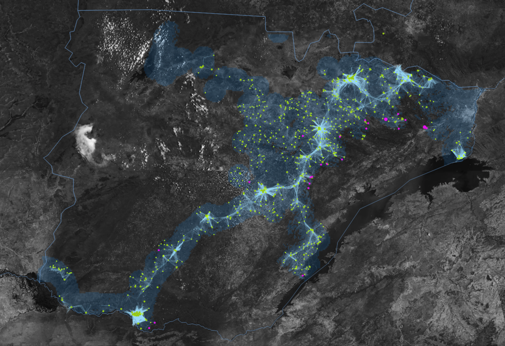
Les #arbres à Londres et New-York
▻https://seenthis.net/messages/549459
Helping PATH scale out data for #VisualizeNoMalaria
▻https://blog.mapbox.com/helping-path-scale-out-data-for-visualizenomalaria-e6b241524f3a
#cartographie #paludisme #making-of très détaillé
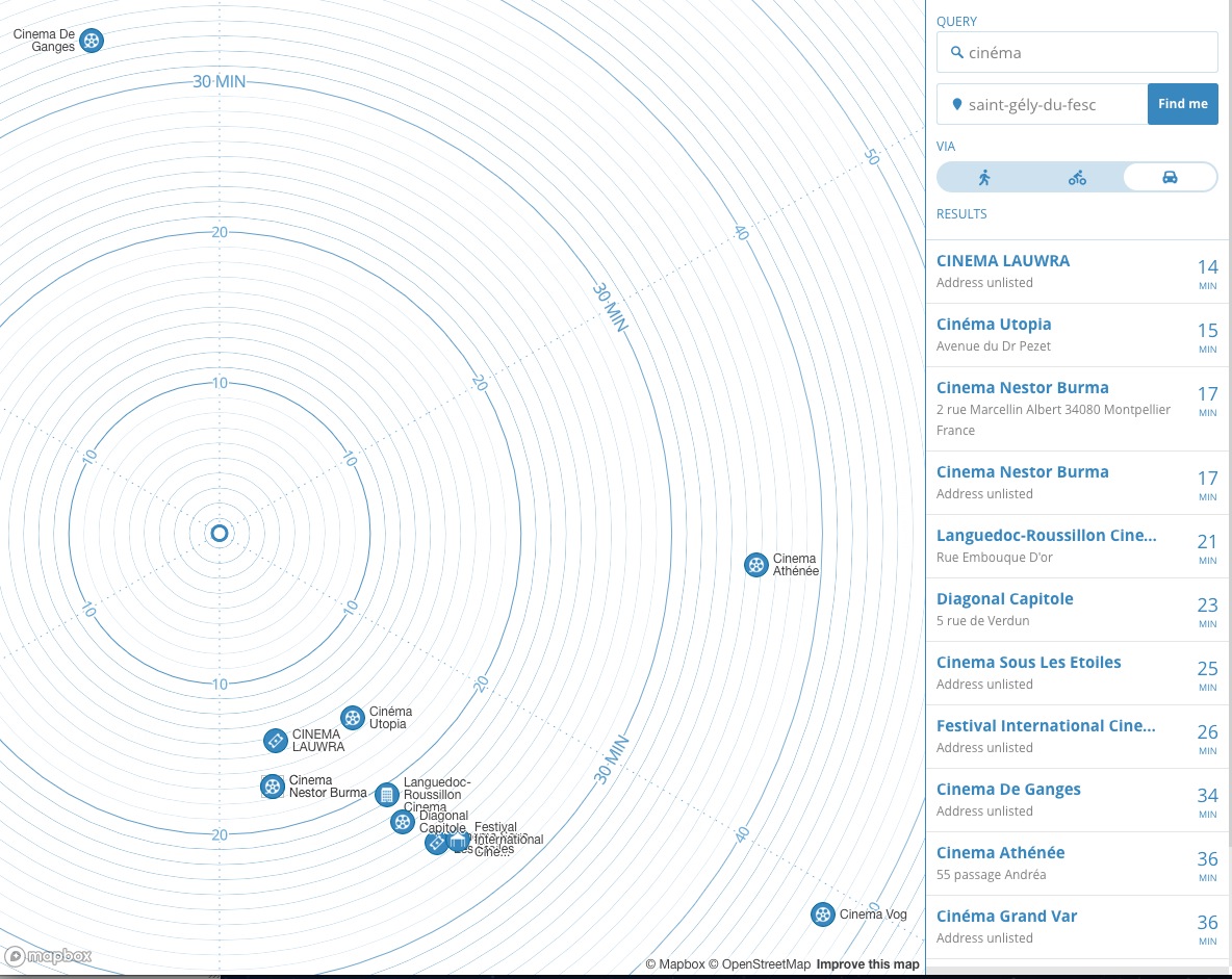
Add isochrones to your next application
▻https://blog.mapbox.com/add-isochrones-to-your-next-application-e9e84a62345f
Today we’re sharing a plugin to generate your own #isochrones, right in your browser. With a starting location and Mapbox access token, the plugin will calculate isochrones up to 60 minutes via driving, cycling, or walking.
▻https://github.com/mapbox/mapbox-isochrone
 https://cdn-images-1.medium.com/max/1200/0*98l51OmSqhfWtpDh.jpg
 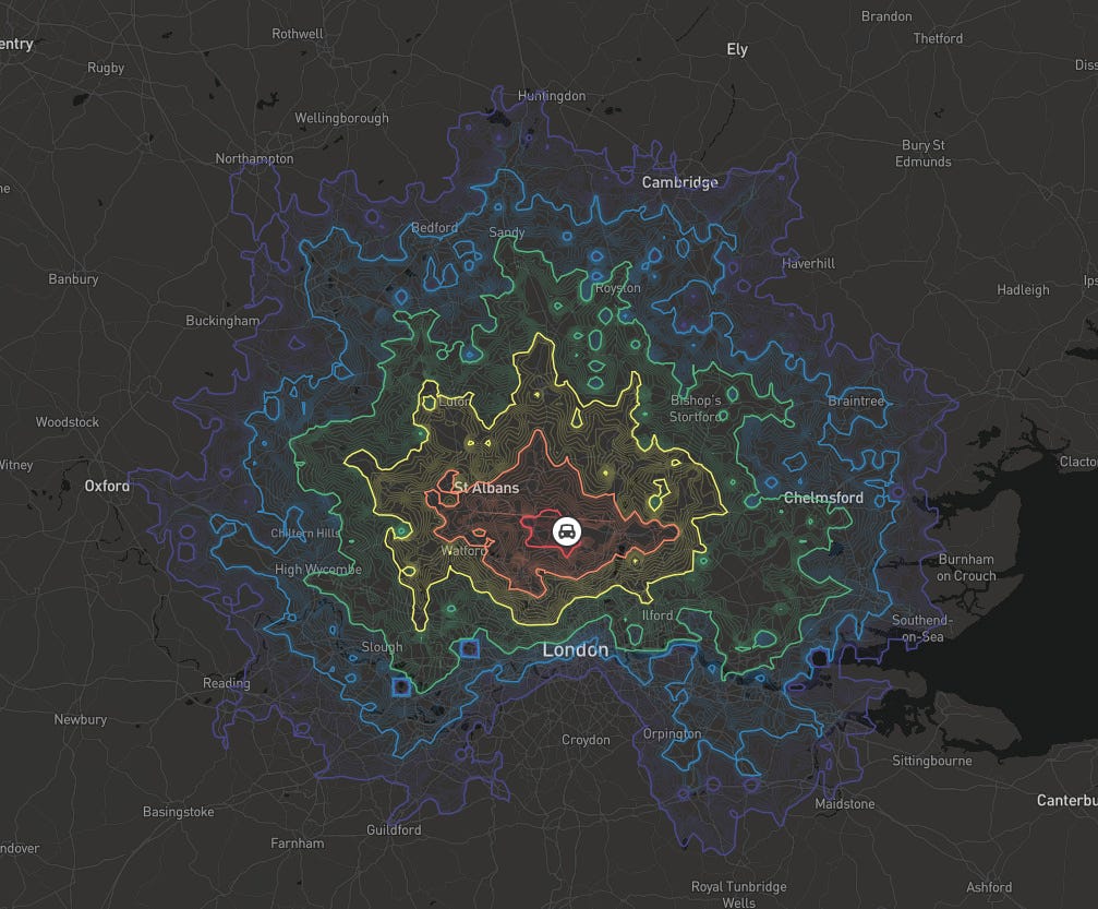 https://cdn-images-1.medium.com/max/1600/0*Got3xIAWKU1l-W8e.jpg
 #map

A new kind of map: it’s about time
▻https://blog.mapbox.com/a-new-kind-of-map-its-about-time-7bd9f7916f7f
“In this time map, we preserve the direction of each point, relative to the user. But the visual distance from that center point is determined by the time it takes to get there, whether driving, biking, or on foot.”
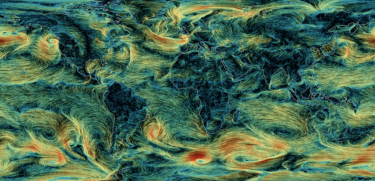
How I built a wind map with #WebGL – Points of interest
▻https://blog.mapbox.com/how-i-built-a-wind-map-with-webgl-b63022b5537f
There are many examples of wind power visualization online, but the most popular and influential one is earth.nullschool.net, a famous project by Cameron Beccario. It’s not open source itself, but it has an old open source version which most other implementations based their code on. One notable open source derivation is Esri Wind-JS. Popular weather services that use the technique include Windy and VentuSky.
Designing North Star – Points of Interest
▻https://blog.mapbox.com/designing-north-star-c8574e299c94
North Star was inspired by older, #nautical themed #maps, such as the US Coast & Geodetic Survey map #style, and this Times’ Atlas Antarctica map, which have a minimal color palette and are great for presenting data on.
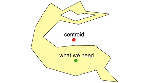
A new #algorithm for finding a visual center of a #polygon
▻https://www.mapbox.com/blog/polygon-center
▻https://github.com/mapbox/polylabel
 http://c1.staticflickr.com/9/8801/28714168970_e93fe37013.jpg
 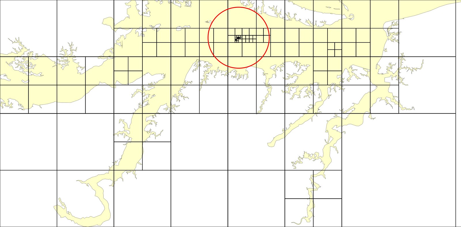 https://c1.staticflickr.com/9/8824/29000043555_6487a7ab36_h.jpg
 The best place to put a text label or a tooltip on a polygon is usually located somewhere in its “visual center,” a point inside a polygon with as much space as possible around it.
The first thing that comes to mind for calculating such a center is the polygon centroid. You can calculate polygon centroids with a simple and fast formula, but if the shape is concave or has a hole, the point can fall outside of the shape.
The result is Polylabel, a fast and precise #JavaScript module for finding good points to place a label on a polygon. It is up to 40 times faster than the algorithm we started with, while also guaranteeing the correct result in all cases.
It’s now being ported to C++ and incorporated into both Mapbox GL JS and Native. The module is just 100 lines of code, so check it out!
#map
J’ai commencé à jouer avec cet algo pour comparer avec le centroide etc.
▻http://bl.ocks.org/Fil/da021023d58b8ddefd165c65e37f796b

Et au passage :
Distance à la côte
self-made using the technique described in Garcia-Castellanos, D., & U. Lombardo, 2007. Poles of Inaccessibility: a calculation algorithm for the remotest places on Earth. Scott. Geogr. J., 123, 227-233. Based on the coastline database of Wessel, P. & Smith, W. H. F. (1996) A global self-consistent, hierarchical, high-resolution shoreline database, Journal of Geophysical Research, 101, B4, 8741 – 8743. Lake shores are excluded.
il y a un #seenthis_bug ci-dessus, le lien vers la page de wikicommons est pris comme un lien vers une image, or c’est une page.

Je viens de tomber dessus depuis un mail de leaflet.
L’article d’explication sur Medium est ici : ▻https://blog.mapbox.com/a-new-algorithm-for-finding-a-visual-center-of-a-polygon-7c77e6492fbc