
A map of how long it takes to get to a city from anywhere on Earth / Boing Boing
►https://boingboing.net/2018/01/10/a-map-of-how-long-it-takes-to.html
A map of how long it takes to get to a city from anywhere on Earth / Boing Boing
►https://boingboing.net/2018/01/10/a-map-of-how-long-it-takes-to.html

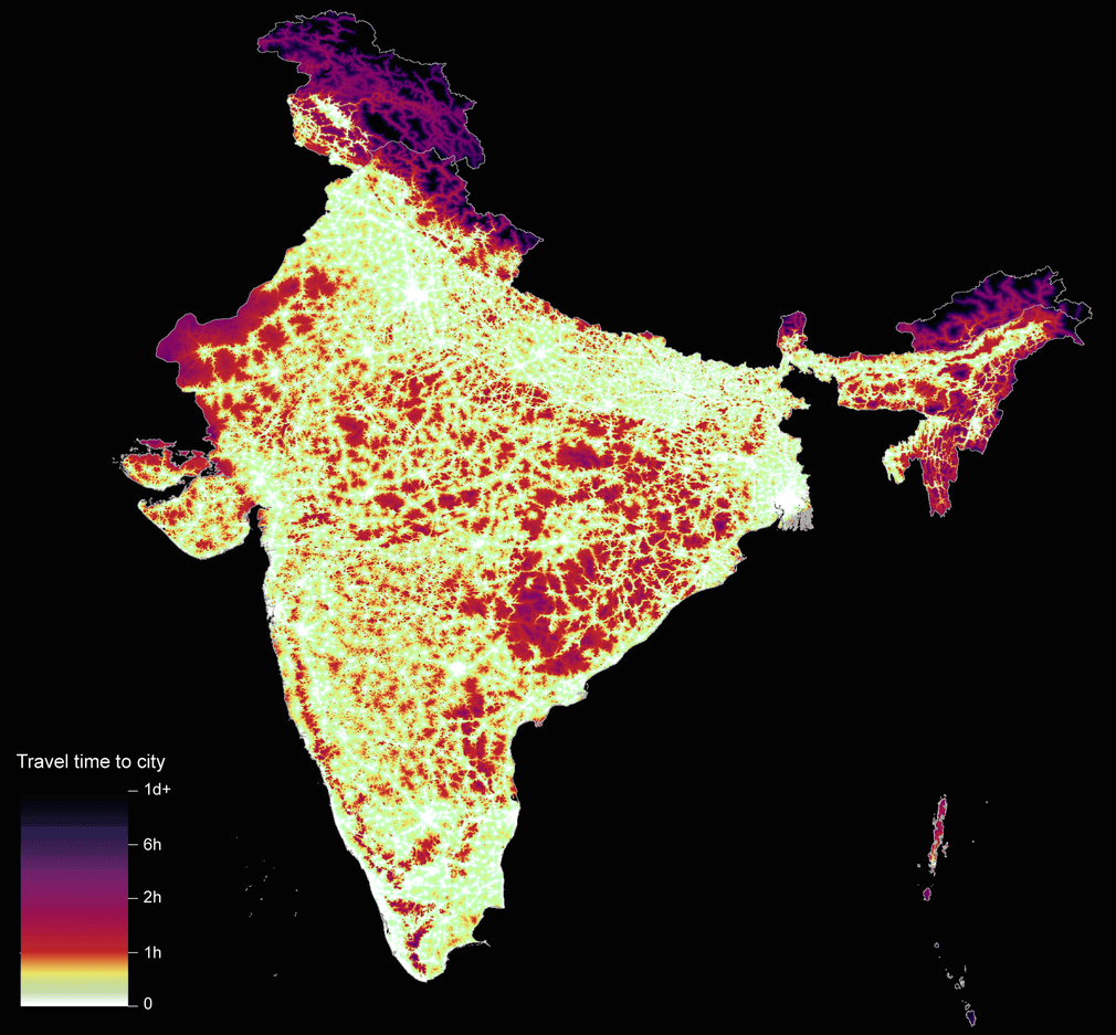
A global map of travel time to cities to assess inequalities in accessibility in 2015 | Nature
►https://www.nature.com/articles/nature25181
▻https://i.guim.co.uk/img/media/c1c5ac0a5d4bf1940cad232c08456843c1d26ade/0_0_1702_1579/master/1702.png?w=1010&q=55&auto=format&usm=12&fit=max&s=5e627ac9ace4cae18f6d9662
The economic and man-made resources that sustain human
wellbeing are not distributed evenly across the world, but are
instead heavily concentrated in cities. Poor access to opportunities
and services offered by urban centres (a function of distance,
transport infrastructure, and the spatial distribution of cities) is
a major barrier to improved livelihoods and overall development.
Advancing accessibility worldwide underpins the equity agenda of
‘leaving no one behind’ established by the Sustainable Development
Goals of the United Nations.
This has renewed international efforts to accurately measure accessibility and generate a metric
that can inform the design and implementation of development
policies. The only previous attempt to reliably map accessibility
worldwide, which was published nearly a decade ago, predated the
baseline for the Sustainable Development Goals and excluded the
recent expansion in infrastructure networks, particularly in lower-
resource settings. In parallel, new data sources provided by Open
Street Map and Google now capture transportation networks with
unprecedented detail and precision. Here we develop and validate
a map that quantifies travel time to cities for 2015 at a spatial
resolution of approximately one by one kilometre by integrating
ten global-scale surfaces that characterize factors affecting human
movement rates and 13,840 high-density urban centres within an
established geospatial-modelling framework. Our results highlight
disparities in accessibility relative to wealth as 50.9% of individuals
living in low-income settings (concentrated in sub-Saharan Africa)
reside within an hour of a city compared to 90.7% of individuals
in high-income settings. By further triangulating this map against
socioeconomic datasets, we demonstrate how access to urban centres stratifies the economic, educational, and health status of humanity.
aussi :
▻https://www.theguardian.com/cities/gallery/2018/jan/10/daily-commute-travel-times-cities-world-pictures-maps-uk-china-mali
▻https://map.ox.ac.uk/accessibility_to_cities_news
►https://boingboing.net/2018/01/10/a-map-of-how-long-it-takes-to.html


