


Most Maps of the New Ebola Outbreak Are Wrong - The Atlantic
▻https://www.theatlantic.com/health/archive/2018/05/most-maps-of-the-new-ebola-outbreak-are-wrong/560777
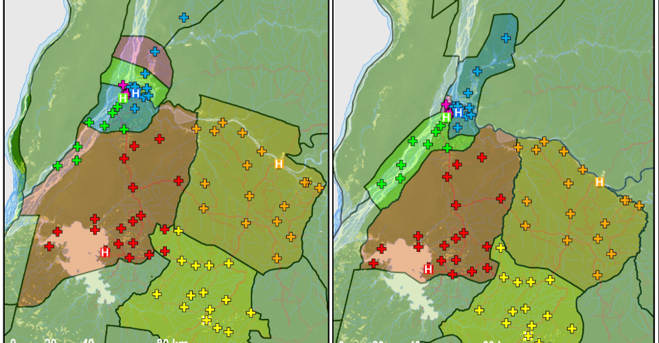
Almost all the maps of the outbreak zone that have thus far been released contain mistakes of this kind. Different health organizations all seem to use their own maps, most of which contain significant discrepancies. Things are roughly in the right place, but their exact positions can be off by miles, as can the boundaries between different regions.
Sinai, a cartographer at UCLA, has been working with the Ministry of Health to improve the accuracy of the Congo’s maps, and flew over on Saturday at their request. For each health zone within the outbreak region, Sinai compiled a list of the constituent villages, plotted them using the most up-to-date sources of geographical data, and drew boundaries that include these places and no others. The maps at the top of this piece show the before (left) and after (right) images.
#cartographie #santé #RDC #erreur #ebola
