

The Chart That Broke Our Brains — Data For Progress
▻https://www.dataforprogress.org/blog/2018/12/24/the-chart-that-broke-our-brains
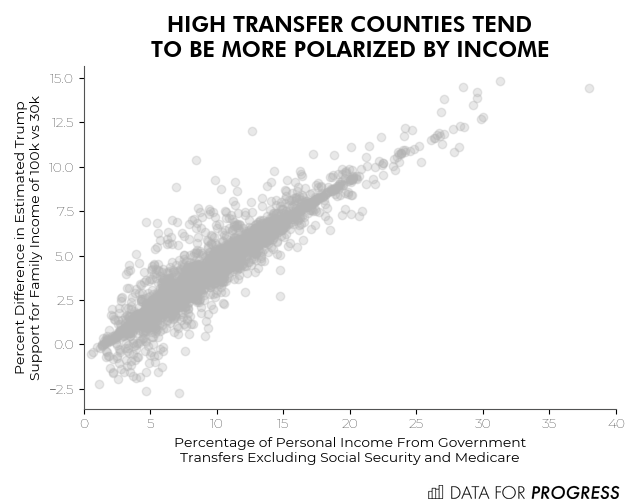
The New York Times recently published a piece that explored why many of the people who depend on government #assistance end up voting for Republicans, the one political party which is not only determined to cut all forms of government assistance but is openly hostile to the concept of government itself (at least the parts of government that don’t kill, imprison, or spy on people). The article offered several important insights, although we will add a few caveats to it here, but mostly the article caught our attention because of a very strange trendline on a chart.
▻https://twitter.com/portereduardo/status/1076171039955144705/photo/1