Typography: Where East Meets West - Brand New
►http://www.underconsideration.com/brandnew/archives/typography_where_east_meets_west.php
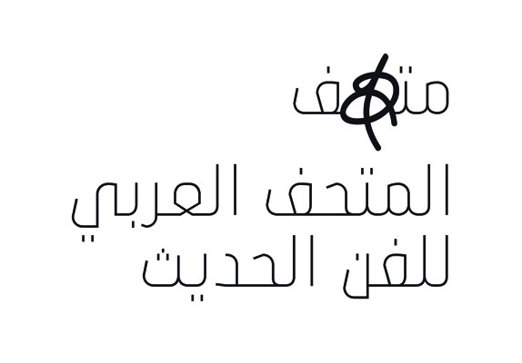
Mathaf manages to sit comfortably amongst this world, whilst pulling off a slight twist. Its identity is almost wholly expressed through typography, and attention has clearly been lavished in this area. As someone with little to no expertise in #Arabic #typography, I’ll refrain from making too many comments on that aspect, other than to say this is probably one of the more pleasing English / Arabic double version logo I have seen to date. As simple a trick the left/right swap may seem, it’s sensitive, refined and elegant whilst retaining a link to the hand rendered essence of Arabic script. But then again, what do I know…