Dasymetric Dot Density and the Uncanny Valley
▻http://uxblog.idvsolutions.com/2013/10/dasymetric-dot-density-and-uncanny.html
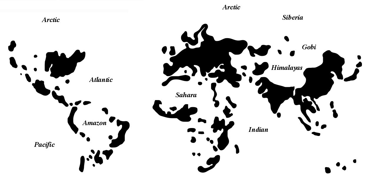
Dasymetric just means cookie-cutting the areas (like countries) for which you have data (like population) into more specific areas (NASA’s zones of populated places) that do a better job of restricting those zones to where your data actually occurs.
Hmmmm...
One of the great things about dot density mapping is that it normalizes for area all by itself. You don’t have to do a ratio of population divided by square miles (a cognitive abstraction) and then key that up to a sequence of colors (another cognitive abstraction) like you would with a choropleth map. But one of the sort-of drawbacks of dot density mapping is that the dots are randomly distributed within their areas -all you can control is how many dots. And if the dots are representing any sort of human data (like bicyclists, demographics, votes, commuters, downloads, etc.) then you are assuredly sprinkling many of them around in places that are obviously unpopulated. Sometimes that’s ok, but sometimes it’s pretty silly. Dasymetric mapping means we pare back our areas to only those that are likely to contain the phenomenon of interest

#cartographie #population #densités
et voir aussi
▻http://www.dwtkns.com/density