
Animated world map of movements | Britain’s Royal Navy in the First World War
▻http://www.theguardian.com/news/datablog/interactive/2012/oct/01/first-world-war-royal-navy-ships-mapped
Animated world map of movements | Britain’s Royal Navy in the First World War
▻http://www.theguardian.com/news/datablog/interactive/2012/oct/01/first-world-war-royal-navy-ships-mapped

Australian immigration detention centres : every incident mapped
A vast dataset, which details every incident reported in each operational immigration detention facility in Australia between October 2009 and May 2011, shows the number of logged incidents - including self-harm, assaults, hunger strikes and damage as well as minor incidents - across much of Australia’s immigration detention network.
►http://www.theguardian.com/news/datablog/interactive/2013/jun/12/immigration-detention-centres-mapped-interactive
#détention #Australie #rétention #carte #graphique #cartographie #visualisation #détention_administrative #migration #réfugiés #asile #accidents #violence #rébellion #carte_historique

#Cancer mortality worldwide mapped
▻http://www.theguardian.com/news/datablog/interactive/2014/feb/14/cancer-mortality-worldwide-mapped
Global cancer death rates are more than 50% higher in men than women, according to figures published today by Cancer Research UK. The numbers show that 4.6m men die from the disease every year – equivalent to 126 men in every 100,000, compared to around 3.5m women – 82 women per 100,000. The statistics compiled by the International Agency for Research on Cancer, have been announced alongside a new interactive map by Cancer Research UK, which compares cancer statistics from around the world. The map shows the variation in incidence, mortality and the reliability of the data in each country and region.
You can find both the mortality and incidence maps below. Click on a country to see its data. You can also select to see the map by cancer type or by gender
▻http://publications.cancerresearchuk.org/downloads/Product/CS_INFOG_WORLD_MORT.PDF
▻http://publications.cancerresearchuk.org/downloads/Product/CS_INFOG_WORLD_INC.PDF

Australian immigration detention centres:every incident mapped
A vast dataset, which details every incident reported in each operational immigration detention facility in Australia between October 2009 and May 2011, shows the number of logged incidents - including self-harm, assaults, hunger strikes and damage as well as minor incidents - across much of Australia’s immigration detention network.
►http://www.theguardian.com/news/datablog/interactive/2013/jun/12/immigration-detention-centres-mapped-interactive
#australia #migration #dention_center #map

Australian immigration detention centres : every incident mapped
A vast dataset, which details every incident reported in each operational immigration detention facility in Australia between October 2009 and May 2011, shows the number of logged incidents - including self-harm, assaults, hunger strikes and damage as well as minor incidents - across much of Australia’s immigration detention network.
►http://www.theguardian.com/news/datablog/interactive/2013/jun/12/immigration-detention-centres-mapped-interactive
#cartographie #décès #accidents #centres_de_rétention #centres_de_détention #Australie #visualisation #carte #cartographie_interactive #database #base_de_données
cc @reka

Interactive European language map: how does everyone say cat? | News | theguardian.com
▻http://www.theguardian.com/news/datablog/interactive/2014/jan/15/interactive-european-language-map?CMP=twt_gu

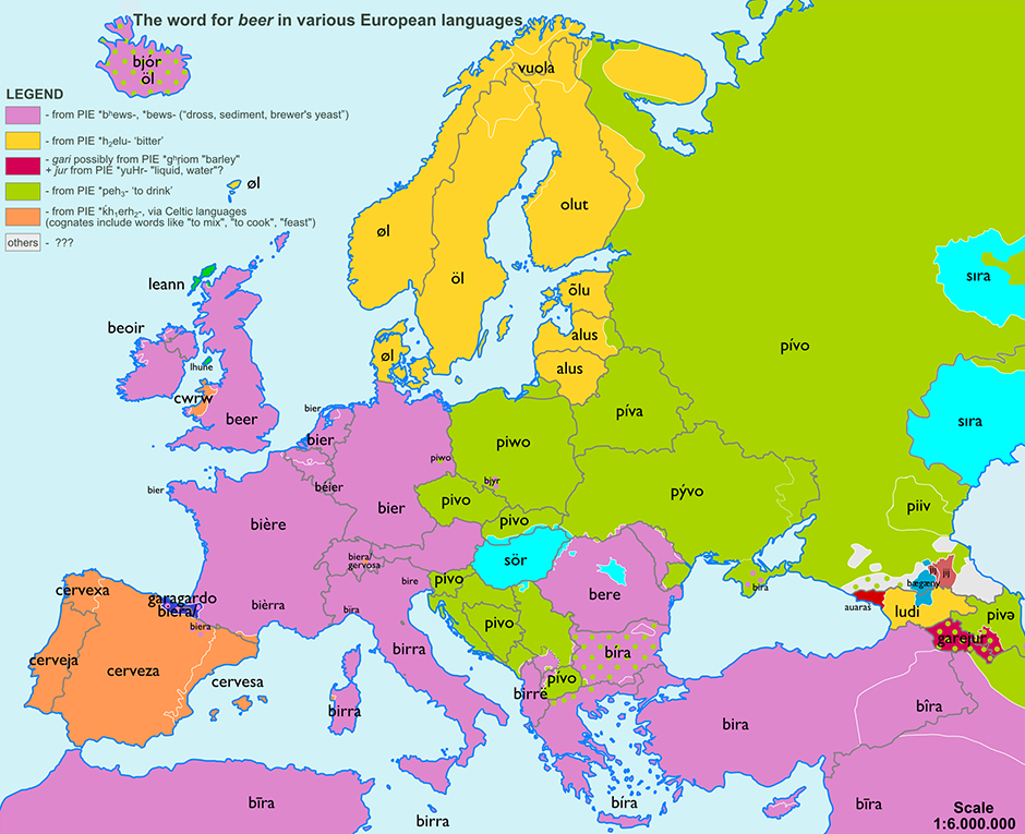
Pain in the ananas: etymology maps | News | theguardian.com
▻http://www.theguardian.com/news/datablog/interactive/2013/nov/14/pain-in-the-ananas-etymology-maps?CMP=twt_gu
Who would have thought that the marriage of two tiny little words - pine from the Latin ’pīnus’ meaning “sap, juice” and apple from ’apple’ meaning “apple” would have split the UK from the rest of the world way back when it was first recorded in 1398?
And what about the word orange? Or beer? Or bear? Or church? Do our language lands collide or do they coincide? Find out with these eight fun etymology maps complete with terrible puns.


#pff, hihi trop tard @baroug, car tout seenthis a déjà noté cette #carte_etymologique, grâce à @simplicissimus ▻http://seenthis.net/messages/194329 #hasbeen
Ah les salauds j’ai pas vu de flèche noire, mais ça me disait bien quelque chose. Bon ben puisqu’on en est là je laisse hein…

Hé, hé, pain in the ananas kidizait l’article…

The safest time to drive
▻http://flowingdata.com/2013/11/08/the-safest-time-to-drive
As we’ve seen, there are more fatal car crashes during the weekend and summer months, which is some time between May and September in the United States. The Guardian took a different approach to look at road fatalities in Australia.
The bottom section is your standard bar charts that show an average, but on top are mini-simulations that represent the averages. Small cars move in the background and squares appear on top to at different volumes. I originally thought the cars actually collided with each square, but it looks like they’re independent of each other. Nevertheless, an interesting approach.
▻http://www.theguardian.com/news/datablog/interactive/2013/oct/27/interactive-safest-time-to-drive


