
Teaching math through percussive dance
▻http://flowingdata.com/2014/09/12/teaching-math-through-percussive-dance
Teaching math through percussive dance
▻http://flowingdata.com/2014/09/12/teaching-math-through-percussive-dance

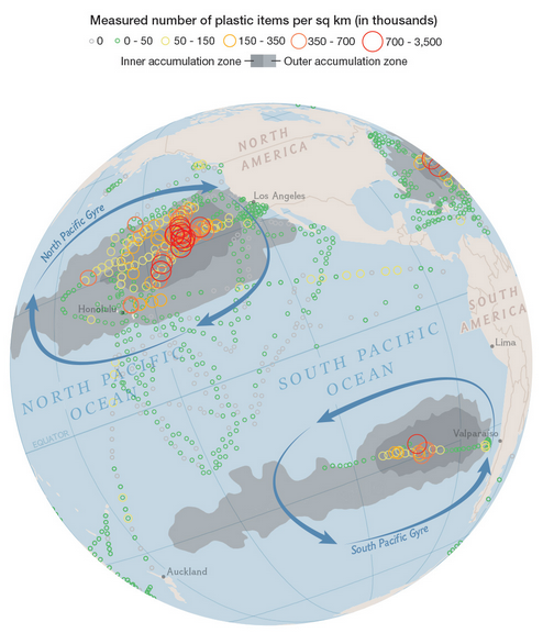
Mapping plastic in the ocean
▻http://flowingdata.com/2014/08/21/mapping-plastic-in-the-ocean
In research efforts to understand marine debris, Andres Cozar Cabañas et al recently published findings on plastic debris in the open ocean. National Geographic and geographer Jamie Hawk mapped the data.

Awesome interactive presentation of p5.js, a #Javascript drawing library:
▻http://hello.p5js.org
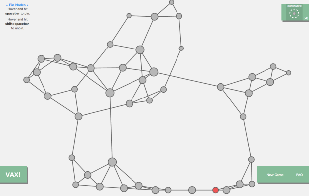
Network visualization game to understand how a disease spreads
▻http://flowingdata.com/2014/07/31/network-visualization-game-to-understand-how-a-disease-spreads

certains évitent déjà le survol de la zone de conflit #data-viz #aérien ▻http://flowingdata.com/2014/07/18/flights-around-ukraine

Visualization Education Mailbag
▻http://flowingdata.com/2014/07/15/visualization-education-mailbag
Visualization Education Mailbag
July 15, 2014 | Ask FlowingData
It’s around that time of year when more people than usual ask for advice about degrees in statistics, career paths in visualization, and how to get started with something that looks awesome.
The high of graduation from high school, undergrad, and grad school has settled, and it’s time to think about the future. Maybe summer brought more idle time at work to imagine what else you could do every day. I know the feeling.
I’ll try to answer the more common questions. However, keep in mind that I’m nowhere near the best person to ask about these things. I didn’t grow interested in statistics until late in college, I studied remotely for most of my graduate student life, and although I consult occasionally, I run FlowingData for a living.
So there’s your salt. Now some Q & A.
I just finished my undergraduate degree in graphic design/engineering/computer science/statistics/etc. Should I go to graduate school for statistics and/or visualization?
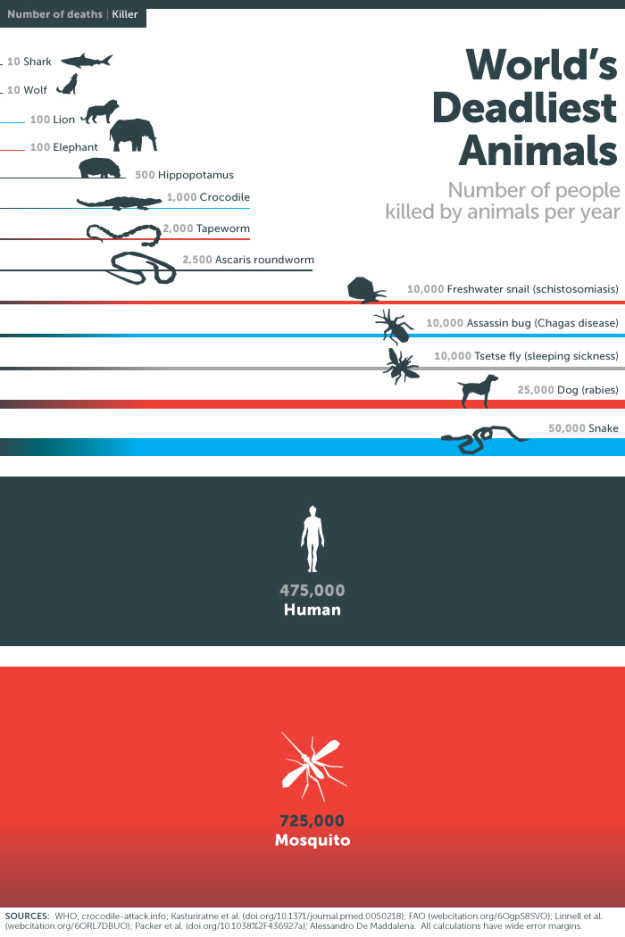
Mosquitos : The deadliest animal
▻http://flowingdata.com/2014/07/11/mosquitos-the-deadliest-animal
via Flowing Data
This graphic from the Gates Foundation is from a few months ago, but it was just National Mosquito Control Awareness Week. The small illustrations in this case make the graphic. Although I’m interested in seeing those “wide error margins.”
19 Maps That Will Blow Your Mind and Change the Way You See the World. Top All-time. You Won’t Believe Your Eyes. Watch.
▻http://flowingdata.com/2014/07/07/19-maps-that-will-blow-your-mind
J’ai eu quelque fois l’occasion de dire ici tout le mal que je pense des sites qui essayent désespérément de faire le buzz avec ce genre de titre et des cartes mille fois vues ailleurs. Je soupçonne l’excellent FlowingData (Nathan Yau) d’avoir eu la bonne idée se foutre de la gueule des petits apprentis-buzzers :)
19 Maps That Will Blow Your Mind and Change the Way You See the World. Top All-time. You Won’t Believe Your Eyes. Watch.
Mercator projection with pole shifted to where you liv
▻http://flowingdata.com/2014/06/09/mercator-projection-pole-shifts-to-where-you-live
Drew Roos made a thing that lets you move the poles of the Mercator projection to anywhere in the world.
▻http://mrgris.com/projects/merc-extreme
As you probably know, map projections all have their pros and cons since there are challenges that come with transforming a globe onto a two-dimensional surface. The Mercator projection, one of the most well-known, distorts as you approach the poles. The scale approaches infinity actually, which is why we’re used to seeing a Greenland that is bigger than Africa. (It’s not.)
Above shows the pole shifted to Washington, D.C. Trippy.
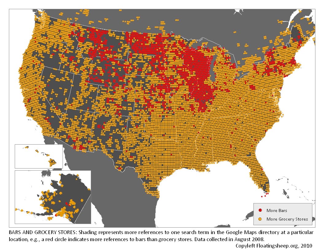
floatingsheep: The Beer Belly of America
▻http://www.floatingsheep.org/2010/02/beer-belly-of-america.html
The Beer Belly of America
At FloatingSheep, we’re willing to search for and analyze almost anything that falls within the realm of human experience. Sometimes this is mundane (pizza) and sometimes it is contentious (abortion) but most of the time it falls somewhere in between. Such as, where can I get a drink?
Voir aussi :
▻http://flowingdata.com/2014/05/29/bars-versus-grocery-stores-around-the-world
#états-unis #cartographie #visualisation #bars #bières #épiceries
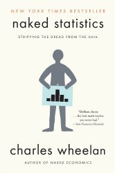
Naked Statistics
▻http://flowingdata.com/2014/05/08/naked-statistics
Naked Statistics by Charles Wheelan promises a fun, non-boring introduction to statistics that doesn’t leave you drifting off into space, thinking about anything that is not statistics. From the book description:
For those who slept through Stats 101, this book is a lifesaver. Wheelan strips away the arcane and technical details and focuses on the underlying intuition that drives statistical analysis. He clarifies key concepts such as inference, correlation, and regression analysis, reveals how biased or careless parties can manipulate or misrepresent data, and shows us how brilliant and creative researchers are exploiting the valuable data from natural experiments to tackle thorny questions.
How Americans Die
▻http://www.bloomberg.com/dataview/2014-04-17/how-americans-die.html
Encore une découverte de FlowingData qui décidément a du nez.
▻http://flowingdata.com/2014/04/21/how-people-die-in-america
Une très belle série de visualisation sur la mortalité aux Etats-Unis. Très très réussi. On y apprend beaucoup de choses et les figures peuvent servir de base pour un débat sur la question. Bravo.
https://dl.dropbox.com/s/uwz5uzach0nwgwr/americandie1.png
https://dl.dropbox.com/s/gb0jdclubmt6pdr/americandie2.png
#états-unis #démographie #mortalité #visualisation #cartographie_dynamique

désolé, il faudrait que je prenne l’habitude de poster plus souvent sur seenthis... pour l’instant je me contente de twitter
▻https://twitter.com/freakonometrics/status/457303844884840449
pas de souci, tu sais, les bons trucs on les rate rarement. On est abonné aussi au formidable FLowingData :)
Extract CSV data from PDF files with Tabula
▻http://flowingdata.com/2014/04/08/extract-csv-data-from-pdf-files-with-tabula-2
Tabula, by Manuel Aristarán, came out months ago, but I’ve been poking at government data recently and came back to this useful piece of free software to get the data tables out of countless free-floating PDF files.
If you’ve ever tried to do anything with data provided to you in PDFs, you know how painful this is — you can’t easily copy-and-paste rows of data out of PDF files. Tabula allows you to extract that data in CSV format, through a simple interface.
It’s not the fastest software in the world, but it really is simple to use and it sure beats manual entry. You just load a PDF file into Tabula, which runs on your computer, highlight the table to extract, and the program does the rest. Save as a CSV and do what you want with it.
Tabula
▻http://tabula.nerdpower.org
Why Tabula?
If you’ve ever tried to do anything with data provided to you in PDFs, you know how painful this is — you can’t easily copy-and-paste rows of data out of PDF files. Tabula allows you to extract that data in CSV format, through a simple interface. And now you can download Tabula and run it on your own computer, like you would with OpenRefine.

Alors là, si t’es content je suis content ! C’est vraiment un vieux problème qui, lorsqu’on produisait les atlas du diplo, a peuplé mes nuits d’authentiques cauchemars. On a passé des heures à recopier ou essayer d’extraire par des moyens invraisemblables des chiffres de fichiers pdf.

J’aime beaucoup la tabula rasa d’arvo pärt :)
▻http://www.youtube.com/watch?v=vu1BcNeebMI


@reka, idem pour moi avec des tableaux de toutes dimensions, en gros de 5 x 3 (ressaisie) à 223 x 15 (avec tous les bricolages entre tableur et traitement de texte, et vérification des totaux en ligne et en colonne…)
@fil, ouarf ! j’y avais pensé. On peut aussi y voir la prononciation sous rhino-pharyngite aiguë de SeenThis en français. Et s’il faut mettre un visage, j’hésiterais entre
@odilon, merci : un peu de tendresse dans ce monde de (données) brutes…


Ah ben tiens, je découvre que l’outil avait déjà été pointé ici par @b_b 6 mois plus tôt…
▻http://seenthis.net/messages/186987
… et… partagé par @reka
Comme quoi, #les_doublons_ont_du_bon !
il existe une version en ligne de commande de tabula ; un peu difficile à installer (il m’a fallu installer une version spécifique de java, puis jruby, puis chercher un chemin abscons), mais ensuite ça marche très très bien
▻https://github.com/tabulapdf/tabula-extractor
Quand FlowingData se moque de Fox News (ils le méritent bien) c’est très drôle (surtout quand on voit les graphiques)
Fox News continues charting excellence
►http://flowingdata.com/2012/08/06/fox-news-continues-charting-excellence
Fox News bar chart gets it wrong
▻http://flowingdata.com/2014/04/04/fox-news-bar-chart-gets-it-wrong
Fox News still makes awesome charts
▻http://flowingdata.com/2011/12/12/fox-news-still-makes-awesome-charts
Fox News Makes the Best Pie Chart. Ever.
►http://flowingdata.com/2009/11/26/fox-news-makes-the-best-pie-chart-ever
#visualisation #propagande #manipulation #fox_news #incompétence #cartographie
Smoking rates and income in United-States
▻http://flowingdata.com/2014/03/27/smoking-rates-and-income
Based on a study on smoking prevalence from 1996 to 2012, a map by The New York Times shows the results. Smoking rates among men and women have declined overall over the years, but there are still relatively high rates in many areas of the country, which appears to correlate with income. Lower income tends towards higher smoking rates.
#états-unis #cigarette #cancer #santé #cartographie #visualisation
Coffee place geography
▻http://flowingdata.com/2014/03/18/coffee-place-geography
Ceci nous vient, bien entendu, de FlowingData !
My fascination with the geography of place and businesses continues. We looked at pizza spots and grocery store locations, and as expected, saw variation and regionality across the country. This time we look at coffee places.
 http://i0.wp.com/flowingdata.com/wp-content/uploads/2014/03/coffee-circles-opaque.png?fit=954%2C6000
 My expectation was that Starbucks and Dunkin’ Donuts would dominate, with 10,000-plus and 7,000-plus locations nationwide, respectively. This wasn’t far-fetched when you look at the map above. It shows the nearest coffee place among the popular chains, within a 10-mile radius.
Statistical concepts explained through dance
▻http://flowingdata.com/2014/03/07/statistical-concepts-explained-through-dance
Raffa
Statistical concepts explained through dance - ►http://flowingdata.com/2014...
13 minutes ago
from Bookmarklet
Comment
Like
Near-real-time global forest watch
▻http://flowingdata.com/2014/02/24/near-real-time-global-forest-watch
Raffa
Near-real-time global forest watch - ►http://flowingdata.com/2014...
20 minutes ago
from Bookmarklet
Comment
Like
A human-readable explorer for SEC filings
▻http://flowingdata.com/2014/02/21/a-human-readable-explorer-for-sec-filings
je n’ai pas réussi à faire marcher la machine mais ça à l’air tout à fait bien.
But in the twenty years since, despite hundreds of millions invested in rounds of contracted EDGAR modernization efforts and interactive data false starts, the SEC’s EDGAR has remained almost untouched. In 2014, the SEC is quite literally doing less with SEC filings than their predecessors had planned for 1984. Data tagging is the red-headed stepchild of the Commission — out of hundreds of forms, only about a dozen are filed as structured data — and the first program to automate the selection of SEC filings for review, the Division of Economic and Risk Analysis (DERA)’s ’Robocop’, has been ’aspirational’ for years. The academics in the division responsible for the SEC’s interactive data initiatives write papers about information asymmetry, using EDGAR data they repurchase in usable form for millions each year, but do nothing to fix it. Companies are chastised for insufficient and inefficient disclosure, while the SEC fails to help retail investors navigate corporate disclosures at all.

Cartographier là où courent les gens - The Atlantic Cities
▻http://www.theatlanticcities.com/arts-and-lifestyle/2014/02/mapping-where-people-run/8313
Grâce à des données agrégées de capteurs pour mesurer son activité sportive, Flowing Data a fait la #cartographie de 18 villes à travers le monde, pour voir où courent leurs habitants : ▻http://flowingdata.com/2014/02/05/where-people-run L’analyse urbaine au plus près de nos comportements... Tags : internetactu internetactu2net fing #citelabo #villelegere cartographie


