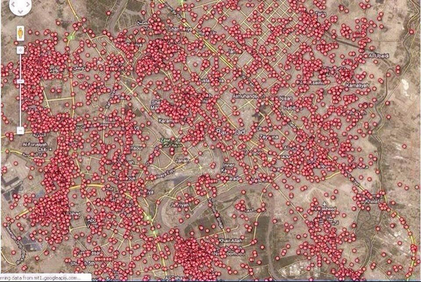
Brilliant Maps sur Twitter : « A map of every car bomb explosion in Baghdad since 2003. ▻http://t.co/A85jier0Ha »
▻https://twitter.com/BrilliantMaps/status/523779391021527040
Sans commentaire.
Brilliant Maps sur Twitter : « A map of every car bomb explosion in Baghdad since 2003. ▻http://t.co/A85jier0Ha »
▻https://twitter.com/BrilliantMaps/status/523779391021527040
Sans commentaire.

#my_god (essai ! de nouveau tag bien qu’il ne puisse pas faire grand chose)


Je cherche une source directe, ce serait bien pratique. J’ai trouvé des choses, mais pas directement cette carte.
Il y a un vieil article avec une animation de la BBC New (jusqu’en 2007) : Baghdad : Mapping the violence
▻http://news.bbc.co.uk/2/shared/spl/hi/in_depth/baghdad_navigator
Il y a la carte réalisée par le Guardian sur la base des données de Wikileaks (établie en 2010) : Wikileaks Iraq war logs : every death mapped
▻http://www.theguardian.com/world/datablog/interactive/2010/oct/23/wikileaks-iraq-deaths-map
article : Wikileaks Iraq : data journalism maps every death
►http://www.theguardian.com/news/datablog/2010/oct/23/wikileaks-iraq-data-journalism
Liste des attaques suicide en Irak depuis 2003 sur Wikipedia (pas de carte) :
▻http://en.wikipedia.org/wiki/List_of_terrorist_incidents_in_Iraq_since_2003
Je cherchais la source et j’ai vu que @brilliantmap a fait un petit communiqué après pour dire que ça venait du Guardian
Clarification: The Iraq carbomb map is from @GuardianData ►http://www.theguardian.com/news/datablog/2010/oct/23/wikileaks-iraq-data-journalism … - and shows IEDs not only carbombs
Nous avions signalé l’article (et pas la carte...) il y a quelques jours

j’aurais toujours voulu faire une carte comme cela pour Beyrouth

Building a better election map | World news | theguardian.com
▻http://www.theguardian.com/world/datablog/2013/sep/06/better-election-results-map?CMP=twt_fd
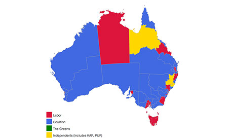
I’ve spent a lot of time thinking about maps this election. Australia has an interesting problem when showing election results on a map – because of our vast landscape, with population centres clustered at the edges, the electorates do not align very well with geography.
Federal seats range from a meagre 30 sq km in the inner city seat of Wentworth to the sprawling 1,587,758 sq km Western Australian electorate of Durack.
Because of this, it’s very hard to present at a glance election results in a geographic form.

Avant :
Default election map showing 2010 results Illustration: Nick Evershed for the Guardian
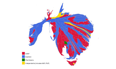
Après (anamorphose) :
Australian election cartogram map showing 2010 results Illustration: Nick Evershed for the Guardian
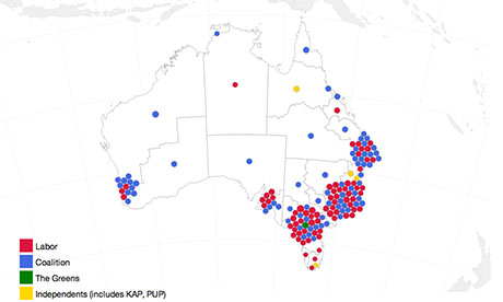
Après (jittered dot map?) :
Map of the 2010 Australian election showing electorates as circles clustered over their locations Illustration: Nick Evershed for the Guardian

pour la troisième carte, vous savez s’il est possible de le faire en #javascript ?
La troisième carte est faite en #javascript avec #D3.js
La carte (regarder le code source pour le javascript) :
▻http://www.theguardian.com/world/datablog/interactive/2013/sep/06/australian-election-results-map