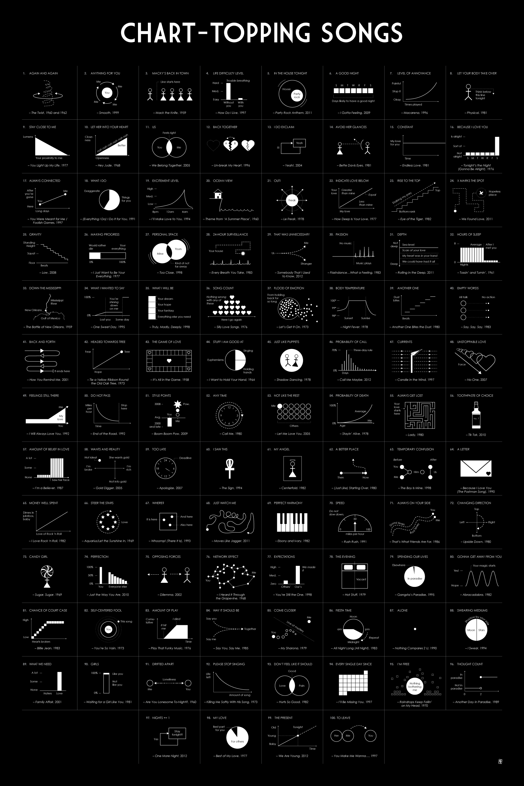
Chart-Topping Songs as Graphs and Diagrams
▻http://flowingdata.com/chart-topping-songs-as-graphs-and-diagrams
Comme son nom l’indique :) #chanson #visualisation
Chart-Topping Songs as Graphs and Diagrams
▻http://flowingdata.com/chart-topping-songs-as-graphs-and-diagrams
Comme son nom l’indique :) #chanson #visualisation
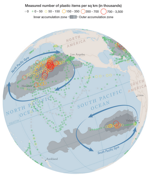
Mapping plastic in the ocean
▻http://flowingdata.com/2014/08/21/mapping-plastic-in-the-ocean
In research efforts to understand marine debris, Andres Cozar Cabañas et al recently published findings on plastic debris in the open ocean. National Geographic and geographer Jamie Hawk mapped the data.

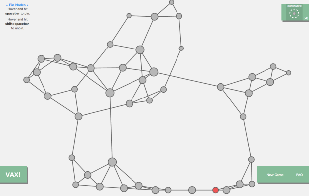
Network visualization game to understand how a disease spreads
▻http://flowingdata.com/2014/07/31/network-visualization-game-to-understand-how-a-disease-spreads

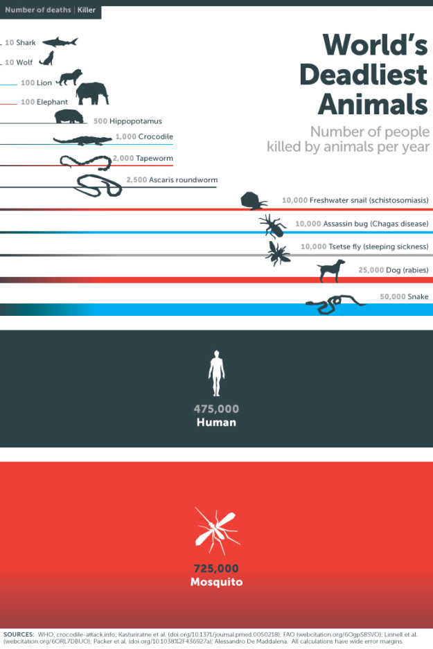
Mosquitos : The deadliest animal
▻http://flowingdata.com/2014/07/11/mosquitos-the-deadliest-animal
via Flowing Data
This graphic from the Gates Foundation is from a few months ago, but it was just National Mosquito Control Awareness Week. The small illustrations in this case make the graphic. Although I’m interested in seeing those “wide error margins.”
19 Maps That Will Blow Your Mind and Change the Way You See the World. Top All-time. You Won’t Believe Your Eyes. Watch.
▻http://flowingdata.com/2014/07/07/19-maps-that-will-blow-your-mind
J’ai eu quelque fois l’occasion de dire ici tout le mal que je pense des sites qui essayent désespérément de faire le buzz avec ce genre de titre et des cartes mille fois vues ailleurs. Je soupçonne l’excellent FlowingData (Nathan Yau) d’avoir eu la bonne idée se foutre de la gueule des petits apprentis-buzzers :)
19 Maps That Will Blow Your Mind and Change the Way You See the World. Top All-time. You Won’t Believe Your Eyes. Watch.
Mercator projection with pole shifted to where you liv
▻http://flowingdata.com/2014/06/09/mercator-projection-pole-shifts-to-where-you-live
Drew Roos made a thing that lets you move the poles of the Mercator projection to anywhere in the world.
▻http://mrgris.com/projects/merc-extreme
As you probably know, map projections all have their pros and cons since there are challenges that come with transforming a globe onto a two-dimensional surface. The Mercator projection, one of the most well-known, distorts as you approach the poles. The scale approaches infinity actually, which is why we’re used to seeing a Greenland that is bigger than Africa. (It’s not.)
Above shows the pole shifted to Washington, D.C. Trippy.
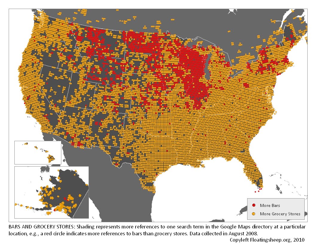
floatingsheep: The Beer Belly of America
▻http://www.floatingsheep.org/2010/02/beer-belly-of-america.html
The Beer Belly of America
At FloatingSheep, we’re willing to search for and analyze almost anything that falls within the realm of human experience. Sometimes this is mundane (pizza) and sometimes it is contentious (abortion) but most of the time it falls somewhere in between. Such as, where can I get a drink?
Voir aussi :
▻http://flowingdata.com/2014/05/29/bars-versus-grocery-stores-around-the-world
#états-unis #cartographie #visualisation #bars #bières #épiceries
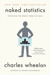
Naked Statistics
▻http://flowingdata.com/2014/05/08/naked-statistics
Naked Statistics by Charles Wheelan promises a fun, non-boring introduction to statistics that doesn’t leave you drifting off into space, thinking about anything that is not statistics. From the book description:
For those who slept through Stats 101, this book is a lifesaver. Wheelan strips away the arcane and technical details and focuses on the underlying intuition that drives statistical analysis. He clarifies key concepts such as inference, correlation, and regression analysis, reveals how biased or careless parties can manipulate or misrepresent data, and shows us how brilliant and creative researchers are exploiting the valuable data from natural experiments to tackle thorny questions.