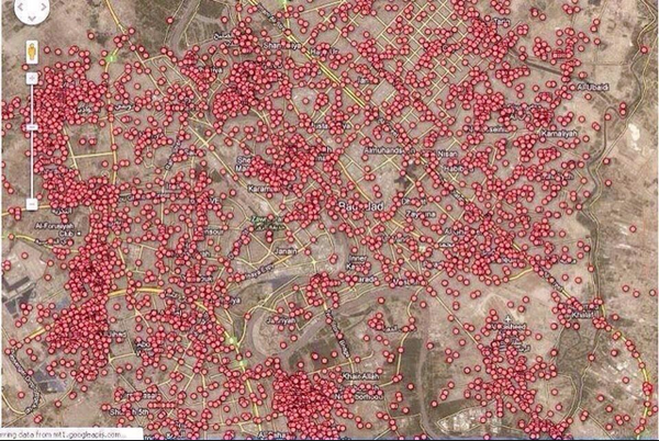
Brilliant Maps sur Twitter : « A map of every car bomb explosion in Baghdad since 2003. ▻http://t.co/A85jier0Ha »
▻https://twitter.com/BrilliantMaps/status/523779391021527040
Sans commentaire.
Brilliant Maps sur Twitter : « A map of every car bomb explosion in Baghdad since 2003. ▻http://t.co/A85jier0Ha »
▻https://twitter.com/BrilliantMaps/status/523779391021527040
Sans commentaire.

#my_god (essai ! de nouveau tag bien qu’il ne puisse pas faire grand chose)


Je cherche une source directe, ce serait bien pratique. J’ai trouvé des choses, mais pas directement cette carte.
Il y a un vieil article avec une animation de la BBC New (jusqu’en 2007) : Baghdad : Mapping the violence
▻http://news.bbc.co.uk/2/shared/spl/hi/in_depth/baghdad_navigator
Il y a la carte réalisée par le Guardian sur la base des données de Wikileaks (établie en 2010) : Wikileaks Iraq war logs : every death mapped
▻http://www.theguardian.com/world/datablog/interactive/2010/oct/23/wikileaks-iraq-deaths-map
article : Wikileaks Iraq : data journalism maps every death
►http://www.theguardian.com/news/datablog/2010/oct/23/wikileaks-iraq-data-journalism
Liste des attaques suicide en Irak depuis 2003 sur Wikipedia (pas de carte) :
▻http://en.wikipedia.org/wiki/List_of_terrorist_incidents_in_Iraq_since_2003
Je cherchais la source et j’ai vu que @brilliantmap a fait un petit communiqué après pour dire que ça venait du Guardian
Clarification: The Iraq carbomb map is from @GuardianData ►http://www.theguardian.com/news/datablog/2010/oct/23/wikileaks-iraq-data-journalism … - and shows IEDs not only carbombs
Nous avions signalé l’article (et pas la carte...) il y a quelques jours

j’aurais toujours voulu faire une carte comme cela pour Beyrouth
Wikileaks Iraq : data journalism maps every death | World news | theguardian.com
►http://www.theguardian.com/news/datablog/2010/oct/23/wikileaks-iraq-data-journalism
Signalé ce matin par Alain Gresh, ce billet effrayant sur les victimes de la guerre en Irak. Le billet semble dater de 2010, mais je n’en suis pas tout à fait sur. Je l’avais raté.
Wikileaks Iraq: data journalism maps every death
Data journalism allows us to really interrogate the Wikileaks Iraq war logs release. Here is the statistical breakdown - and data for you to download
• Get the data
• Get the fullscreen map
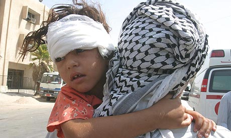
Wikileaks Iraq: a man holds his wounded daughter outside in August 2006 after being injured in road side bomb explosion. Photograph: Ali Abbas/EPA
UPDATE: an academic who has worked with the data has pointed out some of its limitations.
▻http://www.theguardian.com/news/datablog/2010/oct/25/wikileaks-iraq-data?guni=Graphic:in%20body%20link
Data journalism works best when there’s a lot of data to work with.
Wikileaks’ Iraq war logs release has dumped some 391,000 records of the Iraq war into the public arena. We’ve had them for a few weeks - what have we found out?
This is in a different league to the Wikileaks Afghanistan leak - there’s a good case for saying the new release has made the war the most documented in history. Every minor detail is now there for us to analyse and breakdown but one factor stands out: the sheer volume of deaths, most of which are civilians.

La carte avait été mise en ligne par OWNI « IRAQ WARLOGS » :
Je suis allé refaire un tour plus rien n’a l’air de fonctionner.
►http://wikileaks.owni.fr