

Five Ways to Lie with Charts - Issue 19: Illusions
▻http://nautil.us/issue/19/illusions/five-ways-to-lie-with-charts
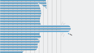
A chart’s purpose is usually to help you properly interpret data. But sometimes, it does just the opposite. In the right (or wrong) hands, bar graphs and pie charts can become powerful agents of deception, tricking you into inferring trends that don’t exist, mistaking less for more, and missing alarming facts. The best measure of a chart’s honesty is the amount of time it takes to interpret it, says Massachusetts Institute of Technology perceptual scientist Ruth Rosenholtz: “A bad chart requires more cognitive processes and more reasoning about what you’ve seen.” It helps to know the kinds of tricks that charts can try to pull. Here are five. Puzzling PerspectiveData from ▻http://www.mrexcel.com/tip142.shtmlBoth of these pie charts show “labor” taking up 30 percent of some total. But you (...)
