


Is it the visualisation or the data we like? - Visualising Data
▻http://www.visualisingdata.com/index.php/2015/02/visualisation-data-like
thought for the day. Stick with me on this, I’m still deciding if there’s something in it: I will only know after I’ve published it though so here goes.
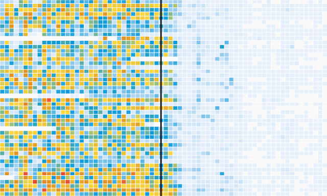
I’m musing about this visualisation work that has received a lot of love and attention on blogs and social media over the past few days. Created by the excellent people in the Wall Street Journal graphics team, it portrays data about the impact of vaccines in battling infectious diseases in the 20th Century.
The chart that has had the most impact, due to the highly topical nature of its subject, is the measles chart. This was certainly the image that was drew me in and was used to accompany the many positive tweets it received.
My question is this: do we like the visualisation or do we like the data?
–— ---
Battling Infectious Diseases in the 20th Century: The Impact of Vaccines - WSJ.com
▻http://graphics.wsj.com/infectious-diseases-and-vaccines

The number of infected people, measured over 70-some years and across all 50 states and the District of Columbia, generally declined after vaccines were introduced.
The heat maps below show number of cases per 100,000 people.
#santé #vaccins #data #statistiques #visualisation #question_cornélienne