Black Lives Matter? Not in an NYT Graphic
▻http://fair.org/home/black-lives-matter-not-in-an-nyt-graphic
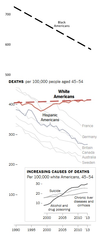
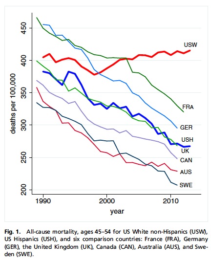
Quick–who’s missing from this New York Times chart (11/2/15)?

The most obvious omission is African-Americans, who make up about 12 percent of the US population. They are left out of the chart not because they don’t support the point—they, too, have a falling death rate in the 45-54 demographic, unlike US whites—but presumably because they would require a larger graph, since the black mortality rate is still well above whites in this age group: 582 vs. 415 per 100,000.
That deaths among middle-aged whites are rising while they’re falling among other groups is a remarkable story—particularly when the disparity is explained, as the PNAS study indicates, by rising rates of drug and alcohol overdoses, alcohol-induced liver damage and suicide. But the story is complicated, surely, by the fact that the shocking news is that middle-age whites in the US now die 71 percent as often as blacks—as opposed to 56 percent as often, like they did 14 years ago.
Perhaps it would have been worth making a bigger chart to make that point?