This Mesmerizing Interactive Map Displays Ship Movements Across the Globe
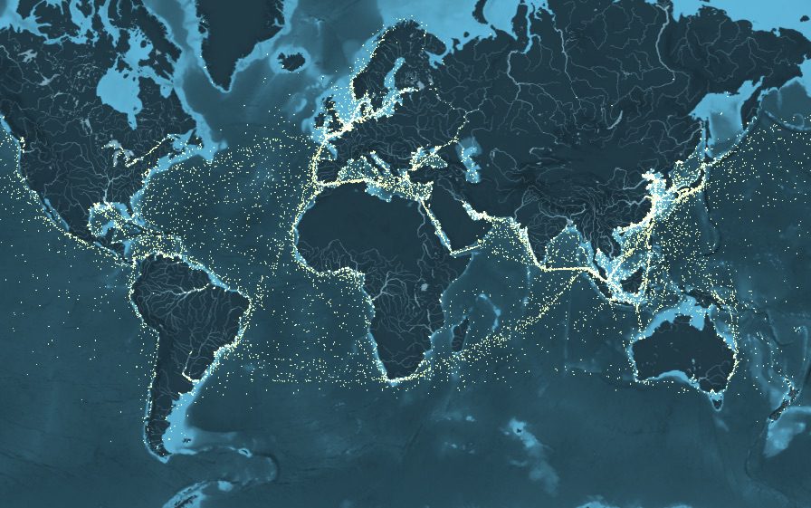
Researchers at UCL Energy Institute together with London-based data visualization and digital journalism studio Kiln have released this amazing interactive map that plots 250 million data points to show the movements of the world’s commercial shipping fleet during the year 2012. (Hit the play button above to learn more about what is being displayed)
The map was created based on the methodology developed for the Third IMO GHG Study 2014 and AIS data to estimate emissions from five different ship types; containerships, tankers, dry bulk, gas carriers and vehicle carriers.
Based only on ship movements and without a background map, the world’s coastlines are clearly defined, with plenty of variation in ship activity: from the buzz of activity in the East China Sea to the relative quiet of Somalia’s piracy afflicted waters to ship movements in areas where one might not expect them, such as the Arctic and Antarctic. The map also clearly shows the most crucial shipping thoroughfares of all: the canals linking different bodies of water, such as the Panama Canal, opened a century ago to connect the Atlantic and Pacific Ocean, and the even older and busier Suez Canal which saw 17,000 transits in 2012 alone.