The 100% correct way to do #CSS #breakpoints
600px, 900px, 1200px, and 1800px if you plan on giving the giant-monitor people something special.
▻https://medium.freecodecamp.com/the-100-correct-way-to-do-css-breakpoints-88d6a5ba1862
The 100% correct way to do #CSS #breakpoints
600px, 900px, 1200px, and 1800px if you plan on giving the giant-monitor people something special.
▻https://medium.freecodecamp.com/the-100-correct-way-to-do-css-breakpoints-88d6a5ba1862

Mouais.
100% correct c’est un peu péremptoire.
Je n’utilise jamais de breakpoints standards, je les définis toujours par rapport aux contenus d’un site.
▻http://bradfrost.com/blog/post/7-habits-of-highly-effective-media-queries
So where should you insert breakpoints? Follow Stephen Hay’s advice:
“Start with the small screen first, then expand until it looks like shit. Time for a breakpoint! –Stephen Hay”
C’est ce que je pratique, sauf que je ne travaille pas mobile first, donc je pars d’une résolution large, que je réduis.
Quand ça pète -> breakpoint.
Oui, c’est ce que pointe le premier commentaire :
This makes more sense than the counter example but it definitely not the 100% correct way. Ideally you want to choose your break points around your content and design, not around devices. This year’s devices are different than last year’s and different than next year’s. Resize your window — when the layout breaks or stops makings sense you have a break point. Devices should have no voice in this decision.
Le plus intéressant dans l’article est certainement cette partie :
 https://cdn-images-1.medium.com/max/2000/1*XoDgRc5GXaxo7j47ClsIgw.png
  https://cdn-images-1.medium.com/max/2000/1*cZcTR2tVMzYg1U1h3cqdNg.png
  https://cdn-images-1.medium.com/max/2000/1*RZryP0xAyOy1_WRpBdPIog.png
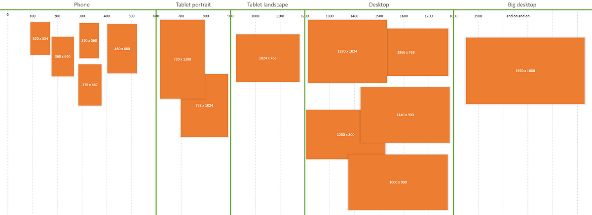
 that’s basically what you’d be doing if you set your breakpoints at positions matching the exact width of popular devices (320px, 768px, 1024px).
...
I think we mix up “boundaries” and “ranges” in our discussions and implementations of breakpoints.

Importing #CSS #Breakpoints Into #JavaScript | Lullabot
▻https://www.lullabot.com/articles/importing-css-breakpoints-into-javascript
Importing CSS Breakpoints Into JavaScript
There are a lot of challenges within responsive web design, and one that that has constantly been a pain is triggering JavaScript based on the current CSS media query breakpoint. The problem is that the breakpoints are in CSS, which JavaScript has no native way to access. Many solutions (including window.matchMedia(), and Enquire.js) involve declaring your breakpoints in both CSS and JS, or require IE10+. The problem with these solutions is that when you change a breakpoint value, you have to change it twice. However, it doesn’t need to be like this.
/squelettes/sarkaspip/trunk/css/sarkaspip.less – SPIP-ZONE
▻http://zone.spip.org/trac/spip-zone/browser/_squelettes_/sarkaspip/trunk/css/sarkaspip.less?rev=69847
#Breakpoints #responsive #sarkaspip
»@media (min-width: 1200px)
@media (min-width: 768px) and (max-width: 979px)
@media (max-width: 768px)
@media (max-width: 550px) «
Create a #Responsive Web Design with #MediaQueries
▻http://line25.com/tutorials/create-a-responsive-web-design-with-media-queries
The next most popular resolution under #960px width is #768px to cater for portrait tablet screens. This Typo design is built using a grid, so to stay true to the layout we can simply remove a column to leave a width of 758px. The original layout can then be narrowed down to fit by reducing the margin on the content div as well as reducing the overall width of the sidebar.
3 #breakpoints
@media screen and (max-width: 960px)
@media screen and (max-width: 758px)
@media screen and (max-width: 524px)