L’association Intercommunalités de France publie ce mercredi 20 mars une cartographie de 198 services d’eau potable dont le taux de fuites sur le réseau égale ou dépasse les 50 %. Il s’agit essentiellement de petites communes dites « isolées », solitaires dans leur gestion de l’or bleu, qui couvrent quelque 64 000 habitants.
La sécheresse historique de 2022 a montré que l’or bleu devait être mieux géré en France. Cette année-là, plus de 1 000 communes ont eu des difficultés d’approvisionnement au robinet, un phénomène accentué par de nombreuses fuites dans les canalisations. En France, 20 % de l’eau potable est perdue lors de son acheminement. « C’est une situation aberrante qu’on doit corriger en urgence », avait tranché le président de la République fin mars 2023, en présentant un « plan eau », dont une partie était censée répondre à cet enjeu en mobilisant davantage d’aides. Le gouvernement avait alors identifié 170 communes prioritaires, victimes d’au moins 50 % de fuites, appelées « #points_noirs ».
Mais il semblerait que le chiffre ait été sous-estimé. Ce mercredi 20 mars, #Intercommunalités_de_France, fédération nationale qui réunit métropoles, agglomérations, communautés urbaines et communautés de communes, dévoile une nouvelle carte, sur laquelle figurent 198 « points noirs » qui perdent donc plus de la moitié de leur eau. Cela représente 4 % des services d’eau en France et concerne un peu plus de 64 000 habitants. L’association a utilisé les données les plus récentes et les plus fiables de l’Observatoire national des services d’eau et d’assainissement, qui datent de 2022. La base, qui avait servi aux premières estimations officielles de 2023, s’est depuis étoffée sans toutefois devenir exhaustive car les communes les plus petites n’ont pas l’obligation de l’alimenter.
Des petites villes dans le triste palmarès
Parmi les « points noirs », tous ne sont pas pilotés de la même façon : 151 sont des régies municipales, 22 sont gérés en intercommunalité et 25 dépendent de syndicats des eaux. A travers cette cartographie inédite, Intercommunalités de France entend démontrer ce que le gouvernement avait déjà identifié : l’écrasante majorité des cas problématiques concerne de petites communes se débrouillant seules pour s’approvisionner en eau. Les #ressources_financières leur manquent pour entretenir les #réseaux et les subventions restent insuffisantes pour les inciter à réaliser des travaux réguliers. Ainsi, #Astet (Ardèche), une commune d’environ 40 habitants, se classe en tête de la liste des communes ayant le plus haut niveau de fuites en métropole : 91 %. Elle présente le même profil que les autres « fuyards » : un village de montagne solitaire dans sa gestion de l’eau. Rien de surprenant : en altitude, les réseaux sont les plus étendus et plus sujets aux fuites.
« Refaire les #canalisations sur 1 km, c’est 1 million. Ça coûte très cher, précise à Libération Régis Banquet, vice-président en charge de l’eau d’Intercommunalités de France et président de Carcassonne agglomération. On a pris un retard phénoménal. Il faut renouveler les #tuyaux tous les cinquante ans pour qu’ils soient en bon état, or on les renouvelle tous les 120 à 140 ans. La prise de conscience qu’il faut porter attention à la moindre goutte d’eau est récente. »
Si les services d’eau les plus en difficulté ne desservent en général que quelques dizaines ou centaines d’habitants, de petites villes figurent cependant dans le triste palmarès, comme #Scionzier, en Haute-Savoie, environ 9 000 habitants, ou #Contes, dans les Alpes-Maritimes, un peu plus de 7 500 habitants, qui fait partie d’un syndicat de quinze communes à proximité de Nice.
« On doit agir vite et fort »
Et une gestion mutualisée ne protège pas de tout. La communauté d’agglomération du Pays de Dreux, qui rassemble 78 communes à cheval entre Eure-et-Loir et Eure, connaît un taux de fuites de 74,7 %. La métropole de Perpignan, 36 communes, totalise, elle, près de 60 % de fuites. Dans ce type de cas, « ça n’est jamais l’ensemble de ses services qui présentent un rendement inférieur à 50 %, mais généralement quelques communes », précise Intercommunalités de France.
La situation a peu de chances de s’être significativement améliorée depuis 2022, malgré le plan eau et les 53 millions débloqués récemment par l’Etat pour les fuites, car la réalisation de travaux ambitieux prend du temps. « C’est forcément un chantier de longue haleine », a reconnu le ministère de la Transition écologique mardi lors d’un point presse sur l’avancée du plan eau.
« La situation est grave. Dans le contexte du changement climatique, on doit agir vite et fort. Une des solutions est le transfert vers l’intercommunalité pour toutes les communes gérant seules afin que la solidarité s’organise sur les territoires. Cette mise en commun des moyens permet de réaliser les #investissements colossaux nécessaires », plaide Régis Banquet. Il estime que 15 à 20 milliards d’euros devraient être exclusivement consacrés au renouvellement des #réseaux_d’eau dans les cinq ans à venir pour rattraper le retard accumulé.
« Les petites communes isolées sont en difficulté »
Il y a un an, Emmanuel Macron avait appelé à « mutualiser différemment » les ressources, en prenant en exemple « l’intercommunalité », un modèle à « consolider partout où c’est accepté ». La loi va dans ce sens. En 2026, plus aucune commune ne pourra gérer seule son eau. Mais certains maires s’y opposent. « Il reste un imaginaire un peu Manon des sources : “C’est le puits de mon village, je n’ai pas envie de le partager”. Ceux qui ont de l’eau ne sont pas toujours très enclins à en fournir à ceux qui n’en ont pas », explique Régis Taisne, chef du département « cycle de l’eau » à la Fédération nationale des collectivités concédantes et régies. Et d’ajouter : « Les maires ruraux ont le sentiment qu’ils sont petit à petit dépossédés de toutes leurs compétences, celle sur l’eau est une de leurs dernières attributions. »
Les deux départements comptant le plus de « points noirs » font justement partie de ceux dans lesquels beaucoup de maires rechignent au #regroupement, fait remarquer Intercommunalités de France. En tête, les Pyrénées-Orientales, avec 17 communes qui perdent plus d’un litre sur deux, alors que la sécheresse y sévit depuis trois ans, suivis par les Hautes-Alpes, qui en comptent quinze.
« Le constat est clair : les petites communes isolées sont en difficulté, acquiesce Régis Taisne, qui est cependant moins catégorique qu’Intercommunalités de France. Il faut regrouper, mutualiser pour atteindre une taille critique permettant de faire face aux enjeux. Et dans beaucoup de cas, l’échelle intercommunale est cohérente. Mais dans d’autres, un autre #découpage_territorial peut s’imposer. Il existe par exemple de grands syndicats des eaux à l’échelle de toute la Vendée ou encore de l’Alsace-Moselle. » Cet expert invite surtout à rassembler des communes de diverses natures pour améliorer la solidarité : urbaines, rurales, de plaine, d’altitude, riches en eau ou dépourvues de ressources.


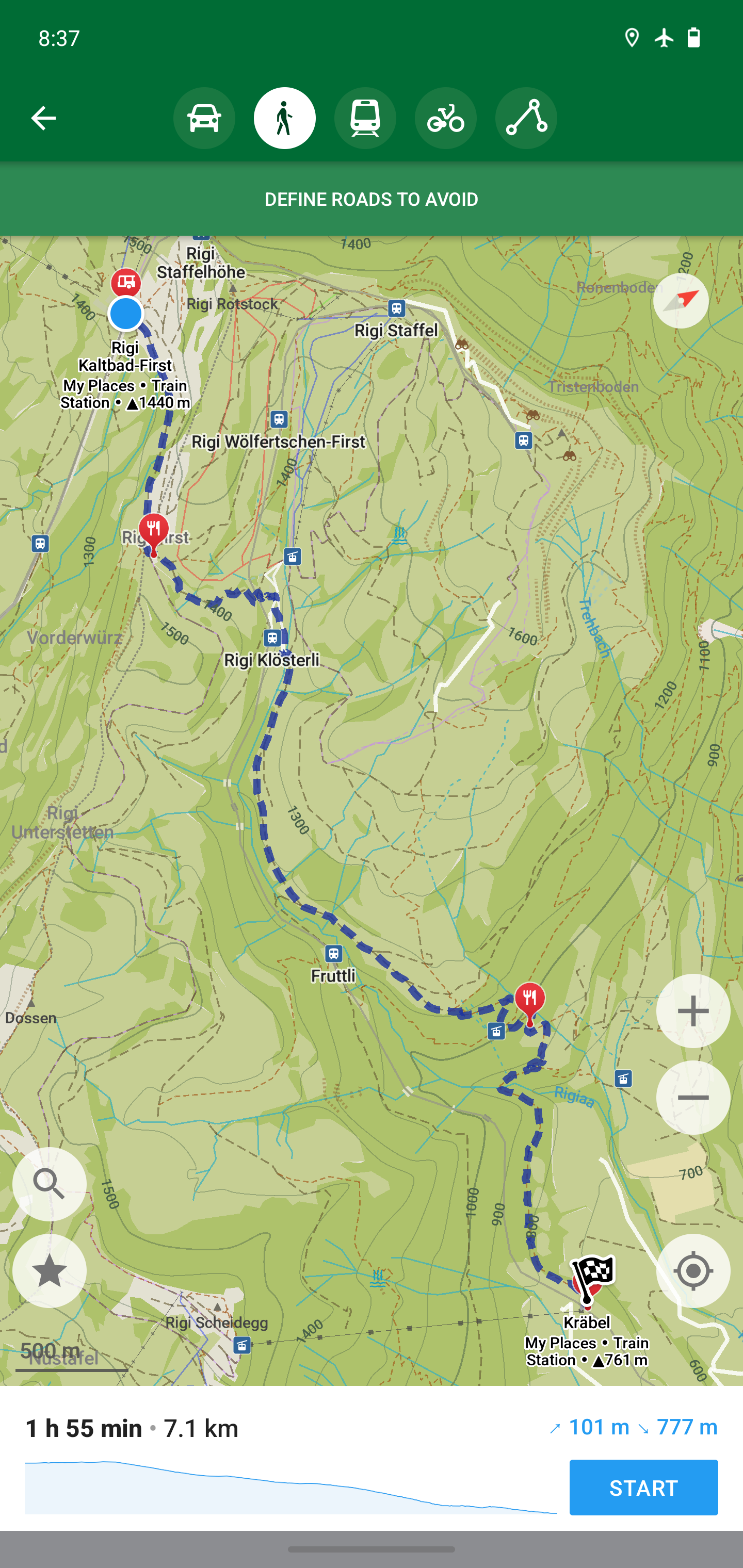 https://organicmaps.app/images/screenshots/hiking.jpg
  https://organicmaps.app/images/screenshots/prague.jpg