
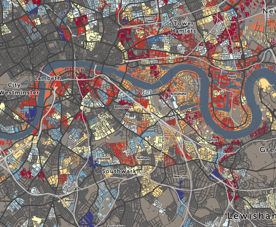
London food hygiene | Caelum Contracts
▻http://caelumcontracts.com/london-food-hygiene

London Food Hygiene
Data from food standards agency on businesses based in London
London food hygiene | Caelum Contracts
▻http://caelumcontracts.com/london-food-hygiene
London Food Hygiene
Data from food standards agency on businesses based in London
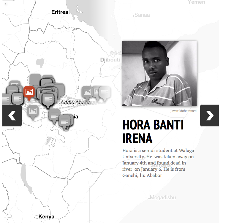
This Interactive Map Plots The Sites Of Possible Ethiopian Government Assassinations Okayafrica.
▻http://www.okayafrica.com/news/oromo-protests-ethiopian-government-assassination-map
ow many protesters have been killed during the recent uprisings against the Addis Ababa master plan?
Two weeks ago in their in-depth primer on the Oromo protests for Okayafrica, Hassen Hussein and Mohamed Ademo wrote that 40 people had been killed in the government crackdown. Human Rights watch estimates that 140 Oromo protesters have been killed since November 2015. One thing’s for sure, the Ethiopian government’s figure of 5 deaths is, to put it mildly, too low.
Pumped Dry: The Global Crisis of Vanishing Groundwater - USA TODAY
▻http://www.usatoday.com/pages/interactives/groundwater
Much of the planet relies on groundwater. And in places around the world – from the United States to Asia, the Middle East, Africa and Latin America – so much water is pumped from the ground that aquifers are being rapidly depleted and wells are going dry.
Groundwater is disappearing beneath cornfields in Kansas, rice paddies in India, asparagus farms in Peru and orange groves in Morocco. As these critical water reserves are pumped beyond their limits, the threats are mounting for people who depend on aquifers to supply agriculture, sustain economies and provide drinking water. In some areas, fields have already turned to dust and farmers are struggling.
So lange zahlen Sie für eine Eigentumswohnung in Deutschland
▻http://interaktiv.morgenpost.de/wohnungskauf-in-deutschland
Revenu net mensuels des ménages en Allemagne
Ihr Einkommen
Wie viel Geld ist in Ihrem Haushalt monatlich netto verfügbar?
Dwelling Age - Consumer Data Research Centre (CDRC) Maps
The modal building age grouping for residential properties in each area. Calculated from VOA data on the numbers of buildings in each grouping.
Some buildings in each area will have been built in a different age grouping to that shown - each area is coloured according the modal (most populated) group only. Where areas are dominated by two groupings, the second one is coloured in stripes. See this blog post with info.
▻http://maps.cdrc.ac.uk/#/metrics/dwellingage/default/BTTTFTT/12/-1.4999/52.1237
Classifications are an average across the local area, rather than for individual houses, therefore the colour coding on a building is not necessarily indicative of that building.
Contains National Statistics & Ordnance Survey data © Crown copyright & database right 2014-5.
Worldwide Air Pollution Map and live air quality levels
Why They Left
▻http://interactive.fusion.net/why-they-left
#cartographie_dynamique ou #cartographie_interactive intéressante, minimaliste montrant les itinéraires and for once "arrow free ! :)
Why They Left
A look at six refugees and their journeys to freedom as told to Fusion
They flee war, dictatorships, instability, abuse, and poverty - sometimes all of the above. The journey can be treacherous, and even when they make it, these mostly young men face hostility, scarce resources, and often detention at the other end. They are among the millions of people who have fled in recent years from countries like Syria, Eritrea, Nigeria, Iran, and the Democratic Republic of Congo. Here is a glimpse of their journeys.

Mapping the Deaths of Protesters in Ethiopia · Global Voices
▻https://globalvoices.org/2016/01/11/mapping-the-death-of-student-protesters-in-ethiopia
Since the beginning of November 2015, at least 140 peaceful protesters have been killed in Ethiopia according to Human Rights Watch. Photo and video evidence suggests that most of the people were killed by bullets fired at close range.
There are also reports by Oromo rights activists indicating that at least 10 individuals died from torture inflicted while they were in prisons.
University students, women, farmers and school teachers have all been victims of government violence.
Among the dead, more than 70% are male students. Male farmers account for about 20% of the deaths.
The remainder are women. A seven-month pregnant woman along with her sister-in-law were killed while they were running away to escape arrest.
It was reported their bodies were discovered in scrub-land days after their disappearance.
Below is an interactive map created by this author with help from Oromo activist Abiy Atomssa. The map lists 111 people that have died during the protests in recent months.
#violences_policières #meurtres #répression #protestation #territoire #cartographie_intéractive
Gene drive gives scientists power to hijack evolution - STAT
▻http://www.statnews.com/2015/11/17/gene-drive-hijack-evolution
 https://farm6.staticflickr.com/5702/22715354214_bff9ae4316_o_d.png
  http://www.statnews.com/wp-content/uploads/2015/11/Mosquito_GettyImages-1024x576.jpg
 As soon as Harvard biologist Kevin Esvelt began reading the scientific paper, he had a desperate question: Who are these guys?
The authors had used a controversial new molecular technique to try to force a certain gene to be inherited by all of a fruit fly’s offspring. Confounding a basic principle of genetics, they had succeeded. Nearly every one of the young flies carried the gene, for yellow pigmentation.
While turning a bunch of flies yellow may sound innocuous, “gene drives” — as biologists call the cellular machinery that guarantees inheritance — have enormous potential promise as well as risks. Because gene drives could rapidly propagate novel DNA through an entire population in the wild, they could be used, proponents say, to eradicate marauders such as the cane toads overrunning Australia. They might make mosquitoes resistant to the microbes that cause malaria or dengue fever, or even block the gene that makes locusts swarm, saving millions of tons of crops every year.
#cartographie #cartographie_interactive #cartographie_dynamique
#santé
Militancy in Mali : Conflict map — IRIN
►http://newirin.irinnews.org/dataviz/2015/11/20/map-of-conflict-in-mali-2015
In August this year, Mali experienced some of the worst violence since international forces pushed Islamist militants out of their northern strongholds in January 2013. The upsurge included a high-profile attack by al-Qaeda-linked Islamists on a popular hotel frequented by UN officials that left 13 people dead. Read more here.
#cartographie #cartographie_interactive #cartographie_dynamique
#mali #conflits

The American cities that are growing the fastest, mapped in 3D
▻http://knowmore.washingtonpost.com/2015/11/18/a-3d-map-shows-what-american-cities-are-growing-the-fastest
Le retour des pics :) cc @fil
Howmuch.net, a cost Web site, recently published this interesting new look at which American cities saw the fastest economic growth last year. In the 3D map above, the cities that are growing the fastest have green cones shooting out of them, while those that saw their economies contract are marked in red. The data comes from the Bureau of Economic Analysis‘ statistics on gross domestic product by metropolitan area for 2014.
#cartographie #cartographie_interactive #cartographie_dynamique #états_unis #économie
Small multiples vs. animated GIFs for showing changes in fertility rates over time | Dr. Randal S. Olson
▻http://www.randalolson.com/2015/08/23/small-multiples-vs-animated-gifs-for-showing-changes-in-fertility-rates
 http://www.randalolson.com/wp-content/uploads/usa-vs-japan-fertility-rates-small-multiple-subset.png
 A couple weeks ago, Stephen Holzman shared an animated GIF on /r/DataIsBeautiful that caught my eye. The GIF showed the evolution of fertility rates of the U.S. and Japan between 1947 and 2010, which starts right in the middle of the post-WWII Baby Boom and follows the gradual decline of Japan’s fertility rates, which has led to somewhat of a population crisis for Japan.
#cartographie #cartographie_interactive #cartographie_dynamique #démographie #santé #taux_de_fertilité #population #indicateurs
HIV Worldwide 1990-2013 | IHME Viz Hub
▻http://vizhub.healthdata.org/hiv
#cartographie #cartographie_interactive #cartographie_dynamique #santé #sida #hiv
Map : Vaccine-Preventable Outbreaks | Introduction
▻http://www.cfr.org/interactives/GH_Vaccine_Map/index.html?cid=nlc-news_release-news_release--link2-20141023&sp_mid=47257856&sp
Vaccine-Preventable Outbreaks
#cartographie #cartographie_interactive #cartographie_dynamique #santé #vaccins
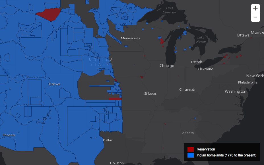
The Invasion of America: How the United States Took Over an Eighth of the World
▻http://invasionofamerica.ehistory.org/#0
Between 1776 and 1887, the United States seized over 1.5 billion acres from America’s indigenous people by treaty and executive order. Explore how in this interactive map of every Native American land cession during that period.
To watch the United States expand across the continent, click the movie icon in the top right. Use the slider below to see how things changed year to year.
Click on any area of the map to see who ceded the land and when. Popup boxes contain links to treaty text.
Find your home or a different address by clicking the target icon at the top right.
Use the “Highlight By Nation” box to find all cessions by the Cherokee, the Sioux, or any other people.
Select source maps to see nineteenth-century maps of land cessions.
#cartographie #cartographie_interactive #cartographie_dynamique #états_unis #histoire #colonisation #colonialisme #peuples_premiers #peuples_autochtones
Every Disputed Territory in the World [Interactive Map]
▻http://metrocosm.com/disputed-territories-map.html
#cartographie #cartographie_interactive #cartographie_dynamique #frontières #conflits_frontaliers
Mapping how the United States generates its electricity - Washington Post
►http://www.washingtonpost.com/graphics/national/power-plants
le WP a encore frappé avec ce projet époustouflant sur les sources de production de l’électricité aux Etats-Unis.
Signalé par Mycle Schneider dans un email.
Mapping how the United States generates its electricity
Coal and natural gas are the most common sources for electricity in the country, but coal represents a declining share. The new Clean Power Plan seeks to accelerate that trend by requiring power plants to cut carbon pollution levels and rewarding states and companies that embrace clean sources of energy. Story: White House set to adopt sweeping curbs on carbon pollution
#états-unis #énergie #électricité #visualisation #cartographie_interactive

The Color of Debt: How Collection Suits Squeeze Black Neighborhoods - ProPublica
▻https://www.propublica.org/article/debt-collection-lawsuits-squeeze-black-neighborhoods
Yolonda Fountain Henderson, 50, was elected last spring as the city’s first black mayor.
On the screen was a list of every debt collection lawsuit against a resident of her city, at least 4,500 in just five years. Henderson asked to see her own street. On her block of 16 modest ranch-style homes, lawsuits had been filed against the occupants of eight. “That’s my neighbor across the street,” she said, pointing to one line on the screen.
And then she saw her own suit.
(...)
super #enquête avec #photographie, #cartographie_interactive etc.
(toute ressemblance avec un roman de Norman Spinrad…)

Gaza. une carte interactive reprend les attaques israéliennes de l’été 2014 - Amnesty International Belgique Francophone
Amnesty International et Forensic Architecture ont dévoilé mercredi 8 juillet un outil d’investigation en ligne, qui dresse la carte des attaques israéliennes contre Gaza durant le conflit de juillet et août 2014. Il a pour but de contribuer à faire pression afin que les responsables présumés de crimes de guerre et d’autres violations du droit international humanitaire rendent compte de leurs actes.
La Plateforme Gaza permet à l’utilisateur d’explorer et d’analyser les données concernant l’offensive militaire menée par Israël à Gaza en 2014. Les données préliminaires actuellement rassemblées sur la Plateforme, qui sera mise à jour au cours des prochains mois, mettent en lumière dans les attaques israéliennes des pratiques systématiques indiquant que des violations graves et systémiques ont été commises.
▻http://www.amnesty.be/doc/s-informer/actualites-2/article/gaza-une-carte-interactive-reprend
▻https://gazaplatform.amnesty.org
Mapping Media Freedom in Europe
▻https://mappingmediafreedom.org
Je n’avais pas encore vu cette carte interactive/participative. C’est intéressant.
Index on Censorship, European Federation of Journalists and Reporters Without Borders are joining forces to map the state of media freedom in Europe. With your participation, we are mapping the violations, threats and limitations that European media professionals, bloggers and citizen journalists face everyday. We are also collecting feedback on what would support journalists in such situations. This mapping project covers European Union member states and candidates for entry. Help protect media freedom and democracy by contributing to this crowd-sourcing effort.
#liberté #presse #médias #censure #cartographie_dynamique #cartographie_interactive
How to make an Animated InfographicVizWorld.com | VizWorld.com
▻http://www.vizworld.com/2015/05/how-to-make-an-animated-infographic/#sthash.KM4SiL3c.dpbs
How to make an Animated Infographic
by Dean Meyers on May 1, 2015
Here’s a how-to on creating animation from TabletopWhale, utilizing Photoshop to build repeating cycle style art. This example applies this type of animation to scientific processes, but it could easily work to visualize any process that is repetitive, from seasonal activity to a manufacturing process.
The organization of the graphic launches you into the technical method way before it talks about planning the project, which might not be the idea method of starting, but it does give you the underlying technique right up front. This will be helpful if you’ve never created animated GIFs before, or if you aren’t familiar with cell frame animation, the most basic kind of 2D animation technique.
The author takes the classic “bouncing ball” animation, (usually taught either with or after a “walking cycle” as animation 101), and makes it a bouncing heart instead, to keep the theme related to biological science–although bouncing hearts are more in the realm of animated cartoons than scientific animations.
#cartographie #cartographie_animée #cartographie_interactive

Jerry Gretzinger a débuté cette oeuvre en 1963. Trente ans plus tard nous pouvons découvrir cette incroyable cartographie artistique... (via Keir Clarke et twitter)
▻http://googlemapsmania.blogspot.fr/2015/05/it-took-30-years-to-draw-this-map.html
Using Jerry’s Map you can zoom in on any of the over 3,200 eight by ten inch panels of the original paper map. Jerry estimates that he has averaged about 20 minutes a day over 30 years working on the map. He says,
“That would come to 456.25 days or 1 year and 3 months. To have ’wasted’ 15 months of my 70 years and nine months doesn’t seem too bad.”
How long will you spend in examining the new interactive version of Jerry’s Map?

Le Rhône, la renaissance d’un fleuve | ARTE
▻http://www.arte.tv/guide/fr/049462-000/le-rhone-la-renaissance-d-un-fleuve?autoplay=1
A visionner pendant deux jours encore sur ARTE+7. C’est magnifique et très intéressant même si l’économie politique de ce projet n’est abordée que marginalement (mais quand même, les barrages hydroélectriques et les centrales nucléaires). Ce sont mes collègues directs qui font cela, chapeau !
En décembre 2003, la montée rapide des eaux hivernales du Rhône vire au drame. Le fleuve casse des digues, tue des gens et en déplace des milliers d’autres. C’est le choc. On pensait le fleuve sous contrôle mais un constat stupéfiant s’impose : l’aménagement frénétique et anarchique du fleuve pour le dompter et l’asservir à nos besoins est en partie responsable de la catastrophe. Trop de digues, trop de barrages, trop de béton, de routes et de voies ferrées l’enserrent. Dénaturé dans ses paysages et appauvri dans sa biodiversité, le Rhône redevient même dangereux pour les hommes. On décide alors de le « restaurer ».
Le Rhône mis à nu
À travers le récit de cette passionnante aventure écologique et scientifique, le film se fait l’écho d’une belle idée qui s’impose dans le monde entier : redonner aux fleuves aménagés un peu d’espace et la liberté dont ils ont besoin. Aux côtés des chercheurs, nous perçons la surface des eaux, traversons le miroir et plongeons au sens propre comme au figuré dans les eaux tumultueuses du Rhône. Une étonnante exploration commence alors. Ce documentaire nous convie à la découverte d’un véritable organisme fluvial, un objet vivant, mouvant, beau et complexe, que la caméra explore dans toutes ses dimensions. L’occasion de mieux comprendre ce que devrait être le fleuve de demain.
#écologie #fleuve #ingénierie_environnementale #cartographie
Jewish Settlements: Interactive maps & graphics
▻http://fanack.com/en/countries/palestine/in-depth/jewish-settlements/interactive-maps-graphics
Superbes cartes interactives, effet très réussi.
Fanack has created a series of maps and graphics, several of which are interactive. They show the spread of the Jewish settlements throughout the West Bank since the occupation by Israel of the West Bank in 1967, as well as the increase in the number of Jewish settlers since then.
#palestine #israël #occupation #colonisation #cisjordanie #cartographie_interactive #cartographi #visualisation

Tunisie. Cartographier le lobbying, l’ambitieux projet de lobby-leaks
▻http://www.lecourrierdelatlas.com/836301122014Tunisie.-Cartographier-le-lobbying-l-ambitieux-proje
Dans la jeune démocratie tunisienne, si informer est devenu plus aisé depuis la révolution, l’épineuse question du lobbying politico-financier ne fait pas exception au reste du monde quant à l’opacité qui entoure ses acteurs. Pour tenter de pallier ce déficit de transparence, des internautes tunisiens ont créé « lobby-leaks.com », vaste cartographie interactive conçue telle une plateforme d’informations sur le fonctionnement des centres de décision et les rapports souvent enchevêtrés qui les lient. - See more at : ▻http://www.lecourrierdelatlas.com/836301122014Tunisie.-Cartographier-le-lobbying-l-ambitieux-proje


