


How to pick the least wrong colors || Matthew Ström, designer-leader
An #algorithm for creating #color_palettes for #data_visualization
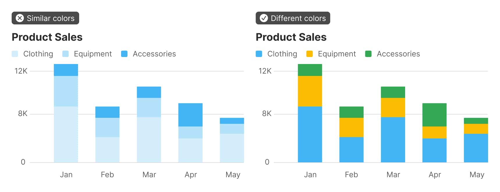
The problem boiled down to this: how do I pick nice-looking colors that cover a broad set of use cases for categorical data while meeting accessibility goals?
The criteria for success are threefold:
– The colors should look nice. In my case, they need to be similar to Stripe’s brand colors.
– The colors should cover a broad set of use cases. In short, I need lots of colors in case I have lots of categories.
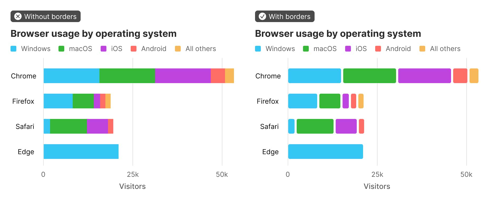
– The colors should meet accessibility goals. WCAG 2.2 dictates that non-text elements like chart bars or lines should have a color contrast ratio of at least 3:1 with adjacent colors.
I’ve made the source code for the algorithm available here — please take a look and let me know if you have ideas for how to improve the method. A month’s worth of nights and weekends exploring the problem might seem like overkill to end up here. But maybe these 4,000 words can help spark more journeys.
▻https://github.com/ilikescience/category-colors
Avec des morceaux de maths dedans, ça pourrait plaire à @fil :)


