Seenthis
•
 
Identifiants personnels
  • [mot de passe oublié ?]

 
  • #c
  • #co
  • #con
  • #cont
  • #contras
RSS: #contrast

#contrast

  • #contrastes
  • #contraste_simultané
  • #contrasts
  • #contrastfinder
  • #contrast_checkers
  • #contrasto_onorato
0 | 25
  • @b_b
    b_b @b_b PUBLIC DOMAIN 19/05/2026
    1
    @cy_altern
    1

    contrast() | CSS-Tricks
    ▻https://css-tricks.com/almanac/functions/c/contrast

    Making product card images pop on hover

    Another useful application for contrast() is to highlight an image in a user’s interaction. For example, in a row of image cards, we could increase the image’s contrast and also scale it on hover

    .card img {
      transition:
        filter 0.4s ease,
        transform 0.4s ease;
    }
    
    .card:hover img {
      filter: contrast(125%);
      transform: scale(1.05);
    }

    #css #contrast #effet #hover

    b_b @b_b PUBLIC DOMAIN
    Écrire un commentaire
  • @cdb_77
    CDB_77 @cdb_77 5/02/2026

    Vieni via con me

    https://www.feltrinellieditore.it/media/copertina/quarta/32/9788807880032_quarta.jpg.800x800_q75.jpg

    “Raccontare come stanno le cose vuol dire non subirle”

    Otto capitoli, otto storie, un ritratto unico dell’Italia di oggi firmato dall’autore del bestseller internazionale Gomorra. Roberto Saviano scava dentro alcune delle ferite vecchie e nuove che affliggono il nostro Paese: il mancato riconoscimento del valore dell’Unità nazionale, il subdolo meccanismo della macchina del fango, l’espansione della criminalità organizzata al Nord, l’infinita emergenza rifiuti a Napoli, le troppe tragedie annunciate. Accanto alla denuncia c’è anche il racconto – commosso e ammirato – di vite vissute con onestà e coraggio: la sfida senz’armi di don Giacomo Panizza alla ’ndrangheta calabrese, la lotta di Piergiorgio Welby in nome della vita e del diritto, la difesa della Costituzione di Piero Calamandrei. Esempi su cui possiamo ancora contare per risollevarci e costruire un’Italia diversa.
    Ideato e condotto da Roberto Saviano e Fabio Fazio, Vieni via con me è stato l’evento televisivo degli ultimi anni, più seguito delle partite di Champions League e dei reality show. Ora è anche un libro che racconta queste storie in una forma ampiamente rivista e arricchita. Facendole diventare, ancora una volta, storie di tutti.

    ▻https://www.feltrinellieditore.it/opera/vieni-via-con-me-1
    #livre #Roberto_Saviano
    #démocratie #macchina_del_fango #démocratie #délégitimation #martiri_di_Cerace #Locride #mafia #liberté_d'expression #Giovanni_Falcone #Rocco_Chinnici #honneur #baptême #picciotto_d'onore #fratelli_di_sangue #contrasto_onorato #rites #giuramento #hiérarchie #Polsi #bunker #déchets #écomafia #sous-sol #Compare_Nuzzo #Carmelo_Novella #mariages #Aspromonte #Madonna_delle_Montagne #Domenico_Oppedisano #Vincenzo_Mandalari #Pino_Neri #Pasquale_Zappia #Carlo_Antonio_Chiriaco #contrôle_du_territoire #Gianfranco_Miglio #répression #restauration #aménagement_du_territoire #sous-traitance #appels_d'offre #Naples #Terra_dei_Fuochi #Naples #ecoballe #Impregeco #Ce4 #Casalesi #Na1 #Na3 #Fibe #Impregilo #Nicola_Cosentino #camorra #écomafia #Villaricca #Operazione_Mosca #Sergio_Orsi #Michele_Orsi #Eco4 #Caserta #santé_publique #cancer #Parco_del_Vesuvio #Terzigno #Giacomo_Panizza #Don_Giacomo #Torcasio #Giampà #Giovanni_Torcasio #Lamezia_Terme #Progetto_Sud #Antonio_Torcasio #L'Aquila #tremblement_de_terre #Casa_dello_Studente #élections

    CDB_77 @cdb_77
    Écrire un commentaire
  • @b_b
    b_b @b_b PUBLIC DOMAIN 31/08/2023
    8
    @monolecte
    @sandburg
    @ericw
    @jeanmarie
    @rastapopoulos
    @7h36
    @bouts
    @alexcorp
    8

    Designing Accessible Text Over Images: Best Practices, Techniques, And Resources — Smashing Magazine
    ▻https://www.smashingmagazine.com/2023/08/designing-accessible-text-over-images-part1
    ▻https://www.smashingmagazine.com/2023/08/designing-accessible-text-over-images-part2

    https://files.smashing.media/articles/designing-accessible-text-over-images-part1/smashing-text-over-images-technique-overlay.jpg https://files.smashing.media/articles/designing-accessible-text-over-images-part1/smashing-text-over-images-technique-scrim.jpg https://files.smashing.media/articles/designing-accessible-text-over-images-part1/smashing-text-over-images-technique-strips.jpg https://files.smashing.media/articles/designing-accessible-text-over-images-part1/smashing-text-over-images-technique-space.jpg https://files.smashing.media/articles/designing-accessible-text-over-images-part1/smashing-text-over-images-technique-blur.jpg https://files.smashing.media/articles/designing-accessible-text-over-images-part2/smashing-text-over-images-technique-frame.jpg https://files.smashing.media/articles/designing-accessible-text-over-images-part2/smashing-text-over-images-technique-soft-colored-gradients.jpg https://files.smashing.media/articles/designing-accessible-text-over-images-part2/smashing-text-over-images-technique-placement.jpg https://files.smashing.media/articles/designing-accessible-text-over-images-part2/smashing-text-over-images-technique-shapes.jpg https://files.smashing.media/articles/designing-accessible-text-over-images-part2/smashing-text-over-images-technique-gradients.jpg

    #CSS #gradient #Images #Text

    En complément de ▻https://seenthis.net/messages/924372

    b_b @b_b PUBLIC DOMAIN
    • @rastapopoulos
      RastaPopoulos @rastapopoulos CC BY-NC 1/09/2023

      #accessibilité #lisibilité #contraste #dégradé #intégration #web

      RastaPopoulos @rastapopoulos CC BY-NC
    Écrire un commentaire
  • @b_b
    b_b @b_b PUBLIC DOMAIN 6/02/2023
    8
    @jeanmarie
    @biggrizzly
    @sandburg
    @gblin
    @rastapopoulos
    @hassan_nya
    @ericw
    @cy_altern
    8

    Visual #design #rules you can safely follow every time
    ▻https://anthonyhobday.com/sideprojects/saferules

    You do not have to follow these rules every time. If you have a good reason to break any of them, do. But they are #safe to follow every time.

    – Use near-black and near-white instead of pure black and white
    – Saturate your neutrals
    – Use high #contrast for important elements
    – Everything in your design should be deliberate
    – Optical #alignment is often better than mathematical alignment
    – Lower letter spacing and line height with larger #text. Raise them with smaller text
    – Container borders should contrast with both the container and the background
    – Everything should be aligned with something else
    – #Colours in a palette should have distinct brightness values
    – If you saturate your neutrals you should use warm or cool colours, not both
    – Measurements should be mathematically related
    – Elements should go in order of visual weight
    – If you use a horizontal grid, use 12 columns
    – #Spacing should go between points of high contrast
    – Closer elements should be lighter
    – Make drop shadow blur values double their distance values
    – Put simple on complex or complex on simple
    – Keep container colours within brightness limits
    – Make outer padding the same or more than inner padding
    – Keep body text at 16px or above
    – Use a line length around 70 characters
    – Make horizontal #padding twice the vertical padding in buttons
    – Use two #typefaces at most
    – Nest corners properly
    – Don’t put two hard divides next to each other

    b_b @b_b PUBLIC DOMAIN
    • @sandburg
      Sandburg @sandburg CC BY-SA 6/02/2023

      #ux Finitions.
      J’ai l’impression qu’on redit toujours un peu les même choses depuis 15 ans.
      Et surtout que ce sont les pratiques de PAO qui débouchent sur le web.

      Sandburg @sandburg CC BY-SA
    • @cy_altern
      cy_altern @cy_altern CC BY-SA 7/02/2023

      #saferules #design_system #webdesign

      cy_altern @cy_altern CC BY-SA
    Écrire un commentaire
  • @b_b
    b_b @b_b PUBLIC DOMAIN 27/08/2021
    6
    @tofulm
    @rastapopoulos
    @ericw
    @suske
    @gblin
    @astier
    6

    Discover the best Apps for GNOME – Apps for GNOME
    ▻https://apps.gnome.org/en
    ▻https://apps.gnome.org/assets/overview.svg

    Discover the best applications in the GNOME ecosystem and learn how to get involved.
    Apps featured in this curated overview are all built with the GNOME philosophy in mind. They are easy to understand and simple to use, feature a consistent and polished design and provide a noticeable attention to details.

    Wow, un site de présentation des applications “à la gnome” dans lequel je découvre quelques trucs que je ne connaissais pas :

    Curtail is an useful #image #compressor, supporting PNG, JPEG and WEBP file types.
    ▻https://apps.gnome.org/app/com.github.huluti.Curtail

    Apostrophe is a GTK based distraction free #Markdown #editor, originally created by Wolf Vollprecht and maintained by Manuel Genovés. It uses pandoc as backend for markdown parsing and offers a very clean and sleek user interface.
    ▻https://apps.gnome.org/app/org.gnome.gitlab.somas.Apostrophe

    #Webfont Kit #Generator is a simple utility that allows you to generate woff, woff2 and the necessary CSS boilerplate from non-web font formats (otf and ttf).
    ▻https://apps.gnome.org/app/com.rafaelmardojai.WebfontKitGenerator

    #Contrast checks whether the contrast between two colors meet the #WCAG requirements.
    ▻https://apps.gnome.org/app/org.gnome.design.Contrast

    Et plein d’autres à découvrir !

    b_b @b_b PUBLIC DOMAIN
    • @rastapopoulos
      RastaPopoulos @rastapopoulos CC BY-NC 28/08/2021

      Trop bien pour Apostrophe, j’ai utilisé pendant des années un éditeur MD du même auteur mais qu’il n’avait pas fait du tout en GTK, donc là trop bien c’est plus fluide et rapide

      RastaPopoulos @rastapopoulos CC BY-NC
    • @rastapopoulos
      RastaPopoulos @rastapopoulos CC BY-NC 28/08/2021

      Par contre tout est en flatpak, et du coup faut l’installer en plus pour la logithèque (ce qui n’est pas le cas par défaut sur Ubuntu). Et ça prend cent fois plus de place.

      RastaPopoulos @rastapopoulos CC BY-NC
    Écrire un commentaire
  • @val_k
    ValK. @val_k CC BY-NC-SA 8/08/2021

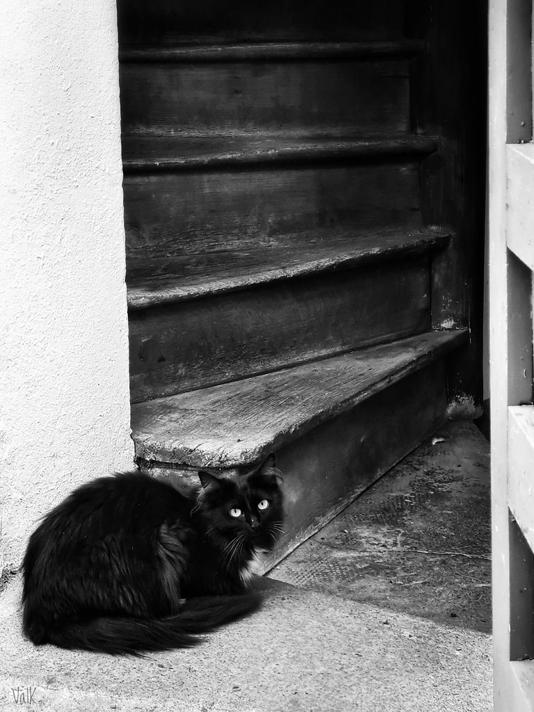
    Joyeuse Journée internationale du Chat !
    #JourneeInternationaleDuChat !
    #InternationalCatDay !
    #DiaDelGato 😻
    ▻https://www.flickr.com/photos/valkphotos/51365175323

    Flickr

    ValK. a posté une photo :

    #Nantes, 8 août 2021.
    .
    Toutes les photos de « Bestiaire » : ▻https://vu.fr/valk-bestiaire
    .
    ¤ autres photos : vu.fr/valkphotos
    (i) infos : twitter.com/valkphotos
    ¿ audios : frama.link/karacole
    ☆ oripeaux : frama.link/kolavalk
    ◇ rdv locaux : 44.demosphere.net
    ♤ me soutenir : liberapay.com/ValK
    .
    📷 #photo #photography #foto #photodujour #picoftheday #pictureoftheday #photooftheday #fotodeldia :cat2 :‍:black_large_square : #chat #kazh #cat #gato #katico #chatnoir #kazhdu #blackcat #gatonegro #nigrakato #NetB #noiretblanc #blackandwhite #blancoynegro #blanquinegro #nigrblanka #contrasts #contrastes (...)

    https://live.staticflickr.com/65535/51365175323_d785ab96ce_b.jpg

    ValK. @val_k CC BY-NC-SA
    Écrire un commentaire
  • @b_b
    b_b @b_b PUBLIC DOMAIN 29/07/2021
    5
    @cy_altern
    @kent1
    @jeanmarie
    @george
    @rastapopoulos
    5

    Handling #Text Over #Images in #CSS - Ahmad Shadeed
    ▻http://ishadeed.com/article/handling-text-over-image-css

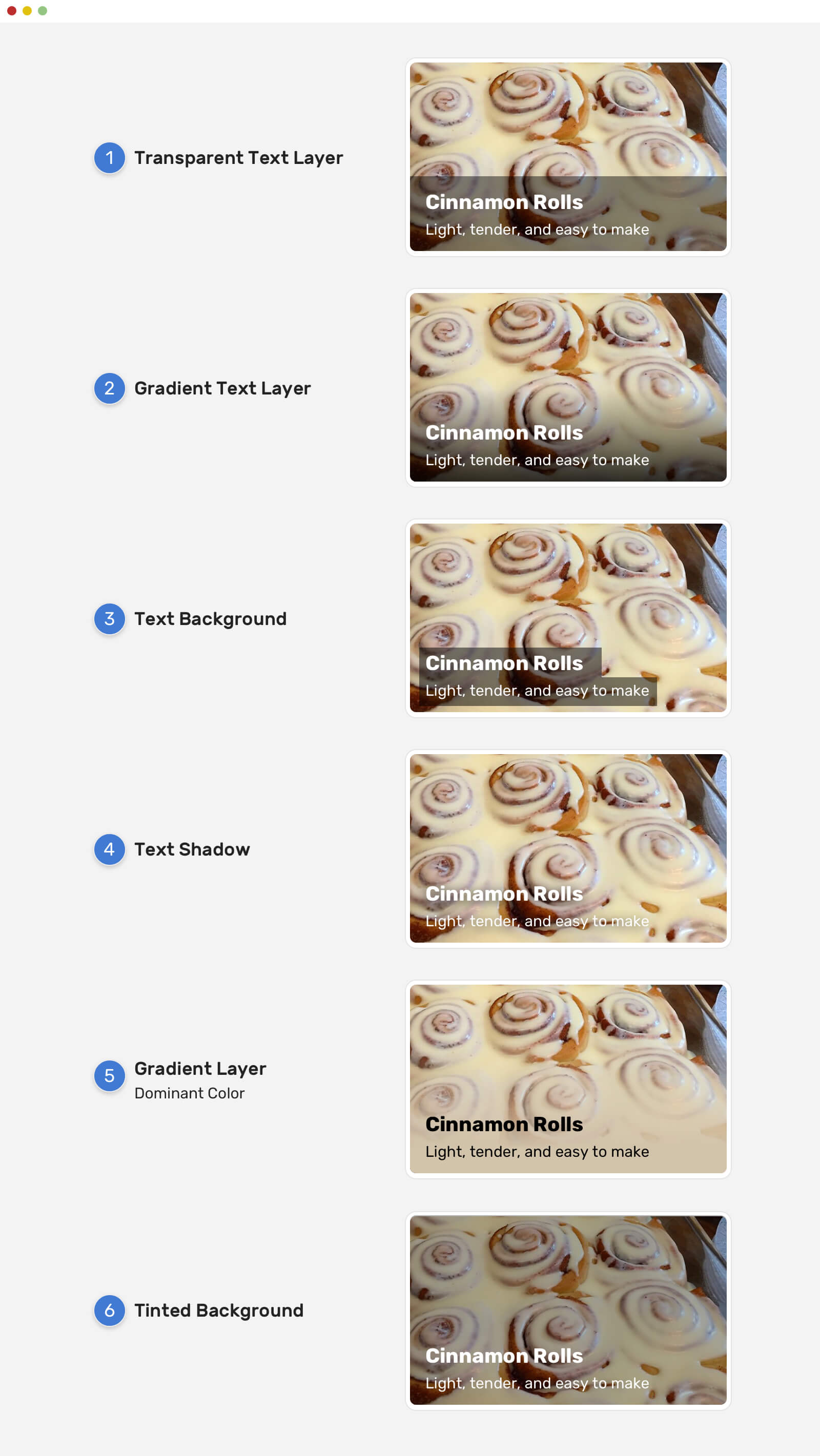
    https://ishadeed.com/assets/text-image/text-image-solutions.jpg

    You might come across a UI component that has text above an image. In some cases, the text will be hard to read depending on the image being used. There are some different solutions like adding a #gradient overlay, or a tinted background image, text-shadow, and others.

    b_b @b_b PUBLIC DOMAIN
    • @rastapopoulos
      RastaPopoulos @rastapopoulos CC BY-NC 29/07/2021

      #accessibilité #lisibilité #contraste #dégradé #intégration #web

      RastaPopoulos @rastapopoulos CC BY-NC
    • @arno
      ARNO* @arno ART LIBRE 30/07/2021

      Ça c’est le truc le plus fun dans mon boulot : tu peux être certain que quand le graphiste propose les maquettes au client où il y a du texte sur des images, il va à tous les coups choisir la plus belle image possible, avec de très beaux aplats de couleur (la mer bleue jusqu’à l’horizon, un grand champ de blé bien flou au premier plan…) sur lesquels il prendra bien soin d’installer son texte. Oh c’est beau. Et la première image que le client mettra en ligne sera évidemment une photo super-moche, avec des micro-contrastes épouvantables partout, et parfois même (oh joie) déjà du texte dans l’image elle-même. Évidemment le texte devient illisible, et c’est à toi de trouver fissa une solution magique.

      L’autre caractéristique du texte sur une image, c’et que c’est souvent dans des blocs de dimensions fixes. Et là encore, le graphiste va soumettre des maquettes où les titre sont « Lorem ipsum », ou « Ici le titre ». Et le premier article que le client va publier sera titré « En réponse à la question posée par un interlocuteur à propos de la posture de notre entreprise quant au truc au nom duquel qu’on se positionne ». Et forcément, ça tient pas (mais le client veut désormais que ça tienne sans avoir à raccourcir son titre, tu penses bien).

      (Et je pourrais ajouter que, même dans les exemples illustrés de l’article ci-dessus, on n’échappe généralement pas à des problèmes de lisibilité et d’accessibilité avec ces différentes solutions. C’est assez chiant, mais si on fait dans le subtile et joli comme ci-dessus, on sera toujours très très limite sur le contraste et la lisibilité, et donc l’accessibilité.)

      ARNO* @arno ART LIBRE
    • @rastapopoulos
      RastaPopoulos @rastapopoulos CC BY-NC 30/07/2021

      C’est pour ça qu’on demande toujours un droit de regard sur les maquettes graphiques, pour faire des commentaires ergo/accessibilité :)

      RastaPopoulos @rastapopoulos CC BY-NC
    Écrire un commentaire
  • @val_k
    ValK. @val_k CC BY-NC-SA 21/07/2021
    5
    @arno
    @mad_meg
    @7h36
    @vazi
    @vanderling
    5

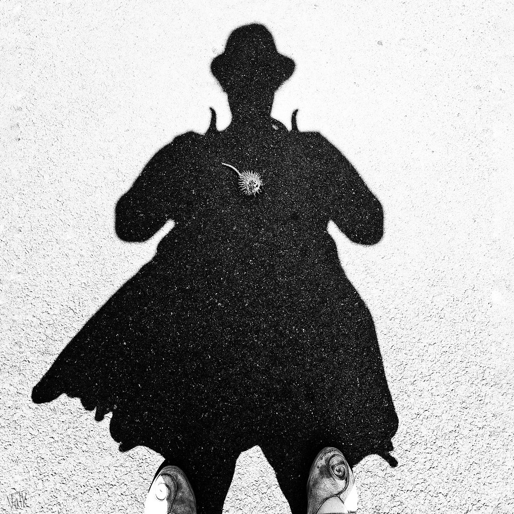
    Ça pique !
    .
    Autoportrait. Nantes, 21 juillet 2021.
    ▻https://www.flickr.com/photos/valkphotos/51326868503

    Flickr

    ValK. a posté une photo :

    Autoportraits : ►https://vu.fr/valk-autoportraits
    .
    ¤ autres photos : vu.fr/valkphotos
    (i) infos : ►https://twitter.com/valkphotos
    ¿ audios : frama.link/karacole
    ☆ oripeaux : frama.link/kolavalk
    ◇ rdv locaux : 44.demosphere.net
    ♤ me soutenir : liberapay.com/ValK
    .
    #photo #photography #foto #photodujour #picoftheday #pictureoftheday #photooftheday #fotodeldia #autoportrait #selfportrait #autoretrato #NetB #noiretblanc #blackandwhite #blancoynegro #blanquinegro #contrasts #contrastes #graphisme #ombre #tenval #darkness #sombra #silhouette #silueta #bogue #marron #chestnut #burr #boga #castaña #covid #covid19 #covid_19 #vaccin

    https://live.staticflickr.com/65535/51326868503_a6aeb128cf_b.jpg

    ValK. @val_k CC BY-NC-SA
    Écrire un commentaire
  • @val_k
    ValK. @val_k CC BY-NC-SA 5/07/2021

    « Et sinon, vous faites toujours de la photo ? »
    « Oui et non : comme je vous l’ai dit, gaz & tonfas m’ont chassée de la rue. »
    ... Le silence ausculte mon ventre.
    https://www.flickr.com/photos/valkphotos/51292226061

    Flickr

    ValK. a posté une photo :

    #Nantes le 5 juillet 2021
    .
    ☆ série « Sombra » : frama.link/valk-sombra
    .
    ¤ autres photos : vu.fr/valkphotos
    ¿ infos audios : frama.link/karacole
    ☆ oripeaux : frama.link/kolavalk
    ◇ rdv locaux : 44.demosphere.net
    ○ réseaux : twitter.com/valkphotos
    ♤ me soutenir : liberapay.com/ValK
    .
    #photo #photodujour #pictureoftheday #photooftheday #picoftheday #fotodeldia #NetB #noiretblanc #blackandwhite #blancoynegro #blanquinegro #contrasts #contrastes #graphisme #ombre #tenval #darkness #sombra #ViolencesPolicieres #criminalisation

    https://live.staticflickr.com/65535/51292226061_7d6ae38544_b.jpg

    ValK. @val_k CC BY-NC-SA
    Écrire un commentaire
  • @val_k
    ValK. @val_k CC BY-NC-SA 30/05/2021
    2
    @arno
    @odilon
    2

    Autoportree.
    ▻https://www.flickr.com/photos/valkphotos/51213912205

    Flickr

    ValK. a posté une photo :

    Autoportraits : ►https://vu.fr/valk-autoportraits
    .
    ¤ autres photos : vu.fr/valkphotos
    ¿ infos audios : frama.link/karacole
    ☆ oripeaux : frama.link/kolavalk
    ◇ rdv locaux : 44.demosphere.net
    ○ réseaux : twitter.com/valkphotos
    ♤ me soutenir : liberapay.com/ValK
    .
    #photo #photodujour #pictureoftheday #photooftheday #picoftheday #fotodeldia #portraitphotography #autoportrait #selfportrait #autoretrato #NetB #noiretblanc #blackandwhite #blancoynegro #contrasts #contrastes

    https://live.staticflickr.com/65535/51213912205_dbd41e2b78_b.jpg

    ValK. @val_k CC BY-NC-SA
    Écrire un commentaire
  • @val_k
    ValK. @val_k CC BY-NC-SA 10/05/2021

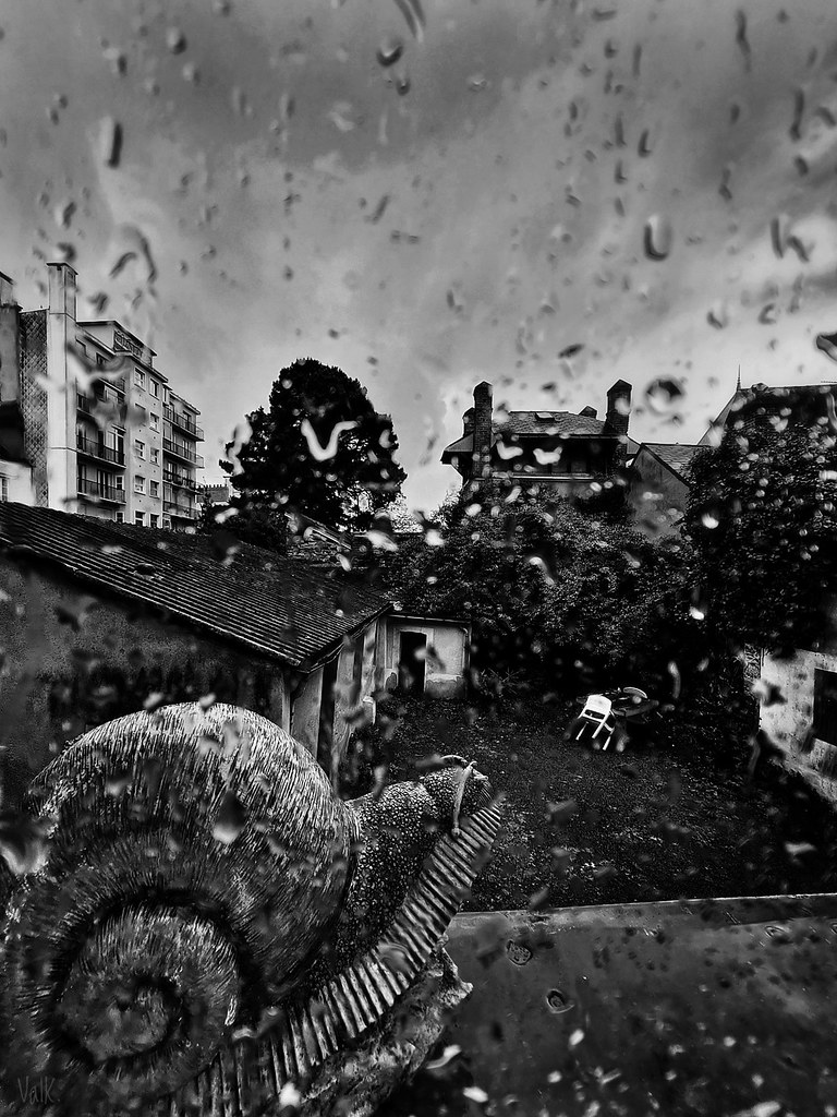
    La petite photo du jour : 4.2.1. Il pleut il mouille c’est la fête à la cagouille !
    ▻https://www.flickr.com/photos/valkphotos/51170461571

    Flickr

    ValK. a posté une photo :

    10 mai 2021, fenêtre, #Nantes.
    .
    #photo #petitephoto #photodujour #pictureoftheday #photooftheday #picoftheday #fotodeldia #escargot #melchwed #snail #caracol #pluie #glav #rain #lluvia #NetB #noiretblanc #blackandwhite #blancoynegro #contrasts #contrastes
    .
    « les petites photos »
    ¤ autres photos : ►https://vu.fr/ValKphotos
    ¿ infos audios : frama.link/karacole
    ☆ oripeaux : frama.link/kolavalk
    ◇ rdv locaux : 44.demosphere.net
    ○ réseaux : twitter.com/valkphotos
    ♤ me soutenir : liberapay.com/ValK

    https://live.staticflickr.com/65535/51170461571_3b47fca004_b.jpg

    ValK. @val_k CC BY-NC-SA
    Écrire un commentaire
  • @val_k
    ValK. @val_k CC BY-NC-SA 23/09/2020

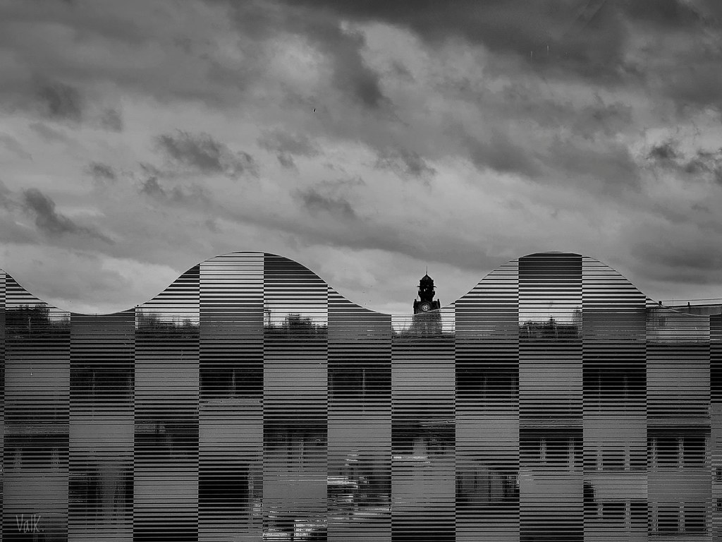
    Il n’y a plus d’après...
    ▻https://www.flickr.com/photos/valkphotos/50375737393

    Flickr

    ValK. a posté une photo :

    ... Ciel d’orage chargé de présences dans les nuages, Nantes, le 19 septembre 2020.
    .
    #Photo : ValK.
    | voir+> ►https://frama.link/valk
    | soutenir+> ►https://liberapay.com/ValK

    #sombra #valk #aigle_noir #ange_blanc #cielo #clouds #contrastes #fronts #noiretblanc #nuages #nubes #orage #sky #storm #tormenta #vision #hommage

    ValK. @val_k CC BY-NC-SA
    • @val_k
      ValK. @val_k CC BY-NC-SA 26/09/2020

      et puis #paraéidolie : il semble que je sois un peu la seule à voir dans les nuages une sorte d’ange en face d’un oiseau noir mais qu’une fois que je l’explique, on « ne voit plus que ça » ! J’ai fait toute une séquence photo sur cette « rencontre » céleste, sa stabilité m’a impressionnée d’autant qu’aucun des deux nuages n’a absorbé ou chassé l’autre.

      ValK. @val_k CC BY-NC-SA
    Écrire un commentaire
  • @eynza
    Eynza @eynza 8/06/2018
    3
    @reka
    @sandburg
    @02myseenthis01
    3

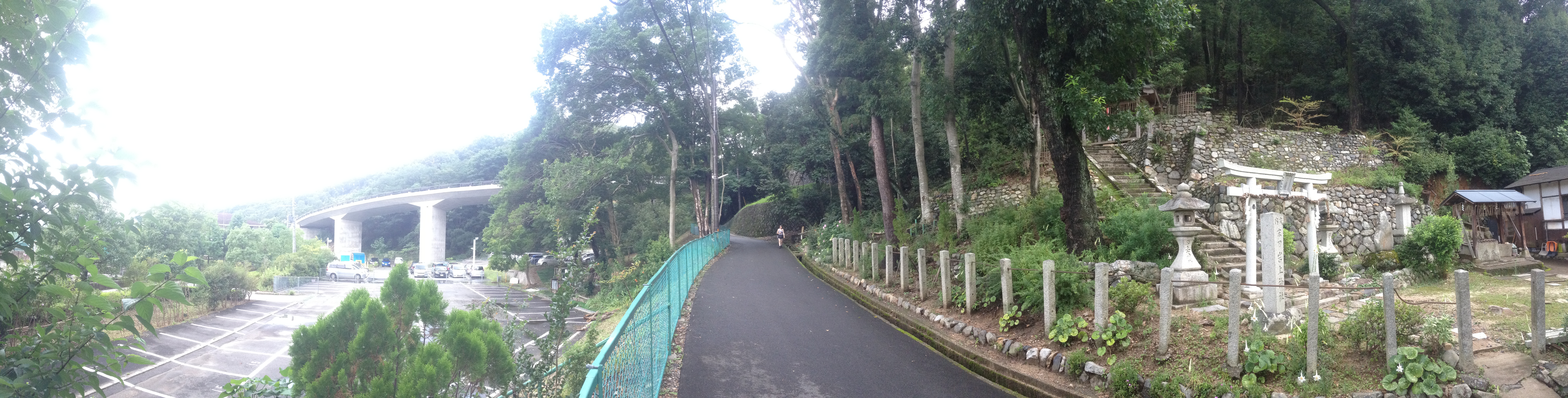
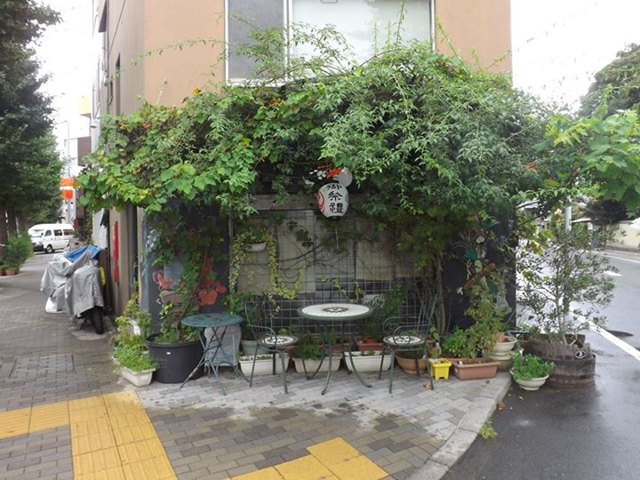
    L’#urbanisation du #Japon, le pays des #possibles, patrie 1 : son #originalité.

    ▻https://www.pop-up-urbain.com/collection-de-curiosites-urbaines-japonaises-2
    Publié le 05/01/2015
    Vu le 07/06/2018

    Pour aborder cette question, nous pouvons d’abord considérer la #ville au Japon par le biais de cet article de Margaux Baldassi qui choisit de nous présenter l’#architecture « disparate » du Japon par la #photographie.

    http://www.pop-up-urbain.com/wp-content/uploads/2014/12/IMG_3093.jpg

    Ainsi, nous découvrons les #contrastes et la place de la #végétation et des #jardins dans les villes #japonaises.

    http://www.pop-up-urbain.com/wp-content/uploads/2014/12/10264536_10154779648475377_4296772546309214681_n.jpg

    Elle évoque également la nécessité de « repousser les #limites » en termes de #construction au Japon, ce qui peut nous faire penser à l’habitat en #montagne et à ses problématiques de constructions comme #d’administration, un sujet traité par cet article d’Hiroshi Tanabe sur Persée.
    ▻https://www.persee.fr/doc/rga_0035-1121_1999_num_87_1_2933
    Vu le 07/06/2018

    D’autre part, elle évoque un autre #voyageur-blogueur auquel nous pourrons plus amplement nous référer dans un second temps.

    Eynza @eynza
    • @philippe_de_jonckheere
      Philippe De Jonckheere @philippe_de_jonckheere CC BY 9/06/2018
      @chezsoi

      cc @chezsoi

      Philippe De Jonckheere @philippe_de_jonckheere CC BY
    Écrire un commentaire
  • @contrastfinder
    Contrast Finder @contrastfinder CC BY-SA 12/09/2017
    10
    @contrastfinder
    @fil
    @asqatasun
    @tartisdm
    @rastapopoulos
    @7h36
    @nicod_
    @lluc
    @02myseenthis01
    @mukt
    10

    Contrast-Finder, c’est un outil en ligne pour trouver les bonnes combinaisons de couleurs (entre le texte et l’arrière plan) afin d’avoir un contraste suffisant pour respecter les critères d’accessibilité (#RGAA, #WCAG).

    la nouvelle version (par les concepteurs de Contrast Finder),
    avec une nouvelle URL :
    ►https://app.contrast-finder.org/?lang=fr

    pour contribuer c’est par ici :
    ►https://github.com/Asqatasun/Contrast-Finder

    pour l’histoire du projet #ContrastFinder, c’est par là :
    ►https://contrast-finder.org/#contrast-finder-history

    #a11y #couleur #contraste #accessibilité

    Contrast Finder @contrastfinder CC BY-SA
    Écrire un commentaire
  • @contrastfinder
    Contrast Finder @contrastfinder CC BY-SA 12/09/2017
    2
    @contrastfinder
    @asqatasun
    2

    #ContrastFinder finds correct #color contrasts for web #accessibility (WCAG) ▻https://app.contrast-finder.org #a11y

    Contrast Finder @contrastfinder CC BY-SA
    Écrire un commentaire
  • @cy_altern
    cy_altern @cy_altern CC BY-SA 10/08/2017
    4
    @rastapopoulos
    @monolecte
    @b_b
    @mukt
    4

    Tanaguru Contrast-Finder
    ▻http://contrast-finder.tanaguru.com/result.html?foreground=%2300C0BD&background=%23FFFFFF&algo

    un outil en ligne pour ajuster les combinaisons de couleurs texte/fond afin d’avoir un contraste suffisant pour passer les tests d’accessibilité

    #accessibilité #RGAA #outil #webdev #contraste #css

    cy_altern @cy_altern CC BY-SA
    • @rastapopoulos
      RastaPopoulos @rastapopoulos CC BY-NC 10/08/2017

      #intégration #conception #web #design

      RastaPopoulos @rastapopoulos CC BY-NC
    • @monolecte
      Monolecte 😷🤬 @monolecte CC BY-NC-SA 10/08/2017

      Bien ! Dans ma première version de ma nouvelle interface, le contraste était insuffisant, mais je ne l’ai su que parce qu’une lectrice a commencé par dire qu’elle ne me lisait plus. Et parce que je lui ai demandé pourquoi, alors, seulement, elle m’a parlé de ses problèmes de vue et de mon problème de contraste.

      Monolecte 😷🤬 @monolecte CC BY-NC-SA
    • @contrastfinder
      Contrast Finder @contrastfinder CC BY-SA 12/09/2017

      la nouvelle version (par les concepteurs de Contrast-Finder),
      avec une nouvelle URL :
      ►https://app.contrast-finder.org/?lang=fr

      pour contribuer c’est par ici :
      ►https://github.com/Asqatasun/Contrast-Finder

      pour l’histoire du projet #ContrastFinder :
      ►https://contrast-finder.org/#contrast-finder-history

      #a11y #couleur #contrast

      Contrast Finder @contrastfinder CC BY-SA
    • @monolecte
      Monolecte 😷🤬 @monolecte CC BY-NC-SA 12/09/2017

      Très utile, merci !

      Monolecte 😷🤬 @monolecte CC BY-NC-SA
    Écrire un commentaire
  • @b_b
    b_b @b_b PUBLIC DOMAIN 6/06/2017
    2
    @baroug
    @kent1
    2

    Color Accessibility Workflows

    ►https://alistapart.com/article/color-accessibility-workflows

    https://alistapart.com/d/excerptillustration_300.png

    The Web Content #Accessibility Guidelines (WCAG) 2.0 contain recommendations from the World Wide Web Consortium (W3C) for making the web more accessible to users with disabilities, including #color blindness and other vision deficiencies.

    #Contrast_checkers

    One of my favorite tools is Lea Verou’s Contrast Ratio. It gives you the option of entering a color code for a background and a color code for text, and it calculates the ratio for you.
    ▻http://leaverou.github.io/contrast-ratio

    https://alistapart.com/d/color-accessibility-workflows/figure-3.2-2x.jpg

    Another great tool that has the benefit of simultaneously showing whether a color combination passes both AA and AAA compliance levels is Jonathan Snook’s Colour Contrast Check
    ▻https://snook.ca/technical/colour_contrast/colour.html

    https://alistapart.com/d/color-accessibility-workflows/figure-3.3-2x.jpg

    b_b @b_b PUBLIC DOMAIN
    • @fil
      Fil @fil 6/06/2017

      #palette

      Fil @fil
    • @rastapopoulos
      RastaPopoulos @rastapopoulos CC BY-NC 6/06/2017

      Et ya l’extension WCAG Contrast Checker pour Firefox, qui fait ça en pointant n’importe quoi sur une page, avec AA et AAA suivant la taille du texte aussi (pas pareil pour du petit et du gros gras).

      RastaPopoulos @rastapopoulos CC BY-NC
    Écrire un commentaire
  • @nicod_
    nicod_ @nicod_ 27/01/2017

    Accessible color palette builder
    ▻https://toolness.github.io/accessible-color-matrix
    #accessibilité #couleur #contraste #outil

    nicod_ @nicod_
    Écrire un commentaire
  • @booz
    BoOz @booz 27/01/2016

    dominoc925: Adjust #brightness and #contrast of intensity images using #Imagemagick
    ▻http://dominoc925.blogspot.fr/2012/05/adjust-brightness-and-contrast-of.html

    To make an intensity image brighter, type in the following at the command line prompt with the brightness-contrast option.
    c:\> convert -brightness-contrast 50x20 input.tif out_lighter.tif

    BoOz @booz
    Écrire un commentaire
  • @fil
    Fil @fil 10/04/2015
    2
    @nidal
    @biggrizzly
    2
    @rezo

    #Cyberterrorisme : jusqu’où iront-ils pour museler @rezo ?

    https://dl.dropbox.com/s/xo7vd59y9w06hyb/rezo.net%20anonymous.png?dl=0

    ►http://rezo.net

    • #Bordeaux
    Fil @fil
    • @grrr
      grrr @grrr CC BY-NC-SA 10/04/2015

      Ils se sont fait hackeeeeeer par des anonymouuuuuuuuys

      grrr @grrr CC BY-NC-SA
    • @simplicissimus
      Simplicissimus @simplicissimus 10/04/2015

      Un front jeuniste très certainement…

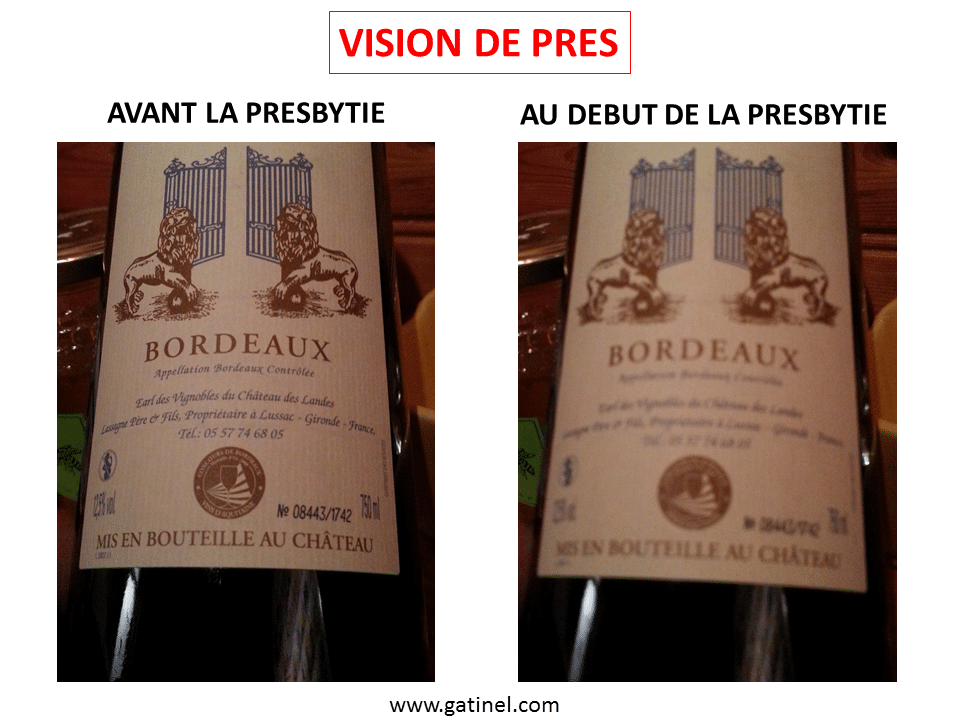
      http://www.gatinel.com/wp-content/uploads/2011/05/Baisse-de-la-vision-de-près-presbytie.png

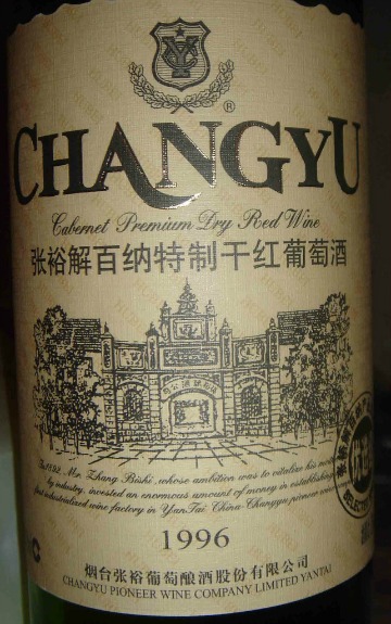
      L’apparition de la #presbytie peut être ressentie de manière subite : difficultés ou impossibilité à lire l’étiquette d’une bouteille de vin de Bordeaux au restaurant (à droite). La calligraphie particulière, et le faible #contraste du texte avec le fond exige une accommodation efficace et précise ( à gauche).

      ▻http://www.gatinel.com/chirurgie-refractive/presbytie-2

      Simplicissimus @simplicissimus
    • @simplicissimus
      Simplicissimus @simplicissimus 10/04/2015

      Pour la presbytie avancée, j’te dis pas…

      http://public.media.smithsonianmag.com/legacy_blog/WineChangyuBIG.jpg

      Simplicissimus @simplicissimus
    • @klaus
      klaus++ @klaus 10/04/2015

      #publicité_mensongère

      klaus++ @klaus
    • @supergeante
      Supergéante @supergeante 10/04/2015

      Rigolo, mais franchement illisible :P

      Supergéante @supergeante
    • @simplicissimus
      Simplicissimus @simplicissimus 10/04/2015
      @supergeante

      @supergeante cf. supra :-P

      Simplicissimus @simplicissimus
    • @fil
      Fil @fil 10/04/2015

      nos équipes mobilisées sur-le-champ ont mis fin à ce #cyberattentat

      Fil @fil
    • @grrr
      grrr @grrr CC BY-NC-SA 10/04/2015

      Bravo à Fil et ses équipes pour cette intervention rapide. C’est formidable de se sentir en sécurité.

      grrr @grrr CC BY-NC-SA
    Écrire un commentaire
  • @monolecte
    Monolecte 😷🤬 @monolecte CC BY-NC-SA 3/03/2015
    6
    @alexandre
    @simplicissimus
    @baroug
    @thibnton
    @geneghys
    @reka
    6

    Pourquoi la #perception des #couleurs diffère-t-elle selon les personnes ?
    ▻http://www.lemonde.fr/les-decodeurs/article/2015/02/27/pourquoi-certains-voient-la-robe-bleue-et-d-autres-blanche_4584833_4355770.h

    http://s1.lemde.fr/image/2015/02/27/600x315/4584837_3_bdf7_la-fameuse-robe-qui-divise-internet-blanc-et_06f874841aadb317cc54b210c5faa1e8.jpg

    Je crois que je vais passer le reste de ma vie à travailler sur ça

    Carrément !

    • #This
    • #Amanda Baggs
    Monolecte 😷🤬 @monolecte CC BY-NC-SA
    • @liotier
      liotier @liotier CC BY-SA 3/03/2015

      “Warning: This page contains some works of ’anomalous motion illusion’ which might make sensitive observers dizzy or sick. Should you feel dizzy, you had better leave this page immediately”

      liotier @liotier CC BY-SA
    • @tintin
      jean michel @tintin 3/03/2015

      tiens marrant, j’ai posté une trad’ d’un très joli petit film d’#Amanda_Baggs, (une activiste autiste disons) cette nuit... ça me semble un peu dans le sujet (quoique), en ajoutant aux couleurs, les notes de musiques et les histoires de #synesthésie en plus d’un propos politique... ▻http://seenthis.net/messages/347389 Sinon #Itten #art_de_la _couleur (#bahaus) et le fameux #contraste_simultané #vibrations

      jean michel @tintin
    • @tintin
      jean michel @tintin 3/03/2015

      #Amanda_baggs est américaine, d’où peut-être la moindre culture psychanalitique, quoique qu’elle connaisse bien l’anti-psy (qui est d’ailleurs un truc plutôt anglais non ?), je crois... Quand j’avais essayé de comprendre tout ce machin d’"autosupport" et d’activisme autie, l’ennemi c’était souvent #Bruno_Bettleheim et effectivement l’équation psychotique = autisme qui vient de la psychanalyse classique (freud etc), si je ne m’abuse. Le truc neuro a peut-être aidé à la création d’un « spectre » autistique et donc d’une definition plus souple, qui permet peut-être même l’auto-définition... J’avoue que le sujet est affreusement ardu et que je manque d’outils pour vraiment piger... Mais Baggs et sa bande déboîtent, quoique je ne sache plus trop où ils en sont aujourd’hui... J’ai posté ça aussi, traduit du site autistics.org ▻http://seenthis.net/messages/347391 qui est bien marrant... et si tu ne l’as pas vu, diable, on avait fait une trad de ce magnifique film de Baggs again, huge classic ►https://www.youtube.com/watch?v=1EvvotxGq4k

      jean michel @tintin
    • @tintin
      jean michel @tintin 3/03/2015

      ah et pour la voix... je crois que j’avais fait ça sur un site internet de voix synthétique, pas direct de l’ordi. Tu tapais une phrase, et le machin te sortais un petit mp3 à télécharger...

      jean michel @tintin
    • @thibnton
      tbn @thibnton PUBLIC DOMAIN 3/03/2015

      Voir aussi : ▻http://seenthis.net/messages/213211

      Je copie ici la lettre de Quartz du week-end pour mémoire :

      “You guys,” a friend tweeted on Thursday, “today was what the Internet used to be like ALL THE TIME.”

      He was talking, of course, about “the dress“—the image of a garment that looked white and gold to some people and blue and black to others, or even looked different to the same people at different times of day, and drove what seemed like the entire internet crazy. BuzzFeed said its coverage of the dress garnered 41 million views in less than a day.

      But the tweet might as well have been talking about that day’s decision by the US Federal Communications Commission to adopt strict “#net_neutrality” rules that treat the internet as a public utility. Both were expressions of the internet in its purest, most democratic form—the way its idealistic pioneers imagined.

      (…) The dress was just an optical illusion. It became #TheDress because everyone could see it, and wanted to know what other people were seeing, and could find out, and tell each other, instantly. While websites vied to profit from their curiosity (and some succeeded hugely), they were just riding the wave. The wave itself was hundreds of millions of moments of direct, unmediated communication, the raw collective power of a society talking to itself—the internet as the ultimate public square.

      This is the internet that net neutrality is designed to protect. It would, of course, be wonderful if as many people used it to try to solve poverty or global warming as went apeshit over a dress. But we’re glad we have it, all the same. — Gideon Lichfield

      tbn @thibnton PUBLIC DOMAIN
    • @koldobika
      koldobika @koldobika CC BY-NC-SA 5/03/2015

      à propos de #réel ▻http://www.staune.fr/Le-reel-voile-Bernard-d-Espagnat.html

      koldobika @koldobika CC BY-NC-SA
    Écrire un commentaire
  • @cdb_77
    CDB_77 @cdb_77 27/07/2013
    1
    @02myseenthis01
    1

    Lampedusa - Island of contrasts. A door into Europe

    Lampedusa sporadically makes headlines in the international press because of the arrival of thousands of migrant and refugee boats from northern Africa. The ’other’ side of Lampedusa, the bustling tourism during the summer months is not so well known. Lampedusa is an island of contrasts, bringing together two different worlds.
    This is part of a long term project “Grapes of wrath revisited: a view from contemporary Italy” on the living conditions of migrant workers working on...

    ▻http://carolereckinger.photoshelter.com/gallery/Lampedusa-Island-of-contrasts-A-door-into-Europe/G0000rWZUgngS.So

    #Lampedusa #photo #autre_Lampedusa #tourisme #contraste

    • #Europe
    • #northern Africa
    CDB_77 @cdb_77
    Écrire un commentaire
  • @sebrobeet
    Sébastien Robeet @sebrobeet CC BY 21/03/2013

    Equipes Populaires | Contrastes
    ▻http://www.equipespopulaires.be/spip.php?article728

    Paysage de désolation sur le front de la réduction du temps de travail... Au beau fixe au début des années 90, l’idée semble aujourd’hui oubliée, étouffée, enterrée... “Faux ! rétorquent les organisations syndicales, cela reste un progrès social très souhaitable”. Mais alors que se passe-t-il ?

    Les Équipes Populaires sont un mouvement d’éducation populaire qui se revendique comme un « mouvement de citoyens pour construire l’égalité ». Ils éditent la très stimulante revue « Contrastes » et sont l’une des composantes du MOC (Mouvement ouvrier chrétien), aux côtés de la CSC, des Mutualités Chrétiennes, de Vie Féminine et de la JOC/F.

    Ce dossier sur la réduction collective du temps de travail date de 2007 mais reste très pertinent.

    #rtt #contrastes #equipes_populaires #belgique #MOC

    Sébastien Robeet @sebrobeet CC BY
    Écrire un commentaire
  • @reka
    Phil Reka docs & archives @reka CC BY-NC-SA 4/01/2013
    1
    @odilon
    1

    Artworks That Shine in New York Museums - NYTimes.com

    La lumière dans l’art [enngénéral] ...

    ►http://www.nytimes.com/2013/01/04/arts/design/artworks-that-shine-in-new-york-museums.html?nl=todaysheadlines&emc=edit_th

    With New Year’s hoopla behind us, we begin to turn a corner on the season of long nights and short days. But there’s still a good stretch of darkness ahead, and New York City museums have their lights on bright.

    Illumination has been a subject and condition of art since prehistoric painters at the Lascaux caves positioned their images to catch the rays of the sun at winter solstice. Great classical cultures across the globe spun visions of the universe around the presence of solar and lunar deities. To designers of stained-glass church windows in medieval Europe light was divine benevolence in sensible form. To the Muslim creators of lusterware in the Arab world radiance as a decorative property helped bind together the widely dispersed faithful.

    Painted dawns and sunsets carried spiritual, political and personal messages for Romantic landscape artists in America and Europe. Light was scientific data to the French Impressionists, the raw material of an optical sublime. In our own era, when art has no center or has centers everywhere, light as a medium has atomized into countless forms and meanings, from fluorescent tubes and video screens to glittering magpie-eye scraps and painted rainbows.

    #art #cartographie #design #lumière #contraste

    Phil Reka docs & archives @reka CC BY-NC-SA
    • @odilon
      odilon @odilon CC BY-NC-ND 4/01/2013

      #couleurs

      odilon @odilon CC BY-NC-ND
    Écrire un commentaire
  • @notabene
    Stéphane Deschamps @notabene CC BY-NC-SA 30/10/2012
    2
    @rastapopoulos
    @mukt
    2

    Content Choreography | Trent Walton
    ►http://trentwalton.com/2011/07/14/content-choreography

    Another thing I’ve noticed is that media queries are being used to significantly #redesign pages. I’ve seen background colors change and top-level elements move from left to right. If critical thought is applied here those choices may be spot on. But what happens if a user visits at full-width one afternoon and revisits your site in the evening on a tablet, and everything looks completely different? It’s annoying—like someone rearranging the groceries in your pantry every time you closed the door. The power of media queries can be intoxicating, but just because you can doesn’t mean you should.

    Mouais. Il a raison sur le fond mais il faudra vraiment que les gens se rendent compte que tant qu’à faire du #responsive, il serait malin de virer les #webfonts pour des questions de bande passante, et forcer le #contraste pour des questions d’#accessibilité en mobilité notamment.

    #mediaqueries #rwd

    Stéphane Deschamps @notabene CC BY-NC-SA
    • @nhoizey
      Nicolas Hoizey @nhoizey CC BY-NC-SA 30/10/2012

      Perso, je vire effectivement les webfonts, mais penses-tu vraiment que je devrais augmenter le contraste ?

      Nicolas Hoizey @nhoizey CC BY-NC-SA
    • @notabene
      Stéphane Deschamps @notabene CC BY-NC-SA 16/11/2012

      Tiens je ne t’avais pas répondu.

      J’ai publié un truc rapide là dans la quasi-indifférence générale : ►http://www.nota-bene.org/Responsive-type-contrast

      Stéphane Deschamps @notabene CC BY-NC-SA
    Écrire un commentaire
0 | 25

Thèmes liés

  • #contraste
  • #accessibilité
  • #design
  • #contrastes
  • #couleur
  • #noiretblanc
  • #photo
  • #blancoynegro
  • #blackandwhite
  • #netb
  • #fotodeldia
  • #photooftheday
  • #pictureoftheday
  • #picoftheday
  • #photodujour
  • #contrasts
  • #web
  • #alignment
  • #blanquinegro
  • #nantes
  • #sombra
  • #a11y
  • #contrastfinder
  • continent: europe
  • #ux
  • #intégration
  • #css
  • #css
  • #gradient
  • #images
  • #text
  • #wcag
  • #foto
  • #photography
  • #darkness
  • #tenval
  • #ombre
  • #graphisme
  • #autoretrato
  • #selfportrait