Seenthis
•
 
Identifiants personnels
  • [mot de passe oublié ?]

 
  • #d
  • #da
  • #das
  • #dash
RSS: #dashboard

#dashboard

  • #dashboards
  • #dashboard_design
0 | 25
  • @b_b
    b_b @b_b PUBLIC DOMAIN 27/04/2026

    alexandre-daubois/ember: 🔥 Real-time terminal dashboard for Caddy servers, with built-in FrankenPHP support
    ▻https://github.com/alexandre-daubois/ember

    https://raw.githubusercontent.com/alexandre-daubois/ember/refs/heads/main/assets/banner.webp

    Real-time terminal #dashboard for Caddy servers, with built-in #FrankenPHP support

    Caddy exposes rich metrics through its admin API and #Prometheus endpoint, but reading raw Prometheus text or setting up a full #Grafana stack just to glance at traffic is heavy. Ember gives you a zero-config, read-only terminal dashboard that connects to Caddy’s admin API and works out of the box.

    https://raw.githubusercontent.com/alexandre-daubois/ember/refs/heads/main/assets/ember.gif

    b_b @b_b PUBLIC DOMAIN
    Écrire un commentaire
  • @nightingale
    nightingale @nightingale via RSS 26/03/2026

    Building #Tableau #dashboards for the PowerPoint Download
    ▻https://nightingaledvs.com/building-tableau-dashboards-for-the-powerpoint-download

    Working in reporting and analytics for the last six years has made me realize an uncomfortable truth about Tableau: Your beautiful interactive dashboard will often..

    #Dashboard_Design #Data_Visualization #How_To #Tools

    nightingale @nightingale via RSS
    Écrire un commentaire
  • @sombre
    Sombre @sombre CC BY-NC-SA 18/02/2026

    C3S data powers new global temperature dashboard | Copernicus
    ▻https://climate.copernicus.eu/c3s-data-powers-new-global-temperature-dashboard

    The open data provided by the Copernicus Climate Change Service is behind a powerful global temperature dashboard created by the Climate Brink. The application retrieves C3S temperature data provided by the Climate Pulse Application, and automatically updates a set of interactive charts. The Climate Brink dashboard provides intuitive visualisations of global temperature data, comparisons of global temperatures with the pre-industrial average, projections and predictions. The app also provides near-real time climate stripes and a visualisation, that represents well the shift of global temperatures over time.

    en rapport avec : ▻https://seenthis.net/messages/1156268

    #climatologie #météorologie #data #C3S #ECMWF #dashboard

    Un incontournable pour qui s’intéresse au #climat et plein de liens pour accéder aux données.

    Sombre @sombre CC BY-NC-SA
    Écrire un commentaire
  • @nightingale
    nightingale @nightingale via RSS 1/10/2024
    1
    @reka
    1

    The Power of Context: Making Data Stories Come Alive
    ▻https://nightingaledvs.com/the-power-of-context

    Raw data can appear sterile without the human touch of thoughtful interpretation. Though information-packed #Charts and graphs showcase vital statistics, the “why should I care”..

    #Dashboard_Design #Data_Visualization #Design

    nightingale @nightingale via RSS
    Écrire un commentaire
  • @nightingale
    nightingale @nightingale via RSS 6/06/2024

    On Business and Beauty in #Data_Visualization
    ▻https://nightingaledvs.com/on-business-and-beauty-in-data-visualization

    In the business of consulting, our clients rely heavily on data visualization to make sense of complex information and drive decision-making. If you’ve ever interacted with the c-suite of a large institution, you know that capturing their attention and conveying insights effectively can be a daunting task.

    #Charts #dashboards #Design

    nightingale @nightingale via RSS
    Écrire un commentaire
  • @nightingale
    nightingale @nightingale via RSS 8/05/2024

    Tips & Tricks to Improve your #Dashboard_Design
    ▻https://nightingaledvs.com/tips-tricks-to-improve-dashboard-design

    Learn how to use data context, visual flow, color, typography, and appeal to create engaging data visualizations for business users.

    #Charts #dashboards #Data_Visualization #Design #Tools

    nightingale @nightingale via RSS
    Écrire un commentaire
  • @nightingale
    nightingale @nightingale via RSS 14/12/2023

    We Cannot Give Up on the Data Viz Renegades!
    ▻https://nightingaledvs.com/we-cannot-give-up-on-the-data-viz-renegades

    Data viz renegades are often resistant to learn how to properly visually communicate the data that they work with. Here’s how to help them.

    #Dashboard_Design #Data_Literacy #Design

    nightingale @nightingale via RSS
    Écrire un commentaire
  • @nightingale
    nightingale @nightingale via RSS 16/11/2023

    Data Dreams Come True: My DVS Mentorship Experience
    ▻https://nightingaledvs.com/data-dreams-come-true-my-dvs-mentorship-experience

    The #DVS_Mentorship_Program was as much an emotional experience as it was an educational one. Here are key lessons I learned along the way.

    #Career #dashboards

    nightingale @nightingale via RSS
    Écrire un commentaire
  • @nightingale
    nightingale @nightingale via RSS 14/11/2023

    From Big Screens to Paper Printouts: Adapting Your Dashboard for Different Formats
    ▻https://nightingaledvs.com/adapting-dasboards-for-different-formats

    Will your dashboard be seen on a phone? In an auditorium? On a printout? Here are the best practices for eight possible dashboard formats.

    #Business_Intelligence #dashboards #Design

    nightingale @nightingale via RSS
    Écrire un commentaire
  • @nightingale
    nightingale @nightingale via RSS 11/10/2023

    How I Took Off My Dashboard Crown and Admitted My Mistakes
    ▻https://nightingaledvs.com/how-i-took-off-my-dashboard-crown-and-admitted-my-mistakes

    An intern ripped apart a dashboard that I had considered a model of good #Design. I chose to swallow my pride and learn from the experience.

    #dashboards #Dataviz_horror_stories

    nightingale @nightingale via RSS
    Écrire un commentaire
  • @nightingale
    nightingale @nightingale via RSS 21/09/2023

    Making #dashboards Optimal for Human Brain Processing
    ▻https://nightingaledvs.com/dashboards-human-brain-processing

    How the science behind brain processing and active memory can help guide our dashboard and other data visual designs.

    #Dashboard_Design #Data_Literacy #data_literarcy #Design

    nightingale @nightingale via RSS
    Écrire un commentaire
  • @nightingale
    nightingale @nightingale via RSS 15/09/2023

    Has #data_storytelling Reached Its Peak?
    ▻https://nightingaledvs.com/has-data-storytelling-reached-its-peak

    “Data storytelling” has become an overhyped, catch-all term. Here’s how to align data storytelling expectations with colleagues and clients.

    #dashboards

    nightingale @nightingale via RSS
    Écrire un commentaire
  • @nightingale
    nightingale @nightingale via RSS 9/05/2023

    Finding The Right Elements For an Award-Winning Dashboard
    ▻https://nightingaledvs.com/elements-for-an-award-winning-dashboard

    Lindsey Poulter won the World Data Viz Prize using a mix of dashboard features—including a shuffle button to randomize the view.

    #Dashboard_Design #dashboards #Data_Visualization #How_To #spotlight #Tools

    nightingale @nightingale via RSS
    Écrire un commentaire
  • @nightingale
    nightingale @nightingale via RSS 28/02/2023

    Well-Designed Consumer Products Can Teach Us How to Build Better Business #dashboards
    ▻https://nightingaledvs.com/dieter-rams-dashboard-design

    Legendary designer Dieter Rams established 10 principles of good product #Design. Here’s how to interpret those principles when designing business dashboards.

    #Business_Intelligence #Data_Visualization

    nightingale @nightingale via RSS
    Écrire un commentaire
  • @nightingale
    nightingale @nightingale via RSS 3/11/2022
    3
    @simplicissimus
    @arno
    @7h36
    3

    Why I Stopped Using Bullet Graphs (and What I Now Use Instead)
    ▻https://nightingaledvs.com/why-i-stopped-using-bullet-graphs-and-what-i-now-use-instead

    tl;dr: After teaching many data professionals about bullet graphs and using them in many #dashboards, I started to notice that they had a fair number..

    #Business_Intelligence #Charts #Data_Literacy #Data_Visualization #How_To

    nightingale @nightingale via RSS
    Écrire un commentaire
  • @nightingale
    nightingale @nightingale via RSS 8/09/2022

    Reasons to Visualise the Same Data, Differently
    ▻https://nightingaledvs.com/reasons-to-visualise-the-same-data-differently

    You may have heard, “data visualisation should tell a story” – but this is not always true. Data visuals are created for many reasons: from..

    #Business_Intelligence #Dashboard_Design #Data_Visualization #How_To

    nightingale @nightingale via RSS
    Écrire un commentaire
  • @gaeller
    gaeru @gaeller CC BY 20/07/2022

    Consommation électrique en France, prévision et émission CO2
    ▻https://www.rte-france.com/eco2mix/synthese-des-donnees?type=consommation11
    #dataviz #co2 #electricity #dashboard #visualisation

    gaeru @gaeller CC BY
    Écrire un commentaire
  • @nightingale
    nightingale @nightingale via RSS 5/07/2022

    Beyond the Bar: Alternative Methods for Visualizing Two Points of Change
    ▻https://nightingaledvs.com/beyond-the-bar-alternative-methods-for-visualizing-two-points-of-cha

    People love comparisons, whether between two groups or the difference in an outcome between two time points. Many data (visualization) designers use a clustered bar..

    #Bar_Charts #Business_Intelligence #Charts #Dashboard_Design #Data_Visualization #How_To #line_charts

    nightingale @nightingale via RSS
    Écrire un commentaire
  • @nightingale
    nightingale @nightingale via RSS 9/11/2021

    #dashboards Are Not Data Stories
    ▻https://nightingaledvs.com/dashboards-are-not-data-stories

    A few months ago, a longtime client asked if my data communication consultancy could build out a dashboard display for health collaboratives in California doing..

    #Charts #data_storytelling #Data_Visualization #How_To #information_design #storytelling

    nightingale @nightingale via RSS
    Écrire un commentaire
  • @nightingale
    nightingale @nightingale via RSS 11/06/2021

    Why Can’t We Have More Fun ?
    ▻https://nightingaledvs.com/why-cant-we-have-more-fun

    This is part 8 in a #series of articles that illustrate how basic #Design principles can improve information display. The previous article reviewed chart choices..

    #Business_Intelligence #Charts #Dashboard_Design #Data_Visualization #design_principles #encoding #graphicacy #How_To #radial_distortion

    nightingale @nightingale via RSS
    Écrire un commentaire
  • @nightingale
    nightingale @nightingale via RSS 8/06/2021

    Dashboard #psychology: Effective #feedback in Data Design
    ▻https://nightingaledvs.com/dashboard-psychology-effective-feedback-in-data-design

    “What you measure, you improve.” You’ve heard this a million times. It sounds nice. It seems plausible. There’s a bunch of evidence supporting it. But..

    #Business_Intelligence #Dashboard_Design #dashboards #Data_Visualization

    nightingale @nightingale via RSS
    Écrire un commentaire
  • @die_brucke
    Die Brücke @die_brucke CC BY-NC 26/04/2020
    3
    @massivesci
    @lescrises
    @monolecte
    3

    COVID-19 Dashboard by the Center for Systems Science and Engineering (CSSE) at Johns Hopkins University (JHU)
    ▻https://coronavirus.jhu.edu/map.html

    Je n’ai pas trouvé ce tableau de bord du “Coronavirus resource center” de l’université Johns Hopkins sur seenthis...
    Alors je le pose là...

    #visualisation #covid19 #jhu #carte #dashboard

    Die Brücke @die_brucke CC BY-NC
    • @die_brucke
      Die Brücke @die_brucke CC BY-NC 26/04/2020

      Je pensais que la barre de recherche ne fonctionnait pas. Mais en fait si...

      Die Brücke @die_brucke CC BY-NC
    Écrire un commentaire
  • @cy_altern
    cy_altern @cy_altern CC BY-SA 17/10/2018
    2
    @spip
    @rastapopoulos
    2

    GitHub - mistergraphx/spip_moncompte : Gestion de compte utilisateur/visiteur coté publique du site
    ▻https://github.com/mistergraphx/spip_moncompte

    Gestion de compte utilisateur/visiteur coté publique du site (avant RGPD). Extensible sous forme de dashboards à ajouter via pipelines

    En relation avec la gestion des RGPD dans SPIP, cf ▻https://contrib.spip.net/Gestion-Mon-Compte et ▻https://contrib.spip.net/Recap-RGPD-webmestres-SPIP

    #mon-compte #SPIP #RGPD #dashboard #pipeline

    cy_altern @cy_altern CC BY-SA
    Écrire un commentaire
  • @hackernoon
    Hacker Noon @hackernoon CC BY-SA 15/07/2018

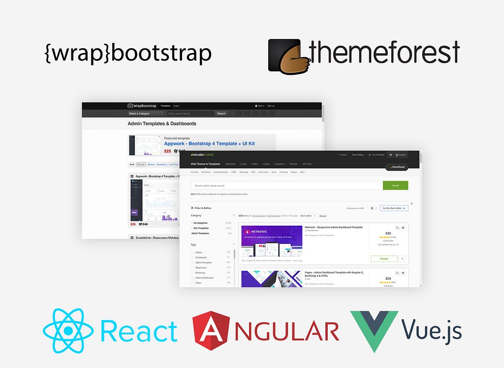
    How to use admin panel template for your project properly?
    ▻https://hackernoon.com/how-to-use-admin-panel-template-for-your-project-properly-8ee077b6bcd?so

    https://cdn-images-1.medium.com/max/1024/1*YuT_wIQHhHYcVZs5M_zYww.jpeg

    We have developed 8 projects using admin panel templates for the past three years of our company existing.It is not a secret anymore that ready-to-go solution is a best option to build small project or MVP. It seems that all you need is to buy such template and customize it for your needs.You can buy admin panel for just $20But this is not the option at all for a huge and expensive project. With all obvious advantages (built-in UI elements, responsive layout, time and money saving) there are a lot of drawbacks each of which slows down your #development process.Issue 1: CustomizationImagine you what you don’t like mayo and prefer oil. You are in a restaurant and your waiter serves you a vegetable salad full of mayo. The only thing you can to do in this case is simply disassemble the entire (...)

    #javascript #dashboard #react #angularjs

    Hacker Noon @hackernoon CC BY-SA
    Écrire un commentaire
  • @fil
    Fil @fil 2/10/2017
    1
    @reka
    1

    Truth & Beauty - Peak Spotting
    ►https://truth-and-beauty.net/projects/peakspotting

    https://truth-and-beauty.net/content/1-projects/32-peakspotting/thumb.png

    #trains #visualisation #dashboard

    Fil @fil
    Écrire un commentaire
0 | 25

Thèmes liés

  • #dashboards
  • #data_visualization
  • #citelabo
  • #dashboard_design
  • #design
  • #villelegere
  • #how_to
  • #charts
  • #business_intelligence
  • #visualisation
  • company: google
  • #logiciel
  • #widget
  • #tools
  • #data_literacy
  • #tableau_de_bord
  • #data_storytelling
  • #iot
  • #internetdesobjets
  • #opendata
  • #éditorialisation
  • #curation
  • #scoop.it
  • #mac
  • #google_analytics
  • person: pixel
  • #netvibes
  • #sage
  • #erp
  • #web_2.0
  • #clevermarks
  • #portail
  • #amc
  • #apple
  • #performance
  • #système
  • #iusethis
  • #scoopit