Create Database and Table in LibreOffice Base [Beginner’s Guide] - libreofficehelp.com
▻https://www.libreofficehelp.com/create-database-libreoffice-base
Create Database and Table in LibreOffice Base [Beginner’s Guide] - libreofficehelp.com
▻https://www.libreofficehelp.com/create-database-libreoffice-base

Fixing My #Design Process from the Inside Out
▻https://nightingaledvs.com/five-sketching-tips
Has this ever happened to you: you’ve just read one of those articles outlining the perfect #Design_Process: understanding your audience, defining an idea or..
#IEEE_VIS_2022 Highlights
▻https://nightingaledvs.com/ieee-vis-2022-highlights
IEEE VIS 2022 happened between October 16th and 22nd in Oklahoma City and I was really happy to have been able to attend in person...

ENQUÊTE. La Caisse des allocations familiales utilise un algorithme pour détecter les allocataires « à risque »
▻https://www.francetvinfo.fr/economie/emploi/carriere/entreprendre/aides/enquete-la-caisse-des-allocations-familiales-utilise-un-algorithme-pour
« On est devenu une mini-PME. On n’est plus là pour aider les gens, mais pour faire du chiffre. » Ainsi parle un « technicien conseil » qui travaille depuis plusieurs années au sein de l’une des 101 Caisses des allocations familiales (Caf) en France. « Notre prime d’intéressement est calculée en fonction des objectifs atteints par les caisses locales, explique le représentant CGT dans les instances nationales de la Sécurité sociale, Yves Alexis. Or parmi ces objectifs, il y a les délais de traitement, l’accueil… mais aussi la détection de fraudes. »
Et pour détecter ces fraudes, la Cnaf a recours à une méthode au nom très anglais : le « datamining ». C’est une technique numérique de statistiques prédictives qui, en croisant différentes données dans différentes administrations, est censée identifier les risques d’erreurs ou de fraude dans un dossier d’allocataire. Elle s’est généralisée au sein de la Cnaf à partir de 2010, avec l’utilisation d’algorithmes. « La Cnaf a été le laboratoire, le bon élève du datamining au sein des administrations françaises », explique le sociologue Vincent Dubois, professeur à l’Institut d’études politiques (IEP) de Strasbourg et auteur de l’ouvrage Contrôler les assistés. Genèses et usages d’un mot d’ordre (Ed. Raisons d’Agir). « Elle a développé une politique d’automatisation du déclenchement des contrôles. »
« Le tournant se situe au milieu des années 90, poursuit l’universitaire. Les organismes de protection sociale vont être poussés par le pouvoir politique à renforcer les contrôles. » À l’époque, l’État lance en effet une politique volontariste de lutte contre la fraude. « Nous avons décidé d’engager une action résolue contre les fraudes sociales, déclare Nicolas Sarkozy, le 15 novembre 2011, à Bordeaux. C’est la fraude qui mine les fondements même de cette République sociale que les frères d’armes de la Résistance ont voulu bâtir pour la France et qu’ils nous ont légué. Frauder la Sécurité sociale, ce n’est pas simplement abuser du système, profiter de ses largesses, c’est voler chacun et chacune d’entre nous. »

un très bon article où l’on voit l’influences de lectures faites avec les premier.es concerné.es sur le travail des journalistes (par l’entremise de structures collectives) ce qui est pas du luxe !
"Contrairement à un contrôle aléatoire où chaque personne aurait la même probabilité d’être contrôlée, cet algorithme entraîne un score de risque élevé pour les personnes les plus précaires, parce qu’à leur statut sont associés des facteurs de risque qui sont en fait des facteurs de précarité, affirme un membre de l’association La Quadrature du net. °C’est la raison pour laquelle, parmi les personnes contrôlées, on retrouve une surreprésentation de personnes aux minima sociaux. Plus quelqu’un est précaire, plus il est considéré comme ’risqué’."_
Punch line étendue qui va bien mais de fait les « contrôles aléatoires » visaient déjà auparavant des catégories, extrêmement nombreuses, parmi les plus précaires, saucissonnés selon des dizaines de critères en fonction desquels augmentait la probabilité de contrôle, avec des pourcentage de contrôles à effectuer par « catégories ». Ce que les algos raffinent.
L’argument d’évidence est qu’il faut augmenter la productivité des contrôles, c’est à dire qu’ils débouchent bien sur la récupération d’indus en faveur de la CAF (et surtout pas l’inverse !), des diminutions et des coupures de droits. Cela passe par une meilleure attribution par exemple des moyens humains consacrés aux contrôles domiciliaires (les agents de contrôle assermentés) qui sont à la fois une base (l’intrusion, la #terreur) et la honte de l’institution qui en a le privilège, pas très éloigné de celui de la police lorsqu’elle agit en flagrant ou sur procédure judiciaire (une modalité de « viol » du domicile d’un degré inférieur à la perquise mais d’une rare violence ).
edit
[#datamining] la Caf minimise l’utilisation de cette technologie. Selon elle, seuls 6 % de l’ensemble des contrôles seraient issus de l’outil datamining, tout en reconnaissant que 70 % des contrôles effectués en présence de l’allocataire, qui ont entraîné un remboursement d’allocation, ont bien été initiés par lui
Peu de place toutefois accordées aux tactiques défensives des ayant droits (ici, faire appel à de très rares asso ou assumer une procédure de plusieurs années au T.A), ce qui assombrit un tableau déjà terrible. Au lieu de les diffuser.
bon, je dis ça, mais je me retrouvé radié de chez policemploi, RSA coupé, factures en déshérence, faut que je retourne mouliner du recours ha ha ha
#toctoc nonobstant la diffusion d’une ambiance de peur qui contribue à la force d’institutions qui marchent à la trouille, au fait de se faire passer passer pour toute puissantes (ce qu’elles sont en partie : 0 thune, c’est pas rien)

Tu peux avoir droit aussi à la dénonciation par le propriétaire de ton logement, même insalubre, comme cela m’est arrivé avec à la clef contrôle au domicile qui n’a rien donné, j’étais en règle d’après eux.
Et surtout dans cet algo, qui décide des critères, quels sont-ils, personne ne le sait, c’est l’#opacité_totale. Je vois des jeunes qui font des tests en ligne pour savoir à combien s’élèvent leurs #droits_sociaux pour prendre un logement en fonction et à qui la CAF annonce ensuite bien moins que sur l’évaluateur en ligne.
incidemment, l’auteur de l’enquête, Benoît Collombat, est par ailleurs l’un des trois journalistes convoqués à la DGSI après la publication d’une enquête sur des soupçons de trafic d’influence au sein de l’armée française.
▻https://www.francetvinfo.fr/economie/emploi/metiers/armee-et-securite/trois-journalistes-sont-convoques-a-la-dgsi-apres-leur-enquete-pour-la-
#follow_the_money
Building Science Graphics: Behind the Scenes with author Jen Christiansen
▻https://nightingaledvs.com/building-science-graphics-behind-the-scenes-with-author-jen-christia
Jen Christiansen is senior graphics editor at Scientific American and has written the #book Building Science Graphics: An Illustrated Guide to Communicating Science with Diagrams..
#Community #Data_Visualization #interview #Science_Communication
A Camera That Prints the Futures We Envision – with a Bit of Help from an AI
▻https://nightingaledvs.com/a-camera-that-prints-the-futures-we-envision-with-a-bit-of-help-from
One of the first things that made me fall in love with my husband was that in the early days of our nine-year relationship, he..
#Data_Art #Data_Humanism #Data_Visualization #exhibit #How_To #Tools

“Every Noise at Once is an ongoing attempt at an algorithmically-generated, readability-adjusted scatter-plot of the musical genre-space, based on data tracked and analyzed for 5,987 genre-shaped distinctions by Spotify as of 2022-12-06.”
▻https://everynoise.com
#map #dataviz #music #serendipity
#spotlight: Using Dataviz to Inform My Childcare Decisions
▻https://nightingaledvs.com/spotlight-using-dataviz-to-inform-my-childcare-decisions
My son Ethan was 18-months old when he had his first daycare summer break. It was my first summer break as a mum, and I..

The Economist – Frozen Out – How the world is leaving Europe behind
▻https://view.e.economist.com/?qs=706216167d7a949d1a8bf6762ff02aee5f6fad9c0f66eae10826eea83914a3
Vladimir Putin, Russia’s president, is using energy as a weapon. Our data journalists set themselves a difficult question: how many people is this weapon likely to kill outside Ukraine? The answer they came up with was alarming. Although heatwaves get more press, cold temperatures are usually deadlier than hot ones. To estimate the relationship between energy costs and deaths, we built a statistical model that predicts how many people die per winter week in each of 226 European regions. This model found that a 10% rise in electricity prices is associated with a 0.6% increase in deaths, concentrated among the elderly and infirm. If the historical relationships between mortality, weather and energy costs continue to apply—which they may not, given how high current prices are—the death toll from the energy weapon could exceed the number of soldiers who have died so far in direct combat from bullets, shells, missiles and drones. It is one more reason why Ukraine’s fight against Russia is Europe’s, too.
Our data team’s work sets the scene for our cover this week. Europe faces a crisis of energy and geopolitics that will weaken it—and could threaten its global position. If you ask Europe’s friends around the world what they think of the old continent’s prospects they often respond with two emotions. One is admiration. In the struggle to help Ukraine and resist Russian aggression, Europe has displayed unity, grit and a principled willingness to bear enormous costs. But the second is alarm. A brutal economic squeeze will pose a test of Europe’s resilience in 2023 and beyond. There is a growing fear that the recasting of the global energy system, American economic populism and geopolitical rifts threaten the long-run competitiveness of all European countries, Britain included. The worry is not just about the continent’s prosperity; the health of the transatlantic alliance is at risk, too.

High fuel prices could kill more Europeans than the war in Ukraine | The Economist
(l’étude de la data team : beaucoup de choses intéressantes et des graphiques statistiques d’excellente facture)
►https://www.economist.com/interactive/graphic-detail/2022/11/26/high-fuel-prices-could-kill-more-europeans-than-fighting-in-ukraine-has
The final element, however, is much less certain: the relationship between energy costs and deaths. We estimate this using our statistical model, which predicts how many people die in each winter week in each of 226 European regions. The model applies to the eu-27 countries, except Malta, plus Britain, Norway and Switzerland. It forecasts deaths based on weather, demography, influenza, energy efficiency, incomes, government spending and electricity costs, which are closely correlated to prices for a wide variety of heating fuels. Using data from 2000-19—we excluded 2020 and 2021 because of covid-19—the model was highly accurate, accounting for 90% of variation in death rates. When we tested its predictions on years not used to train it, it did nearly as well.

#How_To Locate and Understand the Reasons for Rising Land Surface Temperature
▻https://nightingaledvs.com/how-to-locate-and-understand-the-reasons-for-rising-land-surface-tem
September 2022 has been one of the hottest Septembers in the last 143-years of global climate record, as per the National Oceanic and Atmospheric Administration..
Meet the #Data_Visualization King of Basketball Twitter: Todd Whitehead
▻https://nightingaledvs.com/meet-the-data-visualization-king-of-basketball-twitter-todd-whitehea
Not long ago, I had the opportunity sit down with Todd Whitehead to discuss how he creates visualizations that dominate the discourse. Please note that..

[Vidéo] Empreinte carbone de la transmission de données sur le réseau RENATER par Marion Ficher lors de la Journée du Conseil scientifique Afnic 2022 (JCSA22) ▻https://youtu.be/VSkBEpJ1iZ0
#Review: Functional Aesthetics for #Data_Visualization by Vidya Setlur and Bridget Cogley
▻https://nightingaledvs.com/review-functional-aesthetics-for-data-visualization-by-vidya-setlur-
The multi-disciplinary nature of the data visualization profession presents opportunities for fruitful collaboration while also leading to points of tension. One such source of tension..
#How_To Get Executives on Board with #Data_Visualization
▻https://nightingaledvs.com/how-to-get-executives-on-board-with-data-visualization
Convincing senior executives to jump on the data visualization bandwagon isn’t as complicated as you think: here are five tips to get senior decision-makers on..
No Straight Lines: My Process Is Messy and Full of Failures and That’s Okay
▻https://nightingaledvs.com/no-straight-lines-my-process-is-messy-and-full-of-failures-and-thats
The #DVS_Mentorship_Program revolutionized my creative process: learning is iterative, failure is vital, growth comes in many forms, and straight lines are overrated. No..
#Career #Community #Data_Art #Data_Visualization #Design #mentorship
Les données en Open Data des noms de domaine en .fr pour le mois d’octobre sont en ligne ►https://www.afnic.fr/produits-services/services-associes/donnees-partagees/#Open-data---les-donn-es-exploitables-5
The October open data for .fr domain names is available on ►https://www.afnic.fr/en/products-and-services/fr-and-associated-services/shared-data-reuse-fr-data/#OpenData
#PointFR #Afnic #Domains #dotFR #Internet #ccTLDs #France #Dataviz #OpenData #Data
When Oversimplification Obscures
▻https://nightingaledvs.com/when-oversimplification-obscures
When I first entered the information #Design space, I was eager to expand my knowledge of data (visualization) design and the wide range of disciplines..
#data_communication #Data_Humanism #Data_Visualization #equity #information_design
▻https://nightingaledvs.com/wp-content/uploads/2022/10/Tile_Grid_Area.mp4
#data_storytelling Is the Conduit for Modern Data Literacy
▻https://nightingaledvs.com/data-storytelling-is-the-conduit-for-modern-data-literacy
All the images in this article are taken from a keynote about humanizing AI that I delivered in June 2022 at the London Tech Week...
Say It in #icons! – The KomunIKON Project
▻https://nightingaledvs.com/say-it-in-icons-the-komunikon-project
Would you use an iconic language for better visual communication? Using visual elements as a system of communication is called visual language. In this system, ..
#Community #Data_Humanism #Data_Visualization #How_To #New_Voices
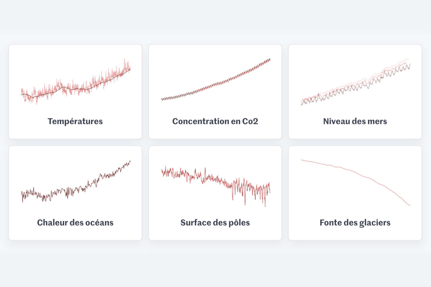
COP27 : six indicateurs pour mesurer l’urgence climatique
▻https://www.lemonde.fr/les-decodeurs/article/2022/11/03/cop27-6-indicateurs-pour-mesurer-l-urgence-climatique_6148399_4355770.html
Température, concentration carbone, océans… A la veille de la COP27 en Egypte, le point sur les indicateurs-clés pour prendre la mesure de l’amplification du dérèglement climatique depuis la première conférence climat, en 1995.
Why I Stopped Using Bullet Graphs (and What I Now Use Instead)
▻https://nightingaledvs.com/why-i-stopped-using-bullet-graphs-and-what-i-now-use-instead
tl;dr: After teaching many data professionals about bullet graphs and using them in many #dashboards, I started to notice that they had a fair number..
#Business_Intelligence #Charts #Data_Literacy #Data_Visualization #How_To
Woven Time: Thoughts on Our Experience of Time in a Mashup
▻https://nightingaledvs.com/woven-time
Our experience of time is simplest described like this: we move forward, and we measure periods by units like seconds, minutes, hours, etc. But I..
Discovering Data Visualisation: How I Discovered and Fell in Love with Data Visualisation Art
▻https://nightingaledvs.com/discovering-data-visualisation-how-i-discovered-and-fell-in-love-wit
I stumbled upon data visualisation art quite by accident early in 2022, at a time when I was at an interesting crossroads in my life...
#Career #Community #Data_Art #Data_Visualization #Historic_Dataviz #spotlight
“I Can’t Draw” and Other Conversations I Always Have with My Dataviz Students
▻https://nightingaledvs.com/i-cant-draw-and-other-conversations-i-always-have-with-my-dataviz-st
When you, like me, have been #teaching for a while, you realize there’s a fundamental paradox: no two clusters of students are alike, yet all..
Behind the Scenes of “The Future of #Data_Science”: An Interview with Ciera Martinez
▻https://nightingaledvs.com/behind-the-scenes-of-the-future-of-data-science-an-interview-with-ci
A few months ago I had the pleasure of sitting down with Ciera Martinez to discuss the founding of the project, Data Science by #Design,..