
-
-
This new Twitter account hunts for bots that push political opinions — Quartz
▻https://qz.com/1110481/this-new-twitter-account-hunts-for-bots-that-push-political-opinions
▻https://qzprod.files.wordpress.com/2017/10/botfeature1.png?w=1600 -
Excellent #making-of technique des #panamapapers
Wrangling 2.6TB of data: The people and the technology behind the Panama Papers · ICIJ
▻https://panamapapers.icij.org/blog/20160425-data-tech-team-ICIJ.html -

Data Journalism Without Borders — Shorthand Social
▻https://social.shorthand.com/Maid_Marianne/n2Fb5QaOUc/data-journalism-without-borders
Simon Rogers, Data Editor at Google News Lab, director of the DJA 2016
How is the field of data journalism doing today? Can we still talk of a buzz in newsrooms globally or has a certain fatigue started to kick in?
The same enthusiasm is still there; it’s just that the market has matured. Instead of it being a new thing, it’s become part of the fabric of newsrooms everywhere. It’s become the norm - and some of the work we’re seeing now is incredibly exciting. And that’s just in Europe and the US - around the world, data journalism is still new and developing.
What trends and techniques do you think will shape the future of data journalism? Which organisations do you see as trend setters?
Increasingly, we are seeing specialisation within data journalism. There are still generalists out there (like me) but now we are seeing the rise of visual reporters who make graphics, developer reporters who build things, designers who work to make things beautiful. This is such an exciting time - we just don’t know what’s coming next.
-
Data Journalism Awards - Data Journalism Unconference | GEN
▻http://www.globaleditorsnetwork.org/programmes/data-journalism-awards/ddjunconfThe Global Editors Network is launching the Data Journalism Unconference,
a FREE, invitation only event to discuss and tackle data journalism challenges across borders.
Organised in partnership with Thomson Reuters, with support from Google, the event will gather around 80 participants from the five continents in New York City on 10 May 2016 and stand as a unique and exclusive opportunity to exchange ideas on how teams, techniques and models vary from one country to the other, with the ultimate goal to initiate fruitful international collaborations.
-
-
Une star du #data-journalisme dans une pour #Microsoft
▻https://www.youtube.com/watch?v=Rmch41uLXRU-

Quand tu es data journaliste tu vis dans un monde où tout est blanc, lumineux et aéré (les meubles, les gens), tu te déplaces en taxi, avec un casque sur la tête et tu fais rire les gens avec des données sur le choléra. Trop cool, le data journalisme. Vraiment, merci Microsoft 360.
-
-
+1 avec peg. ça me fait penser à --->
Serge Reggiani : ’’Le monsieur qui passe’’ (Annie Noel/ Alice Dona), 1973 - YouTube
▻https://www.youtube.com/watch?v=2Ek_8M2fJ1s
–—
Le Monsieur Qui Passe
Paroles d’Annie Noel/ Alice Dona
Je voudrais être ce monsieur qui passe
Ce monsieur qui passe sans se presser
Il a le charme des princes de race
Qu’on a mis au monde tout habillés
Costume en lin, chemise en soie
Cravate à pois, chaussures en daim
Ce monsieur-là connaît bien son solfège
Il joue comme un Chopin des Nocturnes en arpège
Coupe au rasoir, ongles soignés
Montre en sautoir, parfum discret
Ce monsieur-là a la taille rêvée
Pour marcher dans la foule sans lever le nezEt je voudrais être ce monsieur qui passe
Ce monsieur qui passe et ne me voit pas
Avoir ce regard où je ne vois trace
Du regret de qui, de l’ennui de quoi
Qu’il me fait envie, que je voudrais être
Ce monsieur qui passe et qui n’est pas moi
Moi dont je suis las, dans qui je m’empêtre
Que je n’aime pasJe voudrais être ce monsieur qui passe
Il a le sourire des gens satisfaits
Et dans sa tête d’où rien ne dépasse
Tout est à sa place, tout est rangé
Voiture de sport, ski à Morzine
Yacht aux Açores, le grand standing
Je quitte tout, je veux vivre sa vie
Et puis j’offre la mienne à n’importe quel prix
Museau fripé, nez en avant
Sourcils fâchés, les yeux tombants
Mes folies douces et mes peines de cœur
Allez, je brade tout, le pire et le meilleurQue je voudrais être ce monsieur qui passe
Ce monsieur qui passe et qui ne sait rien
Rien de mes espoirs, rien de mes angoisses
Rien de mes révoltes serrées dans mes poings
Je veux une vie où tout soit limpide
Où ne traînent pas tant des chiens perdus
Tant d’étés fanés, tant de chambres vides
Tant d’amours déçuesÇa y est ! c’est moi lui, je passe à sa place
Ma peau se défroisse, je deviens charmant
Qu’est-ce que c’est vaste, enfin j’ai de l’espace
Sa tête, ô miracle, me va comme un gant
J’garde ma Jaguar, j’mange chez Régine
J’commande à boire, je me sens « in »
J’ai plus d’idées, enfin je suis tranquille
Les idées, cher Edgar, c’est pour les imbéciles
Je rentre chez moi, enfin, chez lui
J’entends une voix : « Bonsoir chéri ! »
Non, pas sa femme ! Non, pas sa femme à lui !
Non, pas sa femme, pas sa femme à lui !Je ne veux plus être ce monsieur qui passe
Et grand bien lui fasse d’être aussi beau
Je lui rends sa femme, ses tableaux de chasse
Je reprends mes billes, rendez-moi ma peau
Monsieur qui passez au regard tranquille
Comme je vous plains de n’être pas moi
Gardez votre cœur plein d’automobiles
Je garde le mien, je rentre chez moi -
-
-
Quartz: #bad_data guide
►https://github.com/Quartz/bad-data-guideAn exhaustive reference to problems seen in real-world data along with suggestions on how to resolve them.
exemples :
– Lots and lots of garbage study results make it into major publications because journalists don’t understand p-values.
– Benford’s Law is a theory which states that small digits (1, 2, 3) appear at the beginning of numbers much more frequently than large digits (7, 8, 9). (...) Benford’s Law is an excellent first testchecklist “de base” :
Issues that your source should solve
Values are missing
Zeros replace missing values
Data are missing you know should be there
Rows or values are duplicated
Spelling is inconsistent
Name order is inconsistent
Date formats are inconsistent
Units are not specified
Categories are badly chosen
Field names are ambiguous
Provenance is not documented
Suspicious numbers are present
Data are too coarse
Totals differ from published aggregates
Spreadsheet has 65536 rows
Spreadsheet has dates in 1900 or 1904
Text has been converted to numbersIssues that you should solve
Text is garbled
Data are in a PDF
Data are too granular
Data was entered by humans
Aggregations were computed on missing values
Sample is not random
Margin-of-error is too large
Margin-of-error is unknown
Sample is biased
Data has been manually edited
Inflation skews the data
Natural/seasonal variation skews the data
Timeframe has been manipulated
Frame of reference has been manipulatedIssues a third-party expert should help you solve
Author is untrustworthy
Collection process is opaque
Data asserts unrealistic precision
There are inexplicable outliers
An index masks underlying variation
Results have been p-hacked
Benford’s Law fails
It’s too good to be trueIssues a programmer should help you solve
Data are aggregated to the wrong categories or geographies
Data are in scanned documents
-

#Prévert
Je reprendrais bien une once de Suspicious numbers are present sur un air de It’s too good to be true -


Du coup recherche gg:images sur « suspicious numbers are present »
La première réponse de gg ensoleille ma journée !
(merci @touti !) -
-
-
un logiciel est en préparation pour effectuer ces validations de manière automatisée = Dataproofer
▻https://github.com/dataproofer/Dataproofer
-
-
Journalism schools must become information management schools - Nicolas Kayser-Bril
▻http://blog.nkb.fr/journalism-schoolsOne possibility for journalism schools would be to focus on (...) gathering and producing information in the public interest. This would imply a strong focus on news gathering on social media, digital forensics (to assess the veracity of a piece of content), data gathering and analysis and shoe-and-leather investigation.
There are two problems with this approach. Not all journalism students like these topics. Some still associate journalism with fame (many want to become a news anchor) or travels. Most importantly, there is no market for professional information managers working exclusively in the public interest. (...)
The other possibility for journalism schools is to focus on information management, the first part of the definition of journalism. They need to drop the pretense that they have anything to do with the balance of powers and focus exclusively on producing excellent information management professionals.
#formation #journalistes #data-journalisme
(@nkb ne cherche pas forcément à se faire des amis :)
-

« hey need to drop the pretense that they have anything to do with the balance of powers and focus exclusively on producing excellent information management professionals. »
Rassurez-vous, il y a longtemps qu’ils ne sont plus un contre-pouvoir, ce sont désormais des larbins bien apprivoisés avec les privilèges pour les domestiquer.
Ajoutons-y le « management », ânerie à la mode chez tous les pseudo-intellectuels formatés et incultes, on aura une parfaite profession de laquais, préparés dès le berceau.
-
-
-

-
-

Datalib: JavaScript Data Utilities
▻http://uwdata.github.io/datalibDatalib is a JavaScript data utility library. It provides facilities for data loading, type inference, common statistics, and string templates. This includes:
Loading and parsing data files (JSON, TopoJSON, CSV, TSV).
Summary statistics (mean, deviation, median, correlation, histograms, etc.).
Group-by aggregation queries, including streaming data support.
Data-driven string templates with expressive formatting filters.
Utilities for working with JavaScript functions, objects and arrays.
While created to power Vega and related projects, datalib is a standalone library useful for data-driven JavaScript applications on both the client (web browser) and server (e.g., node.js). -
« #SwissLeaks », ou l’investigation commandée - Myret Zaki - Bilan
▻http://www.bilan.ch/myret-zaki/redaction-bilan/swissleaks-linvestigation-commandeeSwissleaks est une opération qui s’apparente à du journalisme d’investigation organisé par les services de l’Etat.
(la fin de l’article montre qu’il ne s’agit pas de défoncer l’enquête de l’ICIJ et protéger les banques, mais d’aller au-delà du #data-journalisme si on veut vraiment comprendre ce qui se passe en termes de blanchiment, d’évasion fiscale, etc.)
-
ARCADE Issue 31.4: Designing Data | Dialogue on Design
▻http://arcadenw.org/issues/designing-data(#visualisation, #data-journalisme avec de l’#isotype)
-

-

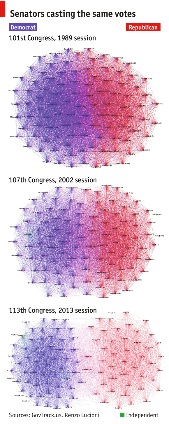
▻http://renzolucioni.com/articles/senate-voting-relationships
(nearly) made in Peru
I made the graphs using Gephi, data from GovTrack, and this Python code. In each graph, edge (u, v) is assigned weight equal to the number of times Senator u and Senator v voted the same way, either Yea or Nay. For the sake of clarity, I filtered out edges with weight less than 100; these lighter edges generally indicate agreement on procedural votes.
The clusters you see in each graph are the result of using Gephi’s Force Atlas layout which applies a physics model to the graph and causes those nodes connected by heavier edges to be pulled together more tightly. A nice side-effect of using this physics model is that more bipartisan senators are pushed closer to the center of the graph, near the party divide, while less bipartisan senators are repelled outwards toward the perimeter of the graph, furthest from the party divide.
-
Toute la méthodologie : ▻http://nbtest.herokuapp.com/gist/rlucioni/7796000
-
Merci pour les explications. J’adorerais voir la même représentation pour nos représentants !
-
-
peut être le suggérer à ▻http://www.regardscitoyens.org
-

peut-être jouable grâce au lien que donnait @denisb tout à l’heure, sur le Parlement européen
▻http://seenthis.net/messages/206322#message206356
-
-

ATodd – When Harvard Met Sally : N-gram Analysis of the New York Times Weddings Section | News Genius
▻http://news.rapgenius.com/Atodd-when-harvard-met-sally-n-gram-analysis-of-the-new-york-times-wWhat do the world’s most self-important people think is important?
The neat thing about these announcements is that they’re fairly structured—if you read a bunch of them, you’ll notice patterns in the way couples are introduced and how their basic “stats” are phrased. This makes it possible to rigorously test our intuitions about trends like:
The decline of debutante culture
When exactly Wall Street hit its period of peak decadence
How the average age of well-to-do brides changes over time
Whether Princeton’s stricter grading standards have resulted in the “nightmare scenario” envisioned by a concerned student in the Times itselfune #enquête à la Coulmont dans les annonces de #mariages du #NYT
#data-journalisme via @archiloque -

Out of Sight, Out of Mind : A #visualization of #drone strikes in #Pakistan since 2004
►http://drones.pitchinteractive.comUne superbe #visualisation d’enfants morts... et autres civils tués par des #drônes.
-
A Conversation with Data Visualization Experts
Features - Source: An OpenNews project
▻http://source.mozillaopennews.org/en-US/articles/conversation-data-viz-experts
A Conversation with Data Visualization Experts
Working notes on the art and its tools from a General Assembly panel
February 7, 2013
By Renee DiRestaBack in September, I started a project in which I crowdsourced a set of Google Autocomplete answers to an interesting question. Responses came in from all over the country, and within a few weeks, I had a spreadsheet with hundreds of thousands of rows…and no idea what to do next. I had a few questions in mind at the start, so I started slicing the data in various ways (in Excel, with pivot tables), and insights began to emerge. But I couldn’t help wondering: was I asking the right questions, or was I missing something important because I didn’t know to look for it? Were the visualization designs that I’d come up with the best ones for the story I was trying to tell? What would professionals do?
#visualisation #cartographie #information-design #data-journalisme #données #graphique
-
Le “data-journalisme” ne va pas tuer les journalistes, enfin, pas tous…
Bon, je me décide à le seenthiser. C’est intéressant, cette réflexion sur le data-journalisme, mais je trouve que ça manque de distance, de regard critique sur les données (données pour acquises) et les informations finalement traitées de la même manière que dans le journalisme "traditionnel". Ce qui change ici, ce n’est pas la méthode ni le fond pour "écrire" les histoires, mais l’utilisation d’un "nouvel" outil (en fait pas si nouveau puisqu’on l’utilise dans le presse depuis 20 ou 30 ans mais pas aussi systématiquement).
Cette approche est trop "en dedans" pour mon goût, trop étroite. En même temps il aborde des sujets importants, qui mériteraient d’être traités de façon plus ouverte.▻http://www.mediaculture.fr/2013/01/20/data-journalisme-infographistes-danger
Le “data-journalisme”, plus qu’un mot à la mode, n’est pas non plus la solution miracle aux problèmes de monétisation de la presse. Cette innovation bouleverse les métiers et contraint les rédactions à plus de polyvalence et de collaboration.
Nicolas Kayser-Bril animait vendredi 18 janvier une conférence au Figaro présentant le data-journalisme et sa présentation a suscité intérêt, scepticisme et crainte tout à la fois. Des réactions qui résument assez bien la palette des sentiments qui émergent quand on évoque le “journalisme de données”.
Mais, avec le “journalisme de données”, de quoi parle-t-on exactement ? Ce n’est pas de l’infographie, même si elle peut s’appuyer sur ce mode de représentation pour gagner en lisibilité et agrément.
Ce qui est différent c’est l‘interactivité de l’information et la possibilité de naviguer dans le contenu pour y puiser ce qui nous concerne ou nous intéresse personnellement. Dans l’exemple ci-dessous, qui montre la densité de chômage par canton allemand depuis 2005, le lecteur a la possibilité d’indiquer son propre canton, dans la première zone de saisie. Le graphisme est au service de la lisibilité, car il permet de saisir immédiatement deux tendances : la nette amélioration de l’emploi pour une vingtaine de cantons. Et la forte disparité régionale, puisque les cantons du bas de l’infographie sont encore beaucoup plus clairs.
#data-journalisme #cartographie #visualisation #journalisme #infographie
-
BTree Huggers: Data Scientists + NYC Parks Get Together, Blow Everyone’s Minds | DataKind
►http://datakind.org/2012/09/btree-huggers-data-scientists-nyc-parks-together-blow-everyones-minds
September 11, 2012
BTree Huggers: Data Scientists + NYC Parks Get Together, Blow Everyone’s Minds
Wow. Just, wow. Last weekend we hosted our first DataDive back in our hometown of NYC since our first event last October and it was, in no uncertain terms, incredible. The NYC Parks Department delivered three amazing projects related to tracking tree diversity in NYC, assessing areas of high risk during storms, and assessing how effective their pruning programs are in reducing work orders. Over the weekend NYC Parks, NYC DOITT, and our great data scientist community drilled into these problems, hacked up data, and ultimately came up with AMAZING results, namely:
Storm Risk Map (headed up by Data Ambassador Brian Dalessandro): A full analysis of storm and tree damage data that resulted in a great study of data preparedness and an awesome map of storm risk.
Block Pruning Analysis (headed up by Data Ambassador Cathy O’Neil): An in-depth look at the effect of block pruning on later work requests, including multiple statistical models, a thorough assessment of the data, and a preliminary analysis that shows pretty clearly that block pruning may not have an effect at all.
Tree Diversity Map (headed up by Data Ambassador Adam Laiacano): An analysis of the tree species in New York, culminating in an insane interactive tool powered by CartoDB.
#data #statistiques #visualisation #cartographie #sources-ouvertes #data-journalisme
-
Big data reveals hidden patterns of political contributions
The Forest of Advocacy❝This site is dedicated to providing visualizations gleaned from big data regarding politics. We will provide at least one new visualization every week from now to the election. So enjoy, and come back next Monday.
Our first family of visualizations is the “Forest of advocacy.” These visualizations provide a dynamic look at the partisan tilt of giving within organizations. For each organization, individuals are characterized as points sketching out a line over time. The X axis is time, and the Y axis represents the net partisan tilt of contributions over the preceding 6 months. Over the decades, one sees lines sketched out, reflecting the partisanship of individuals over time. For each organization, we also provide the net contributions of the entire organization, and the names of biggest Democratic, Republican, and “bipartisan” contributors (the individual with the highest product of Democratic and Republican contributions).
The video above provides an overview of the visualization—we recommend you look at this first. We have chosen eight organizations for our initial analysis: the ACLU, Bain Capital, Bain Company, Boston Consulting Group, Goldman Sachs, Harvard Business School, Heritage Foundation, and McKinsey Company. You can click below for the visualization associated with each organization..
#visualisation #cartographie #data #big-data #base-de-données #data-journalisme #statistiques
-
Density Design | Workshop in Beirut | The Guardian Panorama on Lebanon
►http://www.densitydesign.org/2012/07/workshop-in-beirut-the-guardian-panorama-on-lebanonThe aim of the workshop was to learn how to unveil and describe unexpected stories extracting meaning from big digital datasets by creating different visualizations.
During the workshop the 20 participants explored all the articles related to Lebanon published by the Guardian, to understand how Lebanon is perceived abroad: who are the main actors, relations and most relevant topics.#data-journalisme #data-visualisation #infographie #cartographie #carte&territoire #Liban #Beyrouth #Density_Design
-
Influence Networks : The six degrees of investigative journalism » OWNI.eu, News, Augmented
►http://owni.eu/2011/04/11/influence-networks-the-six-degrees-of-investigative-journalismencore (!) une expérimentation #data-journalisme d’#owni ; cette fois, pour établir un graphe social
Crowdsourced investigation
Influence Networks’ aim is to allow any journalist or citizen to call for a collaborative investigation on a given topic. (...) the tool is not meant for investigations based on secret documents. However, it does structure and reorganize publicly available information. After all, #open-source intelligence is a fast-growing field – in journalism as well.


