Seenthis
•
 
Identifiants personnels
  • [mot de passe oublié ?]

 
  • #f
  • #fo
  • #fon
  • #font
RSS: #fonts

#fonts

  • #fontspec
  • #fontsquirrel
0 | 25 | 50 | 75
  • @omgubuntu
    OMG ! Ubuntu ! @omgubuntu via RSS CC BY 25/11/2025

    #Google Releases its New Google Sans Flex Font as Open Source
    ▻https://www.omgubuntu.co.uk/2025/11/google-sans-flex-font-ubuntu

    Google has made its ‘next generation brand typeface’, Google Sans Flex, available for download — under an open source license, which is welcome #News. A modern sans serif font purpose-designed for use on screens and OSes, Google Sans Flex is a ground-up, multi-axis rebuild of the proprietary Google Sans font, by typographer David Berlow (of Font Bureau fame). The “flex” in GS Flex is because it’s a variable font that is “extremely flexible [with] variable axes for weight, width, optical size, slant, as well as an axis for rounded terminals” (as in terminals in letters, not command-line apps).” Android and web developers will find […] You’re reading Google Releases its New Google Sans Flex Font as Open Source, a blog post from OMG! Ubuntu. Do not reproduce elsewhere without (...)

    #Eye_Candy #Fonts

    OMG ! Ubuntu ! @omgubuntu via RSS CC BY
    Écrire un commentaire
  • @omgubuntu
    OMG ! Ubuntu ! @omgubuntu via RSS CC BY 2/02/2025

    #GNOME Introduces New UI & Monospace Adwaita #Fonts
    ▻https://www.omgubuntu.co.uk/2025/02/gnome-introduces-new-ui-monospace-adwaita-fonts

    GNOME has announced a change to its default UI and monospace fonts ahead of the upcoming #GNOME_48 release — a typographic turnabout that won’t impact Ubuntu users directly, though. Should you feel a sense of deja vu here it’s because GNOME trialled a font switch last year, during #development of GNOME 47. Back then, it replaced its home-grown Cantarell font with the popular open-source sans Inter font (trivia: used by Zorin OS). The change was reverted prior to the GNOME 47 due to various UI quirks, coverage issues, and compatibility (thus underlying the importance of testing things out prior […] You’re reading GNOME Introduces New UI & Monospace Adwaita Fonts, a blog post from OMG! Ubuntu. Do not reproduce elsewhere without (...)

    #News

    OMG ! Ubuntu ! @omgubuntu via RSS CC BY
    Écrire un commentaire
  • @omgubuntu
    OMG ! Ubuntu ! @omgubuntu via RSS CC BY 18/12/2024

    Ubuntu Update Adds Support for #unicode’s Newest #emoji
    ▻https://www.omgubuntu.co.uk/2024/12/ubuntu-update-support-for-emoji-16-0

    A paint splatter, super-tired face, and a harp are among new emoji users of Ubuntu 22.04 and 24.04 LTS will be able to see and type after installing an update to the Noto Color Emoji font. Ubuntu, which has shipped the font by default since 2017, is preparing to release an updated version containing the 8 new emoji added as part of the Unicode 16.0 standard. Unicode 16.0 went live in September, introducing a total of 5,185 new characters, including 7 new emoji code points and 1 new emoji sequence to create the official flag of the Island of Sark. The new […] You’re reading Ubuntu Update Adds Support for Unicode’s Newest Emoji, a blog post from OMG! Ubuntu. Do not reproduce elsewhere without (...)

    #News #Fonts

    OMG ! Ubuntu ! @omgubuntu via RSS CC BY
    Écrire un commentaire
  • @omgubuntu
    OMG ! Ubuntu ! @omgubuntu via RSS CC BY 10/07/2024

    #GNOME 47’s New Font: How to Try it on Ubuntu
    ▻https://www.omgubuntu.co.uk/2024/07/make-inter-default-font-in-ubuntu

    https://149366088.v2.pressablecdn.com/wp-content/uploads/2024/07/inter-font-ubuntu-how-to-406x232.jpg

    News that GNOME’s design team is looking to make Inter the default font in GNOME 47 got me curious about what the typeface might look in action. Why Inter? This clean, open-source sans-serif font is designed specifically for user interfaces. It’s legible and clear at various sizes and resolutions, boasts a broad character set, and supports hundreds of languages. Still, this tentative typography swap is not set in stone: we’re early in the GNOME 47 development cycle, the proposed font change is just that: a proposal. Further testing is needed to ensure Inter is an adequate replacement for Cantarell, GNOME’s […] You’re reading GNOME 47’s New Font: How to Try it on Ubuntu, a blog post from OMG! Ubuntu. Do not reproduce elsewhere without (...)

    #News #Eye_Candy #Fonts

    OMG ! Ubuntu ! @omgubuntu via RSS CC BY
    Écrire un commentaire
  • @omgubuntu
    OMG ! Ubuntu ! @omgubuntu via RSS CC BY 26/05/2024

    #Microsoft Gives Its Open-Source Developer Font Major Update
    ▻https://www.omgubuntu.co.uk/2024/05/cascadia-code-font-update-large-type-pieces

    https://149366088.v2.pressablecdn.com/wp-content/uploads/2024/05/cascadia-code-update-406x232.jpg

    Cascadia Code is an open-source monospaced font made by Microsoft first released in 2020 and serves as the default typeface for the official Windows Terminal app. Similar to Intel’s One Mono, JetBrains’ Mono and IBM’s Plex, Cascadia Code is an clear, legible, modern monospaced font tailored for terminal and code editing and offering a wide range of programming ligatures. Earlier this mont the font received its first update in nearly 3 years and, as per release announcement, it’s a huge one. If you’re a fan of this font and have an older version installed, or you’re just a creative into […] You’re reading Microsoft Gives Its Open-Source Developer Font Major Update, a blog post from OMG! Ubuntu. Do not reproduce elsewhere without (...)

    #News #Fonts

    OMG ! Ubuntu ! @omgubuntu via RSS CC BY
    • @sandburg
      Sandburg @sandburg CC BY-SA 26/05/2024

      #font #police_de_caracteres

      Sandburg @sandburg CC BY-SA
    Écrire un commentaire
  • @omgubuntu
    OMG ! Ubuntu ! @omgubuntu via RSS CC BY 14/12/2023

    Ubuntu Update Adds Support for 118 New #emoji
    ▻https://www.omgubuntu.co.uk/2023/12/ubuntu-noto-emoji-font-update-unicode-15-1

    https://149366088.v2.pressablecdn.com/wp-content/uploads/2023/12/ubuntu-emoji-406x232.jpg

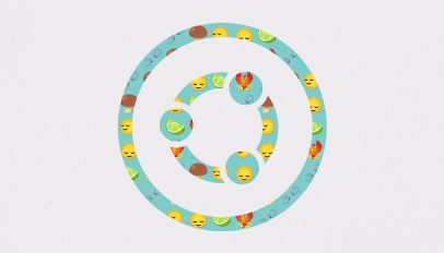
    A brown mushroom, a slice of lime, and a fiery phoenix — no, that’s not the start of a rubbish joke but a selection of the 118 new emoji added to the #unicode standard. And Ubuntu users can see and use these new emoji well before Apple users, as well! Rolling out to #Ubuntu_22.04_LTS and 23.10 this week is an update to the Noto Color Emoji font that’s includes full support for all of the new emoji in Unicode 15.1. Among them: In addition, the latest release includes over 100 new directional glyphs for people running, praying, kneeling, […] You’re reading Ubuntu Update Adds Support for 118 New Emoji, a blog post from OMG! Ubuntu. Do not reproduce elsewhere without (...)

    #News #Fonts

    OMG ! Ubuntu ! @omgubuntu via RSS CC BY
    Écrire un commentaire
  • @b_b
    b_b @b_b PUBLIC DOMAIN 21/11/2023
    4
    @gao_tumbuktu
    @simplicissimus
    @ericw
    @gblin
    4

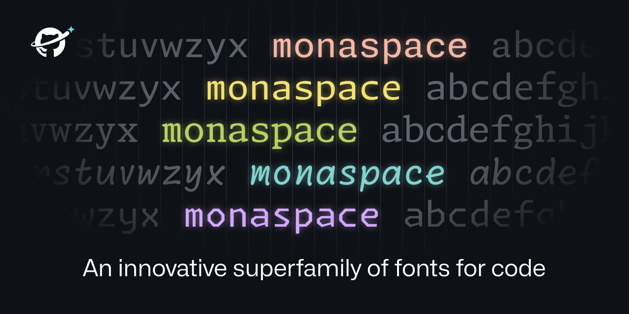
    #Monaspace
    ▻https://monaspace.githubnext.com

    https://monaspace.githubnext.com/opengraph-image.png?8f0e79eb8fe60cfc

    An innovative superfamily of #fonts for #code

    b_b @b_b PUBLIC DOMAIN
    • @ericw
      EricW @ericw CC BY-SA 22/11/2023

      Pour l’instant j’utilise hack que je trouve confortable mais je vais jeter un œil sur celles-ci.

      EricW @ericw CC BY-SA
    • @b_b
      b_b @b_b PUBLIC DOMAIN 22/11/2023

      Le lien vers hack ►https://sourcefoundry.org/hack :)

      b_b @b_b PUBLIC DOMAIN
    • @ericw
      EricW @ericw CC BY-SA 22/11/2023
      @b_b

      @b_b ah ben oui bien joué, où avais-je là tête !

      EricW @ericw CC BY-SA
    Écrire un commentaire
  • @b_b
    b_b @b_b PUBLIC DOMAIN 4/04/2023
    4
    @rastapopoulos
    @odilon
    @kent1
    @cy_altern
    4

    Free #Fonts For #Interface Designers — Smashing Magazine
    ▻https://www.smashingmagazine.com/2023/03/free-fonts-interface-designers

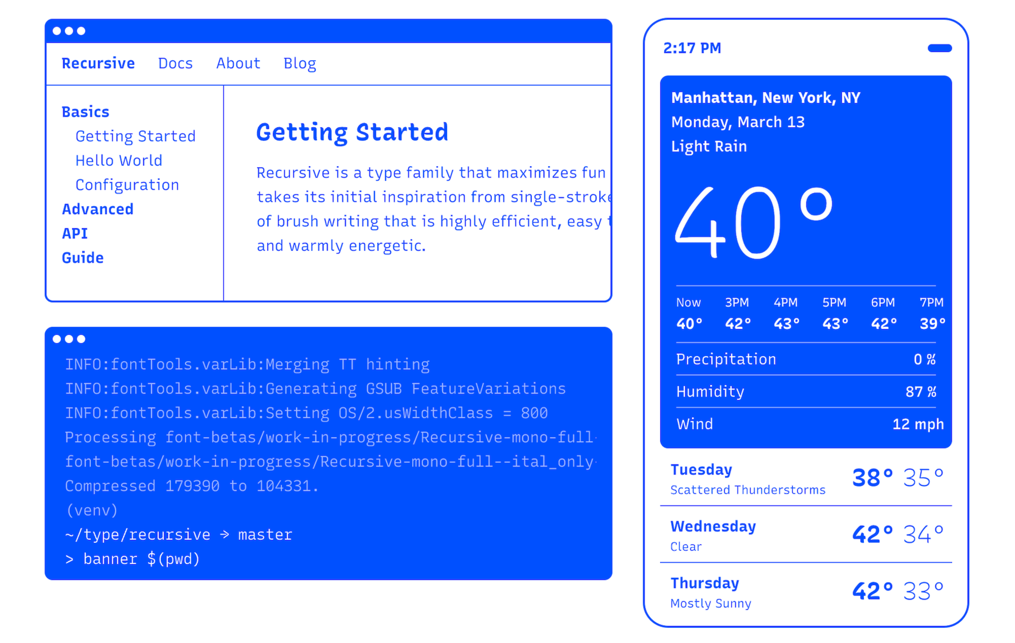
    In this post, we compiled some free fonts that we came across and that you probably haven’t spotted before. Some of them shine with their #flexibility, some put a special focus on #readability, and others are a great choice if you want to make a bold statement.

    https://res.cloudinary.com/indysigner/image/fetch/f_auto,q_80/w_2000/https://files.smashing.media/articles/open-source-fonts-roundup/recursive-opt.png https://res.cloudinary.com/indysigner/image/fetch/f_auto,q_80/w_2000/https://files.smashing.media/articles/open-source-fonts-roundup/yrsa-rasa-opt.png https://res.cloudinary.com/indysigner/image/fetch/f_auto,q_80/w_2000/https://files.smashing.media/articles/open-source-fonts-roundup/space-grotesk-opt.png https://res.cloudinary.com/indysigner/image/fetch/f_auto,q_80/w_2000/https://files.smashing.media/articles/open-source-fonts-roundup/figtree-opt.png https://res.cloudinary.com/indysigner/image/fetch/f_auto,q_80/w_2000/https://files.smashing.media/articles/open-source-fonts-roundup/reforma-opt.png

    b_b @b_b PUBLIC DOMAIN
    • @rastapopoulos
      RastaPopoulos @rastapopoulos CC BY-NC 5/04/2023

      #typographie

      RastaPopoulos @rastapopoulos CC BY-NC
    Écrire un commentaire
  • @b_b
    b_b @b_b PUBLIC DOMAIN 18/11/2022
    8
    @arno
    @rastapopoulos
    @monolecte
    @7h36
    @biggrizzly
    @alexcorp
    @simplicissimus
    @ericw
    8

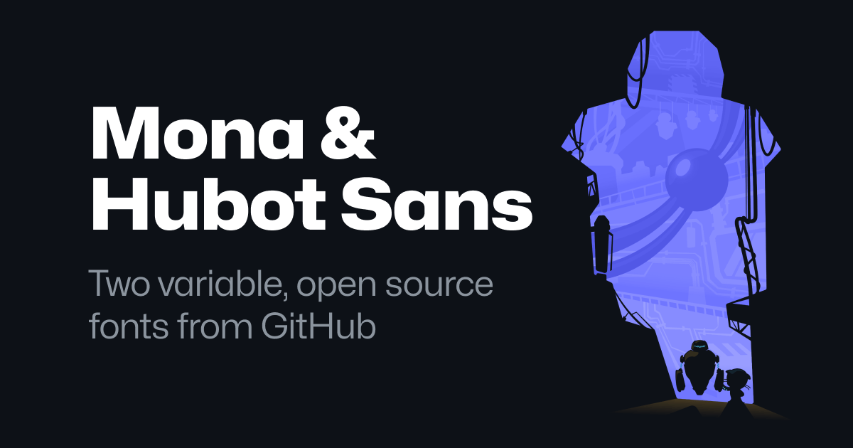
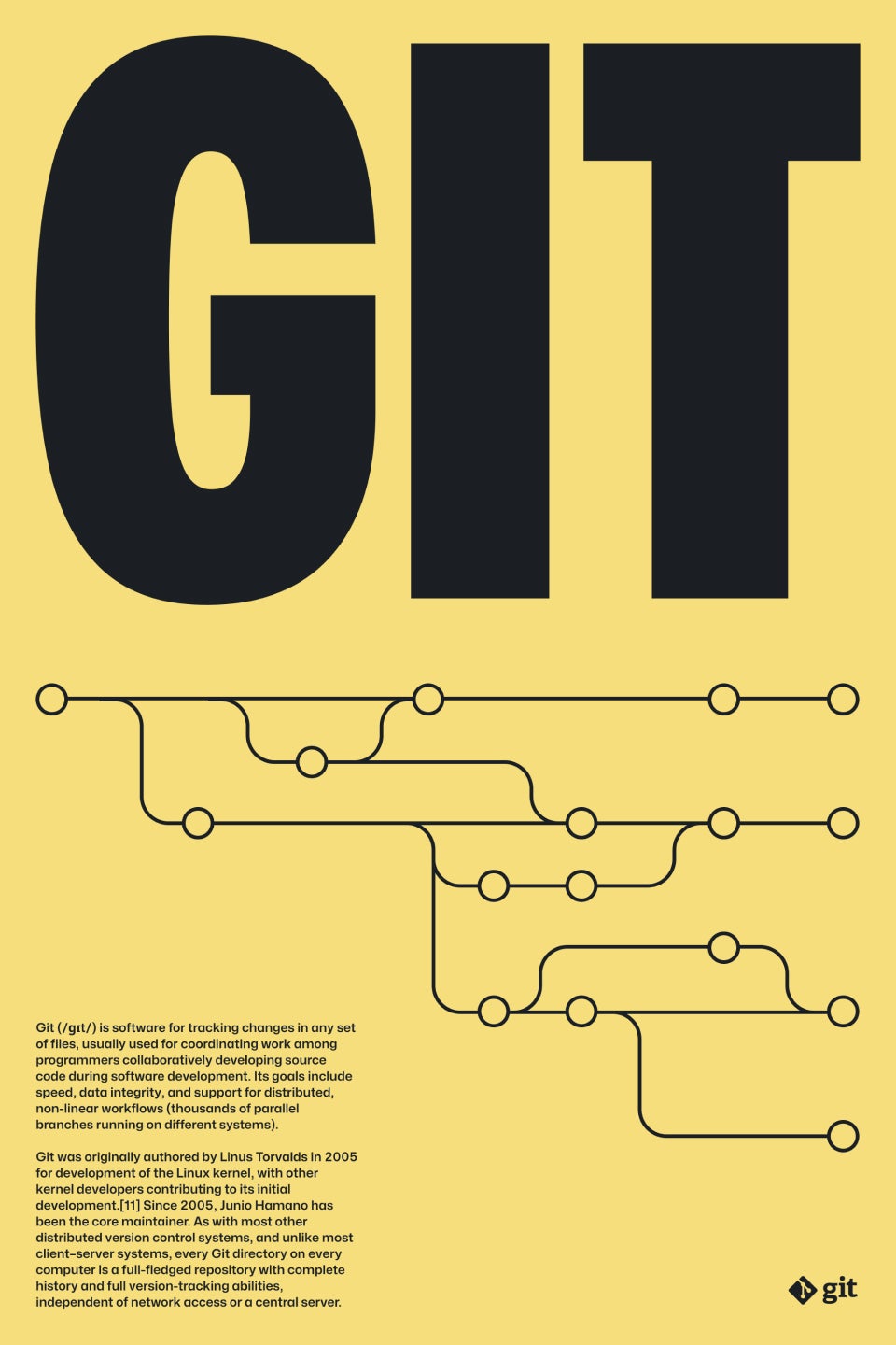
    Mona Sans & Hubot Sans
    ▻https://github.com/mona-sans

    https://github.githubassets.com/images/modules/site/social-cards/mona-hubot-sans.png

    TWO VARIABLE, OPEN SOURCE #FONTS from GITHUB

    https://github.githubassets.com/images/modules/site/mona-sans/poster-2.jpg https://github.githubassets.com/images/modules/site/mona-sans/poster-3.jpg https://github.githubassets.com/images/modules/site/mona-sans/poster-4.jpg

    b_b @b_b PUBLIC DOMAIN
    • @arno
      ARNO* @arno ART LIBRE 18/11/2022

      Très très cool : 48 variantes tout de même ! (Et il y a bien les lettres accentuées.)

      ARNO* @arno ART LIBRE
    • @rastapopoulos
      RastaPopoulos @rastapopoulos CC BY-NC 18/11/2022

      vive les fontes variables !

      RastaPopoulos @rastapopoulos CC BY-NC
    Écrire un commentaire
  • @hackernoon
    Hacker Noon @hackernoon CC BY-SA 12/02/2019

    3 Reasons why you should focus on the Font rather than the color.
    ▻https://hackernoon.com/3-reasons-why-you-should-focus-on-the-font-rather-than-the-color-a37e1af

    https://cdn-images-1.medium.com/max/1024/1*C_oci0catb5JTI5w-B5u4w.jpeg

    3 Reasons Why You Should Focus on the ‘Font’ of your Site.How you can attract your users with your font.Photo by Mr Cup / Fabien Barral on UnsplashLet me make this article short and simple. I have used dozens of sites, and created three. The feedback I get each time differs. I changed a lot on the CSS files, made it look colorful and classy, but something misses out every time.One day, I started changing the #fonts of the site and noticed the vast difference it made. Some sites look better when you choose a style that suits it. I will give you 3 reasons why.Photo by Annie Spratt on Unsplash1.People give attention to things that are NOT ordinary.Take Medium for example. It has a lot of fonts — two for the quotes, one for the heading, one for the subheadings. The difference indicates different (...)

    #font-on-your-site #technology #typography #web-development

    Hacker Noon @hackernoon CC BY-SA
    Écrire un commentaire
  • @ari
    Ari @ari 4/10/2018

    The Complete CSS Demo for #OpenType Features
    ▻https://sparanoid.com/lab/opentype-features
    This project is a comprehensive CSS font-feature-settings demo for OpenType features

    #fonts

    Ari @ari
    Écrire un commentaire
  • @oanth_rss
    oAnth_RSS @oanth_rss CC BY 2/08/2017
    5
    @02myseenthis01
    @mad_meg
    @monolecte
    @7h36
    @ze_dach
    5

    Des sites pour télécharger des fonts gratuites

    ▻https://blog.shevarezo.fr/post/2017/07/31/sites-telecharger-fonts-typos-polices-gratuites

    https://blog.shevarezo.fr/uploads/posts/bulk/9pGEcxho_sites-typos_cover.png

    Que vous soyez graphiste, développeur frontend, vous avez toujours besoin de trouver des typographies qui correspondent au projet que vous menez. Il existe une pléthore de sites répertoriant les typos, avec plus ou moins de réussite. Découvrez une sélection de 9 sites pour télécharger des typos gratuites.

    #typos #fonts #typographies

    via ▻https://diasp.eu/posts/5844068

    oAnth_RSS @oanth_rss CC BY
    Écrire un commentaire
  • @baroug
    baroug @baroug 29/06/2017

    FontStruct | Build, Share, Download Fonts
    ▻https://fontstruct.com

    FontWhat?
    FontStruct is a free, font-building tool sponsored by FontShop.
    With FontStruct you can easily create #fonts using geometrical shapes.
    You create “FontStructions” using the “FontStructor” font editor.
    Once you’re done building, FontStruct generates TrueType fonts, ready to download and use in any application.
    You can keep your creations private, but we encourage users to share their FontStructions. Explore the Gallery of fonts made by other FontStruct users. Download them, or clone them and make your own variations.
    The easiest way to get started with the FontStructor is to watch the intro screencast or read the quick start guide.

    #typo

    baroug @baroug
    Écrire un commentaire
  • @cy_altern
    cy_altern @cy_altern CC BY-SA 17/05/2017
    6
    @tofulm
    @baroug
    @ari
    @rastapopoulos
    @raphael
    @oletrouher
    6

    Create Your Own font-face Kits » Font Squirrel
    ►https://www.fontsquirrel.com/tools/webfont-generator

    Un générateur de variantes de polices (.eot, .svg, .ttf ...) en ligne. Fourni également le code @font-face à intégrer en CSS

    #font-face #générateur #outil-en-ligne #fontsquirrel

    cy_altern @cy_altern CC BY-SA
    • @arno
      ARNO* @arno ART LIBRE 18/05/2017

      Perso je ne l’utilise plus beaucoup, je passe généralement par des outils plus simples qui se content de me convertir la police en WOFF et WOFF2 (les autres formats ne sont plus trop utiles désormais).

      Par exemple :
      ►https://everythingfonts.com/otf-to-woff
      ►https://everythingfonts.com/otf-to-woff2

      ou carrément en ligne de commande sous node.js :
      ►https://github.com/fontello/ttf2woff

      Un petit tour par caniuse indique que Woff est compris par 97% des visiteurs en France (et Woff2 par 87%). Et par ailleurs, @font-face est aussi compris par 97% des visiteurs. Ce qui signifie que tous les visiteurs qui peuvent utiliser des webfonts avec @font-face peuvent en même temps utiliser Woff ; ce qui rend les autres formats (.eot, .svg, .ttf) inutiles.

      ARNO* @arno ART LIBRE
    • @rastapopoulos
      RastaPopoulos @rastapopoulos CC BY-NC 18/05/2017

      Mais suivant la langue des contenus du site final, ça permet aussi de réduire le champs, et donc le fichier, ce que ne font pas forcément les autres outils qui ne font que conversion. Non ?

      RastaPopoulos @rastapopoulos CC BY-NC
    • @arno
      ARNO* @arno ART LIBRE 18/05/2017
      @rastapopoulos

      @rastapopoulos : oui effectivement. Mais l’utiliser parce que ça fait les multiples formats de fontes et le code dont on avait besoin il y a quelques années, je signale que ce n’est plus nécessaire.

      ARNO* @arno ART LIBRE
    Écrire un commentaire
  • @fil
    Fil @fil 29/04/2017
    1
    @monolecte
    1

    Font Map · An AI Experiment by IDEO
    ▻http://fontmap.ideo.com

    http://fontmap.ideo.com/images/Font_Map.png

    Font Map, a quick experiment to see how machine learning can address challenges in design.

    #machine_learning #t-SNE #fonts

    Fil @fil
    Écrire un commentaire
  • @monolecte
    Monolecte 😷🤬 @monolecte CC BY-NC-SA 1/12/2016
    2
    @reka
    @gastlag
    2

    The 100 best free #fonts | Creative Bloq
    ▻http://www.creativebloq.com/graphic-design-tips/best-free-fonts-for-designers-1233380

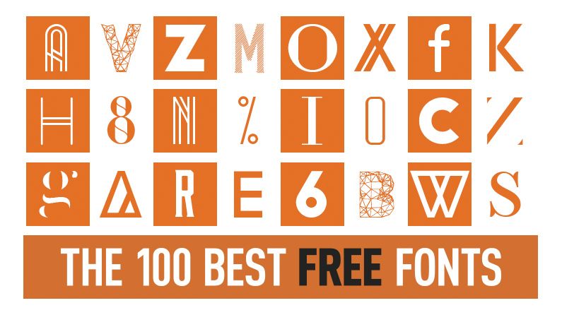
    http://cdn.mos.cms.futurecdn.net/cf2e6d717adbd6fd44531af59ede94b3-1200-80.jpg

    We’ve scoured the web to present you with a fine and varied selection of free fonts. Including scripts, serifs, and a range of ligatures, these fonts will give you greater flexibility in your designs, and add to your arsenal of design tools.

    This list represents the 100 best free fonts we’ve found in a variety of styles. We have many other articles covering specialist font types including handwriting fonts, graffiti fonts, web fonts and more, but we have sectioned our main list under these styles:

    #police #design

    Monolecte 😷🤬 @monolecte CC BY-NC-SA
    • @reka
      Phil Reka docs & archives @reka CC BY-NC-SA 1/12/2016

      #typographie

      Phil Reka docs & archives @reka CC BY-NC-SA
    Écrire un commentaire
  • @supergeante
    Supergéante @supergeante 28/06/2016
    4
    @monolecte
    @mad_meg
    @7h36
    @goom
    4
    @baroug

    Typeset In The Future
    Dedicated to fonts in sci-fi
    Un blog pour @baroug
    ▻https://typesetinthefuture.com

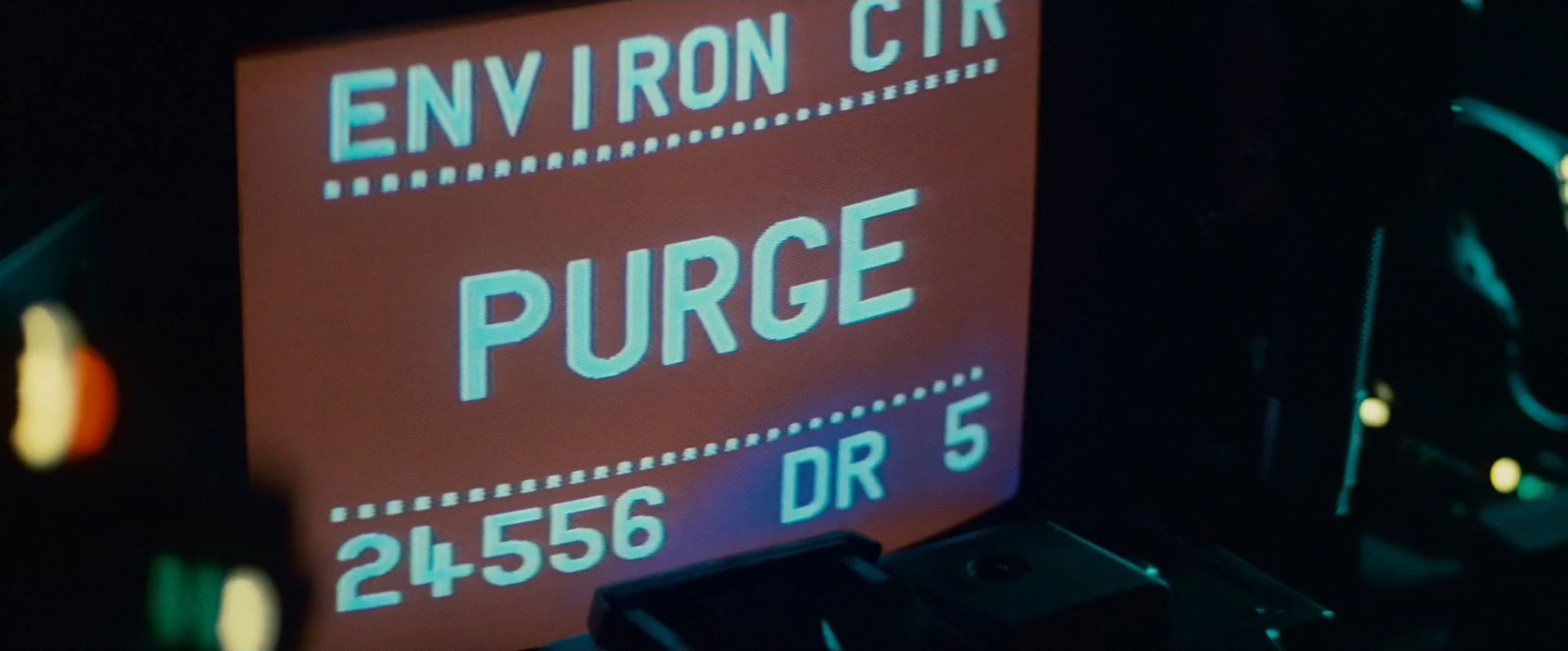
    Avec une analyse typo de Blade runner
    ►https://typesetinthefuture.com/2016/06/19/bladerunner

    https://typesetinthefuture.files.wordpress.com/2016/06/bladerunner_0_05_23_tyrell_corp.jpg?w=560&h=232 https://typesetinthefuture.files.wordpress.com/2016/06/bladerunner_0_09_52_alien_purge_full.jpg https://typesetinthefuture.files.wordpress.com/2016/06/bladerunner_0_14_02_serial_numbers_leon.jpg?w=560&h=232

    #fonts #typographie #science_fiction

    Supergéante @supergeante
    Écrire un commentaire
  • @baroug
    baroug @baroug 27/06/2016
    3
    @supergeante
    @reka
    @gastlag
    3

    Typographics
    ▻http://www.typographics.org

    This site is the beginning of a new publication about type. The focus is you. A designer who uses type, a designers who creates it, or someone who just loves it. Or all three. We’re starting quietly, with a simple group blog. This fall we’ll publish a preview printed edition. The next six months we will try to prove the concept. And if we’re successful, we’ll start regular publication in 2017, with a quarterly print magazine and an active web site.

    #typo

    baroug @baroug
    • @supergeante
      Supergéante @supergeante 27/06/2016

      #fonts #graphisme #fontes #polices_de_caractère

      Supergéante @supergeante
    Écrire un commentaire
  • @b_b
    b_b @b_b PUBLIC DOMAIN 19/05/2016
    1
    @fil
    1

    Using #fonts with node-mapnik
    ▻https://github.com/mapnik/node-mapnik/blob/master/docs/Using-Fonts.md#global

    Mapnik supports rendering custom fonts from a variety of formats. Fonts can either be registered globally or per #map. Normally global font registration is what you need, but per map registration can help reduce memory usage and increase performance in specialized cases.

    /usr/share/fonts/ and /usr/local/share/fonts/ on other Unix systems

    #mapnik #kosmtik

    b_b @b_b PUBLIC DOMAIN
    Écrire un commentaire
  • @b_b
    b_b @b_b PUBLIC DOMAIN 22/03/2016
    2
    @gastlag
    @kent1
    2

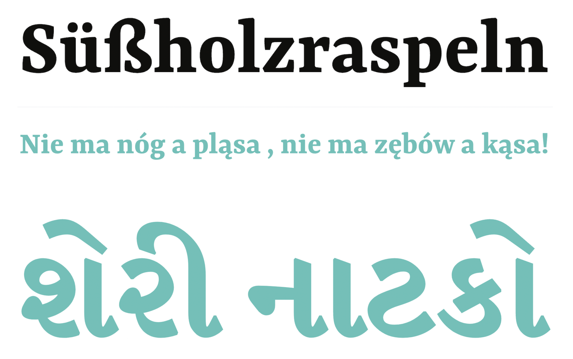
    Yrsa & Rasa – open-source #fonts for Latin + Gujarati
    ▻http://github.rosettatype.com/yrsa-rasa

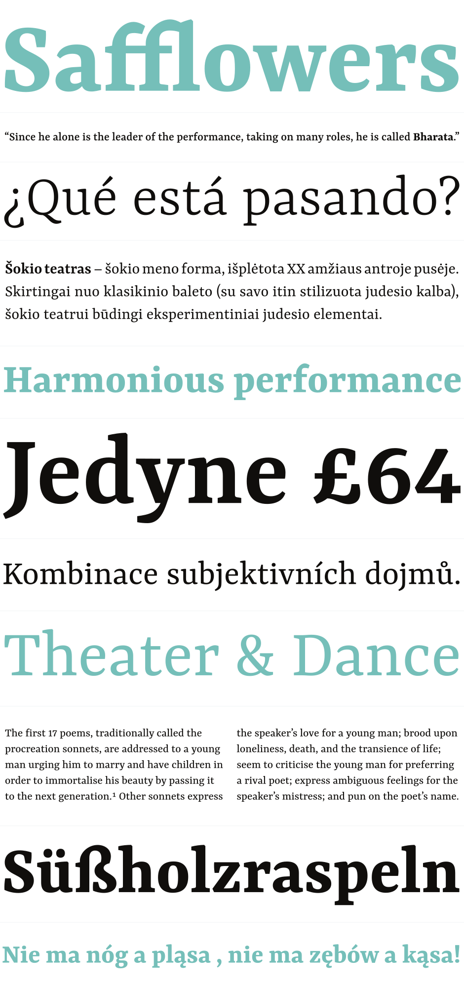
    Yrsa and Rasa are open-source type families published by Rosetta with generous financial support from Google. The fonts support over 92 languages in Latin script and 2 languages in Gujarati script (Gujarati and Kachchi). The family currently has 5 weights. The design and production are done in-house, by Anna Giedryś (@ancymonic) and David Březina (@MrBrezina).

    http://github.rosettatype.com/yrsa-rasa/assets/Yrsa-Rasa-previews_1_big.svg

    #typo

    b_b @b_b PUBLIC DOMAIN
    Écrire un commentaire
  • @liotier
    liotier @liotier CC BY-SA 3/02/2016

    PC Font Pack available: ▻http://int10h.org/oldschool-pc-fonts/fontlist/#ibmvgamcga #typography #fonts - I have no nostalgia for horrible #CGA but the 9x16 #IBM #VGA font elicits very fond memories !

    • #IBM
    liotier @liotier CC BY-SA
    Écrire un commentaire
  • @baroug
    baroug @baroug 27/11/2015
    10
    @b_b
    @rastapopoulos
    @spip
    @nhoizey
    @monolecte
    @7h36
    @goom
    @mukt
    @gastlag
    10

    » Seriously, Don’t Use #Icon #Fonts Cloud Four Blog
    ▻http://blog.cloudfour.com/seriously-dont-use-icon-fonts

    http://blog.cloudfour.com/wp-content/uploads/2015/11/death_to_icon_fonts-slide_20.jpg

    Icons are everywhere. These “little miracle workers” (as John Hicks described them) help us reinforce meaning in the interfaces we design and build. Their popularity in web design has never been greater; the conciseness and versatility of pictograms in particular make them a lovely fit for displays large and small.

    But icons on the web have had their fair share of challenges. They were time-consuming to prepare for every intended display size and color. When high-resolution displays hit the market, icons looked particularly low-res and blocky compared to the text they often accompanied.

    So it’s really no wonder that icon fonts became such a hit. Icons displayed via @font-face were resolution-independent and customizable in all the ways we expected text to be. Sure, delivering icons as a typeface was definitely a hack, but it was also useful, versatile, and maybe even a little fun.

    But now we need to stop. It’s time to let icon fonts pass on to Hack Heaven, where they can frolic with table-based layouts, Bullet-Proof Rounded Corners and Scalable Inman Flash Replacements. Here’s why…

    #typo #icones #web_design

    baroug @baroug
    • @b_b
      b_b @b_b PUBLIC DOMAIN 27/11/2015

      L’article signale cette ressource intéressante pour les personnes qui utilisent ce genre de typos : ▻https://www.filamentgroup.com/lab/bulletproof_icon_fonts.html

      b_b @b_b PUBLIC DOMAIN
    • @rastapopoulos
      RastaPopoulos @rastapopoulos CC BY-NC 27/11/2015

      Résumé :

      – Quand on utilise la zone Unicode réservée aux trucs privés, si la fonte se charge mal, on a soit des rectangles pourris, soit des icônes n’ayant rien à voir (emojis, etc). Et si les utilisateurs (dyslexiques par ex) forcent une fonte propre à leur besoin, pareil, ça nique tout.

      – Quand on fait bien les choses et qu’on utilise le bon caractère Unicode correspondant au dessin que l’on veut utiliser : beaucoup de lecteurs d’écran lisent la description du dessin ! Et le seul moyen de l’enlever est d’ajouter du « aria » dans le HTML en plus. Cela peut marcher dans certains cas, mais du coup impossible d’ajouter des icônes uniquement en CSS, dans le thème graphique.

      Filament a produit une librairie utilitaire contenant CSS et JS nécessaire pour utiliser des fontes d’icônes de manière accessible :
      ▻https://github.com/filamentgroup/a-font-garde

      Mais dans la solution de Filament, dans TOUS les cas d’utilisations, ils demandent à utiliser du HTML supplémentaire spécifique à l’icône. Donc d’après moi, c’est un peu pourri : impossible de faire le choix des icônes (ou pas) uniquement dans le thème graphique…

      Sur le long terme, j’ai l’impression que la solution serait que tous les lecteurs d’écran prennent correctement en compte la propriété speak:none.
      De cette manière, il suffirait :
      1) d’utiliser un bon caractère unicode correspondant au mieux au dessin de chaque caractère de notre fonte d’icône (Fontello permet ça par ex), comme ça le fallback visuel serait bon (sauf s’il n’existe pas et dans ce cas faut utiliser la méthode fallback par image de Filament… galère)
      2) d’appliquer sur tous les :before où on veut ajouter une icône, la directive speak:none

      Mais actuellement même Caniuse.com ne contient pas les statistiques des propriétés orales de CSS… Il y a un ticket pour voter pour ça ici :
      ▻https://github.com/Fyrd/caniuse/issues/1515

      Voilà, comment est-ce que vous allez faire à l’avenir vous ?

      En ce qui me concerne, cela fait de nombreux mois que désormais mon HTML ne contient plus de scories pourries en rapport avec l’aspect graphique, que je n’utilise plus de classes genre « icon », « grid », ou je sais pas quelle merde comme ça, et que j’ajoute tout en CSS grâce aux préprocesseurs (exemple : a.super_lien{ @extend .icon; @extend .icon-super; }).
      Du coup la solution de Filament m’embête vraiment…

      #accessibilité #icônes #fontes #fonts #intégration #HTML #CSS

      RastaPopoulos @rastapopoulos CC BY-NC
    • @rastapopoulos
      RastaPopoulos @rastapopoulos CC BY-NC 27/11/2015
      @notabene @nhoizey

      Et tiens cc @notabene @nhoizey pour intégration/accessibilité.

      RastaPopoulos @rastapopoulos CC BY-NC
    • @nhoizey
      Nicolas Hoizey @nhoizey CC BY-NC-SA 27/11/2015
      @rastapopoulos

      Pour ma part, les pictos sont en SVG inline, tout simplement. Si je devais me préoccuper de fallback (je parle de mes projets perso uniquement), j’utiliserais <picture> avec une source SVG et le fallback en PNG.

      Merci @rastapopoulos pour le ping, je pensais l’avoir dans mes propres liens, mais ce n’est pas encore le cas…

      Nicolas Hoizey @nhoizey CC BY-NC-SA
    • @rastapopoulos
      RastaPopoulos @rastapopoulos CC BY-NC 27/11/2015

      Nan mais si c’est un truc avec des couleurs, etc, ben oui c’est une image, on l’utilise comme une image. Les icônes en fonte pour moi c’est clairement pour les pictogrammes : qui justement doivent suivre UNE couleur choisie en CSS (celle du texte courant très souvent, et parfois une autre), et à utiliser pour différencier des liens, des boutons, etc, tout en restant sobre.

      [ Éditer ] [ Supprimer ]
      versus
      [ ✎ Éditer ] [ ✖ Supprimer ]

      Et dans ces cas là, le fait d’en vouloir ou pas, et le fait de vouloir tels ou tels pictos : c’est un choix du thème graphique. Donc pour moi c’est entièrement au thème graphique de les activer ou pas, et de choisir quelles images ou pas. Sans RIEN changer au HTML (qui ne contient que des classes permettant de différencier le sens de divers liens par exemple, pas leur aspect : « supprimer », « favoris », « inscription », etc).

      Le fait de devoir mettre des <img> (ou même des <span> vides) dans le HTML pour afficher des icônes et non des vraies images, c’est totalement carrément plus du hack (comme il dit dans le lien de départ), qu’utiliser des fontes en CSS. Le fait d’avoir ces pictos, c’est une aide visuelle pour aider à mieux distinguer certains éléments pour celleux qui ont des yeux, mais le lien ou bouton lui c’est juste « Éditer » (par ex).

      Ah et faut ajouter (et ça a été écrit dans les commentaires) que les fontes informatiques, avec unicode, ont été faites pour contenir des lettres ET des pictos. Donc ce n’est absolument pas un hack du tout, c’est parfaitement prévu, et donc c’est aux navigateurs (visuels ET auditifs) et aux normes web (CSS), de savoir les gérer comme il faut.

      Après pour les interfaces où on a des liens ou boutons qui n’ont QUE l’image/picto, là c’est encore autre chose. Mais pour le coup ça pose encore plus de problème ergonomique avant même l’accessibilité : une image seule, tant qu’on ne connait pas l’appli ou le site, difficile de savoir à quoi ça mène (et maintenant dans tous les trucs tactiles on a pas de bulle de survol puisque pas de survol, mais même pour celleux qui ont une souris, ce n’est pas normal de devoir déplacer sa souris un peu partout sur l’écran pour savoir ce que fait l’interface !), donc sauf cas rare et très précis, c’est pour moi de toute façon une mauvaise pratique.

      RastaPopoulos @rastapopoulos CC BY-NC
    • @nhoizey
      Nicolas Hoizey @nhoizey CC BY-NC-SA 27/11/2015

      Pourquoi les pictos devraient-ils n’avoir qu’une seule couleur ?

      (oui, je sais, les fontes multicolores arrivent…)

      Nicolas Hoizey @nhoizey CC BY-NC-SA
    • @rastapopoulos
      RastaPopoulos @rastapopoulos CC BY-NC 28/11/2015

      Pour ce point, Fontello fait déjà tout ça pour toi, comme IcoMoon mais en logiciel libre et gratuit. Tu peux importer tes SVG perso, puis les sélectionner comme caractères, et leur assigner un code unicode. Ensuite ça te génère la fonte dans plein de formats, et le CSS qui va avec (comme IcoMoon encore une fois).

      RastaPopoulos @rastapopoulos CC BY-NC
    • @rastapopoulos
      RastaPopoulos @rastapopoulos CC BY-NC 2/12/2015

      Une réponse là ▻http://seenthis.net/messages/435520
      Mais qui ne prend pas en compte vraiment les problèmes d’accessibilité (juste utiliser le PUA ne suffit pas, puisqu’il y a le problème des fallbacks, et des polices forcées autrement). Or ce sont ces problèmes dont parlent en priorité l’article de départ.

      RastaPopoulos @rastapopoulos CC BY-NC
    • @rastapopoulos
      RastaPopoulos @rastapopoulos CC BY-NC 3/02/2016

      L’explication plus technique de comment ils fonctionnent chez Cloudfour :
      ▻http://seenthis.net/messages/457318

      RastaPopoulos @rastapopoulos CC BY-NC
    Écrire un commentaire
  • @b_b
    b_b @b_b PUBLIC DOMAIN 21/09/2015
    4
    @fil
    @baroug
    @fadixu
    @denisb
    4

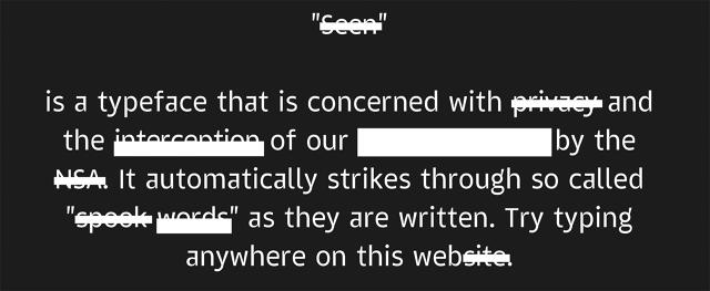
    The NSA Of #fonts Censors You In Real-Time | Co.Design | business design
    ▻http://www.fastcodesign.com/3048286/the-nsa-of-fonts-censors-you-in-real-time

    The NSA Of Fonts Censors You In Real-Time Project Seen is a new typeface that automatically crosses out words on the NSA’s watch list. It’s spooky.

    http://g.fastcompany.net/multisite_files/fastcompany/imagecache/inline-large/inline/2015/07/3048286-inline-i-1-the-nsa-of-fonts-censors-you-in-real-time-copy.jpg

    b_b @b_b PUBLIC DOMAIN
    Écrire un commentaire
  • @b_b
    b_b @b_b PUBLIC DOMAIN 14/09/2015

    MapkeyIcons
    ▻http://www.mapkeyicons.com

    The icon font especially for cartographical use. Developed for retina displays. MapkeyIcons are distributed under public domain license : CC0 1.0 Universal.

    #map #fonts #icone

    b_b @b_b PUBLIC DOMAIN
    Écrire un commentaire
  • @b_b
    b_b @b_b PUBLIC DOMAIN 21/07/2015
    1
    @kent1
    1

    ttfautohint
    ▻http://www.freetype.org/ttfautohint

    ttfautohint’s goal is a 99% automated hinting process for web fonts, acting as a platform for finely hand-tuned hinting.

    via ▻https://pixelsvsbytes.com/2013/11/how-to-create-perfect-web-fonts-in-3-steps

    Disponible dans les options du générateur de #fontsquirrel, ce qui permet d’avoir un bien meilleur rendu sur windows avec certaines typos.

    #font-face #shell

    b_b @b_b PUBLIC DOMAIN
    Écrire un commentaire
0 | 25 | 50 | 75

Thèmes liés

  • #typographie
  • #design
  • #css
  • #typography
  • #webdesign
  • #web
  • #font
  • #icone
  • #fonts
  • #typo
  • #font-face
  • #webfonts
  • #free
  • #spip
  • #news
  • company: google
  • #reference
  • #resources
  • #webdev
  • #html5
  • #map
  • #opentype
  • #tex
  • #graphisme
  • #css3
  • #unicode
  • position: designer
  • #bootstrap
  • company: twitter
  • #tools
  • #eye_candy
  • #gnome
  • #emoji
  • #fontsquirrel
  • industryterm: web fonts
  • #icones
  • #gis
  • #leaflet
  • city: eps
  • company: fuji