#interface
-
-
-

The Man Who Delayed D-Day - Issue 15: Turbulence
▻http://nautil.us/issue/15/turbulence/the-man-who-delayed-d_dayWhen Dwight D. Eisenhower was planning the invasion of Normandy, he made sure to check with Walter Munk and his colleagues first. Munk had come to the United States from Austria-Hungary to work as a banker before switching to oceanography, eventually making major advances in the science of tidal and wave forecasting. He was a defense researcher at the Scripps Institution of Oceanography in 1943 when his team calculated that the seas on June 5 of that year would be so rough that a delay was in order. The invasion would happen on the following day. It was just one highlight among many in Munk’s career. From explaining why we always see the same side of the moon to sending a sound signal halfway around the world, Munk is the very definition of the enterprising scientist. When I spoke to him (...)
-

#océanographie #interface_air-mer
What would you say is the most misunderstood aspect of the oceans today?
I’m trying to give this some thought. I think that people think of the ocean in a negative way. At this meeting yesterday, questions about having energy sources—they think that shallow water is better than offshore deep water. I think it’s the other way around. The oceans can be a friend and a foe and it’s probably more friendly in deep water at great depths. And people are afraid of great depths, the deep water, and I think have made a mistake in that way. I would think that the disaster in Japan was due to the fact that people thought that a nuclear power plant just on the coast very close to the ocean would be safer than in the ocean. It’s certainly safer than in the ocean at very shallow depth. But I think there’s a case to be made that these things would be a lot safer if you go to some other depths seaward, where the waves are not broken. When you are aboard a ship you can’t even know that there’s a tsunami passing, the dimensions are such, and I think that a better assessment of the dangers and the advantages of the ocean environment could be a useful thing to do.What would you say is the most misunderstood aspect of the oceans today?
I’m trying to give this some thought. I think that people think of the ocean in a negative way. At this meeting yesterday, questions about having energy sources—they think that shallow water is better than offshore deep water. I think it’s the other way around. The oceans can be a friend and a foe and it’s probably more friendly in deep water at great depths. And people are afraid of great depths, the deep water, and I think have made a mistake in that way. I would think that the disaster in Japan was due to the fact that people thought that a nuclear power plant just on the coast very close to the ocean would be safer than in the ocean. It’s certainly safer than in the ocean at very shallow depth. But I think there’s a case to be made that these things would be a lot safer if you go to some other depths seaward, where the waves are not broken. When you are aboard a ship you can’t even know that there’s a tsunami passing, the dimensions are such, and I think that a better assessment of the dangers and the advantages of the ocean environment could be a useful thing to do.
-
-
The history of #Android
▻http://arstechnica.com/gadgets/2014/06/building-android-a-40000-word-history-of-googles-mobile-os“When it came time for #Google to dive in to the #smartphone wars, the company took its rapid-iteration, Web-style update cycle and applied it to an operating system, and the result has been an onslaught of continual improvement.” Tags: #histoire #historique Android smartphone Google #interface #RWD
-


Scoop: A Glimpse Into the NYTimes #CMS - NYTimes.com
►http://open.blogs.nytimes.com/2014/06/17/scoop-a-glimpse-into-the-nytimes-cmstake a closer look at Scoop’s past, present and future — what it does well, what can be improved and how it will help The Times remain the finest journalistic organization in the world.
-

-
-
-

Quelques trucs repérés :) :
– un « rétro-planning » de publication,
– une visibilité à la Microsoft Word des corrections apportées à un article,
– la possibilité d’enregistrer plusieurs brouillons / versions d’un même article,
– collaboration en temps réel, mais sur les différents éléments de l’article (titraille, corps de l’article),
– travail de l’image (redimensionnement, rogne) dans l’interface de publication (ça c’est top vu les nouvelles pratiques en matière de logos, dorénavant souvent de la même taille et orientation sur un site, cf. paris-luttes.info )
– prévisualisation pour la version mobile,
– proposition automatique de contenu similaire pour enrichir l’article.
-
-
GoodUI - A Good User #interface
▻http://goodui.org/index_b.html“A Good User Interface has high conversion rates and is easy to use. In other words, it’s nice to both the business side as well as the people using it. Here is a running idea list, which we try on projects.” Tags: #UI #UX interface #bonnes_pratiques
-

#réalité_augmentée thermique - TechCrunch
▻http://alireailleurs.tumblr.com/post/86582089813Et voici la réalité augmentée thermique ! Metaio a développé une interface qui utilise une caméra thermique pour interagir avec ce que vous touchez. Vidéo. Via TechCrunch.
-

Luis Abreu: Why and How to avoid #Hamburger_Menus
▻http://lmjabreu.com/post/why-and-how-to-avoid-hamburger-menusWe now have the data that suggests Sidebar #Menus — sometimes called Hamburger Menus/Basements, are a bad design pattern and consequently reduce user engagement.
-

Side Drawer Navigation Could Cost Half Your User Engagement
▻http://thenextweb.com/dd/2014/04/08/ux-designers-side-drawer-navigation-costing-half-user-engagementSo, you have a mobile app where there are more pages or sections than can fit on a mobile screen at once. Your first thought might be to create a tabbed design, with a row of tabs along the top or buttons along the bottom.
@fil
-
On the other hand, if your app has multiple views that users will engage with somewhat equally, then side navigation could be costing you a great deal of your potential user engagement, and interaction with those part of the app accessed via the side menu.
#menu #ergonomie #conception #navigation #interface #A/B_test
-
-
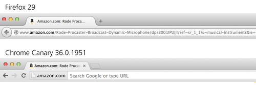
Enterrer l’URL - Allen Pike
▻http://alireailleurs.tumblr.com/post/85895162302Sur son blog, le développeur Allen Pike (@apike), revient sur le #développement d’une nouvelle fonctionnalité sur Canary, la version pour développeur du navigateur Chrome de Google, une fonctionnalité visant à faire disparaître l’URL du navigateur, comme l’explique le développeur Gary Bacon sur son blog. Bien sûr, les URL sont horribles à regarder, difficile à mémoriser et un cauchemar en matière de sécurité… Mais depuis l’origine, elles ont été le point d’entrée du web… « Les URL sont l’essence du web ». Va-t-il pourtant falloir nous apprendre à nous en passer ? Contrairement aux technologies modernes qui tendent à cacher leur complexité, les navigateurs ont, jusqu’à présent, continué à placer cet artefact technique au coeur de leurs programmes. Il y a 6 ans, Chrome et Firefox ont permis que là où s’affiche l’URL (...)
#interfaces #UX
-

While Google is taking the web out of the browser, Facebook is putting the web into apps.
▻http://www.allenpike.com/2014/burying-the-urlpaulirish [ Developer Advocate for #Google #Chrome] - 22 days ago
▻https://news.ycombinator.com/item?id=7678580This is a new UI experiment that’s deployed to a small fraction of users. We’re looking at a few key metrics to see if this change is a net positive for Chrome users. (I imagine it may help defend against phishing).
My personal opinion is that it’s a very bad change and runs anti-thetical to Chrome’s goals. I hope the data backs that up as well.
But regardless, this change is far from shipping as the new default behavior and the reaction here will certainly have an impact on the feature’s future. As mentioned, please feel free to disable it at chrome://flags/#origin-chip-in-omnibox
-
-
#Gremlins.js Go #mobile
▻http://redotheweb.com/2014/04/02/gremlins-go-mobile.htmlTags : #test #fonctionnel Gremlins.js #outil #dev #touch mobile #interface #stress
-
Vers la prothèse vocale - The Atlantic
▻http://www.theatlantic.com/technology/archive/2014/03/the-prosthetic-voice/359563Les #voix synthétiques ne sont pas très personnalisées... Et bien cela pourrait changer. VocalID - ▻http://vocalid.org - a développé un algorithme pour créer des prothèses vocales personnalisées... L’idée, se baser sur des enregistrements de voix d’une personne pour lui créer une voix de synthèse plus proche de la sienne et lui permettre de conserver son identité vocale. Les chercheurs proposent de construire une banque vocale humaine où des gens donneraient leur voix à d’autres qui en ont besoin en lisant 800 ou 3000 phrases à voix haute... Demain, nos machines parleront-elles avec nos voix ? Tags : internetactu fing internetactu2net voix #internetdesobjets (...)
-
TAL, an open source library for building applications for Connected #TV devices
▻http://fmtvp.github.io/tal/getting-started/introducing-tal.htmlTags: TV Responsive Web Design (RWD) #interface #application
-
Mobile #Menu AB Tested: #Hamburger Not the Best Choice?
▻http://exisweb.net/mobile-menu-abtestI did a previous test that seemed to show that a bordered “hamburger” (aka sandwich) icon was used more than other options.
The menu icon on the right was clicked more than the previous two.
I then decided to test the hamburger icon against the word “MENU”.
Ah ! Y’a une suite !
Hamburger vs Menu: The Final AB Test
▻http://exisweb.net/menu-eats-hamburgerThe MENU button was clicked by 20% more unique visitors than the HAMBURGER button (…)
Hamburger icons may appear to be ubiquitous, but they are not the only option.
There is an issue that is much more important:
Android users are almost 3x less likely to click a navigation button than iOS users.
-

-
Résumé : en tout il a fait trois tests AB.
Le premier étant celui de l’image de @tetue, où il montre tout d’abord que la bordure autour du bouton augmente beaucoup les clics.
Ensuite dans le deuxième, il introduit le mot « menu » tout seul, avec et sans bordure.
Enfin dans le troisième, il teste uniquement entre icône et mot, mais les deux avec bordure (puisqu’on a appris avant qu’il faut vraiment avoir une bordure).
Le grand gagnant étant : le mot « Menu » seul (avec une bordure) :
Par contre, il apprend au passage que les utilisateurs d’Android cliquent énormément moins sur les éléments de navigation que les utilisateurs Apple.
-
Abusing Ellipses – Siolon
▻http://www.siolon.com/blog/abusing-ellipsesRecently amongst web developers there been a passionate conversation about the use of “hamburger” iconography for progressive disclosure usually showing navigation (for the record, I hate that name for the icon). Some have done extensive A/B testing to prove it alone doesn’t work well, and others write passionately how they have abandoned the pattern. This along with other examples like using a select menu for smaller viewport navigation highlights a problem with our community: we can all-to-quickly grab onto a fad without asking fundamental questions about whether it works or not.
The Ellipsis’ Traditional Use in Interfaces
I want to bring up another pattern that has recently become a big problem also: the humble ellipsis. I started seeing ellipsis iconography show up more and more over the last couple of years in web applications. Now the pattern has existed for a long time in desktop applications, but it has served a different purposes. For example, in the OS X Human Interface Guidelines, we read the following instructions for using ellipsis:
-
Lien avec ►http://seenthis.net/messages/397625
qui explique que de nombreux gros acteurs (sites ou applis) ont fait machine arrière et on arrêté l’approche « bouton de menu seul qui ouvre un menu caché ».Au lieu de cela, ils sont revenus à un menu directement visible, du type « onglets », avec, lorsque nécessaire, un bouton supplémentaire permettant d’ouvrir des choses en plus : parfois c’est trois points « … », parfois c’est « More » ou « Plus », etc et ça ouvre soit un déroulant, soit une page de menu complète séparée.
Mais le plus important c’est que les éléments principaux, les plus utilisés, sont toujours visibles du premier coup.
-
-
Speed #Design with #Illustrator. 14 tips to create interfaces in minutes
▻http://www.designsprint.net14 tips to create #interfaces in minutes
-

Télétactica
Ca fait à peu près 30 ans que je cherche à retrouvé ce programme TV qui m’avait enthousiasmé quant j’étais gamine.
C’etait à mon avis à l’époque le top de l’interactivité et de la modernité hi-tech qui arrache tout.
voila comment se présente le truc :
▻http://www.youtube.com/watch?v=Yt2ICxaV6ZoLes formes en vinyles se trouvaient dans le programme TV ou pouvaient être achetés dans le commerce mais ca coutait cher et on les faisait avec du papier et on restait près de la télé pour tenir nos ronds et rectangles. C’etait pas toujours évident de trouvé les cotes pour préparé les formes et le calcule pour ajuster le model au format de notre TV m’avait un peu échappé (j’avais 6 ans en 82) du coup je regardait les épisodes la plus part du temps sans avoir les formes et c’etait chouette quant même ca faisait travaillé l’imagination.
et voici deux épisodes complets :
▻http://www.youtube.com/watch?v=Zc295HwgF-w▻http://www.youtube.com/watch?v=nHsgeoE60uk
Je ne connait personne qui se souvienne de cet émission et de cette idée d’interaction un peu étrange. En tout cas je suis toute contente d’avoir retrouvé ces 2 épisodes.
-
Sikuli #script
▻http://www.sikuli.org“Sikuli automates anything you see on the screen. It uses image recognition to identify and control #GUI components. It is useful when there is no easy access to a GUI’s internal or source code.” Tags: #test #automatisation GUI #interface #fonctionnel script
-
Mogotest | Web Consistency Testing Made Easier
▻http://mogotest.com“Our visual analysis will let you know when a site or app doesn’t look the way it should. You don’t even have to write any code — we’ll figure out what your content should look like and tell you when it’s broken.” Tags: #test #automatisation #interface #visuel
-

Besoin d’inspiration pour un design d’interface #Web ?
▻http://www.soon7.com/developpements/besoin-dinspiration-pour-un-design-dinterface-webLors du design d’application, site mobile ou encore site internet, l’ergonomie et l’aspect visuel est un point très important. Pour imaginer tout type d’élément d’interface, vous pouvez utiliser le moteur #ui Cloud, qui vous permet de chercher dans une base de données impressionnante d’exemples comme un style formulaire, de boutons, de navigation, etc. Vous […]
#Dév_&_Code #Graphisme #css3 #html5 #interface #ux_design #webdesign
-
Outdated UX patterns and alternatives
▻http://sideproject.io/outdated-ux-patternsIt may be ambitious to call some of these patterns “outdated” since many of them are still prevalent across the web. It’s also worth saying that there are no simple answers as far which alternatives to explore. But lets walk through some examples of potentially ineffective UX patterns and explore some other options:
-

vue.js
►http://vuejs.orgVue.js is a library for building interactive web interfaces.
It provides efficient MVVM data bindings with a simple and flexible API. -

▻http://facebook.github.io/react/index.html
A JavaScript library for building user interfaces
Approche intéressante et maligne (le virtual DOM et l’approche par composants). Code lisible et joli (grâce à JSX).
Par contre, il semble y avoir des sacrifices à faire (DOM un peu différent, et JSX est un format compilé).Voir :
▻http://facebook.github.io/react/docs/jsx-gotchas.html
▻http://facebook.github.io/react/tips/introduction.html#javascript #UI #interface #design
-
Open #BCI : contrôler n’importe quoi avec votre cerveau - GigaOm
▻http://gigaom.com/2014/01/16/control-anything-using-your-mind-with-the-openbci-brain-computer-interfaceOpenBCI - ▻http://www.openbci.com - est une #interface cerveau machine non intrusive, ouvert, en kit, et à fabriquer soi-même dans un FabLab qui vient de se lancer avec succès sur Kickstarter... Tags : internetactu fing internetactu2net #diy #refaire BCI interface #OpenHardware
-
Les 17 plus étonnantes #interfaces de l’année 2013 - Co.Design
▻http://www.fastcodesign.com/3023146/the-17-most-amazing-user-interfaces-of-the-year#4On vous laisse découvrir la liste... Tags : interfaces internetactu internetactu2net fing #design
-
WYSIWTFFTWOMG! | Mark Boulton
▻http://markboulton.co.uk/journal/wysiwtfftwomg“The issue with #WYSIWYG for me is that by using them the content person is considering the content as what they see. But content is more than that.” Tags: WYSIWYG #WCM #CMS #gestion_de_contenu
-
So, that’s the challenge. How can we help people relearn how the web is now?
Just like when people have a content management problem, a lot of people are turning to technology for the answers. And just like content management problems, my experience is software can’t fix it. Because it’s a people problem, not a software problem.
-
Je note au passage que Mark Boulton a décrit exactement le même découpage des CMS que ce que j’ai écrit il y a quelques semaines : en trois espaces. Et qui plus est, dans le même ordre.
1) A space for writing. For writing and structuring.
2) A space for management. For adding meta data, workflow, configuration and managing roles and people.
3)The website space. Basically your website. A place where you begin the access user journey. Or preview your content. Generally the starting points for lots of little administration tasks.Réflexions sur #SPIP, CMS, gestion de contenu
►http://rastapopoulos.artizanal.info/notes/reflexions-sur-spip-cms-gestion-de-contenuDans un logiciel comme SPIP, il y a plein de fonctionnalités différentes, mais si on prend un peu de recul, je pense que l’on peut découper en trois grandes zones :
– Édition de contenu : créer et modifier des objets éditoriaux
– Gestion de contenu : stocker, classer, versionner et gérer les droits d’accès
– Publication du contenu : rendre visible aux autres du contenu, que ce soit celui provenant de l’édition OU d’autre part (boucle DATA, etc)Bon, il m’a grillé de 14 jours : il a publié ça le 3 septembre, et moi le 17 septembre. :)
et cc @tetue je pense que ça peut l’intéresser.
-
Pas mal cette phrase aussi (vraiment plein de trucs biens quoi) :
But for most use cases, a WYSIWYG is not useful for content people. It’s just familiar.
(Après cinq ou six commentaires j’aurai fini par citer l’article en entier, haha.)
-
Et 4) une zone d’échange, ou comment répondre à la publication, la commenter — ce qui invoque les réflexions en cours sur les commentaires décentralisés (ou pas).
D’accord avec le reste, oui. Je pense aussi que ces « espaces » doivent être des briques modulaires indépendantes : qu’on puisse rédiger avec un outil A et publier via l’outil B. Ce qui signifie que nos/mes contributions ne doivent plus se faire au sein de tel ou tel CMS, mais être autonomes pour être plugables sur l’un ou l’autre.
-

J’approuve vos commentaires @rastapopoulos et @tetue ! ;-)
-
-

Ecrans tactiles : mort aux mythes
▻http://www.pompage.net/traduction/ecrans-tactiles-mort-aux-mythesLes écrans tactiles nous entourent depuis plusieurs dizaines d’années. Depuis 5 ans, c’est même pour beaucoup le principal moyen d’interaction avec notre téléphone. D’ailleurs les designers et développeurs les plus jeunes et ceux qui ont pris le train du Web mobile en route n’ont jamais utilisé de téléphone à touches. Cependant, bien peu de designers savent comment fonctionnent réellement les écrans tactiles, et comment les gens les utilisent. J’ai travaillé avec de nombreuses entreprises en tant que consultant en design d’expérience utilisateur, et rencontré un grand nombre de mythes et de demi-vérités concernant le design pour tactile.