[Appli] Beyond the Sea, flowing and exploding edition | Andy Woodruff
▻http://andywoodruff.com/blog/beyond-the-sea-flowing-and-exploding-edition
[Appli] Beyond the Sea, flowing and exploding edition | Andy Woodruff
▻http://andywoodruff.com/blog/beyond-the-sea-flowing-and-exploding-edition

Your maps are not lying to you – Andy Woodruff – Medium
▻https://medium.com/@awoodruff/your-maps-are-not-lying-to-you-9c8c31c5991f
Your maps are not lying to you
Or, your maps are lying to you but so would any other map.
A week or two ago [edit: by now, sometime last year] a journalist must have discovered thetruesize.com, a nifty site that lets you explore and discover how sizes of countries are distorted in the most common world map, and thus was born another wave of #content in the sea of web media.
Your maps are lying to you! They are WRONG! Everything you learned is wrong! They are instruments of imperial oppressors! All because of the “monstrosity” of a map projection, the Mercator projection
#cartographie #Mensonge #manipulation #visualisation #sémiologie #projections

Hachures and sketchy relief maps | Andy Woodruff
▻http://andywoodruff.com/blog/hachures-and-sketchy-relief-maps
 http://andywoodruff.com/blog/wp-content/uploads/2016/05/craterlake_sketchy.jpg
 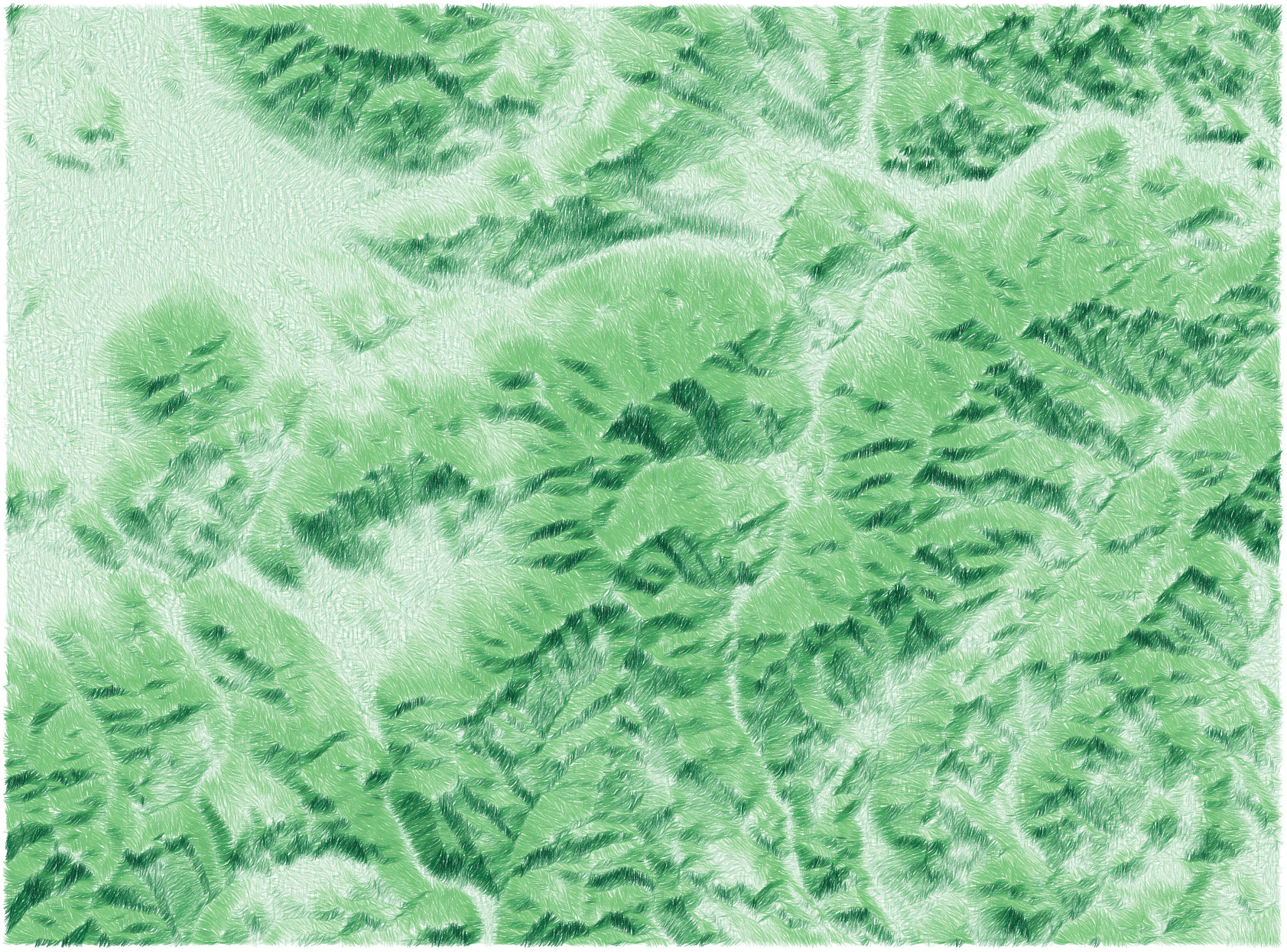 http://andywoodruff.com/blog/wp-content/uploads/2016/05/mtwashington_sketchy.jpg
 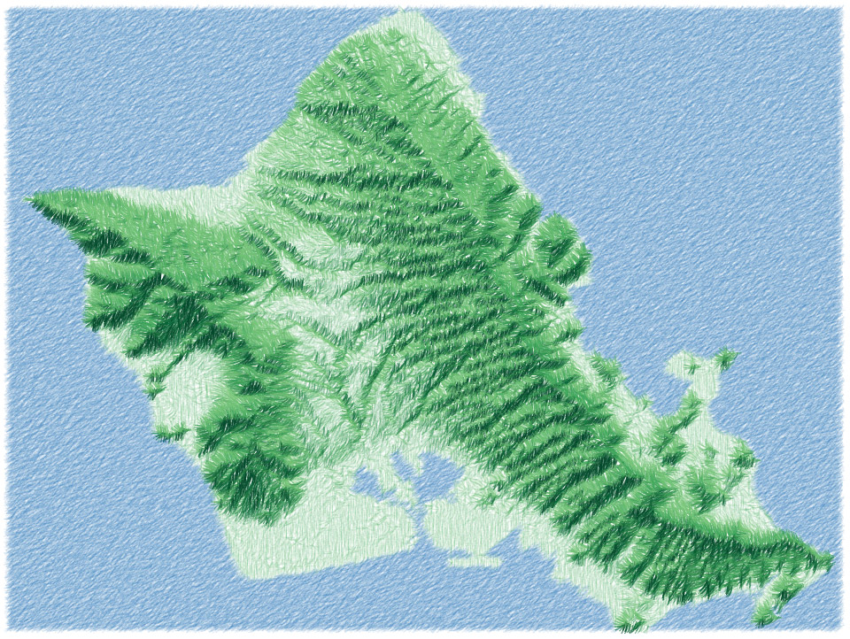 http://andywoodruff.com/blog/wp-content/uploads/2016/05/oahu_sketchy.jpg
  http://andywoodruff.com/blog/wp-content/uploads/2016/05/yosemite_sketchy.jpg
 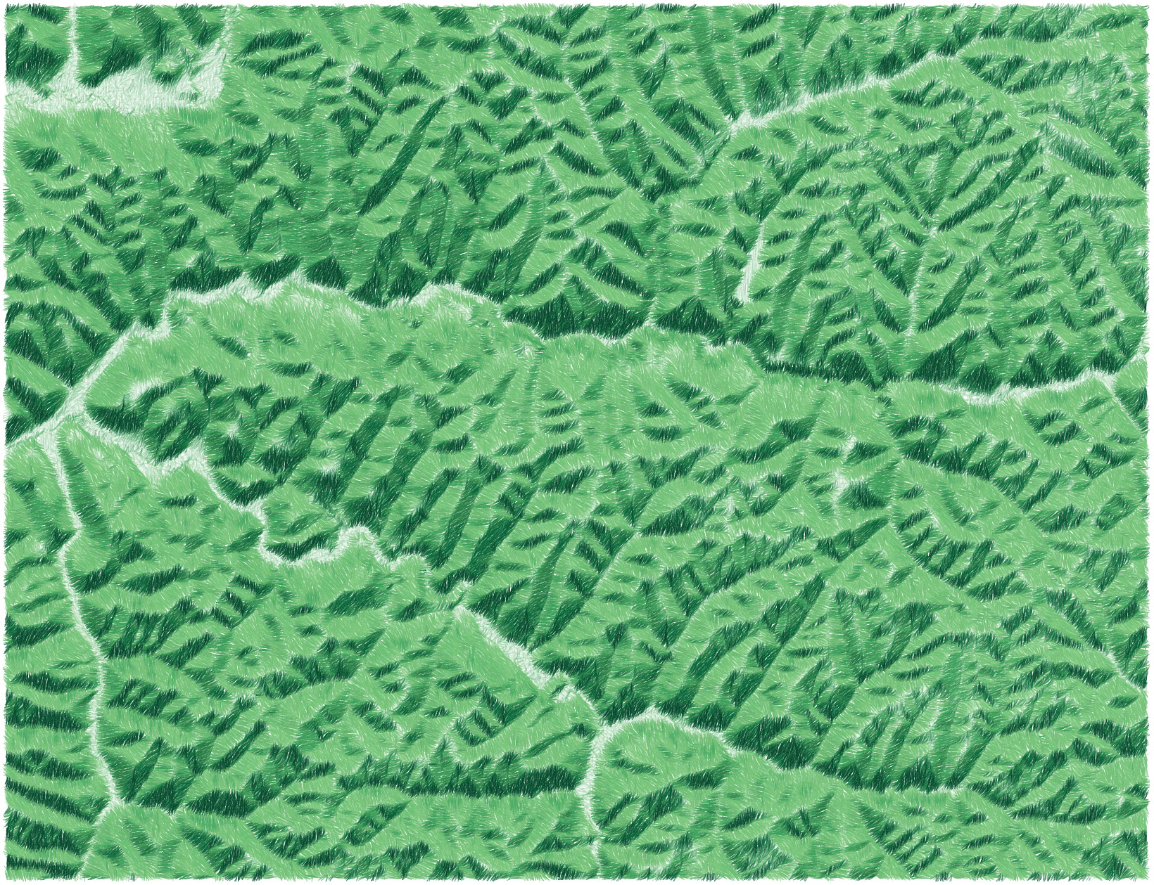 http://andywoodruff.com/blog/wp-content/uploads/2016/05/hocking_sketchy.jpg
 code dispo ici : ▻https://github.com/awoodruff/sketchy-hachures
demo : ▻http://awoodruff.github.io/sketchy-hachures
#map #elevation #javascript #canvas
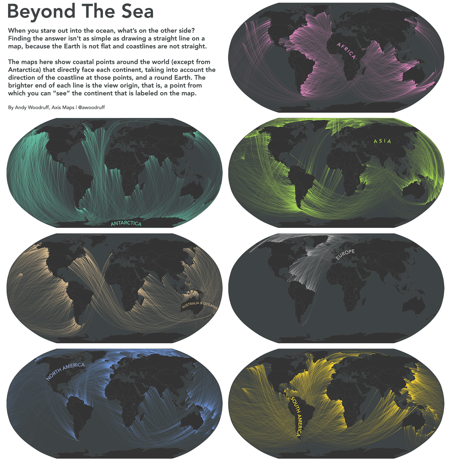
Ce qu’il y a en face quand vous êtes à la plage en cartes - La boite verte
▻http://www.laboiteverte.fr/cartes-de-quil-y-a-face-etes-a-plage
Le cartographe Andy Woodruff a créé cette série de cartes surprenantes qui montrent jusqu’où on arrive quand on part d’une côte de manière perpendiculaire et qu’on suit une ligne droite à travers la mer ou l’océan jusqu’à retrouver une terre.
Grâce à elles on s’aperçoit que si vous êtes tranquille à la plage au Venezuela il y a de grande chances que vous regardiez vers la Bretagne ou si vous êtes tout au nord du Canada à St Antony vous êtes en fait en face de l’Australie.
#map
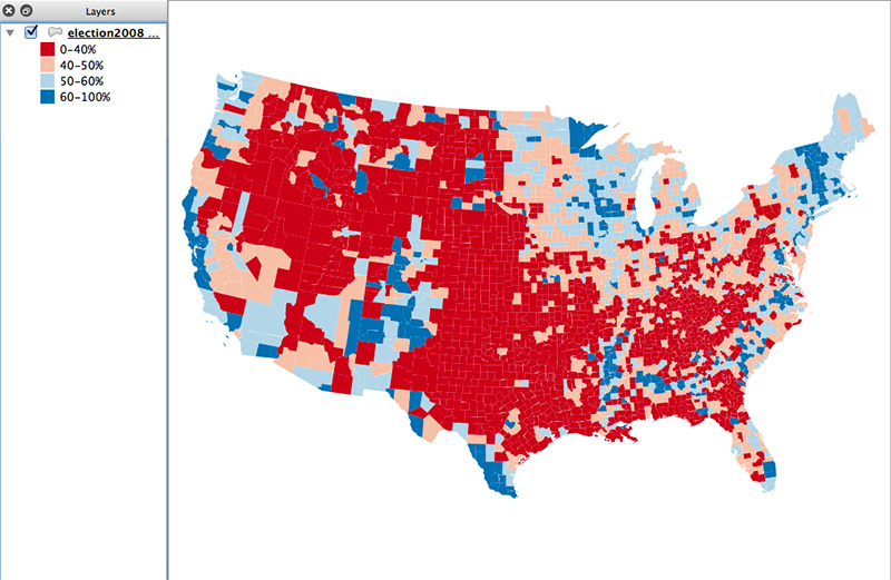
How to make a value-by-alpha map | Andy Woodruff
▻http://andywoodruff.com/blog/how-to-make-a-value-by-alpha-map
How to make a value-by-alpha map
By Andy Woodruff on 25 February 2015
Last week, Josh Stevens published a superb how-to guide for making bivariate choropleth maps, something not directly supported in most GIS applications. Go read it. I’ll wait here.
Josh included a mention of value-by-alpha maps, a pet technique of some colleagues and me. It boils down to a specific type of bivariate choropleth map, in which one variable is intended as a weight for the other and is symbolized by opacity. The idea is offered as an alternative to cartograms—a way to give more visual weight to more significant entities, and suppress less significant ones. Recent examples of the technique include wind energy mapping and midterm election maps.
Anyway, Josh’s post inspired me to write a quick and dirty how-to for value-by-alpha maps. (Dirty because I’m skipping nice things like legends and labels.) So here are a couple of ways to make one. I’m making a map of 2008 US presidential election results, just like our first attempt at this. (Example data here.)