


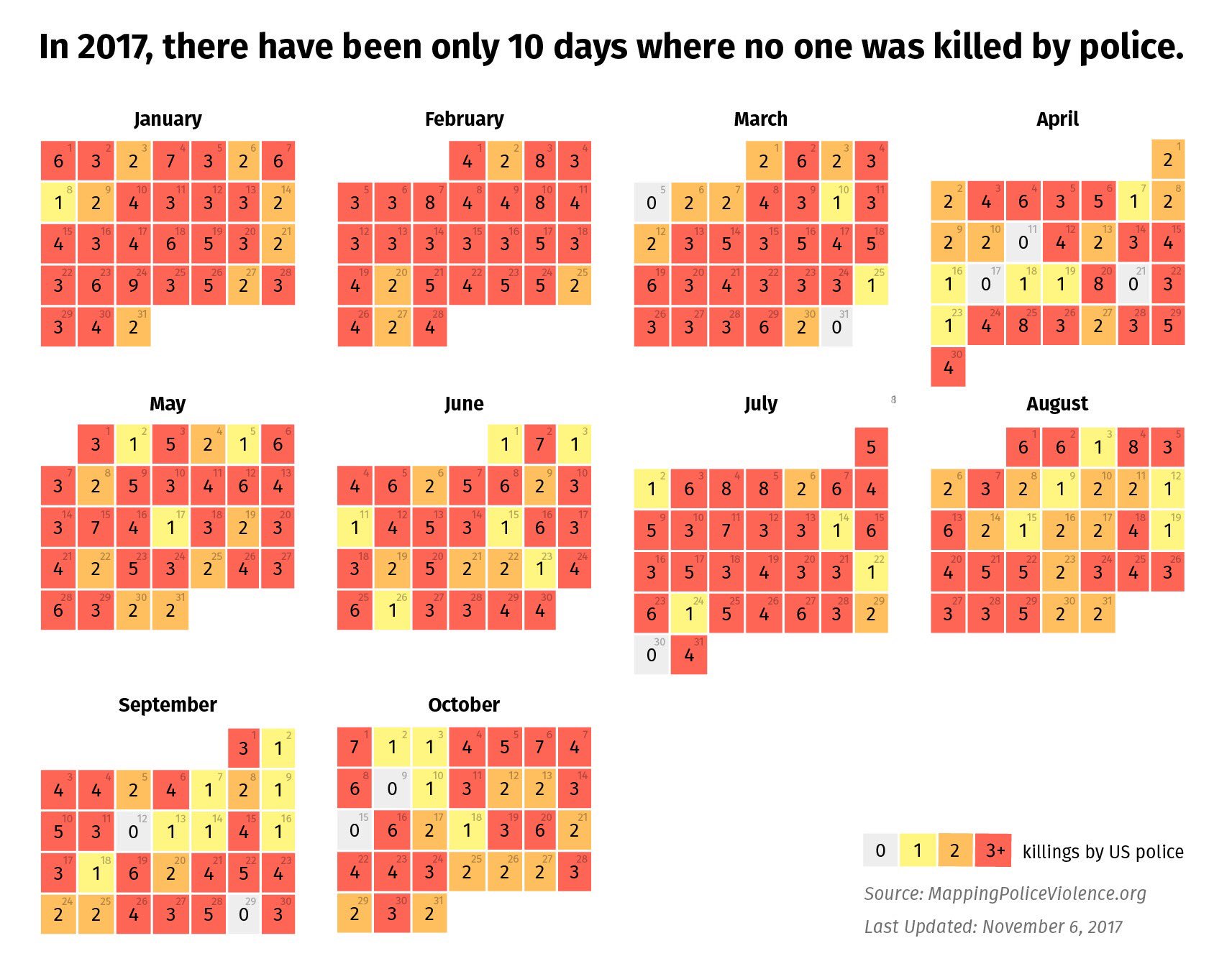
There have only been 10 days this year where no one was killed by police.
There have only been 10 days this year where no one was killed by police.


#Violence_policière #Violences_policières #brutalité_policière #Assassinats_policiers #statistiques
A mettre en parallele avec:
In 2017, No More than Five Days Without a Mass Shooting
NATHAN YAU, Flowing Data, le 6 octobre 2017
▻https://flowingdata.com/2017/10/06/in-2017-no-more-than-five-days-without-a-mass-shooting
et
511 Days. 555 Mass Shootings. Zero Action from Congress.
The New-York Times, le 2 octobre 2017
▻https://seenthis.net/messages/634678


Les gens bien élevés font commencer les barres en zéro
▻http://freakonometrics.hypotheses.org/49561
Il y a quelques jours, je mentionnais sur twitter un graphique mis en ligne sur imgur.com, au sujet des trois dernières élections présidentielles américaines,
Le premier point est que le graphique a été fait alors que les dépouillements n’étaient pas encore finis. 72 heures après la clôture des bureaux de votes, plusieurs millions de bulletins n’avaient pas été dépouillés, comme me l’ont fait noté François Gourio et Tom Roud. Comme on visualise ici le nombre de votants, et pas le pourcentage de votants, c’est génant… Le second point avait été souligné par Marin Dacos, et par plusieurs personnes, toujours sur twitter, qui disaient (je résume un peu)
On ne peut pas faire des diagrammes en barres qui ne commencent pas en zéro ! Sacrilège !
C’est en effet une règle qui semble bien établie. Enfin, quand je dis ‘règle‘, on pourrait penser qu’il s’agit d’une ‘suggestion‘. Des sortes de ‘règles de savoir vivre’, à la Nadine de Rothschild,
Quand on est bien élevé, il est de bon ton de faire commencer ses diagrammes en barres en zéro.
Et cette règle semble importante, car c’est la première que donne Nathan Yau dans ses règles pour faire des graphiques
A bar chart’s baseline must start at zero.
L’intuition est que dans un diagramme en barres, la longueur des barres a un sens.
The bar chart relies on length to show data. Shorter bars represent lower values, and longer bars represent greater values. Compare bar lengths to compare values. That’s how it works. When you shift the baseline, you distort the visual.
effectivement, on avait posté ça sans remarquer :
►https://seenthis.net/messages/540781#message541518
▻https://seenthis.net/messages/542548

Il semble donc que ce « fétichisme » du zéro exprime une volonté de ne pas prendre en compte les spécificités du public (un statisticien ou un public peu adepte des stats) ou celles du contexte (zoomer sur une faible variation peu avoir du sens).
Mais il me semble que cela cache un autre impensé : l’évolution de la population en age de voter et celle de l’abstention et des non-inscrits. Par exemple aux États-Unis la population en age de voter était 230 millions en 2008 contre 251 millions en 2016. Ce qui parfois peu accentuer des variations ou les atténuer voire les inverser. Un peu comme si dans l’exemple des coureurs de 100 mètres... on oubliait justement de dire que la distance était passé à 90 puis 80 mètres....
C’est ce que je montrait pour les élections française et le vote extrême-droite, voir :
– ►https://seenthis.net/messages/360906
– ►https://seenthis.net/messages/443508
Pour les élections étasuniennes si on compare le résultat en nombre de voix à celui en pourcentage de potentiels votants ça donne ça si on fait commencer à zéro :
Et ça si on focalise. On voit bien que la chute du vote démocrate est accentuée en 2016 et la tendance du vote républicain est inversée :
 https://framapic.org/AOoR0bG79SLi/YWq90MzUqYdt.png
  https://framapic.org/jCutG7p6IGi9/b5zJHpvxilfB.png
  https://framapic.org/ZlMMOiHfQaWV/eK6I1aNsO08d.png
 Si on prend sur une période plus large ça donne ça :

Comme toujours les arguments très convaincants de @freakonometrics auxquels je souscris entièrement. Et Merci Arthur pour ces billets si utiles.
je persiste et signe, sur les votes populaires, je ne vois pas le sens du 0... par contre, je le vois sur les grands électeurs, cf
▻https://freakonometrics.hypotheses.org/49784
Maintenant, je comprends le soucis de la faible culture statistique (est-elle d’ailleurs seulement statistique ?)
@freakonometrics Voici une autre proposition pour mettre sur une même échelle (% du corps électoral de référence) les variations des votes populaires et grands électeurs :
On voit bien l’effet de traduction et d’amplification des grands électeurs. En grattant un peu on sent l’ampleur de l’abstention et des non-inscrits du corps électoral populaire. On sent aussi sa non prise en compte (logique ?) par les grands électeurs.
Getting started with visualization after getting started with visualization
▻http://flowingdata.com/2013/07/12/getting-started-with-visualization-after-getting-started-with-visualiza
Getting started with visualization after getting started with visualization
By Nathan Yau
Starting after started
Here’s where to go next once you’ve covered the basics of visualization. When it’s time to actually start making things.
It’s easy these days to get started with visualization. There are a lot of resources — books, tutorials, blogs, and classes — to help you learn, and the many new and old software applications let you work with data right away, point and click.
You don’t have to stop here though. A lot of people do stop at this point. They read the Tufte books (and by read, I mean casually flip through the pages and memorize the bold text), and stick them on a shelf or stack them on a desk like visualization diplomas. Maybe you’re one of these people. I was.
19 Maps That Will Blow Your Mind and Change the Way You See the World. Top All-time. You Won’t Believe Your Eyes. Watch.
▻http://flowingdata.com/2014/07/07/19-maps-that-will-blow-your-mind
J’ai eu quelque fois l’occasion de dire ici tout le mal que je pense des sites qui essayent désespérément de faire le buzz avec ce genre de titre et des cartes mille fois vues ailleurs. Je soupçonne l’excellent FlowingData (Nathan Yau) d’avoir eu la bonne idée se foutre de la gueule des petits apprentis-buzzers :)
19 Maps That Will Blow Your Mind and Change the Way You See the World. Top All-time. You Won’t Believe Your Eyes. Watch.

L’impact de la naissance d’un enfant en données - Flowing Data
▻http://alireailleurs.tumblr.com/post/84816551440
Nathan Yau de Flowing Data a eu un petit garçon récemment… L’occasion pour ce spécialiste de la visualisation de données d’observer dans ses données l’effet concret de la naissance : limitation des déplacements, transformations des horaires de réveil, diminution des échanges par e-mail… et explosion du nombre de photo prises.

Data visualization for science: the next frontier?
by Denise Young and Owen Gaffney
▻http://www.futureearth.info/2014-jan-27/data-visualization-science-next-frontier


La vidéo d’illustration en ouverture de l’article est Wealth Inequality in America
►http://www.youtube.com/watch?v=QPKKQnijnsM
Le billet rend-compte d’un séminaire et met divers liens. Il cite Nathan Yau, fort apprécié ici, mais ne met pas de lien vers son site ►http://flowingdata.com
#infographie : un vent de changement - The Economist
▻http://www.economist.com/news/books-and-arts/21580446-revolution-taking-place-how-visualise-information-winds-change?fsrc=scn/tw_ec/winds_of_change
Une révolution est en cours dans le domaine de la #visualisation de l’information, estime The Economist, qui revient sur 3 publications anglo-saxonnes sur le sujet. Tags : internetactu2net internetactu fing visualisation infographie

Nathan Yau est fréquemment cité ici (notamment par @reka, qui pointait d’ailleurs la même chronique hier ▻http://seenthis.net/messages/154311 ) et son livre est réellement un incontournable, de même que son site
►http://flowingdata.com
Infographics : Winds of change | The Economist
▻http://www.economist.com/news/books-and-arts/21580446-revolution-taking-place-how-visualise-information-winds-change
Data Points: Visualisation That Means Something. By Nathan Yau. Wiley; 300 pages; $32 and £26.99. Buy from Amazon.com, Amazon.co.uk
Facts are Sacred. By Simon Rogers. Faber and Faber; 311 pages; £20. Buy from Amazon.co.uk
The Infographic History of the World. By James Ball and Valentina D’Efilippo. Collins; 224 pages; £20. Buy from Amazon.co.uk
IN THE late 1700s William Playfair, a Scottish engineer, created the bar chart, pie chart and line graph. These amounted to visual breakthroughs, innovations that allowed people to see patterns in data that they would otherwise have missed if they just stared at long tables of numbers.
Big data, the idea that the world is replete with more information than ever, is now all the rage. And the search for fresh and enlightened ways to help people absorb it is causing a revolution. A new generation of statisticians and designers—often the same person—are working on computer technologies and visual techniques that will depict data at scales and in forms previously unimaginable. The simple line graph and pie chart are being supplemented by things like colourful, animated bubble charts, which can present more variables. Three-dimensional network diagrams show ratios and relationships that were impossible to depict before.
Non-statistician analysts are the new norm
▻http://flowingdata.com/2013/06/17/non-statistician-analysts-are-the-new-norm
Non-statistician analysts are the new norm
June 17, 2013 to Statistics by Nathan Yau
As data grows cheaper and more easily accessible, the people who analyze it aren’t always statisticians. They’re likely to not even have had any statistical training. Biostatistics professor Jeff Leek says we need to adapt to this broader audience.
What does this mean for statistics as a discipline? Well it is great news in that we have a lot more people to train. It also really drives home the importance of statistical literacy. But it also means we need to adapt our thinking about what it means to teach and perform statistics. We need to focus increasingly on interpretation and critique and away from formulas and memorization (think English composition versus grammar). We also need to realize that the most impactful statistical methods will not be used by statisticians, which means we need more fool proofing, more time automating, and more time creating software. The potential payout is huge for realizing that the tide has turned and most people who analyze data aren’t statisticians.
The Art of Data Visualization
▻http://flowingdata.com/2013/05/24/the-art-of-data-visualization
Via notre génial FlowingData
The Art of Data Visualization
May 24, 2013 to Visualization by Nathan Yau
▻http://www.youtube.com/watch?feature=player_embedded&v=AdSZJzb-aX8#
!PBS Off Book’s recent episode is on “the art of data visualization.” It feels like a TED talk — kind of fluffy and warm — with several names and visualization examples that you’ll recognize. No clue who the first guy is though.
Les changements sur Wikipedia en temps réel...
Impressionnant
Signalé par Nathan Yau
https://dl.dropbox.com/s/x2vxwgp35cwrxs5/changeswikipedia.png

Marrant pour découvrir des pages improbables. Genre :
Someone in Suresnes (Île-de-France, France) edited « Nourriture pour chats »
Wikistream marche mieux en fait, j’ai mis les deux en même temps, pour le même wikipedia, et il trouve plus de modifs.

Dans la checklist du jour via @opironet :
Leur objectif : illustrer l’évolution perpétuelle de l’encyclopédie participative, mais aussi visualiser le type de modifications, pertinentes ou non, apportées par les contributeurs - les utilisateurs qui enrichissent de manière « non productive » le contenu d’un article étant repérables. Cependant, comme le précisent LaPorte et Hashemi, seuls les utilisateurs non inscrits apparaissent sur la carte des modifications récentes alors qu’ils ne représentent que 20 % des corrections . Selon un sondage réalisé en 2007, ils sont le moins à même de faire des actualisations pertinentes. « N’ayez crainte, précisent les deux Américains, les modifications non appropriées peuvent être retirées ou corrigées par les autres utilisateurs, vous inclus ! » The Atlantic note de son côté que la carte nous renseigne sur la façon dont Wikipédia est utilisé : "Comme nous l’avions déjà remarqué, le lieu géographique d’où Wikipédia est modifié n’a en général pas grand-chose à voir avec l’endroit dont traite l’article en question." Exemple : un Bulgare a modifié hier un article sur le thrash metal brésilien et un habitant de Knoxville, dans le Tennessee, un autre article sur la restauration de la monarchie britannique. Pour plus de données sur Wikipédia, cliquez ici. Les sources :
▻http://blog.hatnote.com/post/49342528753/wikipedia-recent-changes-map
▻http://www.theatlanticcities.com/technology/2013/05/live-map-manic-ways-people-edit-wikipedia/5547
▻http://meta.wikimedia.org/wiki/Research:Data
Et en musique ! ►http://listen.hatnote.com #audio
Listen to Wikipedia’s recent changes feed. The sounds indicate addition to (bells) or subtraction from (strings) a Wikipedia articles, and the pitch changes according to the size of the edit. Green circles show edits from unregistered contributors, and purple circles mark edits performed by automated bots. You may see announcements for new users as they join the site — you can welcome him or her by adding a note on their talk page.
à la base c’était avec #bitcoin :
▻http://www.listentobitcoin.com
Du coup #sonification aussi pour ce dernier com’ il y a deux ans et demi (@reka je te félicite pas de virer ainsi des fichiers de ta dropbox)
Data Points: Visualization That Means Something. Présentation du dernier ouvrage de Nathan Yau (FlowingData)
▻http://flowingdata.com/data-points
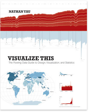
In his bestselling book Visualize This, Nathan Yau introduced you to the tools and programming techniques for visualization. Now, in Data Points, he explores the thinking process that helps you create original, meaningful visualization. Start with the data and build.
Table of Contents
Chapter 1 — Understanding Data
Chapter 2 — Visualization: The Medium
Chapter 3 — Representing Data
Chapter 4 — Exploring Data Visually
Chapter 5 — Visualizing with Clarity
Chapter 6 — Designing for an Audience
Chapter 7 — Where to Go from Here
Visualization is often approached within a rigid framework of design rules and principles. We tend to think of it as charts that have been optimized for graphical perception and anything that sits outside the framework must not work. This notion is outdated.
#visualisation #cartographie #graphic_design #information_design
Wealth distribution in America
▻http://flowingdata.com/2013/04/16/wealth-distribution-in-america
via FlowingData
Wealth distribution in America
April 16, 2013 to Infographics by Nathan Yau
This video clearly describes the distribution of wealth in America using a set of transitioning charts. The graphics are good. The explanation is better.
▻http://www.youtube.com/watch?feature=player_embedded&v=QPKKQnijnsM

Ce n’est pas #santé mais #richesse et #inégalités
en effet, heureusement que certaines veillent #Monolecte-oeil-de-linx
From A to B
▻http://www.rubenvandervleuten.com/AtoB.html
Signalé par Nathan Yau (FlowingData)
What happens when you send something by mail? What happens in between you sending it off and someone else receiving it? What people and processes are involved and how many steps does it take?
Those all were questions I was dealing with and wanted to find out. So instead of sitting back I started a simple project to actually see it myself. I put a small camera in a box, build a timer circuit using Arduino and shipped it.
That’s as simple as it is. The timer circuit was set to make a 3 sec video every minute and make longer videos while the box was movin: to not miss on the ’interesting’ parts.
The differences between machine learning, data mining, and statistics
▻http://flowingdata.com/2012/12/10/the-differences-between-machine-learning-data-mining-and-statistics
The differences between machine learning, data mining, and statistics
December 10, 2012 to Statistics by Nathan Yau
From machine learning to data mining. From statistics to probability. A lot of it seems similar, so what are the differences? Statistician William Briggs explains in an FAQ.
What’s the difference between machine learning, deep learning, big data, statistics, decision & risk analysis, probability, fuzzy logic, and all the rest?
#data #données #statistiques #visualisation #cartographie
None, except for terminology, specific goals, and culture. They are all branches of probability, which is to say the understanding and sometime quantification of uncertainty. Probability itself is an extension of logic.
Why context is as important as the data itself
▻http://flowingdata.com/2010/05/21/why-context-is-as-important-as-the-data-itself
Why context is as important as the data itself
May 21, 2010 to Design, Statistics by Nathan Yau
John Allen Paulos, a math professor at Temple University, explains, in the New York Times, the importance of the before and after of when you get that data blobby thing in your hands.
The problem isn’t with statistical tests themselves but with what we do before and after we run them. First, we count if we can, but counting depends a great deal on previous assumptions about categorization. Consider, for example, the number of homeless people in Philadelphia, or the number of battered women in Atlanta, or the number of suicides in Denver. Is someone homeless if he’s unemployed and living with his brother’s family temporarily? Do we require that a women self-identify as battered to count her as such? If a person starts drinking day in and day out after a cancer diagnosis and dies from acute cirrhosis, did he kill himself?
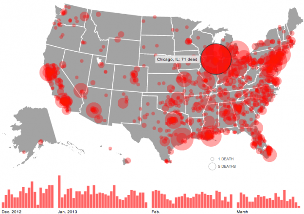
Gun deaths since Sandy Hook
▻http://flowingdata.com/2013/03/28/gun-deaths-since-sandy-hook
via FlowingData, superbe carte de Nathan Yau
The shooting at Sandy Hook Elementary School was horrible, but there have been thousands of gun deaths since. Huffington Post is mapping them.
Circles represent the number of deaths in a city, and the larger a circle the higher the count. A bar chart on the bottom shows the data over time and serves as a navigation device. Click on a day or a location, and the names of victims appear on the right with a link to the related news story.
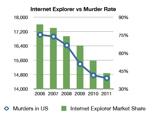
Internet Explorer causation
Correlation statistique plutôt marrante
▻http://flowingdata.com/2013/01/25/internet-explorer-causation
Internet Explorer causation
January 25, 2013 to Misc. Visualization by Nathan Yau
I’m almost certain this relationship is significant. Side note: Is there a meaningless-correlations tumblr yet?
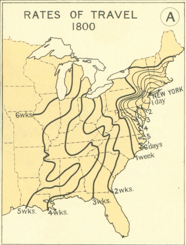
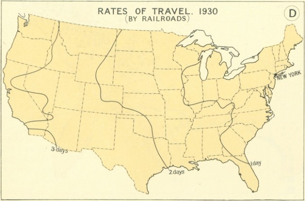
Cartographie chronospatiale... Time of travel in the 1800s
Voilà pourquoi j’aime beaucoup suivre FlowingData
►http://flowingdata.com/2013/01/04/time-of-travel-in-the-1800s
January 4, 2013 to Mapping by Nathan Yau
Time of travel in the 1800s
From the 1932 Atlas of the Historical Geography of the United States, these maps paint the picture of transportation in the 1800s. Each line represents how far one could travel in some amount of time, starting from New York. For example, it took about a month to get to Louisiana.
In contrast, here’s what travel by railroad in 1930 looked like:
Travel in 1930
#etats-unis #cartographie #transport #voyage #conquête-de-l-ouest
►http://book.flowingdata.com
(rien que la vidéo sur le site est géniale…)
Wood charts reveal layers of underwater world
►http://flowingdata.com/2013/01/03/wood-charts-reveal-layers-of-underwater-world
Ce qu’on pourra bientôt faire en cartographie avec une imprimante 3D :)
Wood charts reveal layers of underwater world
January 3, 2013 to Mapping by Nathan Yau
Wood map of SF bay
Below the Boat produces beautiful laser-cut wood maps:
Starting with a bathymetric chart (the underwater equivalent of a topographic map), the contours are laser-cut into sheets of Baltic birch and glued together to create a powerful visual depth. Select layers are hand-colored blue so it’s easy to discern land from water, major byways are etched into the land, the whole thing’s framed in a custom, solid-wood frame and protected seamlessly with a sheet of durable, ultra-transparent Plexiglas.
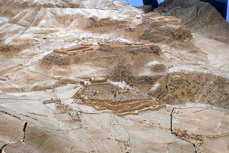
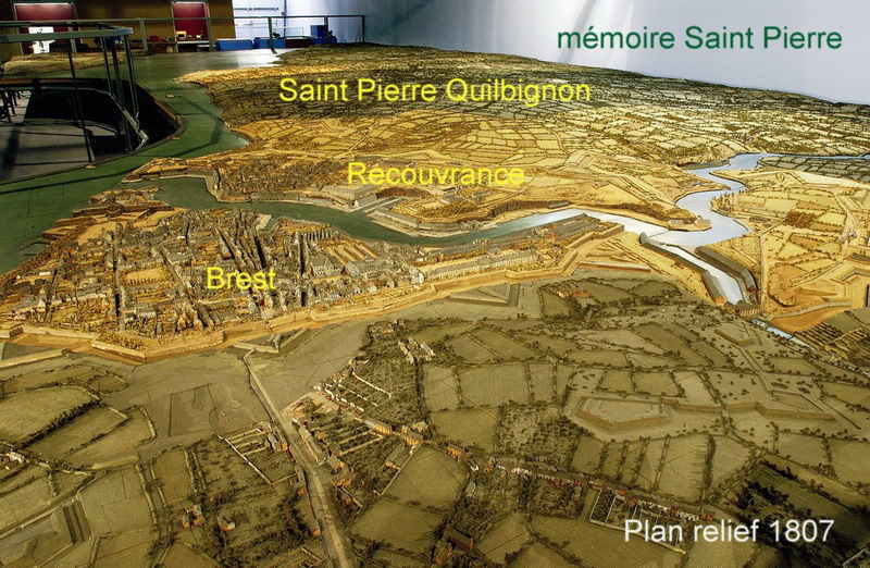
Plans-reliefs ! (profond soupir !!!)
La présentation de l’expo :►http://www.ecpad.fr/exposition-des-plans-reliefs-des-invalides-au-grand-palais
Briançon (1731-1736) :
Château d’Oléron (1703) :
Brest (1807-1811) :
etc., etc.
An introduction to diagrams
►http://flowingdata.com/2012/12/14/an-introduction-to-diagrams
December 14, 2012 to Network Visualization by Nathan Yau
As a teaser for a larger project on diagrams, Jane Nisselson describes how they exist in the real world.
Diagrams are everywhere — from the established conventions of highway signs to the newly emerging visualizations appearing on social networking websites. Most people have a personal experience of diagrams whether drawing directions or figuring out how to operate a new computer. Yet very few people are familiar with how we read or construct diagrams.
This short film introduces the language of diagrams and their role in visual thinking and communication. As only a film can do, it reveals the vocabulary “in the wild” and in the context of making and using diagrams.
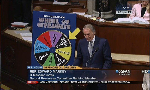
Ridiculous but real charts from the U.S. Congress floor
Le graphique totalement idiot mais complètement authentique d’un membre du congrès aux Etats-Unis
►http://flowingdata.com/2012/11/20/ridiculous-but-real-charts-from-the-u-s-congress-floor
Ridiculous but real charts from the U.S. Congress floor
November 20, 2012 to Ugly Charts by Nathan Yau

Data visualization as cultural phenomenon (via FlowingData)
►http://vimeo.com/51365288
November 8, 2012 to Data Art by Nathan Yau
In 1979, Joy Division released their album ’Unknown Pleasures’, and the cover was an image of readings from a pulsar. That image grew into a cultural phenomenon. With the kick off of the new Visualized conference in New York, this short video explores the growth of the icon. [Thanks, Eric]
Fox News traine ses téléspectateurs dans la farine
►http://flowingdata.com/2012/08/06/fox-news-continues-charting-excellence
Fox News continues charting excellence : Bush cuts
August 6, 2012 to Mistaken Data by Nathan Yau
Fox News tried to show the change in the top tax rate if the Bush tax cuts expire, so they showed the rate now and what’d it be in 2013. Wow, it’ll be around five times higher. Wait. No.
The value axis starts at 34 percent instead of zero, which you don’t do with bar charts, because length is the visual cue. That is to say, when you look at this chart, you compare how high each bar is. Fox News might as well have started the vertical axis at 34.9 percent. That would’ve been more dramatic.
Voir aussi :
►http://www.forbes.com/sites/naomirobbins/2012/08/04/another-misleading-graph-of-romneys-tax-plan
Another Misleading Graph of Romney’s Tax Plan
#Visualisation #Représentation #Manipulation #Graphiques #Cartographie #Etats-Unis #Politique-Fiscale
Data Données Statistiques Visualisation Science
From statistics to data science, and vice versa
►http://flowingdata.com/2012/07/26/from-statistics-to-data-science-and-vice-versa
July 26, 2012 to Statistics by Nathan Yau
Carnegie Mellon statistics professor Cosma Shalizi considers the differences and similarities between statistics and data science.
If people want to call those who do such jobs “data scientists” rather than “statisticians” because it sounds more dignified, or gets them more money, or makes them easier to hire, then more power to them. If they want to avoid the suggestion that you need a statistics degree to do this work, they have a point but it seems a clumsy way to make it. If, however, the name “statistician” is avoided because that connotes not a powerful discipline which transforms profound ideas about learning from experience into practical tools, but rather, a meaningless conglomeration of rituals better conducted with twenty-sided dice, then we as a profession have failed ourselves and, more importantly, the public, and the blame lies with us. Since what we have to offer is really quite wonderful, we should not let that happen.
Some time during the past couple of years, statistics became data science’s older, more boring sibling that always plays by the rules. There are a lot of statisticians who now call themselves data scientists. I still call myself a statistician.


