Seenthis
•
 
Identifiants personnels
  • [mot de passe oublié ?]

 
  • #p
  • #pr
  • #pre
  • #préc
  • #précurseur
RSS: #précurseurs

#précurseurs

0 | 25 | 50
  • @cdb_77
    CDB_77 @cdb_77 28/12/2025
    3
    @ericw
    @mad_meg
    @grommeleur
    3

    La femme que Marx n’a jamais voulu rencontrer : #Flora_Tristán, l’autodidacte qui aurait pu changer l’histoire du socialisme

    Autodidacte et militante infatigable, Flora Tristán a observé la réalité sociale avec un regard de scientifique pour proposer un modèle alternatif de société et de travail.

    Pour Flora Tristán (Paris, 1803-Bordeaux, 1844), la #transformation_de_la_société devait être intégrale, et la communication avec les masses laborieuses était aussi importante que la diffusion littéraire de son modèle. C’est pourquoi elle ne se contenta pas d’écrire pour ceux qui pouvaient payer un livre et le lire, mais chercha à sensibiliser directement les classes travailleuses.

    Sa proposition novatrice impliquait un lien indissociable entre la #question_ouvrière et la #question_féminine : il n’y aurait pas de libération prolétarienne sans #libération_des_femmes. L’#émancipation était donc la condition nécessaire de la #justice_universelle. Flora Tristán anticipa ainsi des débats qui, bien des années plus tard, occuperaient une place centrale dans les discours féministes.

    Bien qu’elle soit née dans un milieu aristocratique, l’écrivaine, penseuse socialiste et féministe franco-péruvienne, considérée comme l’une des pionnières du #féminisme moderne et une précurseure du #mouvement_ouvrier_international, ne reçut pas l’éducation d’institutrices.

    À l’âge de quatre ans, le malheur frappa sa famille avec la mort de son père, Mariano Tristán y Moscoso, qui n’avait pas régularisé juridiquement son mariage avec sa mère, Thérèse Laisnay. Or, le droit français ne reconnaissait pas comme légitime un mariage uniquement religieux. La jeune veuve, enceinte d’un autre enfant et privée de patrimoine, partit donc vivre à la campagne avec Flora pendant plusieurs années, et la petite famille connut un vrai déclassement.

    Une vie de proscrite

    De retour à Paris, alors adolescente et ouvrière, Flora Tristán épousa en 1821 son jeune patron, André Chazal. Quatre ans plus tard, après de nombreuses dissensions conjugales et enceinte de son troisième enfant, elle s’enfuit du domicile conjugal en abandonnant son mari. Le divorce n’existait pas. La séparation des Chazal n’était pas légale. Pendant plusieurs années, Flora vécut comme une proscrite en France et en Angleterre. En 1833, elle traversa l’océan pour réclamer son héritage au Pérou auprès des Tristán. La famille l’accueillit plutôt favorablement et son oncle lui attribua certaines rentes, mais sans lui reconnaître de droit à l’héritage.

    Elle revint en Europe deux ans plus tard, ajoutant à son expérience personnelle un important travail de terrain. Elle avait développé une #méthodologie pionnière pour décrire et dénoncer les injustices de race, de classe et de genre : voyager, dialoguer, recueillir des données à l’aide du modèle de l’#enquête, et élaborer des analyses et des propositions.

    Ainsi, Flora Tristán, autodidacte, fit de la véritable #science_sociale à partir de l’#observation de la réalité, développant des travaux innovants qui fusionnaient réflexion théorique et expérience pratique.

    Dans des ouvrages tels que Pérégrinations d’une paria (1838) ou Promenades dans Londres (1840), elle dénonça la misère et le manque d’instruction des classes laborieuses, la pauvreté infantile, la prostitution et la discrimination dont étaient victimes les #femmes. Elle pointa les #inégalités_structurelles de la #société_capitaliste comme la racine de ces problèmes.

    Face à cette situation, elle proposa son modèle d’#organisation_sociale, dont l’élément central était un #prolétariat consolidé à travers l’#Union_ouvrière. Ce prolétariat devait être formé et bénéficier de #protection_sociale. Il ne s’agissait pas seulement de se constituer en force productive, mais aussi de transformer l’histoire.

    Militante d’un socialisme en devenir

    À partir de 1835, elle remporta un franc succès littéraire et s’attira l’estime des cercles intellectuels. C’est au sein de l’Union Ouvrière qu’elle choisit de s’engager comme militante d’un socialisme naissant, affirmant un style qui lui était propre et se faisant la porte-parole passionnée de ses idées, de ses modèles et de ses théories.

    Elle entama ainsi son tour de France, un exercice harassant de communication de masse. Ce mode de vie était inhabituel pour une femme de son époque. Mais Flora Tristán mit son talent intellectuel au service d’une mission rédemptrice en laquelle elle croyait profondément.

    Sa vision se caractérisait également par le rejet de la #violence_révolutionnaire comme unique voie de salut. Elle reconnaissait l’antagonisme entre #travail et #capital, mais ses stratégies réformatrices sociales reposaient sur la #fraternité. Son but était d’atteindre la #justice et l’#amour universel.

    Sa vocation de femme messie lui donna la force de diriger et d’échanger avec des milliers d’ouvriers et d’ouvrières lors de ses tournées à travers la France. Sa santé était fragile, avec un possible problème tumoral, et tous ces voyages la laissèrent exsangue. Des efforts incessants qui, combinés à un probable typhus, précipitèrent sa mort en 1844, quatre ans avant la publication du Manifeste du Parti communiste.

    Après sa mort, sa voix ne fut pas intégrée au socialisme de #Karl_Marx et #Friedrich_Engels, que ce dernier qualifiait de scientifique et qui plaçait la lutte des classes presque exclusivement au centre de sa réflexion. Engels qualifiait les approches antérieures d’« utopiques ».

    Et pourtant, il suffit de parcourir les biographies de Robert Owen, Charles Fourier, des saint-simoniens et de Tristán elle-même pour constater que le terme « #utopie » ne rend pas justice à la portée de leurs pensées et de leurs actions.

    À la fin de 1843 à Paris, le philosophe allemand Arnold Rüge conseilla au jeune Marx de rencontrer Flora Tristán, mais celui-ci ne le fit pas. Engels, quant à lui, mentionna avoir connaissance de son œuvre, mais sans se départir d’une certaine indifférence.

    Toujours en arrière-plan

    Tristán est restée en arrière-plan de l’histoire officielle du socialisme, alors qu’elle avait anticipé de nombreux débats qui allaient plus tard prendre de l’importance. Plus d’un siècle plus tard, la mise en valeur – importante et nécessaire – de la dimension féministe de son discours a éclipsé tous les autres aspects.

    Aujourd’hui, il est indispensable de reconnaître pleinement Flora Tristán, cette petite aristocrate déclassée qui n’eut pas de gouvernantes mais finit par apprendre auprès d’Owen et de Fourier.

    Il faut également la reconnaître comme une socialiste du romantisme, une #pionnière des #sciences_sociales, une communicante d’un talent extraordinaire et la créatrice d’un modèle alternatif de société, de production et de travail : l’Union Ouvrière.

    On peut se demander ce qui se serait passé si elle avait vécu plus longtemps. Elle n’aurait vraisemblablement jamais accepté que son modèle de socialisme soit qualifié d’« utopique ». Si elle avait atteint 1864, elle aurait très probablement participé à la Première Internationale et, malgré sa condition de femme, sa présence impressionnante aurait sans doute influencé d’une manière ou d’une autre le cours du socialisme.

    ►https://theconversation.com/la-femme-que-marx-na-jamais-voulu-rencontrer-flora-tristan-lautodid

    #socialisme #femmes #capitalisme #classes_sociales #SHS #précurseurs #révolution #violence

    CDB_77 @cdb_77
    Écrire un commentaire
  • @reka
    Phil Reka docs & archives @reka CC BY-NC-SA 17/12/2025

    OMA’s “DIAGRAMS” exhibition at Prada foundation in Venice

    The World Mapped: An exhibit on visual represention -

    ▻https://thevisualagency.com/tva-blog-articles/the-world-mapped-how-9-diagrams-shaped-our-understanding-of-reality

    https://thevisualagency.com/wp-content/uploads/2025/12/DIAGRAMS_cover.jpg

    The World Mapped: how 9 Diagrams shaped our understanding of reality

    Diagrams are far more than technical drawings or abstract symbols. They are visual frameworks that have shaped how we read the world — from the intricacies of the human body to the forces driving global economies.

    #cartographie #visualisation #précurseurs #graphiques #représentation_visuelle

    Phil Reka docs & archives @reka CC BY-NC-SA
    Écrire un commentaire
  • @reka
    Phil Reka docs & archives @reka CC BY-NC-SA 15/12/2025

    Unique pieces from the box

    ▻https://attilabatorfy.substack.com/p/christmas-edition-unique-pieces-from

    https://substackcdn.com/image/fetch/$s_!MDQL!,w_1200,h_600,c_fill,f_jpg,q_auto:good,fl_progressive:steep,g_auto/https%3A%2F%2Fsubstack-post-media.s3.amazonaws.com%2Fpublic%2Fimages%2Ff2aa39b5-f211-4574-8ec0-3c38859e1115_2880x1800.png

    This selection consists of data graphics, infographics, and maps that are unique, but I couldn’t write not even a short post about them. When I found them, I put them in a separate folder, thinking they might come in handy someday. My grandfather also collected every piece of scrap metal, piece of leather, tiny button, and paintbrush bristle in his drawer, thinking they might come useful for patching a hole in a bucket or repairing the speaker of his Soviet-made Sokol radio for the tenth time.

    Of course, these graphics and drawings are not junk, they just have no match. Like the porcelain green angel inherited from the granny.

    The following information and data graphics, maps and illustrations come from: Australia, China, Czech Republic, Denmark, Germany, Greece, Italy, New Zealand, Norway, Portugal, Spain and Switzerland.

    #cartographie #précurseurs #graphiques #sémiologie #couleur

    Phil Reka docs & archives @reka CC BY-NC-SA
    Écrire un commentaire
  • @reka
    Phil Reka docs & archives @reka CC BY-NC-SA 8/12/2025
    2
    @simplicissimus
    @freakonometrics
    2

    Squaring the nation - two strange Hungarian cartograms from 1902
    ▻https://attilabatorfy.substack.com/p/squaring-the-nation-two-strange-hungarian

    https://substackcdn.com/image/fetch/$s_!WQl9!,w_1200,h_600,c_fill,f_jpg,q_auto:good,fl_progressive:steep,g_auto/https%3A%2F%2Fsubstack-post-media.s3.amazonaws.com%2Fpublic%2Fimages%2F37a8be02-7a19-44f7-acf2-9eba8e515c65_2548x1706.png

    Squaring the nation - two strange Hungarian cartograms from 1902
    The first equal square mosaic tile maps.
    Attila Bátorfy
    Dec 08, 2025

    This article was originally published in IMCoS Map Journal in 2023. Republished with permission. Recommended citing: Bátorfy, Attila 2023. “Squaring the Nation: Two Strange Hungarian Cartograms from 1902.” IMCoS Map Journal No. 172 (March 2023), pp. 6–15. This online version contains a few minor changes and a new paragraph at the end.

    Two of the twenty-two map appendices in Pál Balogh’s book A népfajok Magyarországon (The Ethnic Species of Hungary), published in 19021, which runs to more than one thousand and thirteen pages, are remarkable for the way they present the ethnicities and religions of Hungary (Figs 1ab & 2). The graphic method used to produce them is variously known as as equal square/area grid map, or tilegram, or mosaic map, and it has been suggested that they may be the first examples of maps employing this method2. The two maps, designed by Pál Balogh and drawn by Sándor Kocsárd Proff are well known in Hungarian map history, especially within ethnic cartography.3 Balogh’s work is also a frequently cited source in the Hungarian historical demographic literature. But the now popular method of the maps4 or ‘anamorphic cartograms’5 is worth a closer look.

    #cartographie_radicale #précurseurs #cartographie #sémiologie #couleurs #cartoexperiment_2025

    Phil Reka docs & archives @reka CC BY-NC-SA
    Écrire un commentaire
  • @reka
    Phil Reka docs & archives @reka CC BY-NC-SA 8/10/2025

    Attila Bátorfy’s Cabinet of Infographic Curiosities | Substack

    ▻https://attilabatorfy.substack.com

    Cabinet of Infographic Curiosities is a weekly selection of old, rare and lesser-known information graphics, visualizations and maps from all around the world curated and written by Attila Bátorfy. Attila is a Hungarian dataviz designer and visual storyteller, who not only loves these oldies, but also researches them and teaches about them at the Media Department of ELTE University, Budapest.

    #cartographie
    #sémiologie
    #cartoexperiment_2025
    #precurseurs

    Phil Reka docs & archives @reka CC BY-NC-SA
    Écrire un commentaire
  • @reka
    Phil Reka docs & archives @reka CC BY-NC-SA 3/05/2024
    2
    @grommeleur
    @cdb_77
    2

    Histoire de la cartographie du XXe siècle : Visionscarto publie ce matin la version française d’un remarquable opus de Gilles Palsky publié initialement en anglais, qui explore l’œuvre de deux cartographes radicaux avant l’heure, Frank Horrabin, socialiste britannique, et Alexander Radó, communiste hongrois.

    Des cartes pour dénoncer l’impérialisme

    ▻https://www.visionscarto.net/es-cartes-pour-denoncer-l-imperialisme

    par Gilles Palsky, Professeur de géographie
    université de Paris I Panthéon-Sorbonne

    « Horrabin et Radó envisageaient les cartes comme des outils permettant de dénoncer et de combattre l’impérialisme bourgeois. Ils présentaient leurs travaux comme des projets nouveaux, différents des atlas ordinaires, qu’ils voulaient ancrés dans l’actualité et offrant des approches dynamiques. »

    https://www.visionscarto.net/local/cache-vignettes/L1024xH775/Fig_5-97e9bd53-4a79b-82a14.jpg?1714216259 https://www.visionscarto.net/local/cache-vignettes/L1024xH751/Fig-7-2eed0f17-9748a-ecf21.jpg?1714216259 https://www.visionscarto.net/local/cache-vignettes/L1024xH663/palsky-8-a6aadee8-baa4e-1543c.jpg?1714627152 https://www.visionscarto.net/local/cache-vignettes/L348xH500/palsky-1-453140d3-28b06-c0c4f.jpg?1714593183 https://www.visionscarto.net/local/cache-vignettes/L822xH611/palsky-9-d8a63103-998b0-827f2.jpg?1714629813

    #cartographie_radicale #précurseurs #rado #horrabin #histoire_de_la_cartographie

    Phil Reka docs & archives @reka CC BY-NC-SA
    Écrire un commentaire
  • @nightingale
    nightingale @nightingale via RSS 10/06/2021
    3
    @reka
    @fil
    @02myseenthis01
    3

    György Markos and His Pictorial Information Graphics
    ▻https://nightingaledvs.com/gyorgy-markos-and-his-pictorial-information-graphics

    The Hungarian Marxist, self-made geographer, and economist György Markos (1902–1976) was not the first to introduce #ISOTYPE to the Hungarian public, but he was the..

    #Data_Visualization #Gyorgy_Markos #Historic_Dataviz #Hungary #pictorial_statistics

    nightingale @nightingale via RSS
    • @reka
      Phil Reka docs & archives @reka CC BY-NC-SA 10/06/2021

      #isotype #neurath

      Phil Reka docs & archives @reka CC BY-NC-SA
    • @fil
      Fil @fil 10/06/2021

      https://nightingaledvs.com/wp-content/uploads/2021/06/49-web.jpg

      #précurseurs

      Fil @fil
    Écrire un commentaire
  • @reka
    Phil Reka docs & archives @reka CC BY-NC-SA 17/02/2021
    1
    @nightingale
    1

    Race and America: why data matters | Financial Times

    ▻https://www.ft.com/content/156f770a-1d77-4f6b-8616-192fb58e3735

    https://www.ft.com/__origami/service/image/v2/images/raw/https%3A%2F%2Fd1e00ek4ebabms.cloudfront.net%2Fproduction%2F4cb54a37-1eda-40aa-a25b-4dd3d9a8c1e8.jpg?fit=scale-down&source=next&width=400

    When Yeshimabeit Milner was in sixth grade in Miami, Florida she was suspended for three days after talking back to the teacher in a technology class. Milner was devastated — but the episode also led to an epiphany. A few years later, she began to collect data on suspensions in a neighbouring school and found that black children like her were four times more likely to be suspended than white children. This was the beginning of her life as a data activist.

    –—

    Black students in US nearly four times as likely to be suspended as white students | US education | The Guardian

    ▻http://www.theguardian.com/education/2016/jun/08/us-education-survey-race-student-suspensions-absenteeism

    lack students are nearly four times as likely to be suspended as white students, according to new federal data.The sweeping bi-annual survey of more than 50 million students by the US Department of Education found that suspensions overall have dramatically decreased by nearly 20% between the 2011-12 and 2013-14 school years.

    –---

    W.E.B. Du Bois’ Visionary Infographics Come Together for the First Time in Full Color | History | Smithsonian Magazine
    ▻https://www.smithsonianmag.com/history/first-time-together-and-color-book-displays-web-du-bois-visionary-in

    https://thumbs-prod.si-cdn.com/jR3nsGP8Q17v9O3xwP8sTfYBcFM=/fit-in/1600x0/filters:focal(1223x1116:1224x1117)/https://public-media.si-cdn.com/filer/3b/22/3b22a3d0-0a6f-42fb-a1d6-58019a3d9312/11_33873a_city_and_rural_population_18901.png

    fter three decades of emancipation, the gains made by African-Americans, those that existed at all, presented a decidedly mixed picture about the state of racial progress in the country. The political obstacles were voluminous, with the failure of Reconstruction still lingering, and Jim Crow institutional racism ascendant. In 1897, the United States Supreme Court would rule in Plessy v. Ferguson that separate was indeed equal. All the while, new generations of African-Americans found ways to uplift themselves, despite discrimination, through grassroots efforts in education, work and community building.

    #WEB_du_Bois #cartoexperiment #précurseurs

    Phil Reka docs & archives @reka CC BY-NC-SA
    Écrire un commentaire
  • @reka
    Phil Reka docs & archives @reka CC BY-NC-SA 13/10/2020

    When #WEB_Du_Bois Made a Laughingstock of a White Supremacist | The New Yorker

    Époustouflant ...

    ▻https://www.newyorker.com/magazine/2019/08/26/when-w-e-b-du-bois-made-a-laughingstock-of-a-white-supremacist

    https://media.newyorker.com/photos/5d55c5980a38b90008fe2e11/16:9/w_1280,c_limit/190826_r34810-tout.jpg

    W. E. B. Du Bois, the twentieth century’s leading black intellectual, once lived at 3059 Villa Avenue, in the Bronx. He moved to a small rented house there with his wife, Nina Gomer Du Bois, and their daughter, Yolande, in about 1912. When I’m walking in that borough I sometimes stop by the site. It’s just off Jerome Avenue, not far from the Bedford Park subway station. The anchor business at that intersection seems to be the Osvaldo #5 Barber Shop, which flies pennants advertising services for sending money to Africa and to Bangladesh. All kinds of people pass by. You hear Spanish and Chinese and maybe Hausa spoken on the street. The first time I went to Du Bois’s old address, I wondered if I might find a plaque, but the house is gone, and 3059 Villa is now part of a fenced-in parking lot. Maple and locust trees shade the front stoops, and residents wait at eight-twenty on Tuesday mornings to move their cars for the street-sweeping truck. A fire hydrant drips, slowly enlarging a hole in the sidewalk. Even unmemorialized, 3059 Villa is a not-unpleasant spot from which to contemplate the great man’s life.

    About a forty-minute walk away is the Bronx Zoo. In 1912, it was called the New York Zoological Park, and it was run by a patrician named Madison Grant from an old New York family. Though he and Du Bois lived and worked within a few miles of each other for decades, I don’t know if the two ever met. As much as anyone on the planet, Grant was Du Bois’s natural enemy. Grant favored a certain type of white man over all other kinds of humans, on a graded scale of disapproval, and he reserved his vilest ill wishes and contempt for blacks.

    #précurseurs #cartoexperiment

    Phil Reka docs & archives @reka CC BY-NC-SA
    Écrire un commentaire
  • @reka
    Phil Reka docs & archives @reka CC BY-NC-SA 27/01/2020
    1
    @unagi
    1

    La ligne de couleur de W.E.B. Du Bois : un savoir de résistance
    ▻https://www.en-attendant-nadeau.fr/2020/01/14/savoir-resistance-du-bois

    https://enattendantnadeau-11dcb.kxcdn.com/wp-content/uploads/2020/01/dubois-2-categorie.jpg

    Après la publication à l’automne par les éditions de La Découverte d’une première traduction (enfin, serait-on tenté de dire) de sa célèbre enquête The Philadelphia Negro, parue en 1899, un nouveau pas dans le dévoilement au public francophone de l’incontournable œuvre de W.E.B. Du Bois (1868-1963) est franchi par les éditions B42, avec la traduction d’un ouvrage relatif à l’exposition « Des Nègres d’Amérique », réalisée par l’auteur africain-états-unien en 1900 pour l’Exposition universelle de Paris.

    #WEB_du_bois #cartographie #précurseurs #cartoexperiments

    Phil Reka docs & archives @reka CC BY-NC-SA
    Écrire un commentaire
  • @reka
    Phil Reka docs & archives @reka CC BY-NC-SA 6/01/2020

    How the Victorians Mapped London’s Cholera – Spatial.ly
    ▻https://spatial.ly/2019/03/mapping-and-visualising-cholera-data

    https://spatial.ly/wp-content/uploads/2019/03/cholera_bar.jpg

    It is, of course, John Snow who is credited with using maps to demonstrate that the clusters of deaths from cholera in London’s Soho during London’s 1854 outbreak were caused by contaminated water. This marked a major shift in thinking away from the disease being transmitted through dirty air: the more widely accepted theory at the time.

    However, it wasn’t just Snow producing innovative maps and charts to support his cause. Snow was part of an arms race to get the best data communicated by the most compelling maps/ charts, to evidence his side of the debate against his contemporaries – people like William Farr who was also a master data visualiser.

    The Wellcome Collection’s image catalogue contains many great examples of maps and charts produced around the 1850s . These images are high resolution and free to use under a CC-BY 4.0 license. Most have very little information associated with them, but I think many are worth sharing because they such amazing examples of Victorian data visualisation. I have pasted them here with the catalogue details where they have them (in no particular order). I’ve included the original links back to the high resolution image in the collection. Enjoy!

    #cartographie #précurseurs #cartoexperiment

    Phil Reka docs & archives @reka CC BY-NC-SA
    Écrire un commentaire
  • @reka
    Phil Reka docs & archives @reka CC BY-NC-SA 2/11/2019

    The Pioneering Maps of #Alexander_von_Humboldt | History | Smithsonian

    ▻https://www.smithsonianmag.com/history/pioneering-maps-alexander-von-humboldt-180973342

    https://thumbs-prod.si-cdn.com/Lf-AM-0eQhCo9DMfPEnmgUunwKk=/fit-in/1600x0/filters:focal(1157x1514:1158x1515)/https://public-media.si-cdn.com/filer/96/81/9681f8b5-3026-42fe-acb1-7eca1a5cbe1c/wikicommons-geographie_der_pflanzen_cropped.jpg

    The German naturalist and explorer Alexander von Humboldt was one of the most celebrated scientists of the 19th century. In 1869, on the 100th anniversary of his birth, 25,000 people gathered in New York’s Central Park to listen to speeches extolling his accomplishments and witness the unveiling of a large bronze bust of Humboldt, who had died ten years earlier. Flags and enormous posters showing Humboldt’s face lined the streets of Manhattan. Similar celebrations took place around the world—in Berlin, Humboldt’s birthplace, 80,000 admirers gathered in the chilly rain to listen to eulogies and songs sung in his honor.

    It’s hard to imagine any modern scientist achieving such celebrity, and now, 250 years after his birth, Humboldt himself has largely been forgotten by the general public. But as historian Andrea Wulf wrote in her 2015 biography of Humboldt, The Invention of Nature, his scientific legacy lives on in scores of geographic features and place names, from a glacier in Greenland to a mountain range in Antarctica. (The state of Nevada was almost named Humboldt, Wulf writes.) The Latin names of nearly 300 plants and more than 100 animals pay homage to him, including the aggressive, predatory Humboldt squid, which can grow up to eight feet long and weigh 100 pounds.

    #cartoexperiment #cartographie #précurseurs

    Phil Reka docs & archives @reka CC BY-NC-SA
    • @cdb_77
      CDB_77 @cdb_77 2/11/2019

      #Humboldt

      CDB_77 @cdb_77
    Écrire un commentaire
  • @reka
    Phil Reka docs & archives @reka CC BY-NC-SA 16/07/2019
    1
    @nightingale
    1

    From the Battlefield to Basketball: A Data Visualization Journey with Florence Nightingale
    ▻https://medium.com/nightingale/from-the-battlefield-to-basketball-a-data-visualization-journey-with-florenc

    https://miro.medium.com/max/2000/1*yA1TZ06aWm-vlmUrGkU9rQ.jpeg

    1858, Florence Nightingale published a study on the conditions of army hospitals, her seminal Notes on Matters Affecting the Health, Efficiency, and Hospital Administration of the British Army. Her Diagram of the Causes of Mortality had a singular goal: to vividly demonstrate that the lack of proper sanitary caretaking facilities was a far more severe, but also far more avoidable, cause of death for soldiers than injuries suffered in battle. It’s one thing to simply state that the disease killed a lot of soldiers. It’s another thing entirely to effectively and actionably juxtapose it against the casualties encountered at the hands of the opposing army.

    –—

    Beyond Nightingale: Being a Woman in Data Visualization
    ▻https://medium.com/nightingale/beyond-nightingale-being-a-woman-in-data-visualization-d7968d171ccf

    https://miro.medium.com/max/1200/1*e-agrluocCFHnZ3e_-ymnQ.png

    you conduct a quick internet search on “history of data visualization,” you’ll nearly always see Florence Nightingale included in the annals of history. Why? It’s not like a Nightingale Rose chart is easy to read, or a cinch to make, or even all that common.

    #visualisation #cartographie #précurseurs #précurseuses #datavisualisation #visualisation_de_données #Florence_Nightingale #féminisme

    Phil Reka docs & archives @reka CC BY-NC-SA
    Écrire un commentaire
  • @reka
    Phil Reka docs & archives @reka CC BY-NC-SA 21/02/2019
    4
    @simplicissimus
    @unagi
    @mad_meg
    @7h36
    4

    African American Photographs Assembled for 1900 Paris Exposition -

    Du Bois Materials - Prints & Photographs Online Catalog (Library of Congress)

    ▻http://www.loc.gov/pictures/collection/anedub/dubois.html

    Ce lien pointe sur une époustouflante collection d’images, de figures, de photographies qui ont été réunies par #W.E.B_Du_Bois lui même, pour l’exposition "« The American Negro » présenté à Paris en 1900 lors de l’exposition universelle.

    http://cdn.loc.gov/service/pnp/ppmsca/33800/33878v.jpg http://cdn.loc.gov/service/pnp/ppmsca/33800/33884v.jpg

    ▻https://en.wikipedia.org/wiki/The_Exhibit_of_American_Negroes

    ▻https://en.wikipedia.org/wiki/Exposition_Universelle_(1900)

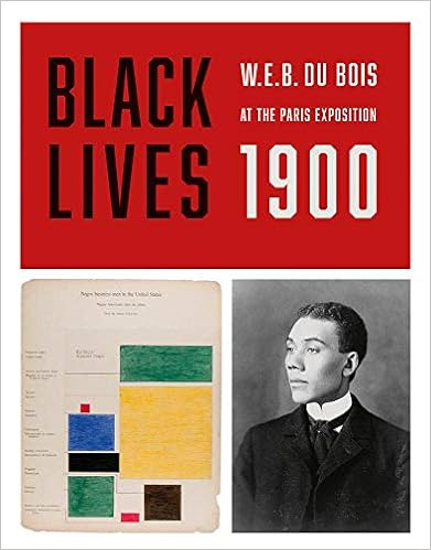
    At the turn of the century, W. E. B. Du Bois compiled a series of photographs for the “American Negro” exhibit at the 1900 Paris Exposition. He organized the 363 images into albums, entitled Types of American Negroes, Georgia, U.S.A. and Negro Life in Georgia, U.S.A..

    At the time, Du Bois was a professor of sociology at Atlanta University, committed to combating racism with empirical evidence of the economic, social, and cultural conditions of African Americans. He believed that a clear revelation of the facts of African American life and culture would challenge the claims of biological race scientists influential at the time, which proposed that African Americans were inherently inferior to Anglo-Americans. The photographs of affluent young African American men and women challenged the scientific “evidence” and popular racist caricatures of the day that ridiculed and sought to diminish African American social and economic success. Further, the wide range of hair styles and skin tones represented in the photographs demonstrated that the so-called “Negro type” was in fact a diverse group of distinct individuals. The one public statement Du Bois made concerning these photographs was that visitors to the American Negro exhibit would find "several volumes of photographs of typical Negro faces, which hardly square with conventional American ideas."1

    Du Bois’s work for the American Negro exhibit was extensive and much praised. In the Spring of 1900, Paris Exposition judges awarded him a gold medal for his role as “collaborator” and “compiler” of materials for the exhibit.

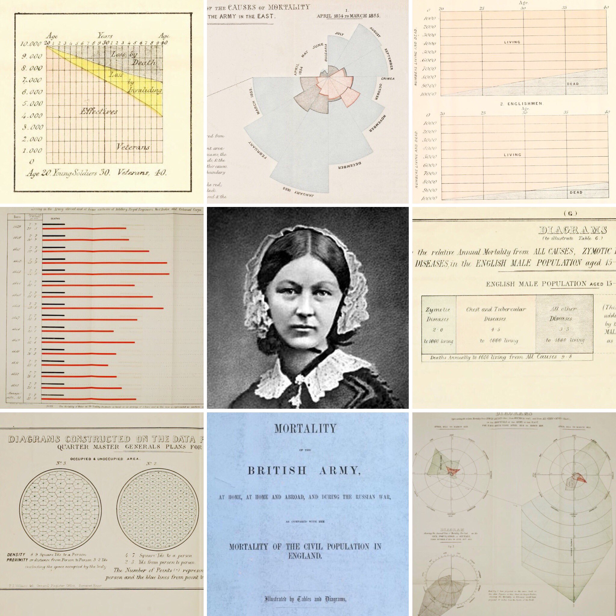
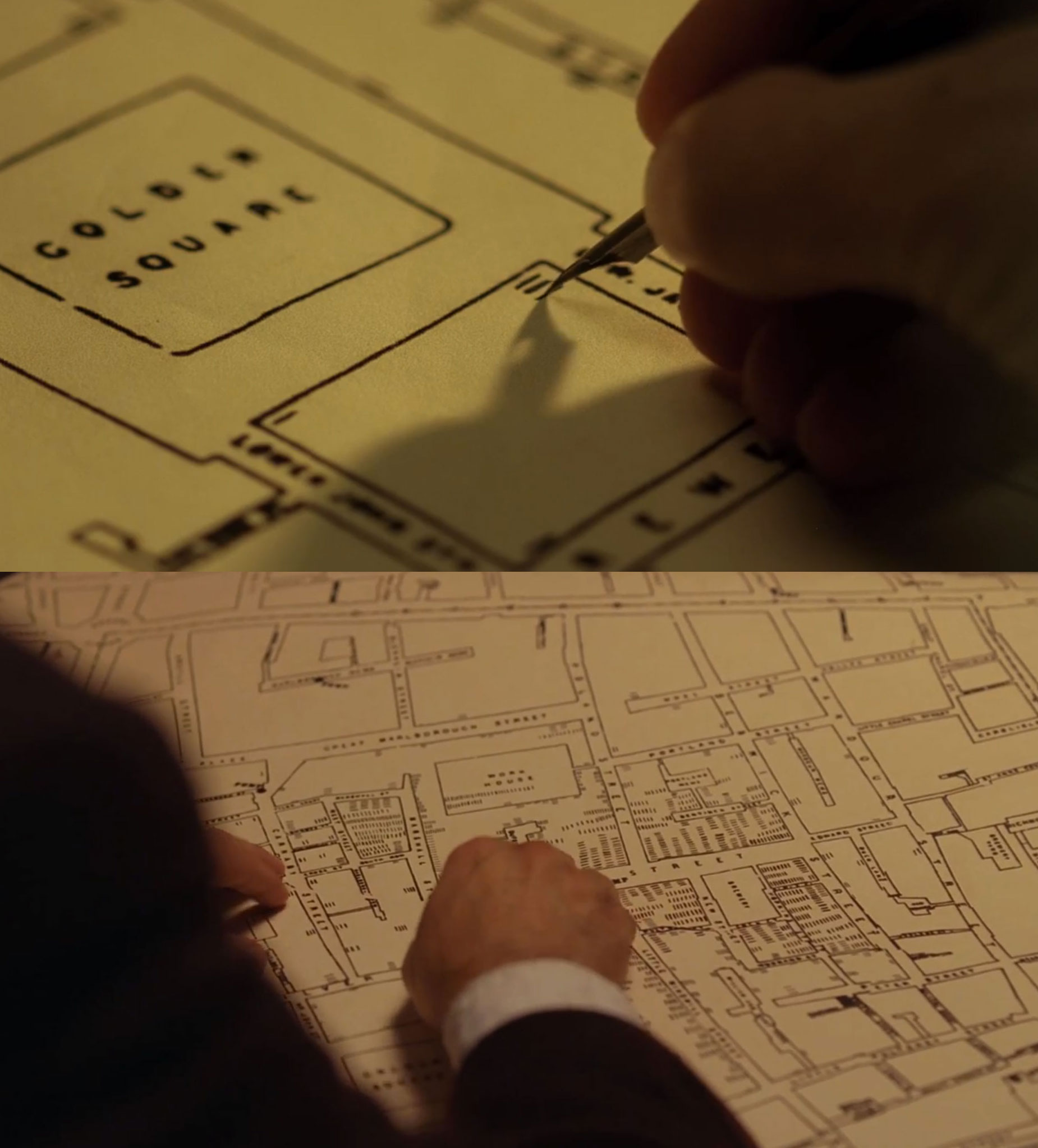
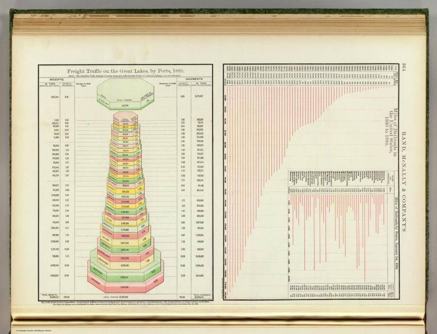
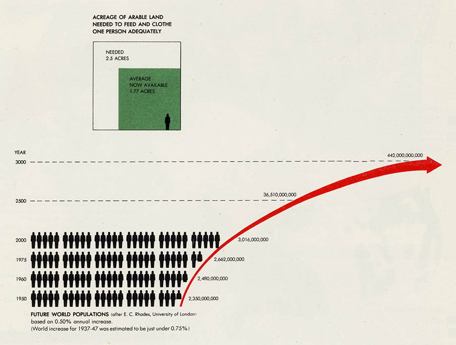
    #cartographie #précurseurs #visualisation #cartoexperiment

    Phil Reka docs & archives @reka CC BY-NC-SA
    • @reka
      Phil Reka docs & archives @reka CC BY-NC-SA 21/02/2019

      http://cdn.loc.gov/service/pnp/ppmsca/33800/33875v.jpg

      Phil Reka docs & archives @reka CC BY-NC-SA
    • @fil
      Fil @fil 22/02/2019

      tu l’as trouvé sur ►https://visionscarto.net/web-du-bois-color-line ? :)

      Fil @fil
    • @reka
      Phil Reka docs & archives @reka CC BY-NC-SA 22/02/2019

      hu hu hu ! :) c’est une espèce de syndrome de Florence qu’on peut appeler le syndrome seenthis : c’est tellement riche, ça nous fait tourner la tête et on perd la trace et la mémoire des connaissances et du savoir mis à notre disposition ici et là...

      Phil Reka docs & archives @reka CC BY-NC-SA
    • @fil
      Fil @fil 22/02/2019

      ▻https://www.wbur.org/artery/2019/02/21/web-du-bois-infographics-humanity-african-american
      ▻https://www.youtube.com/watch?v=Rybvo1-cAWU

      Fil @fil
    • @rastapopoulos
      RastaPopoulos @rastapopoulos CC BY-NC 23/02/2019

      #WEB_Du_Bois

      RastaPopoulos @rastapopoulos CC BY-NC
    Écrire un commentaire
  • @reka
    Phil Reka docs & archives @reka CC BY-NC-SA 14/12/2018
    5
    @simplicissimus
    @reka
    @fil
    @7h36
    @sombre
    5

    « Quand William Playfair voulait dépecer la France ! »

    Signalé sur Twitter par Michael Friendly @datavisFriendly

    A little known Playfair map: “A map of France with the proposed divisions”, 1793.

    William Playfair proposes dividing France and giving pieces to its neighbors.

    Found in: John Delaney’s “First X, Then Y, Now Z”, p. 143.

    https://dl.dropbox.com/s/llmgyc4dw9pxe6l/DuTUwToXcAE6TkL.jpg%20large.jpg?dl=0

    #cartoexperiement #cartographie #william_playfair #précurseurs #frontières #territoires

    • #France
    Phil Reka docs & archives @reka CC BY-NC-SA
    • @simplicissimus
      Simplicissimus @simplicissimus 14/12/2018

      #Luxembourg_français — Wikipédia
      ▻https://fr.wikipedia.org/wiki/Luxembourg_fran%C3%A7ais

      https://upload.wikimedia.org/wikipedia/commons/6/6c/LuxembourgPartitionsMap_english.png

      Le Luxembourg français désigne la partie méridionale de l’ancien duché de Luxembourg, cédée au royaume de France, en 1659, par le traité des Pyrénées. Il avait pour chef-lieu Thionville.

      Simplicissimus @simplicissimus
    Écrire un commentaire
  • @reka
    Phil Reka docs & archives @reka CC BY-NC-SA 24/10/2018
    1
    @fil
    1

    W. E. B. Du Bois’s Data Portraits

    ▻http://www.papress.com/html/product.details.dna?isbn=9781616897062

    http://www.papress.com/17pix/480covers/9781616897062.jpg

    The colorful charts, graphs, and maps presented at the 1900 Paris Exposition by famed sociologist and black rights activist W. E. B. Du Bois offered a view into the lives of black Americans, conveying a literal and figurative representation of “the color line.” From advances in education to the lingering effects of slavery, these prophetic infographics—beautiful in design and powerful in content—make visible a wide spectrum of black experience.

    W. E. B. Du Bois’s Data Portraits collects the complete set of graphics in full color for the first time, making their insights and innovations available to a contemporary imagination. As Maria Popova wrote, these data portraits shaped how “Du Bois himself thought about sociology, informing the ideas with which he set the world ablaze three years later in The Souls of Black Folk.”

    #WEB_Du_Bois #visualisation #états-Unis #précurseurs #cartoexperiment

    Phil Reka docs & archives @reka CC BY-NC-SA
    • @cdb_77
      CDB_77 @cdb_77 25/10/2018

      #exposition_de_paris #the_color_line #ligne_de_couleur #Noirs #histoire #Afro-américains

      CDB_77 @cdb_77
    • @fil
      Fil @fil 7/11/2019

      Un nouveau livre sur le sujet, cette fois avec plein de photos:
      “Black Lives 1900: W. E. B. Du Bois at the Paris Exposition,” a new book edited by Julian Rothenstein and out in November, from Redstone Press

      https://images-na.ssl-images-amazon.com/images/I/41WI79%2B9S-L._SX389_BO1,204,203,200_.jpg

      ▻https://www.newyorker.com/books/page-turner/what-web-du-bois-conveyed-in-his-captivating-infographics

      Fil @fil
    Écrire un commentaire
  • @reka
    Phil Reka docs & archives @reka CC BY-NC-SA 3/08/2018
    3
    @simplicissimus
    @02myseenthis01
    @freakonometrics
    3

    Une conférence en 1885, picorée sur Twitter

    via RJ Andrews alias @infowetrust qui nous offre ces incroyables documents historiques

    Set the time machine for 1885 London. Holy mackerel what a program.

    https://pbs.twimg.com/media/DjpCOOoUwAA7voo.jpg

    Over the next day or so I’ll be sharing my reading of the international event that was the golden Jubilee celebration of the Statistical Society, with a special eye for the “Graphic Method of Statistics”

    Who was there? ?? Galton! ?? Toussant Loua (the shaded table)! ?? Francis A Walker (visual Census)!

    I’m going right to these ~hundred pgs, all loaded with viz.

    https://pbs.twimg.com/media/DjptrI-VsAEuIzB.jpg

    the President intro weighs the reasoning for statistics being a science. I really like this bit.

    https://pbs.twimg.com/media/Djp5ocbU4AAHEiO.jpg:large

    Avec ces remarques et ajouts :

    Mara Averick @dataandme dit :

    « Fun fact: The @royalsociety was founded in 1660. The first female Fellows (2 of them) were elected in 1945. Interesting @nature article about how its gone since came out in March: ▻https://buff.ly/2JFXXzW (ht @Fausto_Sterling) / apologies for binarification – their data / »

    ... et a retweeté from DynamicWebPaige @$HOME :

    “It is these activities that lead to giving conferenc[e], talks, and groups like @RLadiesGlobal should promote more female participation in them. We all know some outstanding women in those activities, but to truly solve the problem, many more women need to get involved.”

    #cartoexperiment #cartographie statistiques #précurseurs #data

    Phil Reka docs & archives @reka CC BY-NC-SA
    • @philippe_de_jonckheere
      Philippe De Jonckheere @philippe_de_jonckheere CC BY 3/08/2018

      On utilisait déjà le surligneur jaune au XIXème ? Je n’aurais jamais cru.

      Philippe De Jonckheere @philippe_de_jonckheere CC BY
    Écrire un commentaire
  • @reka
    Phil Reka docs & archives @reka CC BY-NC-SA 7/05/2018
    4
    @odilon
    @visionscarto
    @af_sobocinski
    @kent1
    4

    visionscarto.net publie - sous la plume d’Alexandre Chollier - un bel hommage qui évoque un intellectuel « multicarte », autant biologiste que géographe, urbaniste que sociologue ou écologiste : Patrick Geddes ->

    La vision grandeur nature ou la raison d’être de l’Outlook Tower

    ►https://visionscarto.net/la-vision-grandeur-nature

    Alexandre Chollier écrit :

    « Jamais, à l’évidence, les cartes n’ont atteint pareil degré de précision qu’aujourd’hui. Jamais elles n’ont été si nombreuses et accessibles. Un désir insatiable de tout cartographier s’est emparé de nous et sans vergogne nous y succombons. »

    « [...] Les cartes sont partout, la cartographie [est] en train de nous échapper [...] parce que les conventions cartographiques (projections, échelles, légendes...) sont de moins en moins connues [des utilisateurs·trices] et cela rend malaisée l’élaboration de savoirs cartographiques communs et partagés. »

    « Le but de la cartographie de type Google n’est pas tant de donner à voir et à situer que d’emmagasiner et de digérer en continu, algorithmiquement, des données personnelles afin de prédire des comportements. »

    « Cette cartographie tire profit du moindre de nos gestes, archivant et analysant chaque byte d’information que nous générons, produisant des cartes de notre vie intime et sociale. »

    La suite là :

    ►https://visionscarto.net/la-vision-grandeur-nature

    https://visionscarto.net/local/cache-vignettes/L1024xH641/40863775854_4615-2ffc3.jpg?1525279270 https://visionscarto.net/local/cache-vignettes/L958xH977/40985145195_5b68-8ac59.jpg?1525434274

    #cartographie #patrick_geddes #cartoexperiment #précurseurs #utopie #imaginaire

    Phil Reka docs & archives @reka CC BY-NC-SA
    Écrire un commentaire
  • @reka
    Phil Reka docs & archives @reka CC BY-NC-SA 18/04/2018
    5
    @simplicissimus
    @02myseenthis01
    @fil
    @7h36
    @af_sobocinski
    5

    A tribute to #Florence_Nightingale

    via RJ Andrews @infowetrust sur Twitter

    Mortality of the British army : at home and abroad, and during the Russian war, as compared with the mortality of the civil population in England ; illustrated by tables and diagrams.

    https://pbs.twimg.com/media/Da_-BMCU8AAf446.jpg:large

    Mortality of the British army : at home and abroad, and during the Russian war, as compared with the mortality of the civil population in England ; illustrated by tables and diagrams
    Publication date 1858
    Topics Mortality, Military Medicine, Military Personnel
    Publisher London : Printed by Harrison and Sons, Martin’s Lane
    Collection nightingale; cdl; biomed; americana
    Digitizing sponsor Internet Archive
    Contributor University of California Libraries
    Language English
    “Reprinted from the Report of the Royal Commission appointed to enquire into the Regulations affecting the Sanitary State of the Army.”

    ►https://archive.org/details/mortalityofbriti00lond

    ▻https://archive.org/services/img/mortalityofbriti00lond

    #visualisation #sémiologie #précurseures (?) #précurseurs #cartoexperiment

    Phil Reka docs & archives @reka CC BY-NC-SA
    Écrire un commentaire
  • @reka
    Phil Reka docs & archives @reka CC BY-NC-SA 13/04/2018
    1
    @odilon
    1

    Carte de la production, de la circulation, de la consommation des minerais et de la production des metaux en Belgique - David Rumsey Historical Map Collection

    ▻https://www.davidrumsey.com/luna/servlet/detail/RUMSEY~8~1~303650~90074096:Carte-de-la-production,-de-la-circu

    Color map of Belgium 73x87, dissected into 24 sections of 18x14, backed with linen. Showing production, circulation, consumption of minerals and the production of metals in Belgium during 1878. Includes color coded signs showing production, consumption and transportation of minerals, and Table of mines, minerals, factories and production of iron, zinc, lead, copper or pyrite minerals in 1878. Map showing cities, villages, roads, railroads, rivers, canals, etc. Includes legend and text. This flow diagram was likely influenced by the work of #Charles_Joseph_Minard.

    #cartographie #précurseurs #cartoexperiment

    Phil Reka docs & archives @reka CC BY-NC-SA
    Écrire un commentaire
  • @visionscarto
    visionscarto @visionscarto 31/10/2017
    3
    @reka
    @fil
    @odilon
    3

    L’atlas uniprojectionnel de Joseph-Victor Barbier : une utopie cartographique, par Alexandre Chollier
    ▻https://visionscarto.net/atlas-uniprojectionnel-barbier

    https://visionscarto.net/local/cache-vignettes/L2500xH2253/37241086604_3e70-3799f.jpg?1509352610

    À l’automne 1895, c’est ainsi un géographe au faîte de son activité intellectuelle qui écrit à Reclus. Cette lettre paraît à Nancy dans le Bulletin de la Société de géographie de l’Est. Au vu de son importance, je la retranscris en entier

    #Précurseurs #Atlas #Projections #histoire #utopie

    visionscarto @visionscarto
    Écrire un commentaire
  • @reka
    Phil Reka docs & archives @reka CC BY-NC-SA 22/09/2017

    Heroes of Visualization: John Snow, H.W. Acland, and the Mythmaking Problem | | Peachpit

    ►http://www.peachpit.com/articles/article.aspx?p=2048358

    http://www.peachpit.com/content/images/art_cairo_cholera/elementLinks/Figure2_film.jpg

    #John_Snow, Movie Star

    John Snow’s myth is one of a rebel scientist of humble origins fighting against ingrained prejudices. I won’t bore you with the details of his tale, as it has been beautifully narrated elsewhere3. Let me just offer a brief summary: In the nineteenth century, cholera was a disease that killed many thousands a year. Today, we know that cholera is caused by a bacteria—Vibrio cholerae—which has been shaped by evolution to spread itself in a devilish manner: It provokes severe vomiting and diarrhea. If its victims live very close to each other and they don’t have access to adequate sanitary conditions, it is likely that the fluids they release will contaminate sources of water or food.

    #cartoexperiment #cartographie #précurseurs

    Phil Reka docs & archives @reka CC BY-NC-SA
    • @reka
      Phil Reka docs & archives @reka CC BY-NC-SA 22/09/2017

      Formidable, Elsa avait déjà repéré cette contribution, mais je l’avais raté...

      Phil Reka docs & archives @reka CC BY-NC-SA
    Écrire un commentaire
  • @fil
    Fil @fil 17/09/2017
    2
    @freakonometrics
    @reka
    2

    Damier géographique (breveté s. g. d. g.) : Les Alliés : Nouveau jeu de guerre (1916)
    ▻http://gallica.bnf.fr/ark:/12148/btv1b530644988

    http://gallica.bnf.fr/ark:/12148/btv1b530644988/f1.medres#.jpg

    #carte #jeu #guerre

    (vue ce midi à la Map Fair de San Francisco)

    Fil @fil
    • @reka
      Phil Reka docs & archives @reka CC BY-NC-SA 17/09/2017

      #cartographie #cartexperiment #précurseurs « la géographie ça sert d’abord à faire la guerre » #propagande #manipulation

      Phil Reka docs & archives @reka CC BY-NC-SA
    Écrire un commentaire
  • @reka
    Phil Reka docs & archives @reka CC BY-NC-SA 11/06/2017
    1
    @fil
    1

    Deux siècles de contributions cartographiques à l’analyse des interactions spatiales par les flux

    ▻https://hal.archives-ouvertes.fr/hal-01518424/document

    Par Françoise Bahoken

    L’idée qui consiste à représenter graphiquement des données quantitatives trouve son origine au XVIIème siècle, dans les travaux de William Playfair considéré comme l’inventeur de la statistique graphique. Il faudra toutefois attendre la seconde moitié du XIXème siècle pour voir apparaître les premières cartes portant sur des flux agrégés, qu’ils soient affectés (flux matériels) ou non (flux immatériels) sur réseaux. En effet, si la cartographie chorophète s’est développée dans un premier temps, la situation apparemment secondaire de la cartographie de flux tiendrait dans la difficulté de sa construction et celle de la mobilisation de données complexes. Elle réside moins dans la manipulation d’un outil, que dans la méconnaissance des méthodes pouvant être mises en oeuvre, quelle que soit l’époque considérée. Outre les questions liées au support de la représentation, la difficulté de réalisation d’une carte de flux émane surtout de la capacité à résoudre les problèmes inhérents à l’appréhension d’un objet complexe : une matrice de flux agrégés dans l’espace, le temps et à sa représentation. Cette complexité intrinsèque à l’objet se traduit par la concomitance de plusieurs composantes (spatiales, sociales ou thématiques, et temporelles) dont l’articulation nécessite de faire des choix quant à la logique de raisonnement à mettre en oeuvre, aux méthodes et outils à mobiliser compte tenu de la sémantique (flux, mouvement) et du type de flux (commerciaux, financier, migratoire...). Ces différentes contraintes n’étant pas, dans l’ensemble, nouvelles, certaines d’entre elles ont pu être résolues au cours du temps, à mesure que se développait l’analyse des interactions spatiales. L’objectif de cette communication est de présenter la contribution de l’analyse cartographique des flux (et des mouvements) au domaine de l’analyse spatiale. Pour ce faire, nous proposons une mise en perspective de l’évolution de la figure de la carte de flux en six grandes périodes (1836-2016) que nous considérons représentatives d’une (r)évolution dans la manière de penser, de faire (émergence d’une méthode ou d’un procédé) et de donner à voir les motifs de flux sur une carte. En la matière et probablement plus qu’ailleurs, l’innovation méthodologique est indéniablement le reflet d’une époque, de ses acquis théoriques et des possibilités techniques permettant leur validation empirique. Elle participe pleinement de la réponse, apportée par les géographes, aux critiques qui leur sont formulées dans la première moitié du XXème siècle à savoir : un renforcement de la prise en compte des mouvements spatiaux dans l’analyse géographique, a fortiori dans leur représentation. La recherche géographique a ainsi pu identifier différents types de mouvements, de flux et autres circulations dont il a bien fallu modéliser les processus et représenter graphiquement les motifs principaux ou significatifs, par le truchement de variables visuelles. La présentation de ces six périodes sera par ailleurs réalisée au prisme d’une classification des méthodes de cartographie de flux réalisée en fonction des principaux types de matrices.

    #cartographie #histoire #sémiologie #sémantique #flux #circulation #précurseurs #cartoexperiment

    Phil Reka docs & archives @reka CC BY-NC-SA
    Écrire un commentaire
  • @reka
    Phil Reka docs & archives @reka CC BY-NC-SA 31/05/2017

    Statistical chart from the end of 19th century

    ▻http://www.huffingtonpost.com/2014/07/09/digital-public-library-maps_n_5549723.html

    http://i.huffpost.com/gen/1887988/thumbs/o-1897-900.jpg?1

    This was Rand McNally’s highwater mark for its 19th century atlases. No obvious changes from the 1896 edition. Similar to the 1897 Standard Atlas of the World. Vol 1 - Foreign Countries, Vol 2 - United States. Map in full printed color. Atlas is bound in green cloth covers with ’The Rand-McNally indexed atlas of the world . Foreign countries’ and ’... United States’ stamped in gilt on Volumes 1 and 2, respectively. 1897.

    #cartoexperiment #précurseurs #cartographie_historique #visualisation #sémiologie

    Phil Reka docs & archives @reka CC BY-NC-SA
    Écrire un commentaire
0 | 25 | 50

Thèmes liés

  • #cartographie
  • #cartoexperiment
  • #visualisation
  • #histoire
  • #sémiologie
  • country: united states
  • city: paris
  • #web_du_bois
  • #cartographes
  • person: alexandre chollier
  • #précurseurs
  • #utopie
  • #infographie
  • #humboldt
  • #cartographie
  • #géographie
  • person: federico ferretti
  • #cartographie_radicale
  • city: london
  • country: france
  • #anarchisme
  • #cartoexperiment_2025
  • #suisse
  • #justice_spatiale
  • person: john snow
  • #alexander_von_humboldt
  • person: béatrice collignon
  • #géographie
  • #visualisation_de_données
  • #florence_nightingale
  • #socialisme_libertaire
  • industryterm: web
  • #atlas
  • #histoire
  • country: united kingdom
  • #utopies
  • person: william playfair
  • person: charles perron
  • #enseignement
  • #graphiques