Seenthis
•
 
Identifiants personnels
  • [mot de passe oublié ?]

 
  • #r
  • #re
  • #rés
  • #responsive
RSS: #responsive_design

#responsive_design

  • #responsive_designs
  • @b_b
    b_b @b_b PUBLIC DOMAIN 6/02/2023
    9
    @arno
    @gblin
    @rastapopoulos
    @ericw
    @cy_altern
    @7h36
    @alexcorp
    @monolecte
    @marcimat
    9

    The Guide To #Responsive_Design In 2023 and Beyond - Ahmad Shadeed
    ▻http://ishadeed.com/article/responsive-design
    https://ishadeed.com/assets/responsive-design/twitter-card.jpg

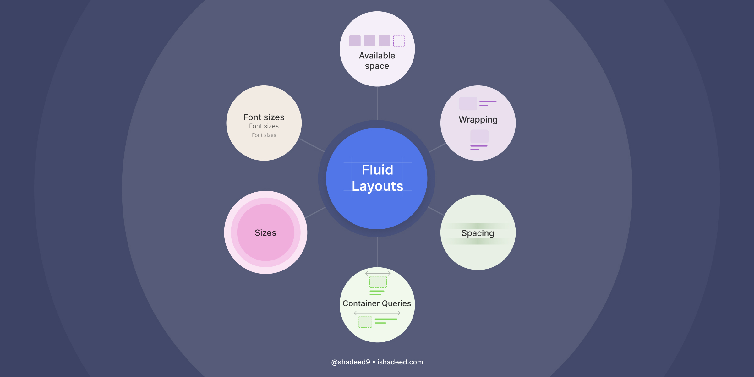
    Responsive design isn’t about #media_queries anymore.

    So, the web is responsive by default, unless we start getting creative in designing our layouts.

    Using modern CSS

    – The typography is responsive to the viewport width via clamp() function.
    – The spacing is responsive to the viewport width via clamp() function.
    – The hero section is responsive to its content via flexbox wrapping.
    – The cards grid is responsive to the available space with minmax(), no media queries.
    – The card component is responsive to its wrapper via size container queries and style container queries.
    – The margins and paddings are responsive to the websites language via logical properties.

    Using media queries

    – The site navigation is responsive to the viewport width.
    – The theming is responsive to the user preferences in their operating system.
    – The card hover effect is responsive to what the user is using (touch vs mouse).

    b_b @b_b PUBLIC DOMAIN
    Écrire un commentaire
  • @baroug
    baroug @baroug 22/04/2015

    Fall of the Designer Part III : Conformist #Responsive_Design — Eli Schiff
    ►http://www.elischiff.com/blog/2015/4/21/fall-of-the-designer-part-iii-responsive-design

    Unfortunately for Marcotte, his responsive design techniques unintentionally led exactly to the separation and abandonment of visual design principles in the interests of putting implementation first. Today, responsive techniques allow design practitioners and engineers to argue that the centrally important aspect of digital design is whether it adapts to multiple screens using fluid layouts to the exclusion of any other need.

    Beaucoup d’exemples assez nuls et pas très convaincants mais quelques idées intéressantes.

    #web_design

    • #Eli Schiff
    • #designer
    baroug @baroug
    • @baroug
      baroug @baroug 29/04/2015

      La suite : ►http://www.elischiff.com/blog/2015/4/28/fall-of-the-designer-part-iv-credible-threats

      baroug @baroug
    Écrire un commentaire
  • @baroug
    baroug @baroug 5/12/2013
    1
    @reka
    1

    The Business of #Responsive_Design | Journal | The Personal Disquiet of Mark Boulton
    ▻http://markboulton.co.uk/journal/thebusinessofrwd

    Let’s talk about responsive design.
    Responsive design has changed my work and, ultimately, how I do business. This talk is about how it’s done that. But before I do that, I’d like to tap about the definition of responsive design.

    • #Mark Boulton
    baroug @baroug
    Écrire un commentaire
  • @fil
    Fil @fil 2/12/2013
    4
    @baroug
    @reka
    @0gust1
    @gblin
    4
    @opironet

    Deserting the Digital Utopia / CrimethInc. Ex-Workers’ Collective
    ▻http://crimethinc.com/texts/ex/digital-utopia.html

    It would not be the first time dissidents have extrapolated their utopia from the infrastructure of the ruling order. Remember the enthusiasm Karl Marx and #Ayn_Rand shared for railroads! By contrast, we believe that the technology produced by capitalist competition tends to incarnate and impose its logic; if we wish to escape this order, we should never take its tools for granted. When we use tools, they use us back.

    http://crimethinc.com/texts/ex/computer-room.png

    Here follows our attempt to identify the ideology built into digital technology and to frame some hypotheses about how to engage with it.

    et un podcast associé :
    ▻http://www.crimethinc.com/blog/2013/11/18/the-ex-worker-13-ones-and-zeroes

    #idéologie #internet #capitalisme #anarchisme #outils #cccp et même #responsive_design via @opironet

    • #Ayn Rand
    • #Karl Marx
    Fil @fil
    • @robin
      robin @robin CC BY 2/12/2013

      HAH ! Super, ça colle parfaitement avec un texte que je suis en train de préparer (en mode semi-stealth) : ▻https://github.com/darobin/vision :-D

      robin @robin CC BY
    • @thibnton
      tbn @thibnton PUBLIC DOMAIN 2/12/2013

      Ones and Zeroes, Scoundrels and Heroes (à partir de 13’)
      ▻http://traffic.libsyn.com/exworker/13_Ones-and-Zeroes-Scoundrels-and-Heroes.mp3

      Transcript :
      ▻http://www.crimethinc.com/podcast/13/transcript13.html

      Some radicals believe the internet prefigures a decentralized utopia; others foresee a new digital feudalism of total management and #surveillance.

      ▻http://seenthis.net/messages/202878

      tbn @thibnton PUBLIC DOMAIN
    • @fil
      Fil @fil 2/12/2013

      Understood as a class, programmers occupy the same position today that the bourgeoisie did in 1848, wielding social and economic power disproportionate to their political leverage. In the revolutions of 1848, the bourgeoisie sentenced humanity to two more centuries of misfortune by ultimately siding with law and order against poor workers. Programmers enthralled by the Internet revolution could do even worse today: they could become digital Bolsheviks whose attempt to create a democratic utopia produces the ultimate totalitarianism.

      Fil @fil
    Écrire un commentaire
  • @booz
    BoOz @booz 10/11/2013
    3
    @baroug
    @habbon
    @reka
    3

    Le Quatre Heures
    ►http://lequatreheures.com

    Qu’est-ce que Le Quatre Heures ?

    Chaque mercredi, à 16 heures pile, Le Quatre Heures propose aux lecteurs un grand reportage #multimédia. Une nouvelle expérience narrative qui entremêle texte, photo, vidéo et son dans une lecture fluide, « en immersion » et sans aucun clic. Un récit au long cours que nous vous invitons à « déguster » confortablement installé, en plein écran.

    #slow_journalism #reportage #parallax #responsive_design #journalisme #sites_de_presse

    #plo

    • #Palestine Liberation Organization
    BoOz @booz
    • @rastapopoulos
      RastaPopoulos @rastapopoulos CC BY-NC 10/11/2013

      Trop la mooode.
      ▻http://seenthis.net/messages/174177

      RastaPopoulos @rastapopoulos CC BY-NC
    • @thibnton
      tbn @thibnton PUBLIC DOMAIN 10/11/2013

      #journalisme_numérique #art_directed_article

      tbn @thibnton PUBLIC DOMAIN
    • @reka
      Phil Reka docs & archives @reka CC BY-NC-SA 11/11/2013

      #media #presse #site_de_presse

      Phil Reka docs & archives @reka CC BY-NC-SA
    Écrire un commentaire
  • @baroug
    baroug @baroug 23/06/2013
    1
    @fil
    1

    Working around a lack of element queries | Filament Group, Inc., Boston, MA
    ▻http://filamentgroup.com/lab/element_query_workarounds

    Lately, we’ve been running into a recurring dilemma when building #responsive_designs. We want to build responsive layouts comprised of many modular, independent HTML components that fluidly fill any layout container we drop them into, but CSS3 #media_queries don’t currently offer a way to make content respond to its container’s dimensions (as opposed to the overall viewport size).

    • #Boston
    • #Filament Group Inc.
    baroug @baroug
    • @yohooo
      yohooo @yohooo CC BY-ND 23/06/2013

      Sur le même sujet, tu as peut-être lu cet article :

      Responsive Webdesign – présent et futur de l’adaptation mobile - Alsacreations
      ▻http://www.alsacreations.com/article/lire/1559-responsive-web-design-present-futur-adaptation-mobile.html

      La problématique du responsive est bien plus complexe que ce qu’on peut lire sur certains blogs qui essaient de nous faire croire qu’il suffit aujourd’hui, pour optimiser un site pour mobile, d’ajouter 2 Media Queries pour l’iPhone et l’iPad et redimensionner toutes les images. Le Responsive Web Design est une technique toute jeune, loin d’être parfaite et en constante évolution. Beaucoup de choses sont aujourd’hui possible, mais hélas il reste encore pas mal de chemin à parcourir dans le domaine.
      [...]
      Le responsive webdesign reste une technique et une infime partie de ce qui est aujourd’hui appelé « Adaptive Webdesign ». Le but de l’article n’est pas non plus de décourager les gens qui optimisent des sites pour mobile, mais de mettre le doigt sur ce qui aujourd’hui pose problème, est bancal, pour ensemble, trouver des solutions à ces différents problèmes.

      yohooo @yohooo CC BY-ND
    • @baroug
      baroug @baroug 24/06/2013

      non, merci donc : )

      baroug @baroug
    Écrire un commentaire
  • @fil
    Fil @fil 7/03/2013

    Impact of #Responsive_Designs
    ▻http://www.lukew.com/ff/entry.asp?1691

    Time Inc. Responsive Redesign

    Pages per visit, across #mobile, tablet and desktop are up considerably. (source)
    Mobile is up 23% compared to what it had been. (source)
    Homepage uniques are up 15%, and time spent is up 7.5%. (source)
    The mobile bounce rate decreased by 26%. (source)

    • #Time Inc.
    Fil @fil
    Écrire un commentaire
  • @fil
    Fil @fil 23/11/2012
    2
    @0gust1
    @reka
    2

    Why Google might just be wrong about responsive design in Africa | memeburn
    ►http://memeburn.com/2012/11/why-google-might-just-be-wrong-about-responsive-design-in-africa

    – Most Africans do not have internet at home or at work. Only about 15% of the population does. And the internet that they have at home and work is not at all comparable with what you have in America (in terms of speed and reliability).
    – Smartphone penetration in Africa is less than 20%.
    – Public Wi-Fi Hotspots are not widely available.
    – The GDP and PPP in Africa is among the lowest in the world.
    So your typical African’s first and only point of access to the internet is via a feature phone. Because of the cost of data and the disposable income of a typical African, an African feature phone internet user is very aware of the size and cost of a web page.

    What we need in Africa is a solution that is lightweight in terms of data usage.

    http://s4.cdn.memeburn.com/wp-content/uploads/2012/11/Obama-site-speeds.jpg

    [with #proactive_design] an African user can surf the net 10 times more (or at a cost that is 10 times less) and 10 times faster [than with #responsive_design].

    #mobile #afrique via @NdifunaUkwazi

    Fil @fil
    • @0gust1
      0gust1 @0gust1 CC BY-NC 24/11/2012

      Un argument pour le « UA Sniffing » ? Cela explique aussi le succès des navigateurs comme #Opera_Mini.

      0gust1 @0gust1 CC BY-NC
    • @fil
      Fil @fil 24/11/2012

      hmmm… peux-tu expliquer cette histoire d’opéra mini ?

      Fil @fil
    • @0gust1
      0gust1 @0gust1 CC BY-NC 24/11/2012

      Opera mini semble avoir beaucoup de succès dans les zones où Internet est cher (facturation au volume de données transférées) et où les gens n’ont pas des smartphones dernier cri.

      Contrairement à la majorité des navigateurs mobiles, Opera Mini (client) obtient ses pages web par l’intermédiaire de proxy hébergés par Opera Software. Ces proxy vont s’occuper de faire le rendu de la page, de l’adapter au format de l’écran et de redimensionner les images. La page est transmise au client dans un langage de balisage, le OBML (Opera Binary Markup Language)3.
      Cette approche de l’Internet mobile a de nombreux avantages :
      du fait que le client ne contient aucun moteur de rendu, il est très léger : 120 Kio ;
      le rendu demande pas mal de ressources, et il sera donc plus rapide sur les serveurs d’Opera Software que sur l’appareil mobile ;
      le client fonctionne de manière fluide, même sur de vieux appareils ;
      le trafic entre le serveur et le client sont largement revu à la baisse (dans un rapport de 2 à 3, en fonction de la page et de la qualité des images choisie), ce qui améliore la vitesse de chargement des pages et réduit l’utilisation du quota alloué par l’opérateur qui est généralement faible ;
      le moteur de rendu des proxy est celui d’Opera 9.5 ;

      ►http://fr.wikipedia.org/wiki/Opera_Mini

      0gust1 @0gust1 CC BY-NC
    • @fil
      Fil @fil 24/11/2012

      merci !

      Fil @fil
    • @opironet
      Zalameh @opironet 24/11/2012

      #fracture_numérique

      Zalameh @opironet
    • @0gust1
      0gust1 @0gust1 CC BY-NC 28/11/2012

      à articuler avec ►http://seenthis.net/messages/100104

      0gust1 @0gust1 CC BY-NC
    Écrire un commentaire
  • @julien
    juba @julien CC BY 29/01/2012

    Simple Responsive Design Test Page - bookmarklet - BenjaminKeen.com
    ►http://www.benjaminkeen.com/misc/bricss

    The link below lets you use lensco’s Simple #Responsive_Design Test Page on any page, by clicking the #bookmarklet. It lets you see how a page looks within different screen sizes. Very cool and simple idea. The bookmarklet lets you run it on any page (regardless of filename) and saves you the step of having to add the test page to each folder.

    M’a l’air bien pratique ce bookmarklet...

    #HTML #CSS

    juba @julien CC BY
    Écrire un commentaire
  • @nhoizey
    Nicolas Hoizey @nhoizey CC BY-NC-SA 7/11/2011

    Please resize me - Rudy Rigot & Sophie Taboni
    ►http://pleaseresize.me

    A brief history of fluidity in #webdesign

    #responsive_design #fluid #fixed #fun #parisweb
    ►http://pleaseresize.me/images/petit/fluidgrid/3/petitNormal.png

    Nicolas Hoizey @nhoizey CC BY-NC-SA
    Écrire un commentaire
  • @nhoizey
    Nicolas Hoizey @nhoizey CC BY-NC-SA 10/08/2011

    responsivepx - find that tricky breakpoint
    ►http://responsivepx.com

    Enter the url to your site - local or online: both work - and use the controls to adjust the #width and #height of your #viewport to find exact breakpoint widths in pixels. Then use that information in your #media_queries to create a #responsive_design.

    Nicolas Hoizey @nhoizey CC BY-NC-SA
    Écrire un commentaire

Thèmes liés

  • #media_queries
  • #responsive_design
  • #mobile
  • #afrique
  • #proactive_design
  • company: opera software
  • #css
  • #html
  • #bookmarklet
  • technology: html
  • programminglanguage: html
  • #fixed
  • #fluid
  • #webdesign
  • #fun
  • #parisweb
  • person: rudy rigot
  • person: sophie taboni
  • #width
  • #height
  • #viewport