

mapbox/mapbox-studio-picture-book.tm2
▻https://github.com/mapbox/mapbox-studio-picture-book.tm2
Picture book style for #mapbox_studio.
mapbox/mapbox-studio-picture-book.tm2
▻https://github.com/mapbox/mapbox-studio-picture-book.tm2
Picture book style for #mapbox_studio.
Weekend Update - SNL 40 Edition
▻http://jonahadkins.github.io/weekendupdate
Maps / Layers Inspired By Saturday Night Live’s Weekend Update Segment
For Your Not So Serious Stories And Maps*
Includes #tilemill Files And Sample Images For The Iconic #map Backgrounds Featured On Weekend Update
OpenStreetMap passe dans la 4ème dimension ! - cquest.hackpad.com
▻https://cquest.hackpad.com/OpenStreetMap-passe-dans-la-4me-dimension--q4LrvTSYNUQ
OpenStreetMap a dix ans et plusieurs créations ont été faites à cette occasion pour montrer l’évolution de cette gigantesque base de données géographiques au fur et à mesure de sa constitution... Euh... et si on représentait le temps par la 3ème dimension ?
Sources dispos sur github : ▻https://github.com/cquest/anaglyph-cartocss

Mapping the Story of San Francisco’s Bike Lanes | Streetsblog San Francisco
▻http://sf.streetsblog.org/2014/08/05/mapping-the-story-of-san-franciscos-bike-lanes
Betsey Emmons, a fellow at MapStory, has created an interactive map showing the history of San Francisco’s bicycle network. The map allows viewers to watch as San Francisco’s bike infrastructure develops over a 43-year period, showing streets that now feature bike lanes and sharrows.
https://dl.dropbox.com/s/aatnjh6vtbnu6b4/sfbikelane.png?dl=0
This story begins in 1971, when the first designated bicycle lane was striped on Lake Street, between 10th and 13th Avenues in the Inner Richmond. This was an early political victory for the SF Bicycle Coalition, which had just been formed by a small group of grassroots activists.
What’s not visible on the map are the bike lanes that almost came to be. As recounted in a 2011 issue [PDF] of SFBC’s Tube Times magazine, the Board of Supervisors in 1972 approved a plan for parking-protected bike lanes on upper Market Street, but the head of the Department of Public Works put a stop to it. Save for the occasional two-block long bike lane, the momentum for bicycle infrastructure didn’t really pick up speed until the late 1990s.
#cartographie #san_francisco #urban_matter #visualisation #bicyclette #vélo #ville


C’est l’occasion de jeter un œil à l’outil #mapstory qui est derrière (déjà signalé ici) ; mapstory « ingère » un fichier au format CSV contenant des données géocodées et temporelles, et fabrique une « storylayer » à partir de là. Ensuite, le storyteller compose sa carte en ajoutant des « layers » pour produire une « storymap », et peut alors ajouter une légende, des bulles de commentaires (géo- et time-codées), etc.
J’ai fait quelques essais avec mes données de livraison (à venir sur @visionscarto), et ça permet d’avoir très vite une petite animation. Mais je trouve l’interface un peu lourde, et j’ai du mal à voir comment on fait les « finitions »…
►http://mapstory.org
▻http://mapstory.org/mapstory/manual
au passage je découvre le plugin de géocodage pour #google_docs proposé par #mapbox/#tilemill
▻https://www.mapbox.com/tilemill/docs/guides/google-docs
#cartographie_narrative #outils_(ou_pas)
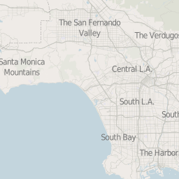
datadesk/osm-quiet-la
▻https://github.com/datadesk/osm-quiet-la
A template for a muted base layer about Southern California. Designed for overlaying loud data visualizations. Created with open data. Configured for #tilemill and Mapnik. Ready to deploy to Amazon S3 using Fabric, invar and boto.
karlwettin/tilemill-style-hydda
▻https://github.com/karlwettin/tilemill-style-hydda
Hydda style #tilemill project
Based on an old version of OSMBright, but patched to add more features such as piers, stadiums, pitches, and more.
Colors set to allow for looking good when adding transparent red-yellow-green overlays.
(used on ▻http://openstreetmap.se)
Bientôt disponible dans le plugin GIS pour #spip...
►https://github.com/leaflet-extras/leaflet-providers/issues/96
#todo
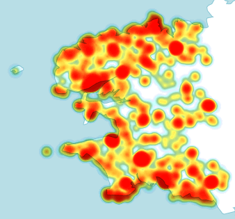
Et hop, pour faire suite à ▻http://seenthis.net/messages/237957 voici un tutoriel pour réaliser une #heatmap de façon simple avec #tilemill
▻http://www.weblog.eliaz.fr/article123.html
+
=
#map

c’est joli ! par contre, il faut faire attention à l’interprétation du heat map, qui ne corrige pas ici des effets de bords ! c’est ce qu’on explique dans un papier avec Ewen Gallic, Visualizing spatial processes using Ripley’s correction ▻http://hal.archives-ouvertes.fr/hal-00725090
c’est un peu technique, j’en conviens, mais c’est assez fondamental pour avoir des heat map interprétable !
(cf ▻http://freakonometrics.hypotheses.org/2416 et ►http://freakonometrics.hypotheses.org/7129 pour quelques explications supplémentaires)
pour faire simple, tu ne peux pas rajouter de la masse partout quand tu es au bord de l’eau... en terme de couleur, la couleur est 2x plus rouge au bords de l’eau, car tu sous-estime la densité avec un facteur 1/2

merci pour les remarques et précisions @freakonometrics je garde tes liens au chaud


merci @b_b pour le tuto et merci @freakonometrics pour les liens !

Beautiful ’hand-drawn’ style map render from #Openstreetmap data - don’t forget to zoom for detail !
▻http://dessine-moi-une-ville.makina-corpus.net/#13/43.5903/1.4481


►https://www.mapbox.com/tilemill
#tilemill #hand_made #map_texture
Tu en penses quoi @odilon?

Je trouve le rendu du tracé plutôt bien réussi, moins les textures et la typo qui reproduisent la rigidité de l’outil technique.
C’est l’éternel débat - la carte est-elle un rendu de données ou une interprétation directe par le dessin ? Donner à la première option une saveur artificielle de la seconde sera forcément moins savoureux... Mais la puissance de l’outil industriel vaut parfois bien une finition moins bonne que celle de l’artisan...

cartographie #visualisation #débat à mettre en lien avec ▻http://seenthis.net/messages/242404#message242477 pour un futur débat sur la question soulevée par @liotier
D’ailleurs en passant, un truc marrant qui me fait penser - rien à voir avec ce post - à un livre de Michel Serre « ce que les mots me disent » : quand on lit très vite un mot ou un nom, on lit parfois complètement autre chose... Par exemple @liotier : j’ai lu pendant longtemps « ilotier » et je pensais à quelqu’un qui fait une veille d’information locale :)
A rapprocher aussi de la perception d’humanité sensible des cartes aux crayons de couleurs qu’on évoquait à propos d’Ernest Pignon-Ernest
▻http://seenthis.net/messages/221631
En fait n’est pas l’aspect technique proprement dit que je critique dans le cas présent, c’est son esthétique. C’est un élément important. Une carte réalisée dans un logiciel comme illustrator peut être très belle, très réussie pour l’info qu’on y trouve, sa dynamique, l’impression qu’elle dégage, etc. Mais là je trouve les textures moyennement réussies sur le plan
esthétique.

Et le détail de la méthode par l’auteur :
▻http://makina-corpus.com/blog/metier/2014/dessiner-une-ville-a-la-main-les-batiments
▻http://makina-corpus.com/blog/metier/2014/dessiner-une-ville-a-la-main-avec-tilemill-2-decouper-les-polygones
▻http://makina-corpus.com/blog/metier/2014/dessiner-une-ville-a-la-main-avec-tilemill-3-2013-occupation-des-sols
Dans le même genre, j’avais été bluffé par le « watercolor » de Stamen Design :
▻http://maps.stamen.com/watercolor/#12/37.7706/-122.3782
Et ici aussi, un tutoriel en trois parties :
►http://content.stamen.com/watercolor_process
►http://content.stamen.com/watercolor_textures
▻http://content.stamen.com/maps_dot_stamen_dot_com_is_live

Salut
Merci pour vos critiques ; c’est vrai Odilon que si je reprenais ça aujourd’hui je ferais certaines choses différemment. A force de travailler dessus je ne vois plus que les défauts :)
Par exemple, j’aurais finalement tenté de représenter les routes aux niveaux de zoom élevés dans un style Stabilo ou autre, car dans les quartiers résidentiels finalement on n’a pas de repères.
Par exemple dans le quartier où se trouvent les locaux de Makina Corpus : ▻http://dessine-moi-une-ville.makina-corpus.net/#18/43.57492/1.40676

@kazem : d’autant que mon potager n’est pas très loin de chez vous, donc même si vous parlez Drupal et moi SPIP p’tet qu’on va pouvoir quand même se boire un verre un de ces quatres ;)
En tout cas, je te souhaite la bienvenue sur seenthis !

@touti t’inquiète pour ma part j’ai passé plus de temps sur SPIP que Drupal :)
N’hésites pas à passer chez Makina, ils font régulièrement des p’tits dej thématiques. Le prochain 24/04 :
▻http://makina-corpus.com/blog/societe/petit-dejeuner-Les%20bases%20de%20la%20cartographie%20sur%20le%20Web
Je travaille ailleurs donc je n’y serai pas, mais il y aura toujours possibilité d’aller boire un verre !
Create Heatmaps Using New Colorize-Alpha Image Filter | Mapbox
▻https://www.mapbox.com/blog/colorize-alpha-image-filter
Une #heatmap pliée en un rien de temps avec #tilemill. C’est la méthode que j’ai utilisé pour cette carte publiée il y a quelques temps : ►http://tiles.kupaia.fr/article22.html
#map
Build #ubuntu 13.10 saucy salamander package · Issue #2103 · mapbox/tilemill
▻https://github.com/mapbox/tilemill/issues/2103#issuecomment-37473991
Installer #tilemill sur ubuntu tout en utilisant le ppa ubuntugis :
git clone git@github.com:mapbox/tilemill.git cd tilemill npm install # will get node-mapnik binary now ./index.js # run tilemill!
#map
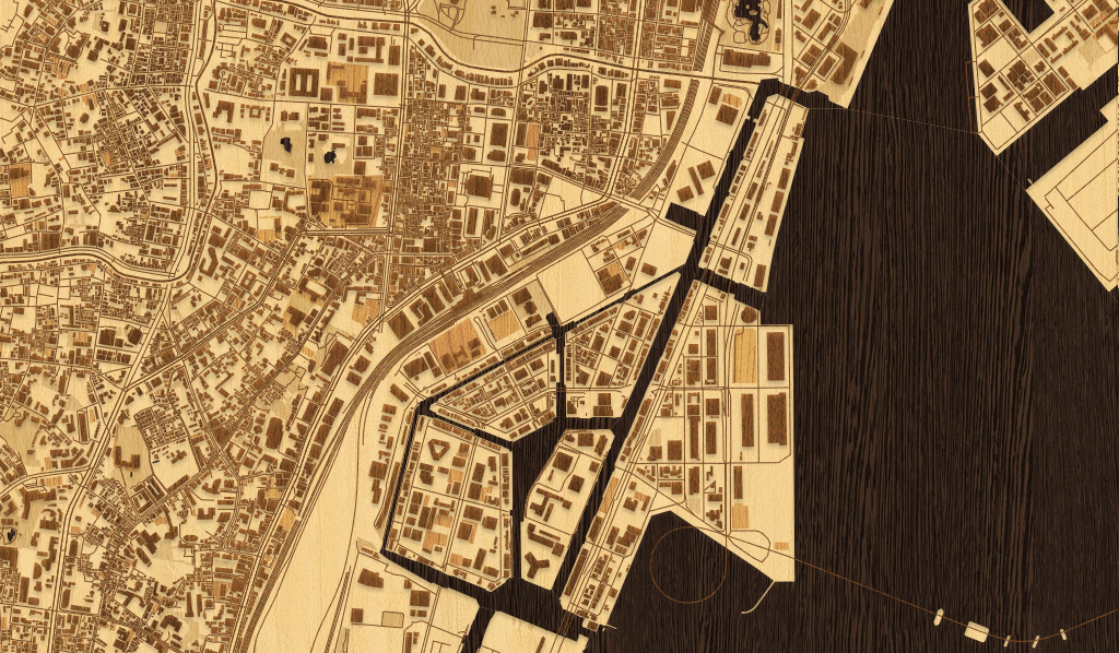
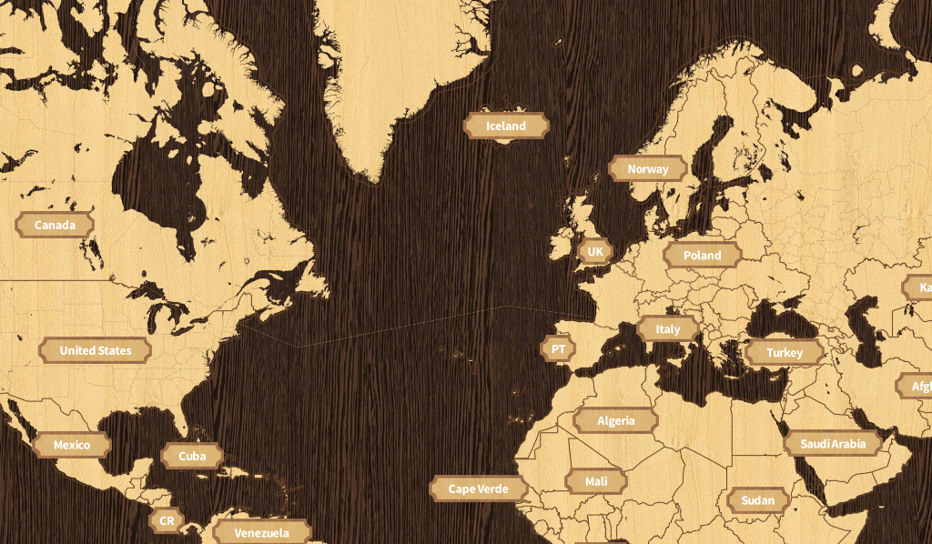
A woodcut inspired #map for city streets | Mapbox
▻https://www.mapbox.com/blog/woodcut-inspired-map
Une belle carte réalisée par la nouvelle recrue de chez #mapbox
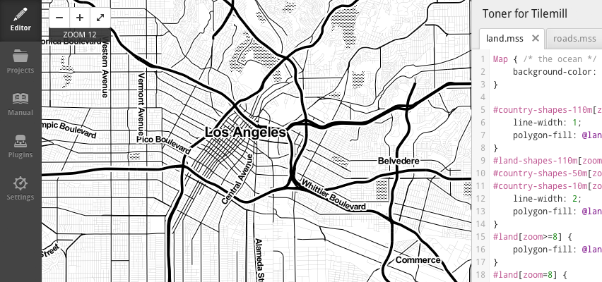
aaronlidman/Toner-for-Tilemill
▻https://github.com/aaronlidman/Toner-for-Tilemill
Adventures in Mapmaking : How to Map the Age of Buildings in Your Hometown - Wired Science
▻http://www.wired.com/wiredscience/2013/10/how-to-map-building-ages-in-your-home-town
You may have seen some of the beautiful maps of building ages that have been cropping up around the internet. I first noticed an amazing one of Portland, and then another great one of Brooklyn. I decided I wanted to try to make one of San Francisco, but, as I still know very little about making maps, I knew I’d need help.
So I called up Thomas Rhiel of the independent journalism site BKLYNR.com. Rhiel was willing to help, and it turns out he was just the right person to advise me. His map of Brooklyn building ages was his first foray into mapmaking, so he had just muddled his way down the same path I was about to navigate.
I’m going to tell you exactly how I made this map. I hope that people with little or no experience making maps will be able to use this as a guide to getting started on a map of their own hometown. And I also hope expert mapmakers will chime in to tell us how we can improve our maps.
Bon, je ne retrouve pas les précédents référencements sur seenthis
#cartographie
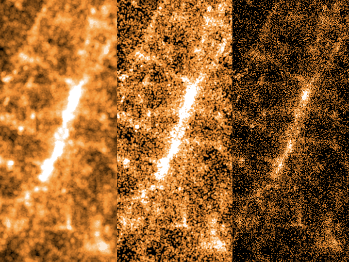
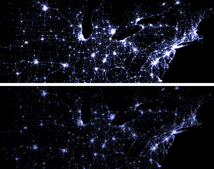
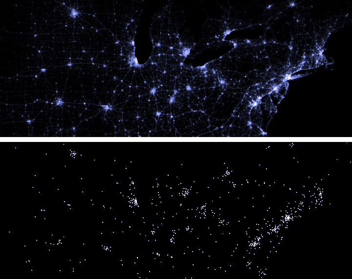
Mapping Millions of dots | MapBox
▻http://www.mapbox.com/blog/mapping-millions-of-dots
double the area of the dots for each level you zoom in
increase the brightness of the dots as you zoom in
draw fewer dots at lower zoom levels
Behind the scenes: Making a #heatmap of gun seizures | Washington Post Graphics
▻http://postgraphics.tumblr.com/post/51818823313/behind-the-scenes-making-a-heatmap-of-gun-seizures
The screengrab below shows how I shaded grid cells based on the “dzall” attribute Ted included in his shapefile. You can also see how I created different styles based on zoom level, so users could see geography more clearly when zoomed in.
Phonegap + Leaflet + TileMill = #Offline #Mobile #Maps
▻http://geospatialscott.blogspot.fr/2012/04/phonegap-leaflet-tilemill-offline.html
Recently I’ve been researching a mobile project that will require offline-capable base maps. After unsuccessfully finding a solution already built I decided to try wire together #Phonegap, #Leaflet, and #TileMill's .mbtiles.
Scaled Data Value Design in TileMill | MapBox
▻http://mapbox.com/blog/scaled-data-value-design-in-tilemill
Scaled data values can ensure that a user’s eyes are drawn to important data points rather than geographical anomalies associated with many choropleth maps,
Export Your #ArcGIS Projects to #TileMill | MapBox
►http://mapbox.com/blog/announcing-arc2earth-sync
TileMill Connect, a new feature from Arc2Earth Sync that lets you open ArcGIS projects in TileMill to utilize its beautiful cartography and advanced web publishing features, is available to use today.
CSS For Maps
►http://macwright.org/2012/11/02/css-for-maps.html
thanks to its inclusion in #TileMill, a lot of people have used #CartoCSS. It’s about time for some reflection.
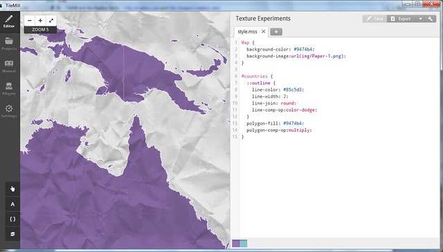
GeoSprocket Community Jive : Map Texture Studies
►http://geosprocket.blogspot.fr/2012/09/map-texture-studies.html
Given enough time to play with them, I’m coming to adore the new Mapnik image compositing features available in Tilemill. I’ll cover some methods in more detail in the next few days, but for now here’s a look at a series of map background textures, composited through geographic features. The vignettes below are displayed with their attendant carto parameters for your re-creative enjoyment. Click here to see the full set.
Un billet à propos des textures dans Tilemill dont la version 0.10.0 vient de sortir :
Deux liens intéressants pour choper des belles textures :
►http://www.flickr.com/photos/zooboing


ah cool pour des backgrounds de sites aussi, old school

old school
C’est clair ^^
Pour ceux que ça intéresse, il y a 2 filtres de #Gimp qui permettent de faire ça (rendre raccordable un morceau d’image) :
– Filtres > Mappage > Rendre raccordable
– Filtres > Mappage > Resynthesize
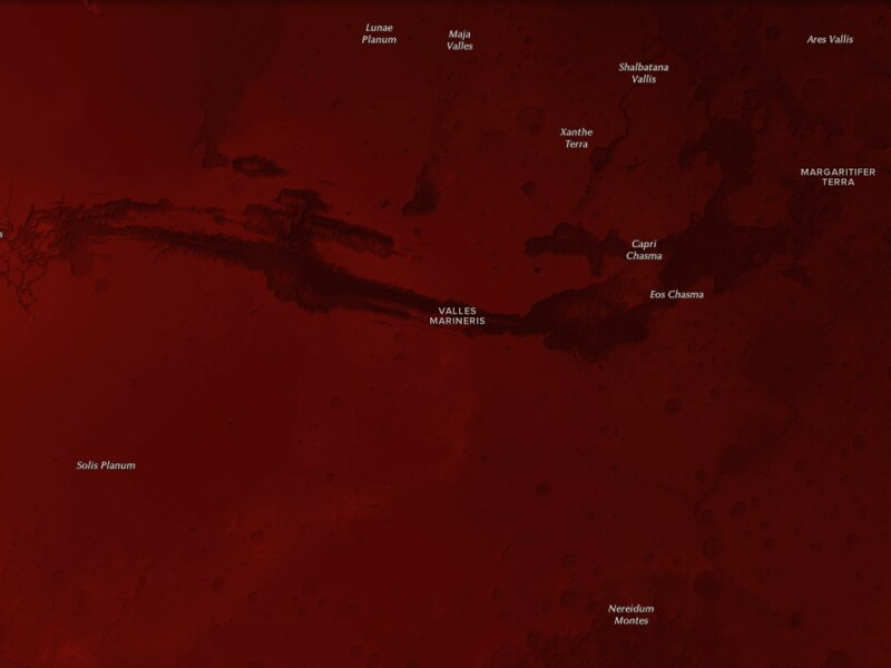
Mapping Mars with Open Planetary Data | MapBox
►http://mapbox.com/blog/2012-08-26-mapping-mars
“Inspired by the Mars Curiosity rover, I set out to map Mars using all open source tools (like QGIS and TileMill) and open data. The results of these tools and awesome data are stunning. The first shows Mars as “the red planet,” and the second map uses a more divergent color ramp to show Mars’ topographical variation.”
Toujours à fond chez #mapbox, cette fois ils nous pondent des cartes de Mars.
Code : Flickr Developer Blog » The great map update of 2012
►http://code.flickr.com/blog/2012/06/29/the-great-map-update-of-2012
Flickr design ses propres tuiles basées sur les données OSM dans Tilemill et devrait bientôt switcher vers Leaflet, plein de bonnes choses à venir.
Today we are launching Buenos Aires and Santiago in a new style. We will be launching more cities in this new style in the near future. They are built from more recent OSM data and they will also have an entirely new style which we call Pandonia. Our new style was designed in TileMill from the osm-bright template, both created by the rad team at MapBox.
►https://github.com/flickr/Pandonia
To host all of these new tiles we needed to find a flexible javascript api. Cloudmade’s Leaflet is a simple and open source tile serving javascript library... We have a fork on GitHub which we plan to contribute to as time goes on. We’ll keep you posted.
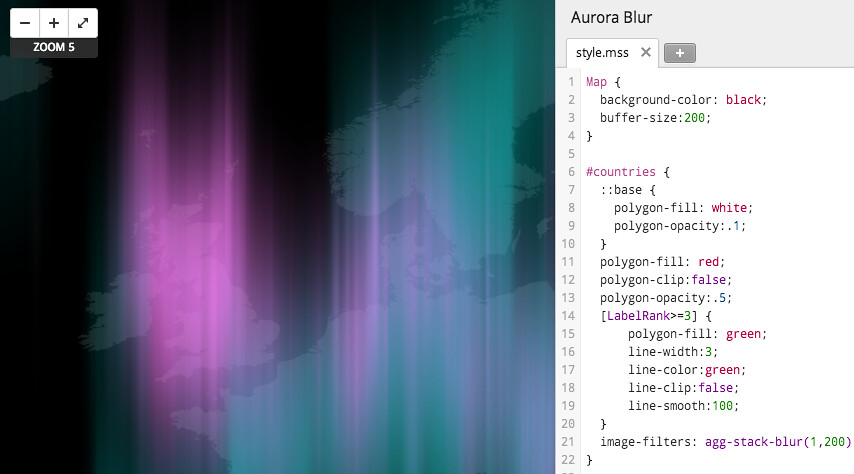
Il est maintenant possible d’utiliser des filtres graphiques dans #mapnik :
►http://mapnik.org/news/2012/04/26/image-filters
Une carte de base comme celle-ci :
Peut donner quelque chose de plus sympa comme ça :
Du coup, les gens de mapbox sont chaud pour utiliser tout ça dans #tilemill et ça donne envie :


