


New #Viewport Units
▻https://ishadeed.com/article/new-viewport-units
However, using the vh unit on mobile is buggy. The reason is that the viewport size won’t include the browser’s address bar UI. To solve that, we now have new viewport units. Let’s find out about them in this article.
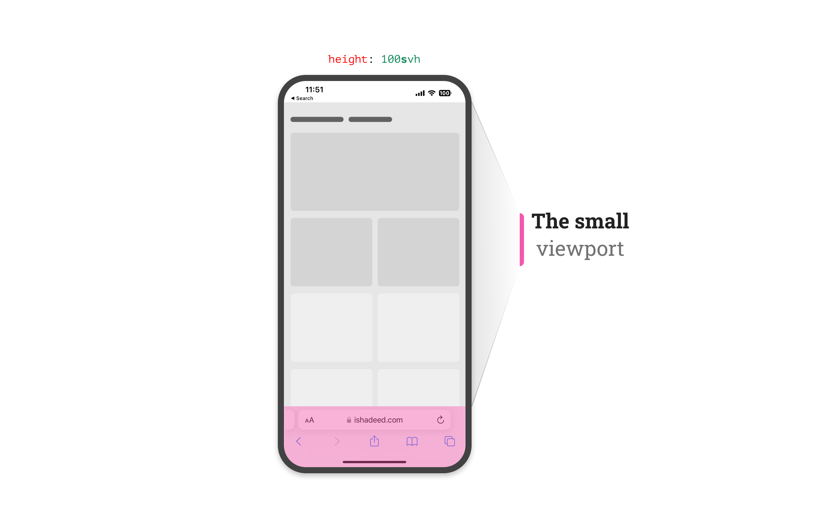 https://ishadeed.com/assets/new-viewport-units/small-viewport-css.png
 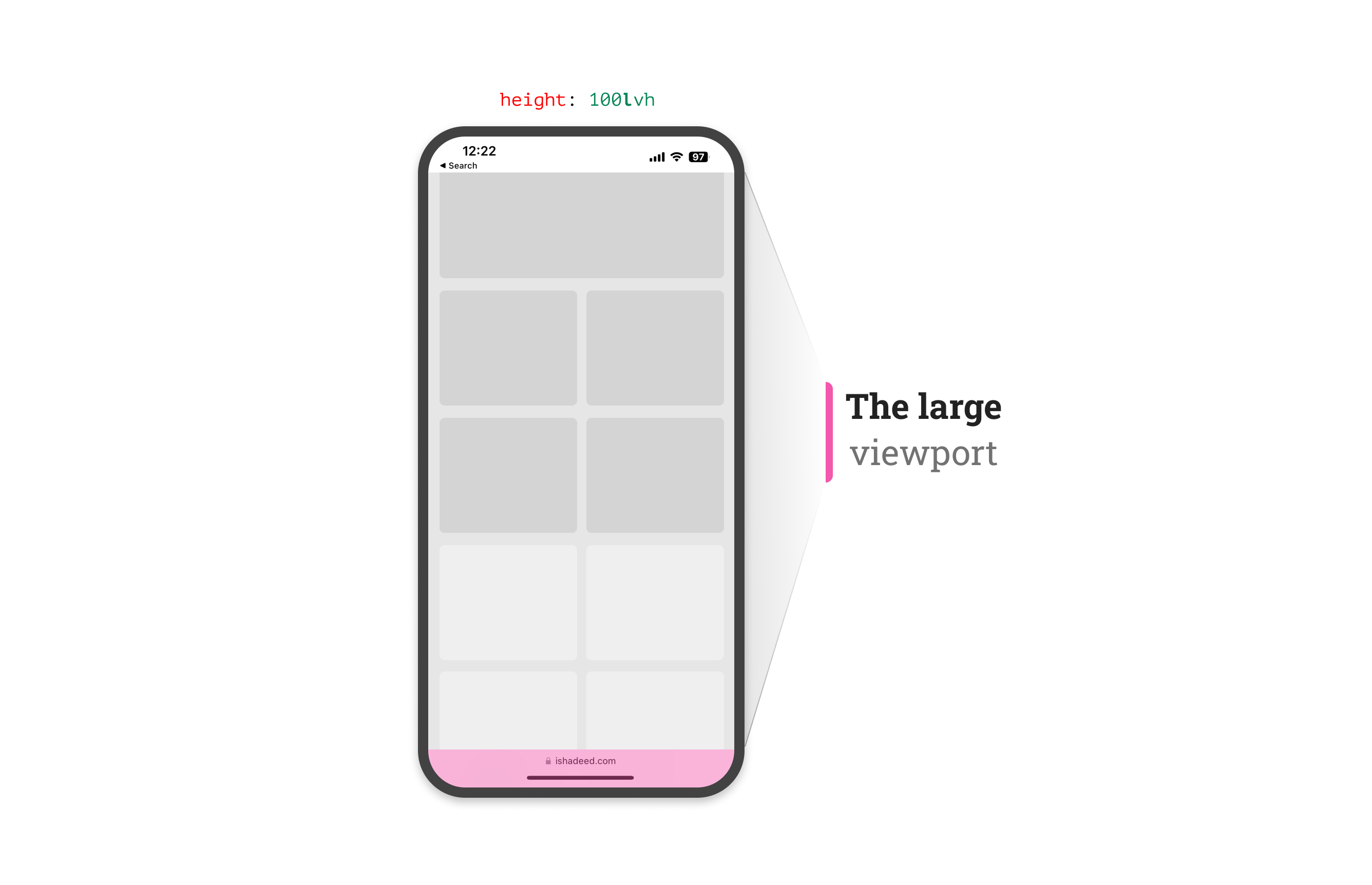 https://ishadeed.com/assets/new-viewport-units/large-viewport-css.png
 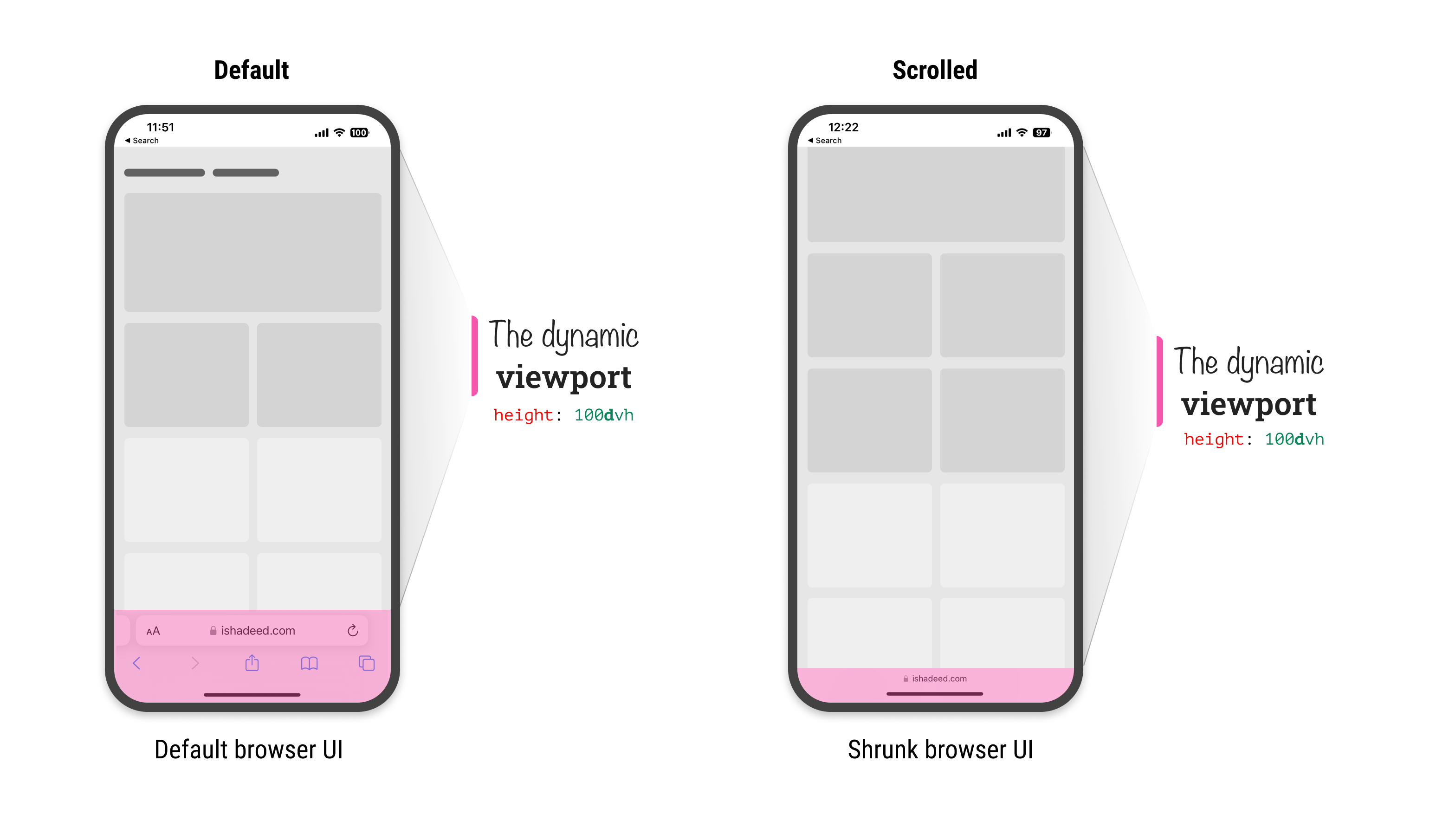 https://ishadeed.com/assets/new-viewport-units/dynamic-viewport-css.png
 #css


