


11 maps that explain the US energy system - Vox
▻http://www.vox.com/2014/6/12/5803998/the-us-energy-system-in-11-maps
Super outil pour tous les profs d’histoire et de géographie qui ont les Etats-Unis au programme.
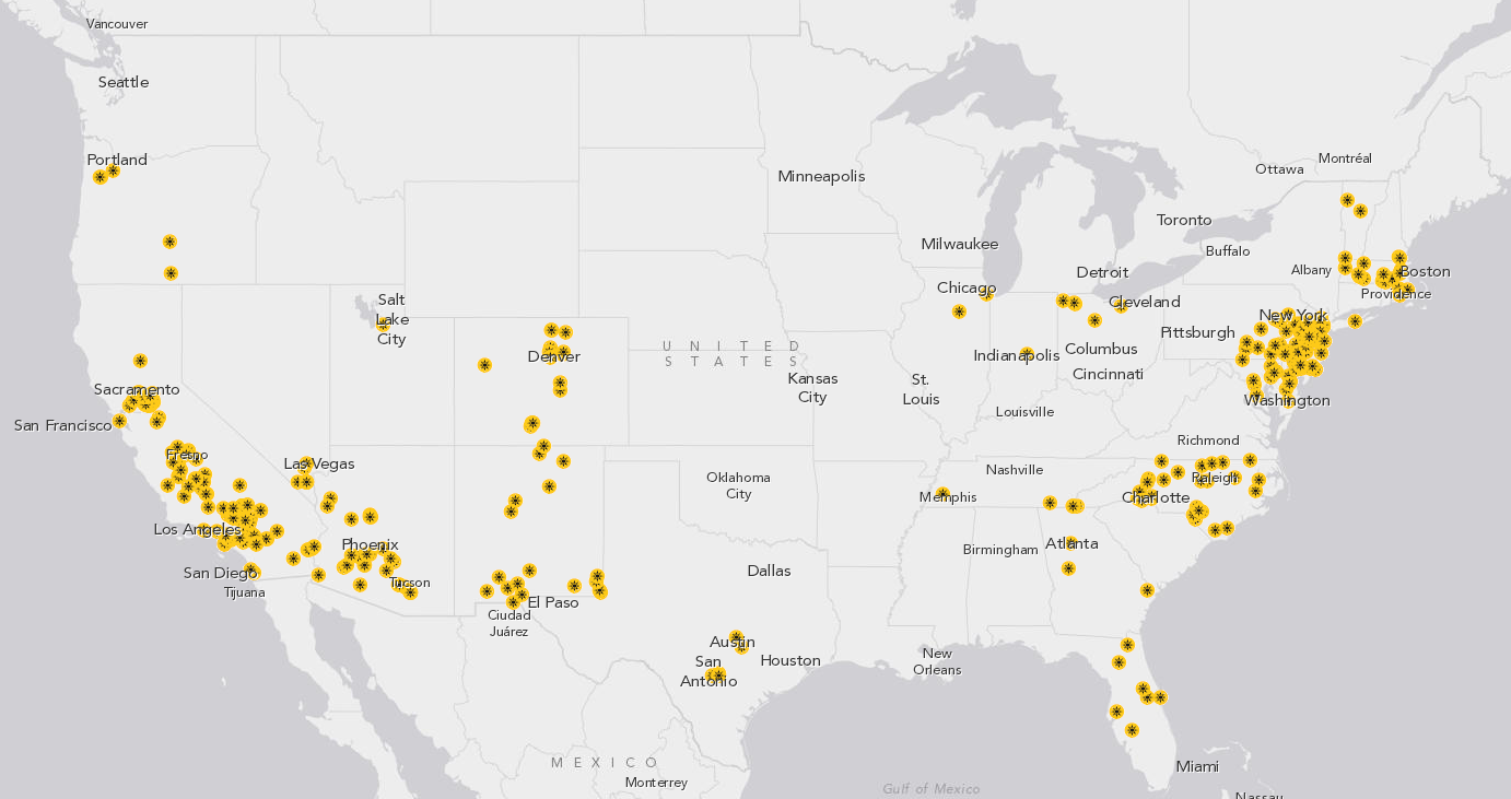
Ever wonder what America’s energy infrastructure looks like? All those power plants and coal mines and oil wells and transmission lines?
Then you’re in luck. The Energy Information Administration (EIA) has a fascinating new mapping tool that lets you take a detailed look at every aspect of America’s energy system :
▻http://www.eia.gov/state/maps.cfm
Below I’ve pulled out 11 maps of interest, but you can use the tool to customize the maps in any way you want (or zoom in to see state-level details and look at individual congressional districts).
#états-unis #énergie #cartographie #visualisation #cartographie_interactive