The Best New Maps, According to Cartographers
▻http://news.nationalgeographic.com/2016/11/best-new-maps-atlas-design

Carte par Levy Westerveld actuellement en poste au Grid-Arendal en Norvège... Si ça vous dit quelque chose :)
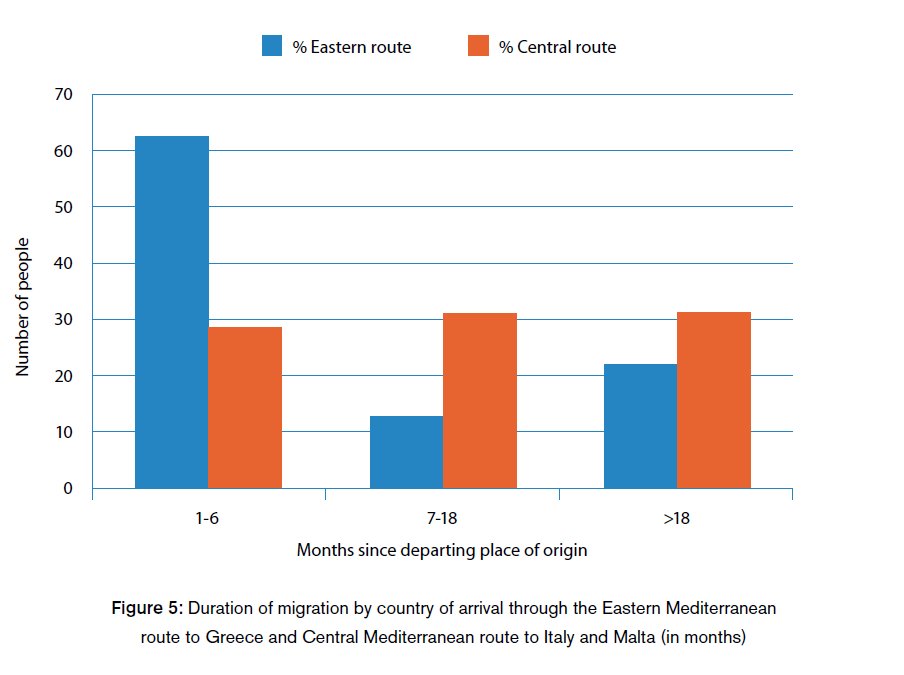
Every person who died trying to reach Europe by crossing the water from Africa and the Middle East between 2005 and 2015 is represented by a single dot on this map. Levi Westerveld, a spatial analyst and cartographer at the Norwegian foundation GRID-Arendal, placed each dot, one by one, as close as he could to where each person died or went missing. “Assigning a unique dot to each victim helped to portray the unsettling number of recorded losses,” Westerveld wrote in the atlas.
Distances and locations aren’t exact on this map, but Westerveld’s intention was to portray the experience of the people who were fleeing conflicts in their home countries. They were often navigating the Mediterranean with just handheld compasses in un-seaworthy boats, hoping to see a thin line of coast on the horizon, represented on the map by a thin black line.
If you look closer, you’ll see thin blue lines of text waving away from a few of the dots. These are descriptions of who died, how they died, and the destination they hoped to reach. Westerveld writes: “And they leave us wondering: What about the stories behind all the other dots?”
Elmer says the editors all felt that the overall effect of the map is “a total emotional gut-punch.”
–---
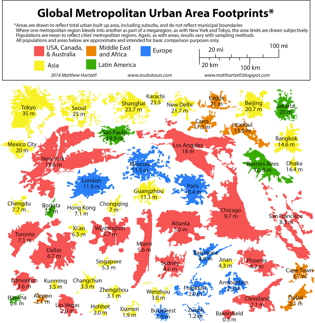
The other maps are :
 http://news.nationalgeographic.com/content/dam/news/2016/11/16/atlas_design/04_atlas_design_maps.ngsversion.1479330016156.adapt.1190.1.jpg
  http://news.nationalgeographic.com/content/dam/news/2016/11/16/atlas_design/05_atlas_design_maps.ngsversion.1479330022674.adapt.1190.1.jpg
  http://news.nationalgeographic.com/content/dam/news/2016/11/16/atlas_design/01_atlas_design_maps.ngsversion.1479330037514.jpg
 The Best New Maps, According to Cartographers
By Betsy Mason
PUBLISHED November 16, 2016
From charts of UFO sightings in the United States to surveys of bear population density in Finland to a 3-D visualization of where London’s airport employees live, a new collection of maps shows off the skill and creativity of today’s cartographers.
The third volume of the Atlas of Design contains 32 maps, each representative of a different style of design and craft. The one thing the maps have in common is that they tend to “impress the viewer at first glance, and have enough rich details to reward the time spent looking closer,” says atlas co-editor Marty Elmer, a member of the North American Cartographic Information Society, which publishes the atlas.
As they sifted through nearly 250 submissions from more than 15 countries, a panel of NACIS members considered the maps’ creativity, scientific rigor, and artistic mastery. The result is a beautiful set of modern maps that will appeal to both professional mapmakers and casual map enthusiasts. “Whether the mapmaker is a journalist, student, GIS professional, lifetime cartographer, or independent artist, people of all sorts of backgrounds are making maps that are interesting, informative, and fun,” Elmer says.