DVS Mentor Spotlight: Lior Lavi
▻https://nightingaledvs.com/mentorship-spotlight-lior-lavi
To get to know Lior Lavi better, we asked him a series of questions so you can learn a bit more about a mentor making a difference.

DVS Mentor Spotlight: Lior Lavi
▻https://nightingaledvs.com/mentorship-spotlight-lior-lavi
To get to know Lior Lavi better, we asked him a series of questions so you can learn a bit more about a mentor making a difference.
Good Morning Data #1 | The Mystery Job
▻https://nightingaledvs.com/good-morning-data-1-the-mystery-job
How do we explain to those unfamiliar what we do as #Data_Visualization professionals and designers? Join datacitron is the first issue of this new column “Good Morning Data.”
Tips & Tricks to Improve your #Dashboard_Design
▻https://nightingaledvs.com/tips-tricks-to-improve-dashboard-design
Learn how to use data context, visual flow, color, typography, and appeal to create engaging data visualizations for business users.
‘The Data Diaries’: Making Interactive Data Visualizations about World Banknotes
▻https://nightingaledvs.com/interactive-data-diaries-banknotes
The process behind building an interactive #Data_Visualization story about world banknotes from concept to finished visual.
Rapid Fire: Scaling a Portfolio with Design Components
▻https://nightingaledvs.com/rapid-fire
There are many ways that can speed your development cycle from data cleanliness to clarity of your user’s needs. My efficiency lay in the use of component-driven design.
The evolution and future of interactive data visualization (Part 5)
▻https://nightingaledvs.com/the-evolution-and-future-of-interactive-data-visualization-part-5
In just three decades we’ve made major advances in interactive data visualization as a result of progress in four drivers of change.
Flowers and Numbers
▻https://nightingaledvs.com/flowers-and-numbers
Explore the process of creating #Data_Visualization badges for a #Community using flowers and numbers. Creating a local data art community!
Color Jitter: Using Randomness to Augment Categorical Visualizations
▻https://nightingaledvs.com/color-jitter
A colormap can enrich a story by anchoring the value mapping to our shared experience or symbolism.

Évolution graphique du site d’Apple :
►http://www.apple.com
Le site d’Apple influence généralement les tendances du #webdesign. Mais je trouve que c’est plus lourdingue que la version précédente, avec notamment un retour des effets Aqua et une structuration de la page ultra-marquée.
Navigating Data for Social Change: Lessons from the Abolitionists’ Database Project
▻https://nightingaledvs.com/navigating-data-for-social-change-lessons-from-the-abolitionists-dat
Drawing from the abolitionists’ database project, we identify five key lessons about data collection, analysis, and advocacy.

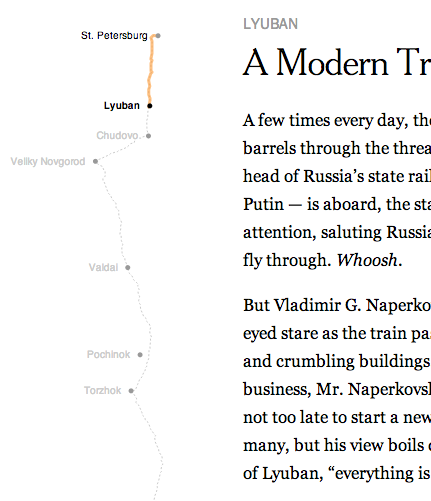
The Russia Left Behind
▻http://www.nytimes.com/newsgraphics/2013/10/13/russia


En fait, c’est le créateur de #d3.js (qui travail au nytimes) qui a fait la visualisation. On peut voir ce qu’il fait sur : ▻http://bost.ocks.org/mike
►http://www.nytimes.com/newsgraphics/2013/09/13/fashion-week-editors-picks pourrait intéresser @flip-zone


Rough.js : Create graphics with a hand-drawn, sketchy, appearance
▻http://roughjs.com
3 Data Points from New DVS Board Members
▻https://nightingaledvs.com/3-data-points-from-new-dvs-board-members
The start to 2024 saw the induction of seven new #Data_Visualization Society board members. As they begin their respective duties to elevate DVS, we wanted to offer them the chance to introduce themselves, asking them a few questions along the way. Get to know the new DVS board members!
The evolution and future of interactive #Data_Visualization (Part 2)
▻https://nightingaledvs.com/the-evolution-and-future-of-interactive-data-visualization-part-2
The second installment in a series on the evolution and future of interactive data visualization. The early years of the internet.
Flags and Figures
▻https://nightingaledvs.com/flags-and-figures
In both vexillology and data visualisation, the elegance lies in simplicity, the power in clarity, and the beauty in purposeful #Design.
Stop Trying to Prove Yourself with a Viz
▻https://nightingaledvs.com/stop-trying-to-prove-yourself-with-a-viz
Every #Data_Visualization job that I have held has included introducing my work to teammates and then feeling like I have to impress them.
The Evolution and Future of Interactive #Data_Visualization (Part 1)
▻https://nightingaledvs.com/the-evolution-and-future-of-interactive-data-visualization-part-1
As humans, we have always had the urge to chart the world around us. This urge has pushed us to improve the way we collect, process, and communicate information throughout history.
Visualizing the History of Saturn and its Rings
▻https://nightingaledvs.com/visualizing-the-history-of-saturn-and-its-rings
In March 2025, Saturn’s rings will disappear. Well, this isn’t entirely true. NASA has confirmed that the rings will disappear, yes, but they will only disappear from Earth’s view.

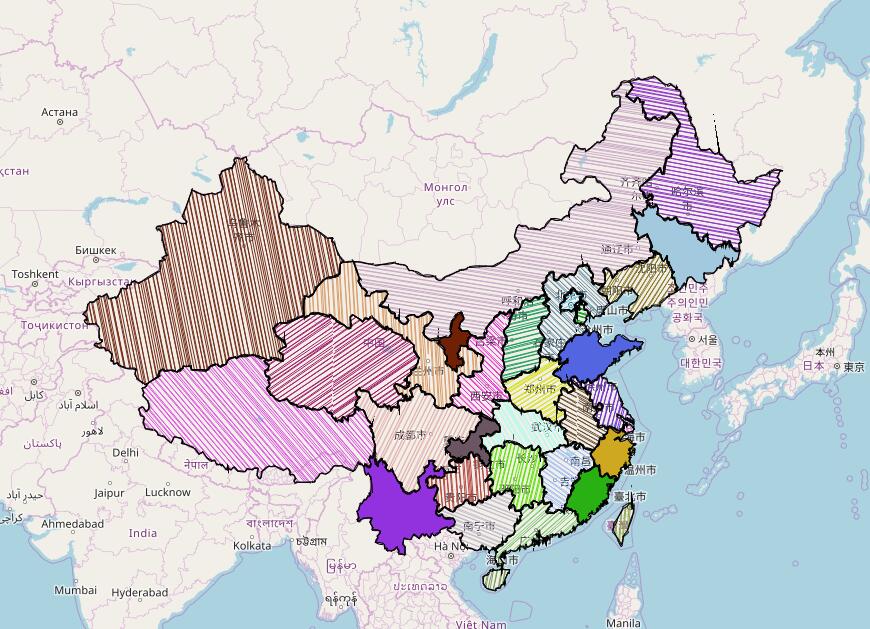
Blanked-Out Spots On China’s Maps Helped Us Uncover Xinjiang’s Camps
▻https://www.buzzfeednews.com/article/alison_killing/satellite-images-investigation-xinjiang-detention-camps
China’s Baidu blanked out parts of its mapping platform. We used those locations to find a network of buildings bearing the hallmarks of prisons and internment camps in Xinjiang. Here’s how we did it. In the summer of 2018, as it became even harder for journalists to work effectively in Xinjiang, a far-western region of China, we started to look at how we could use satellite imagery to investigate the camps where Uighurs and other Muslim minorities were being detained. At the time we began, (...)
Visualizing Music Through Data: Are The Most Popular Ghost Songs Statistically More Metal?
▻https://nightingaledvs.com/visualizing-music-through-data
Ghost, the Swedish satanic metal band that blew up during the summer of 2022 when their song “Mary On A Cross” went viral on TikTok, now has over 8 million monthly listeners on Spotify—rising from around 2 million before summer of 2021.
Three Questions with… Teo Popescu
▻https://nightingaledvs.com/three-questions-with-teo-popescu
Teo Popescu is the new section editor of Nightingale. She is the creative manager at KUOW, one of the Seattle branches of National Public Radio.
Three Questions with… Alejandra Arevalo
▻https://nightingaledvs.com/three-questions-with-alejandra-arevalo
Alejandra Arevalo is a Peruvian multimedia journalist and engineer based in San Francisco. A self-taught coder, she currently works as a developer at Hearst Newspapers where she focuses on #Data_Visualization and interactive storytelling.
Internal #Design: Success Requires Form and Function
▻https://nightingaledvs.com/internal-design-success-requires-form-and-function
My journey with EdWise and the Career Explorer #Tools taught me about generating change using innovative #Data_Visualization within an organization.
A Visual Compliment: Charting Kindness in Data
▻https://nightingaledvs.com/a-visual-compliment
This story details and visualizes the time Kayla Marie set out to track how many compliments she gave in a week, but came away with having received almost as many as she gave.
Data #Design in Focus: Students #Review Diverse Installations at Venice Biennale 2023
▻https://nightingaledvs.com/data-design-in-focus-students-review-diverse-installations-at-venice
During a visit to the Venice Biennale in November 2023, a series of reviews of selected installations and presentations were created by students from the Hochschule für Gestaltung (HfG) Offenbach, Lucerne University of Applied Sciences and Arts (HSLU), and the Berlin University of the Arts (UdK).