


Mapping gentrification : The great inversion | The Economist
▻http://www.economist.com/blogs/blighty/2013/09/mapping-gentrification?fsrc=scn%2Ffb%2Fwl%2Fbl%2Fgreatinversion
Le discours of The Economist n’est pas trop ma tasse de thé, mais il faut quand même leu dire « chapeau » pour la section cartographie et visualisation.
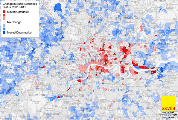
LONDON is turning inside out. That, anyway, is roughly the argument of a couple of pieces we have published recently. Just as affluent young professionals seem to be staying in the inner-city longer, turning places such as Dalston (in Hackney) and Peckham (in Southwark) into hipster enclaves, so too are the outer suburbs getting poorer, as people who cannot afford inner-London rents are pushed further out.
Anyway, I come back to the topic because since publishing those pieces, Neal Hudson, an analyst at Savills, a big estate agent, sent me the quite fascinating map above. He has calculated a weighted overall NS-Sec figure—the measure of socio-economic class used by the the Office for National Statistics—for London’s super output areas in 2001 and 2011. He has then mapped the change. In red areas, the demographic profile of the area has gone upmarket. In blue ones, it has gone downmarket.
#cartographie #visualisation #londres #gentrification #royaume-uni