
This is Visual Journalism [154] - Visualoop
▻http://visualoop.com/blog/98203/this-is-visual-journalism-154
This is Visual Journalism [154] - Visualoop
▻http://visualoop.com/blog/98203/this-is-visual-journalism-154

Les graphiques de W.E.B. Du Bois et de ses étudiants (liens en vrac)
▻https://blog.kurtosys.com/storytelling-data-visualization
 http://2.bp.blogspot.com/-nR8GIyJANfA/TWVlQnJUDhI/AAAAAAAAETQ/OQJDoPnaOiM/s1600/GN_illiteracy.jpg
  http://1.bp.blogspot.com/-sx-ppkHIGwg/TWVlQl6fm2I/AAAAAAAAETI/ZPD7sy6WLQA/s1600/GN_Value.jpg
  http://2.bp.blogspot.com/-PEf7IH9aiGE/TWVlQ9IHaYI/AAAAAAAAETY/gw70834JnMg/s1600/GN_CityRural.jpg
  http://visualoop.com/media/2014/04/Routes-of-the-African-slave-trade-1900-680x490.png
  http://visualoop.com/media/2014/04/Income-and-expenditure-of-150-Negro-families-in-Atlanta-680x490.png
  http://visualoop.com/media/2014/04/City-and-rural-population-1890-1900-680x490.jpg
 (recherche à partir de ▻https://twitter.com/joshbegley/status/745234042212257792 )
Hand-Drawn Early-20th-Century Charts Showing the State of African-American Economic Life
▻http://www.slate.com/blogs/the_vault/2014/03/04/web_du_bois_charts_from_his_project_the_georgia_negro.html
et tout est dispo en haute définition ici:
▻http://www.loc.gov/pictures/search/?q=%22lot%2011931%22%20NOT%20medal&st=grid&co=anedub&loclr=blogpic
Cette figure est particulièrement étonnante :
W.E.B. Du Bois commissioned beautiful hand-drawn data visualizations and infographics for the Paris World Fair — Quartz
▻https://qz.com/906774/w-e-b-du-bois-commissioned-beautiful-hand-drawn-data-visualizations-and-infograp
▻https://qzprod.files.wordpress.com/2017/02/lead-image.jpg?quality=80&strip=all&w=1600
Capturing my creative process, by Helena Jakoube - Visualoop
▻http://visualoop.com/blog/9179/capturing-my-creative-process-by-helena-jakoube
un post marrant sur la visu.
Infographic tube
As a graphic designer I often deal with a fact that people don’t understand what graphic design means, what it is about, and especially how hard work it can sometimes be. Being designers doesn’t mean that we only play or have fun. The creative process can be very painful, and besides it includes many steps and procedures. These initial thoughts gave a basis to my project, and I started to observe my creative activities and collect the related data. After a while I have gathered quite a lot of information and the infographic elaboration seemed as the best possible solution.


Invasion of the drug cartels - Visualoop
▻http://visualoop.com/infographics/invasion-of-the-drug-cartels
Vous vouliez de la flèche ? en voilà ! C’est ce qui s’appelle «remplir l’espace» en cartographie.
Invasion of the drug cartels
The race for Arctic domination par Alberto Lucas López (Design) - Visualoop
▻http://visualoop.com/infographics/the-race-for-arctic-domination
Publishers : South China Morning Post
To build and manage the Panama Canal, the United States pushed through Panama’s independence from Colombia and spent more on this construction project than on any other before. To create the Suez Canal, the Egyptian government leased its land to a private French company, which used forced labour to complete the project. Nowadays, the question is, will the Arctic frontier become an ecological preserve or an economic engine, an area of international cooperation or confrontation?
European banks and government debt - Visualoop
▻http://visualoop.com/infographics/european-banks-and-government-debt
Très intéressante forme visuelle, à explorer.
The visualisation compares the sovereign debt exposure of sixty-one European banks to the twenty-nine nations of the old continent. The data refer to the years 2011 and 2012 and have been gathered, analysed and visualized comparing three different sources: The Guardian, Eurostat (Ue) and Business Week.
#visualisation #dette #économie #banques #crise_bancaire #crise_financière
Ivory poaching - Visualoop
▻http://visualoop.com/infographics/ivory-poaching
via Jean-Christophe Fichet sur Twitter
Ivory poaching
China Investments in Europe (2012) - Visualoop
▻http://visualoop.com/infographics/china-investments-in-europe-2012
Un peu ancien mais intéressant pour la recherche graphique.
via Jean-Christophe Fichet sur Twitter
China Investments in Europe (2012)


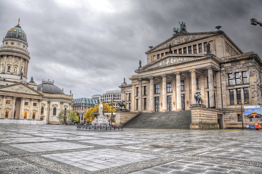
High up! The new skyline of Berlin - Visualoop
▻http://visualoop.com/infographics/high-up-the-new-skyline-of-berlin
#berlin #urban_matter #cc @klaus et @unagi


Ce désir de hauteur mène à une nouvelle version du Berlin qui imite les véritables métropoles. Déjà le square le plus célèbre de la ville fut construit d’après des bâtiments existants. Le roi Frédéric le Grand avait fait une commande dans un catalogue d’architeture pour montrer que lui aussi était riche et cultivé. Il nous l’a laissé sous l’appellation Gendarmenmarkt .
Le dernier empereur allemand nous a légué comme ça l’église la plus moche du monde , la cathédrale Berliner Dom .
Le pouvoir et l’argent ignorent la beauté, il leur faut des artistes rusés qui arrivent à faire passer la beauté et la créativité humaine auprès des commanditaires en leur faisant croire qu’elles représentent l’essence de leur existence grandiose. On va encore beaucoup rire des projets absurdes et des arguments fallacieusement avancés pour les vendre.
Sans rire : j’ai horreur de l’architecture mondialisée . La ville moderne exprime la mégalomanie des gens riches à l’esprit médiocre. Ici on en a eu assez. Exemple :
C’est ce qui nous reste du projet pour le plus grand hall du monde dans un Berlin transformée en capitale du monde Germania. Ouf, an l’a échappée belle.
A Look At Area Graphs - Visualoop
▻http://visualoop.com/blog/30496/a-look-at-area-graphs
The chart we’ll be looking at in this post is Area Graphs, a graph which is essentially a Line Graph with the area below the line filled in.
A Simple Area Graph is drawn by plotting data points on a cartesian coordinate grid, then joining a line between the points and finally filling in the space below the completed line. This give Area Graphs their iconic rocky mountain-like appearance. Area Graphs are ideal for showing trends, by showing the development of quantitive values over intervals or time periods.
History
The first appearance of a Area Graph or Line Graph was a chart on the national debt of England in the 1786 book The Commercial and Political Atlas, by William Playfair, a Scottish engineer and political economist.
Troubled waters - Visualoop
▻http://visualoop.com/infographics/troubled-waters
Une carte que m’on doit à Adolfo Arranz
Creative Director at MediaCorp. Today newspaper. Ex-South China Morning Post. Urban sketcher. Pintamonas.
▻http://visualoop.com/adolfoarranz
Troubled waters
Residential property in Berlin - How prices have changed. - Visualoop
▻http://visualoop.com/infographics/residential-property-in-berlin-how-prices-have-changed
Population with 60+ years-old
Digital Cartography [130] - Visualoop
▻http://visualoop.com/blog/93430/digital-cartography-130

Centre d’actualités de l’ONU - Golfe du Bengale : des taux de décès de #migrants trois fois supérieurs à ceux en Méditerranée en 2015, selon le HCR
▻http://www.un.org/apps/newsFr/storyF.asp?NewsID=36690
23 février 2016 – Un nouveau rapport du Haut-Commissariat des Nations Unies pour les réfugiés (HCR), publié mardi, indique que les routes maritimes d’Asie du Sud-Est ont été trois fois plus mortelles pour les réfugiés et demandeurs d’asile que la mer Méditerranée en 2015, soulignant l’urgence d’une plus grande coopération entre les États concernés pour les opérations de sauvetage.
Intitulé « Mouvements maritimes mixtes en Asie du Sud-Est », ce rapport fournit des données chiffrées et tendances concernant les traversées de #réfugiés, demandeurs d’asile et migrants dans l’océan Indien l’an dernier.
Selon l’étude, 33.600 réfugiés et migrants de diverses nationalités se sont aventurés sur des bateaux de passeurs dans la région l’an dernier, dont environ 32.600 dans la baie du Bengale et la mer d’Andaman, 700 à travers le détroit de #Malacca et plus de 200 qui ont été interceptés en direction de l’#Australie.
La majeure partie des 32.600 passagers dans le golfe du Bengale et la mer d’Andaman était des #Rohingyas et #Bangladeshis, indique le rapport, mettant en évidence une disparité importante entre les chiffres du premier semestre et du second semestre 2015.
[...]
... environ 370 personnes seraient mortes dans le golfe du Bengale et la mer d’Andaman, non pas par noyade, mais suite aux mauvais traitements des passeurs, qui ont abusé et tué des passagers en toute impunité.
« Ce bilan inclue également les personnes tuées à la suite d’affrontements pour de la nourriture sur un bateau qui avait été empêché de débarquer à deux reprises », a précisé Mme Needham, ajoutant que certains décès auraient pu être évités en autorisant plus rapidement le débarquement des passagers....
Separated by the Sea
Over 30,000 refugees and migrants travelled through South-East Asia in 2015, including about 1,000 who made perilous journeys across the #Malacca_Straight from Indonesia to Malaysia or who attempted to reach Australia from Indonesia, Sri Lanka and Vietnam.

a précisé Mme Needham, ajoutant que certains décès auraient pu être évités en autorisant plus rapidement le débarquement des passagers.... « » auraient pu aussi étre évités si les needham leur avaient conseillés de prendre le necessaire plutôt que leur faire croire que le trajet jusqu’à la cantine était fléché
Refugees: A special report on the South-east Asian and European migrant crises
▻http://visualoop.com/infographics/refugees-a-special-report-on-the-south-east-asian-and-european-migrant-cr
The student movement that ended up in tragedy - Visualoop
▻http://visualoop.com/infographics/the-student-movement-that-ended-up-in-tragedy
This social movement show us the need for a radical change in the relationship between government and society. It was a very sad day for the mexican people
The king has no castle - Visualoop
▻http://visualoop.com/infographics/the-king-has-no-castle
The king has no castle
965 fatal police shootings in 2015 - Visualoop
▻http://visualoop.com/infographics/965-fatal-police-shootings-in-2015
The Washington Post launched a comprehensive project to log every on-duty fatal shooting by police in 2015. The resulting database chronicled shootings nationwide in real time, using news reports and other public sources. The Post compiled data about each death, including the race of those killed, whether they were armed and descriptions of the events. The project revealed that police nationwide were killing more than twice as many people as the FBI had previously reported. In October, the agency’s director, James B. Comey, said it was “unacceptable” that journalists had become the leading source of information on the subject. In December, an FBI official told The Post the agency is overhauling how it tracks violent police encounters, calling it “the highest priority.”
Words of war – Svetlana Alexievich’s vocabulary - Visualoop
▻http://visualoop.com/infographics/words-of-war-svetlana-alexievichs-vocabulary
Words of war – Svetlana Alexievich’s vocabulary
Aleksievich: il lessico familiare della guerra
Federica Fragapane (Design)
ItaliaNLP Lab (Research)
Publishers
Corriere della Sera – La Lettura
Artwork for Visual Data, the column on “La Lettura”, the cultural supplement of “Corriere Della Sera”.
In collaboration with Institute of computational linguistics “Antonio Zampolli” and ItaliaNLP Lab.
The visualization shows the most frequent terms and their proximity in her books. For each book are indicated the 10 most frequent single terms, the 10 most frequent complex terms and their most frequent neighboring words in the text.
For each book are also indicated the linguistic features: distribution of adjectives, verbs and nouns.
It is also shown a comprehensive analysis of all the books: the most frequent words, their proximity in the text and the average linguistic characteristics.
The words she communicates are so powerful and meaningful: this is why I tried to visualize the analysis keeping the focus on them.
A project by Federica Fragapane.
Data extraction by ItaliaNLP Lab.
#visualisation #cartographie_narrative #Svetlana_Alexievich #littérature


