• Behind the painstaking process of creating Chinese computer fonts | MIT Technology Review
    https://www.technologyreview.com/2021/05/31/1025599/history-first-chinese-digital-computer-fonts

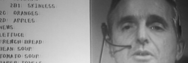
    Bruce Rosenblum switched on his Apple II, which rang out a high F note followed by the clatter of the floppy drive. After a string of thock thock keystrokes, the 12-inch Sanyo monitor began to phosphoresce. A green grid appeared, 16 units wide and 16 units tall. This was “Gridmaster,” a program Bruce had cooked up in the programming language BASIC to build one of the world’s first Chinese digital fonts. He was developing the font for an experimental machine called the Sinotype III, which was among the first personal computers to handle Chinese-language input and output.

    At the time, in the late 1970s and early 1980s, there were no personal computers being built in China. So to make a “Chinese” PC, Rosenblum’s team was reprogramming an Apple II to operate in Chinese. His list of tasks was long. He had to program an operating system from scratch, since Apple II’s DOS 3.3 simply wouldn’t allow the inputting and outputting of Chinese-character texts. Likewise, he had to program the Chinese word processor itself, a job he worked on tirelessly for months.
    A photograph of the Sinotype III monitor shows the Gridmaster program and the digitization process of the Chinese character 电 (dian, electricity).
    LOUIS ROSENBLUM COLLECTION, STANFORD UNIVERSITY LIBRARY SPECIAL COLLECTIONS

    While Gridmaster may have been a simple program, the task that it would be used to accomplish—creating digital bitmaps of thousands of Chinese characters—posed profound design challenges. In fact, creating the font for Sinotype III—a machine developed by the Graphics Arts Research Foundation (GARF) in Cambridge, Massachusetts—took far longer than programming the computer itself. Without a font, there would be no way to display Chinese characters on screen, or to output them on the machine’s dot-matrix printer.

    For each Chinese character, designers had to make 256 separate decisions, one for each potential pixel in the bitmap. (A bitmap is a way of storing images digitally—whether as a JPEG, GIF, BMP, or other file format—using a grid of pixels that together make up a symbol or an image.) Multiplied across thousands of characters, this amounted to literally hundreds of thousands of decisions in a development process that took more than two years to complete.

    Programming Gridmaster—which in hindsight Rosenblum described to me as “clunky to use, at best”—enabled his father, Louis Rosenblum, and GARF to farm out the responsibility of creating the digital font. Using any Apple II machine, and running Gridmaster off a floppy disc, data entry temps could create and save new Chinese character bitmaps, remotely. Once these bitmaps were created and stored, the Rosenblums could install them on the Sinotype III by using a second program (also designed by Bruce) that ingested them and their corresponding input codes into the system’s database.

    Sinotype III was never commercially released. Nevertheless, the painstaking work that went into its development—including the development of this bitmap Chinese font—was central to a complex global effort to solve a vexing engineering puzzle: how to equip a computer to handle Chinese, one of the most widely used languages on Earth.
    A photograph of a Sinotype III monitor displaying the Chinese bitmap font.
    LOUIS ROSENBLUM COLLECTION, STANFORD UNIVERSITY LIBRARY SPECIAL COLLECTIONS

    At the advent of computing and word processing in the West, engineers and designers determined that a low-resolution digital font for English could be built upon a 5-by-7 bitmap grid—requiring only five bytes of memory per symbol. Storing all 128 low-resolution characters in the American Standard Code for Information Interchange (ASCII), which includes every letter in the English alphabet, the numerals 0 through 9, and common punctuation symbols, required just 640 bytes of memory—a tiny fraction of, for example, the Apple II’s 64 kilobytes of onboard memory.
    Related Story
    brain made of electrical cord
    Is your brain a computer?

    We asked experts for their best arguments in the long-standing debate over whether brains and computers process information the same way.

    But there are tens of thousands of Chinese characters, and a 5-by-7 grid was too small to make them legible. Chinese required a grid of 16 by 16 or larger—i.e., at least 32 bytes of memory (256 bits) per character. Were one to imagine a font containing 70,000 low-resolution Chinese characters, the total memory requirement would exceed two megabytes. Even a font containing only 8,000 of the most common Chinese characters would require approximately 256 kilobytes just to store the bitmaps. That was four times the total memory capacity of most off-the-shelf personal computers in the early 1980s.

    As serious as these memory challenges were, the most taxing problems confronting low-res Chinese font production in the 1970s and 1980s were ones of aesthetics and design. Long before anyone sat down with a program like Gridmaster, the lion’s share of work took place off the computer, using pen, paper, and correction fluid.

    Designers spent years trying to fashion bitmaps that fulfilled the low-memory requirements and preserved a modicum of calligraphic elegance. Among those who created this character set, whether by hand-drawing drafts of bitmaps for specific Chinese characters or digitizing them using Gridmaster, were Lily Huan-Ming Ling (凌焕銘) and Ellen Di Giovanni.
    Draft bitmap drawings of Chinese characters for the Sinotype III font.
    LOUIS ROSENBLUM COLLECTION, STANFORD UNIVERSITY LIBRARY SPECIAL COLLECTIONS

    The core problem that designers faced was translating between two radically different ways of writing Chinese: the hand-drawn character, produced with pen or brush, and the bitmap glyph, produced with an array of pixels arranged on two axes. Designers had to decide how (and whether) they were going to try to re-create certain orthographic features of handwritten Chinese, such as entrance strokes, stroke tapering, and exit strokes.

    In the case of the Sinotype III font, the process of designing and digitizing low-resolution Chinese bitmaps was thoroughly documented. One of the most fascinating archival sources from this period is a binder full of grids with hand-drawn hash marks all over them—sketches that would later be digitized into bitmaps for many thousands of Chinese characters. Each of these characters was carefully laid out and, in most cases, edited by Louis Rosenblum and GARF, using correction fluid to erase any “bits” the editor disagreed with. Over top of the initial set of green hash marks, then, a second set of red hash marks indicated the “final” draft. Only then did the work of data entry begin.
    A close-up of a draft bitmap drawing of bei (背, back, rear) showing edits made using correction fluid.
    LOUIS ROSENBLUM COLLECTION, STANFORD UNIVERSITY LIBRARY SPECIAL COLLECTIONS

    Given the sheer number of bitmaps that the team needed to design—at least 3,000 (and ideally many more) if the machine had any hopes of fulfilling consumers’ needs—one might assume that the designers looked for ways to streamline their work. One way they could have done this, for example, would have been to duplicate Chinese radicals—the base components of a character—when they appeared in roughly the same location, size, and orientation from one character to another. When producing the many dozens of common Chinese characters containing the “woman radical” (女), for example, the team at GARF could have (and, in theory, should have) created just one standard bitmap, and then replicated it within every character in which that radical appeared.

    No such mechanistic decisions were made, however, as the archival materials show. On the contrary, Louis Rosenblum insisted that designers adjust each of these components—often in nearly imperceptible ways—to ensure they were in harmony with the overall character in which they appeared.

    In the bitmaps for juan (娟, graceful) and mian (娩, to deliver), for example—each of which contains the woman radical—that radical has been changed ever so slightly. In the character juan, the middle section of the woman radical occupies a horizontal span of six pixels, as compared with five pixels in the character mian. At the same time, however, the bottom-right curve of the woman radical extends outward just one pixel further in the character mian, and in the character juan that stroke does not extend at all.
    The bitmap characters for juan (娟, graceful) and mian (娩, to deliver) from the Sinotype III font, recreated by the author.
    LOUIS ROSENBLUM COLLECTION, STANFORD UNIVERSITY LIBRARY SPECIAL COLLECTIONS

    Across the entire font, this level of precision was the rule rather than the exception.

    When we juxtapose the draft bitmap drawings against their final forms, we see that more changes have been made. In the draft version of luo (罗, collect, net), for example, the bottom-left stroke extends downward at a perfect 45° angle before tapering into the digitized version of an outstroke. In the final version, however, the curve has been “flattened,” beginning at 45° but then leveling out.
    A comparison of two draft versions of the character luo (罗, collect, net).
    LOUIS ROSENBLUM COLLECTION, STANFORD UNIVERSITY LIBRARY SPECIAL COLLECTIONS

    Despite the seemingly small space in which designers had to work, they had to make a staggering number of choices. And every one of these decisions affected every other decision they made for a specific character, since adding even one pixel often changed the overall horizontal and vertical balance.

    The unforgiving size of the grid impinged upon the designers’ work in other, unexpected ways. We see this most clearly in the devilish problem of achieving symmetry. Symmetrical layouts—which abound in Chinese characters—were especially difficult to represent in low-resolution frameworks because, by the rules of mathematics, creating symmetry requires odd-sized spatial zones. Bitmap grids with even dimensions (such as the 16-by-16 grid) made symmetry impossible. GARF managed to achieve symmetry by, in many cases, using only a portion of the overall grid: just a 15-by-15 region within the overall 16-by-16 grid. This reduced the amount of usable space even further.
    Symmetry and asymmetry in the characters shan (山, mounting), zhong (中, middle), ri (日, sun), and tian (田, field).
    LOUIS ROSENBLUM COLLECTION, STANFORD UNIVERSITY LIBRARY SPECIAL COLLECTIONS

    The story becomes even more complex when we begin to compare the bitmap fonts created by different companies or creators for different projects. Consider the water radical (氵) as it appeared in the Sinotype III font (below and on the right), as opposed to another early Chinese font created by H.C. Tien (on the left), a Chinese-American psychotherapist and entrepreneur who experimented with Chinese computing in the 1970s and 1980s.
    A comparison of the water radical (氵) as it appeared in the Sinotype III font (right) versus an early Chinese font created by H.C. Tien (left).
    LOUIS ROSENBLUM COLLECTION, STANFORD UNIVERSITY LIBRARY SPECIAL COLLECTIONS

    As minor as the above examples might seem, each represented yet another decision (among thousands) that the GARF design team had to make, whether during the drafting or the digitization phase.

    Low resolution did not stay “low” for long, of course. Computing advances gave rise to ever denser bitmaps, ever faster processing speeds, and ever diminishing costs for memory. In our current age of 4K resolution, retina displays, and more, it may be hard to appreciate the artistry—both aesthetic and technical—that went into the creation of early Chinese bitmap fonts, as limited as they were. But it was problem-solving like this that ultimately made computing, new media, and the internet accessible to one-sixth of the global population.

    Tom Mullaney is a professor of Chinese history at Stanford University, a Guggenheim fellow, and the Kluge Chair in Technology and Society at the Library of Congress. He is the author or lead editor of six books, including The Chinese Typewriter, Your Computer Is on Fire, and the forthcoming The Chinese Computer—the first comprehensive history of Chinese-language computing.
    by Tom Mullaney

    #Chine #Caractères #Bitmap #Histoire_informatique #Tom_Mullaney

  • Inside the flop that changed Apple forever - YouTube
    https://www.youtube.com/watch?v=pcYX-2uWwsk

    Apple’s Macintosh, released in 1984, is celebrated for ushering in a new era of user-friendly computing. But! The Mac owes a lot to its lesser-known, older sister Lisa. Here’s how the Lisa, while seen as a flop today, used clever interface design to welcome everyone into the personal computer era. Though as new technologies like AR, VR, and AI chatbots arrive, are we finally leaving Lisa’s legacy behind? #Apple #Technology #History

    Read more: http://bit.ly/3UdVXAW

    00:00 Intro
    00:37 Computers of the 1970’s
    01:13 The Beginning of GUIs
    01:40 Xerox PARC’s Alto Computer
    02:10 Other Tech Inspirations for Apple
    02:42 Goals behind the Apple Lisa
    03:20 Hands-on with a Lisa
    04:35 Developing the Lisa with Bill Atkinson
    06:22 Introducing Macintosh
    07:06 Lisa vs Macintosh
    07:24 Countdown of switching applications on a Macintosh
    08:15 What the ‘Desktop Metaphor’ means now
    09:28 Final thoughts with Bill Atkinson

    #Histoire_informatique #Apple #Interface_graphique

  • The Rise and Demise of RSS
    https://motherboard.vice.com/en_us/article/a3mm4z/the-rise-and-demise-of-rss

    Before the internet was consolidated into centralized information silos, RSS imagined a better way to let users control their online personas.

    The story of how this happened is really two stories. The first is a story about a broad vision for the web’s future that never quite came to fruition. The second is a story about how a collaborative effort to improve a popular standard devolved into one of the most contentious forks in the history of open-source software development.

    RSS was one of the standards that promised to deliver this syndicated future. To Werbach, RSS was “the leading example of a lightweight syndication protocol.” Another contemporaneous article called RSS the first protocol to realize the potential of Extensible Markup Language (XML), a general-purpose markup language similar to HTML that had recently been developed. It was going to be a way for both users and content aggregators to create their own customized channels out of everything the web had to offer. And yet, two decades later, after the rise of social media and Google’s decision to shut down Google Reader, RSS appears to be a slowly dying technology, now used chiefly by podcasters, programmers with tech blogs, and the occasional journalist. Though of course some people really do still rely on RSS readers, stubbornly adding an RSS feed to your blog, even in 2019, is a political statement. That little tangerine bubble has become a wistful symbol of defiance against a centralized web increasingly controlled by a handful of corporations, a web that hardly resembles the syndicated web of Werbach’s imagining.

    RSS would fork again in 2003, when several developers frustrated with the bickering in the RSS community sought to create an entirely new format. These developers created Atom, a format that did away with RDF but embraced XML namespaces. Atom would eventually be specified by a standard submitted to the Internet Engineering Task Force, the organization responsible for establishing and promoting the internet’s rules of the road. After the introduction of Atom, there were three competing versions of RSS: Winer’s RSS 0.92 (updated to RSS 2.0 in 2002 and renamed “Really Simple Syndication”), the RSS-DEV Working Group’s RSS 1.0, and Atom. Today we mostly use RSS 2.0 and Atom.

    For a while, before a third of the planet had signed up for Facebook, RSS was simply how many people stayed abreast of news on the internet.

    Today, RSS is not dead. But neither is it anywhere near as popular as it once was. Lots of people have offered explanations for why RSS lost its broad appeal. Perhaps the most persuasive explanation is exactly the one offered by Gillmor in 2009. Social networks, just like RSS, provide a feed featuring all the latest news on the internet. Social networks took over from RSS because they were simply better feeds. They also provide more benefits to the companies that own them. Some people have accused Google, for example, of shutting down Google Reader in order to encourage people to use Google+.

    RSS might have been able to overcome some of these limitations if it had been further developed. Maybe RSS could have been extended somehow so that friends subscribed to the same channel could syndicate their thoughts about an article to each other. Maybe browser support could have been improved. But whereas a company like Facebook was able to “move fast and break things,” the RSS developer community was stuck trying to achieve consensus. When they failed to agree on a single standard, effort that could have gone into improving RSS was instead squandered on duplicating work that had already been done. Davis told me, for example, that Atom would not have been necessary if the members of the Syndication mailing list had been able to compromise and collaborate, and “all that cleanup work could have been put into RSS to strengthen it.” So if we are asking ourselves why RSS is no longer popular, a good first-order explanation is that social networks supplanted it. If we ask ourselves why social networks were able to supplant it, then the answer may be that the people trying to make RSS succeed faced a problem much harder than, say, building Facebook. As Dornfest wrote to the Syndication mailing list at one point, “currently it’s the politics far more than the serialization that’s far from simple.”

    #RSS #Histoire_informatique #Politique_algorithme #Normalisation

    • J’apprécie, comme toi, qu’il fasse remarquer que les décisions
      techniques ont des conséquences politiques. Il est clair que l’abandon de facto de la #syndication SS a accéléré le passage d’un web décentralisé vers un web polarisé par les GAFA. Je suis moins convaincu par ses explications sur les raisons pour lesquelles la syndication n’a pas tenu sur le long terme :

      – dire que RSS n’est pas user-friendly est franchement débile. RSS est un format. L’utilisateur ne le voit pas. Quasiment aucun utilisateur
      de RSS, que ce soit côté producteur ou consommateur, n’a regardé à quoi ça ressemblait en utilisant vi ! Un logiciel peut être
      « user-friendly » ou pas. Pour un format, ça n’a pas de sens.

      – je trouve qu’il exagère le rôle des disputes au sein du monde de la
      syndication. Certes, ces disputes ont pu contribuer à semer le trouble mais n’exagérons pas : ça se passait dans un tout petit microcosme et la grande majorité des webmestres et des lecteurs n’en ont jamais entendu parler. (Au passage, le camp vainqueur est nettement celui qui voulait un format simple : les sites Web n’utilisent qu’une petite partie du format.) Et, d’une point de vue pratique, ces disputes n’ont eu aucune conséquence : tous les logiciels de lecture comprennent les trois formats. Le webmestre peut donc publier ce qu’il veut, sans inquiétude.

      – par contre, il parle trop peu des raisons politico-marketing de
      l’abandon de la syndication : propagande effrénée des médias et
      autres autorités en faveur des solutions centralisées, notamment.

  • 50 years on, we’re living the reality first shown at the “Mother of All Demos” | Ars Technica
    https://arstechnica.com/information-technology/2018/12/50-years-on-were-living-the-reality-first-shown-at-the-mother-of-all-de

    A half century ago, computer history took a giant leap when Douglas Engelbart—then a mid-career 43-year-old engineer at Stanford Research Institute in the heart of Silicon Valley—gave what has come to be known as the “mother of all demos.”

    On December 9, 1968 at a computer conference in San Francisco, Engelbart showed off the first inklings of numerous technologies that we all now take for granted: video conferencing, a modern desktop-style user interface, word processing, hypertext, the mouse, collaborative editing, among many others.

    Even before his famous demonstration, Engelbart outlined his vision of the future more than a half-century ago in his historic 1962 paper, “Augmenting Human Intellect: A Conceptual Framework.”

    To open the 90-minute-long presentation, Engelbart posited a question that almost seems trivial to us in the early 21st century: “If in your office, you as an intellectual worker were supplied with a computer display, backed up by a computer that was alive for you all day, and was instantly responsible—responsive—to every action you had, how much value would you derive from that?”

    Of course at that time, computers were vast behemoths that were light-years away from the pocket-sized devices that have practically become an extension of ourselves.

    #Histoire_informatique #Mother_of_all_demos #Douglas_Engelbart

  • Someone Recreated HyperCard, Apple’s 80s Programming Tool Invented on Acid - Motherboard
    https://motherboard.vice.com/en_us/article/59jg73/vipercard-recreated-hypercard-apple-80s-acid

    ViperCard’s old school look and faithful recreation of the HyperCard experience bring back days when users were encouraged to play with their new machines rather than simply follow their glossily-rendered instructions. In a 2016 interview, HyperCard creator Bill Atkinson said that the point of the tool was to “give programming abilities to people with a passion, rather than trying to give programmers a passion.”

    This revelation, Atkinson said in the same interview, was inspired by an acid trip. It’s a long story that begins on “a park bench outside [Atkinson’s] house” after having “taken some really nice acid.” During this trip, Atkinson thought about the parallels between stars and streetlamps, and “saw the curvature of the planet.” Eventually, he had a realization that boiled down to average people engaged in different areas of knowledge—music, biology, poetry, chemistry, etc.—being able to talk to each other. Really, information being able to link to other information.

    “If you can facilitate the connection between different bodies of knowledge talking to each other, then there’s a trickle-up effect that maybe you’ll develop some wisdom on the planet,” Atkinson said in the interview.

    With ViperCard, a tiny bit of that original acid-tinged vision for computing is back.

    J’ai adoré HyperCard... Il faut que je vois si ce ViperCard peut utiliser des vieux stacks.
    #HyperCard #Histoire_informatique

  • AOL Instant Messenger to Shut Down in December - The New York Times
    https://www.nytimes.com/2017/10/06/technology/aol-aim-shut-down.html

    AOL Instant Messenger, the chat program that connected a generation to their classmates and crushes while guiding them through the early days of digital socializing, will shut down on Dec. 15, its parent company announced on Friday.

    Released in 1997, the program had largely faded into obscurity over the last decade, replaced by text messages, Google Chat, Facebook, Twitter, Instagram, Snapchat and on and on we go. But at its height, AIM, as it was known, served as the social center for teenagers and young adults, the scene of deeply resonant memories and the place where people learned how to interact online.

    #Histoire_informatique #Messagerie #AOL

  • Du Minitel à l’Internet… – Christian Quest – Medium
    https://medium.com/@cq94/du-minitel-%C3%A0-linternet-a3ce9a712440

    On voit que les tarifs ont bien évolué car il fallait soit débourser 2400F HT (environ 480 € HT d’aujourd’hui) pour un domaine, ou bien adhérer à l’AFNIC avec une cotisation annuelle de… 30.000F HT (environ 6000 € HT d’aujourd’hui) pour bénéficier d’un tarif réduit de 560F à 2400 F HT. Ceci était l’option des prestataires (c’était le cas de ma société). Nous n’étions pas bien nombreux au comité de concertation, la barre était un peu haute et il fallait être bien motivé et y croire !

    #Histoire_informatique #Noms_de_domaine

  • Interstices - 50 ans d’interaction Homme-machine : retours vers le futur
    https://interstices.info/jcms/c_23015/50-ans-d-interaction-homme-machine-retours-vers-le-futur

    Depuis qu’existent les ordinateurs, la question de l’interface avec les utilisateurs s’est posée. En cinquante ans, l’interaction Homme-machine (IHM) a permis de rendre l’informatique accessible au plus grand nombre, d’une façon que personne n’avait anticipée. Mais ne sommes-nous pas devenus prisonniers d’interfaces qui ont peu évolué depuis plusieurs décennies ?

    Un survol passionnant des modes d’interaction avec les ordinateurs.

    #Histoire_informatique #IHM #Interfaces

  • «Lo and Behold»: Werner Herzog invente Internet - Page 1 | Mediapart
    https://www.mediapart.fr/journal/culture-idees/190817/lo-and-behold-werner-herzog-invente-internet

    Werner Herzog a réalisé en 2016 Lo and Behold : Reveries of the Connected World. Ce documentaire consacré à Internet, son histoire et ses perspectives, pose l’une des questions au cœur de cette série d’articles : Internet est-il un sujet comme les autres ?

    En termes plus simples et plus nettement appliqués à ce film-ci : l’omniprésence d’Internet est aussi bien son absence, son extrême visibilité est aussi bien son invisibilité, son progrès est aussi son recul dans des confins de moins en moins faciles à cartographier, son miracle est aussi bien son cauchemar.

    #Histoire_informatique #film

  • 8 Lessons from 20 Years of Hype Cycles | Michael Mullany | Pulse | LinkedIn
    https://www.linkedin.com/pulse/8-lessons-from-20-years-hype-cycles-michael-mullany

    As most of you know, the Gartner Hype Cycle for Emerging Technologies is practically an institution in high tech. First published in 1995, the Hype Cycle proposed a standard adoption model for new technologies. In this model, technologies all go through a process of :

    Emergence: “The Technology Trigger”
    Excessive enthusiasm: “The Peak of Inflated Expectations”
    Excessive disappointment : “The Trough of Disillusionment”
    Gradual, practical adoption: “The Slope of Enlightenment” and “The Plateau of Productivity”

    But our inability to remember the past in proper context is not the only lesson from taking a deep dive into Gartner’s past Hype Cycles. After analyzing every year from 2000 on, I think I can say with confidence that we are simply not very good at predicting the future. I’ve learned that lesson and seven more from my deep dive into the data. Read on for the details:
    Lesson 1. We’re terrible at making predictions. Especially about the future.

    #Histoire_informatique #Cycle_technologie

  • Women pioneered computer programming. Then men took their industry over.
    https://timeline.com/women-pioneered-computer-programming-then-men-took-their-industry-over-c29

    Between 30 and 50 percent of programmers were women in the 1950s, and it was seen as a natural career for them, as evidenced by a 1967 Cosmopolitan feature about “Computer Girls.”

    “It’s just like planning a dinner…You have to plan ahead and schedule everything so that it’s ready when you need it,” Dr. Hopper told the magazine. “Women are ‘naturals’ at computer programming.”

    But things were already changing. Programming was being recognized as intellectually strenuous, and salaries were rising significantly. More men became interested in it and sought to increase their own prestige, according to historian Nathan Ensmenger. They formed professional organizations, sought stricter requirements to enter the field, and discouraged the hiring of women.

    One of they key takeaways of the personality tests was the best programmers were antisocial, and that that was a male trait.

    By the time we entered the personal computer age in the 1980s, the stereotype of the programmer as antisocial super-nerd was set, aided by the rise of wonder boys like Steve Jobs and Bill Gates. Films like Weird Science, War Games, and Real Genius perpetuated the stereotype. And since you could play video games on early personal computers, advertisers marketed them primarily to men and boys (even though girls liked them, too).

    “This idea that computers are for boys became a narrative. It became the story we told ourselves about the computing revolution,” wrote Steven Henn on the Planet Money blog. “It helped define who geeks were, and it created techie culture.”

    #Histoire_informatique #féminisme #stéréotypes

  • Jean Sammet, Co-Designer of a Pioneering Computer Language, Dies at 89 - The New York Times
    https://www.nytimes.com/2017/06/04/technology/obituary-jean-sammet-software-designer-cobol.html

    Jean E. Sammet, an early software engineer and a designer of COBOL, a programming language that brought computing into the business mainstream, died on May 20 in Maryland. She was 89.

    The United States Department of Defense, the largest purchaser of computers at the time, set general guidelines for COBOL, including asking for “the maximum use of simple English” to “broaden the base of those who can state problems to computers.” Later, the Pentagon declared it would not buy or lease computers unless they ran COBOL.

    Grace Hopper, a computer pioneer at Sperry Rand in the late 1950s, led the effort to bring computer makers together to collaborate on the new programming language. Ms. Hopper is often called the “mother of COBOL,” but she was not one of the six people, including Ms. Sammet, who designed the language — a fact Ms. Sammet rarely failed to point out. (Ms. Sammet worked for Sylvania Electric at the time.)

    “I yield to no one in my admiration for Grace,” she said. “But she was not the mother, creator or developer of COBOL.”

    Ms. Sammet and the other five programmers did much of the new language’s design during two weeks of nearly round-the-clock work, holed up in the Sherry-Netherland Hotel in Manhattan. Their proposal was presented in November 1959 and accepted with few changes by the computer makers they worked for and the Pentagon.

    #histoire_informatique

  • 1988, le virus informatique était dans le courrier (du facteur) - Vidéo Ina.fr
    http://www.ina.fr/video/S629642_001

    1988, le virus informatique était dans le courrier (du facteur)
    flash-back

    Une attaque informatique mondiale a fait 200 000 victimes dans 150 pays. La première attaque en France date de 1988. Rapidement identifié, on parlait déjà de « possible émergence d’une nouvelle forme de terrorisme ». A l’époque, la disquette contenant le virus avait été envoyé par la poste… L’ingénieur, découvreur du virus, raconte son aventure.

    #histoire_informatique #sécurité_informatique #virus